Art gallery seems to be a place for everyone, but at the same time, only for those art passionates who truly consider visiting art galleries as one of their hobbies as well, especially in this contemporary world that being filled with electronic devices, such as laptops and smartphone that we cannot get rid of in our daily life. These days, as we can also view and appreciate artworks on the internet, visiting galleries had turned into an activity with ‘purpose’, a place that could let us to complete our visual art assignments, or a ‘tourist attraction’ where we could experience its art culture when visiting a new city (Philips, 2012).
Immersion, from the perspective of design (Lidwell, Elam, Butler & Holden 2010), it could refer to the state when a person is intensely focused on a task that led to forgetting the presence of the actual world, and the flowing of time, such as daily routines like eating and sleeping, due to the happiness and fulfilment gained from that activity, which similar to a psychological theory called Flow that raised by Mihaly Csikszentmihalyi (1991), when focusing on a task had become an ecstatic and objective specific activity with feedback could be received, in the other word, you feel happy because of it and clear about what your goals are, and it is also ‘interactive’ in certain extent. Which this state could be achieved by, various senses being stimulated by different stimuli, and the rest stimuli could remind us where we currently are, that could arouse both of our comforts and excitement.
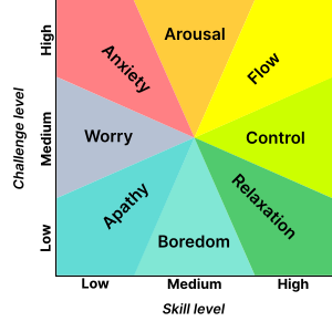
Different states of emotion cr. Wikipedia
In the case of visiting art galleries, the ‘goal’ could be provided by deeply focus on appreciating artworks, curious about the meaning behind them and pondering the story of them, or having interaction with artworks and installations where we could get multi-sensory experiences from it rather than just the senses of vision and brain. Where this continuity of sensory communication could get us into the state of Flow, and the state of Immersion, with also having a long-lasting aftertaste left by those interactively-immersive experiences, instead of just a simple seeing-thinking process (Kim, 2015).
Another design objective of art galleries would be to maintain the novelty of it. As mentioned above, the main marketing audiences of art galleries are those art lovers who would frequently visit galleries and treating it as one of their main interests, which following with the general public as a secondary target audience. Therefore, keep renewing and rearranging exhibitions and exhibits would be one of the effective ways to make it looks different from time to time, including to release temporary exhibitions of different fields, themes and even different regions, that this had already been a characteristic of art galleries around the world (Riding, 2006).
Moving back to Immersion, for this project, we had audited the two art centres of the National Gallery of Victoria (NGV), the NGV International and NGV Australia in a group of five, with mainly recorded stimulus in the format of images and videos. Next, this article is going to discuss how successful had the NGV created an immersive atmosphere toward the general public in the following aspects, their interior design, the interactivity of their exhibitions, and their techniques in presenting texts, the description of exhibits and artworks.
Interior design
In NGV’s exhibitions, through deliberately arrange the placement of exhibits and their related adornments, with the use of colour and lighting, they could minimise the distraction in those spaces, where minimizing distractions could achieve by enhancing stimuli that linked to that immersive environment, and cutting off stimuli that could remind them their real life (Lidwell et al., 2010). For instance, the wall colour, most of the galleries had applied a mono-colour on their exhibition’s wall, including the NGV, which was integrated with the atmosphere of the exhibition, acting as a supporting role to make artworks look more outstanding, that could let visitors pay more attention to those artworks (Miller, 2016).

In the section of 16th-18th Century Art Collection, the colour of Worsted had been applied on both the wall and artwork labels, a deep gray that could fit into the mood of the space, and make the place more atmospheric (Miller, as cited in Cosby, 2016). Meanwhile, crystal light stands with neutral lighting and wooden floor had also been employed, that could produce a feeling of comfort to visitors, putting these backdrops into the field of subconscious, completely concentrated on appreciating those art pieces.
As well as, they had used the concept of contrast, the contrast of colour/lighting, and placing representative adornments of those distinct regions and time periods to help visitors differentiate certain similar sections, such as the Art collection of Japan and China, that both of them had seemingly adopted the wall colour of white.

As shown above, their degree of white were different, that the Japanese and Chinese Collection had used creamy-white and pure-white like wall representatively, even though the color of lighting was seemingly the same, this differentiation could still be told by human eyes. Also, in order to separate them, NGV had installed typical decorations and sculptures of those countries: the Japanese style screens in front of the entrance and surrounding the sealing, and an ancient Chinese statue in the Chinese Collection to express the message of different spaces to visitors.
However, often use of white colour may make visitors feel bored. White, for the galleries, a colour that was originally designed for “wiping out people’s awareness of the real world” (Kelly, as cited in O’Doherty, 2012), had been overly used during the 20th century and some of the national level galleries had already made changes on it (Jones, 2011). The use of white, could be one of the key elements to achieve immersion, or turned into a useless stimuli toward immersion instead, as had been too common, that visitors cannot be visually stimulated by it anymore.
Interactivity
Starting from the moment of entering the NGV International, we had already been surrounded by installations. The glass waterfall placed at the entrance, an animated Grandfather clock inconspicuous hiding in the gallery store, as well as the ‘Hiding Buddha’ trick next to the Chinese Art Collection, all had first drawn our attention to it since its novelty and creativity, then having physical interaction such as gazing what was hiding under the glass, or indirect interaction with it by guessing how it works. Nevertheless, this kind of interactive experience, is largely depends on the visitor’s mindset, whether he or she had ‘prepared’ enough, interested in and concentrated on the visiting experience, to be interacted with, being physically or mentally stimulated, and getting immersed (Kim, as cited in Zisch, Gage & Spiers, 2015).
The interactive installation ‘Buddha Smile’ cr. Wendell Nulot
Besides installation, interactivity could also be obtained through strange and weird artworks, that aroused either our curiosity or the feeling of disgust. Curiosity, which could mean having intense attention to or the increased of perceiving stimuli, one of the keys that letting us deeply involved in a space and get to the stage of immersion (Lowry et al., as cited in Berlyne, 2007). When seeing those unintelligible artworks that doesn’t match the overall theme of a place, especially those placing at the centre of an exhibition space, if we are concentrate to the exhibition and curious enough, we would be mentally stimulated and unconsciously thinking about the gallery’s intention of its arrangement, and what that artwork is going to represent.

An unintelligible artwork that placing at the centre of a display room cr. Trista Zheng
However, once those artworks had beyond our understanding of aesthetic, or related to our own traumas, we may label it as ‘weird’ and having a negative impression on it. For example, if a visitor is afraid of insects, just a model of spider could be well enough to provoke one’s feeling of disgust, which could imprint on their mind depends on how serious those traumas were, that became a significant distraction at the same time and lower the degree of immersion. Where there is still an exception that, some of us would enjoy the state of disgust, how excited the stimulation of diverse senses is in that between ‘to look and not to look’ circumstance (Ndalianis, 2012).

For me, hybrid animals are pretty disgusting cr. Trista Zheng
A different artwork label
Furthermore, two impressive approaches could be found on the labels of artworks in NGV, that some of them contain a separate label for kids, and various foreign exhibits have art descriptions in both English and their primary language. Where those ‘labels for kids’ could be targeting non-English speakers as well, who do not have enough English proficiency to read the main tag of those artworks. For both kids and English learners, these texts could give them a better understanding about the artwork, and also plays a role of thought-provoking, that inspire them to think more, having a stronger engagement with it.

Artwork label for kids
Likewise, texts in the original language had been included in the description of exhibits and artworks in the Asia Collection sector, where East Asian and Southeast Asian immigration took a certain amount of the entire Australian population. Those texts written in their native language, could let them being emotionally stimulated, enhance their sense of familiarity toward those exhibits, thus, arouse their sense of belonging. Through gaining belongings, ones could feel safe, survival, as well as comfortable that could grow into the motivation toward tasks (Comaford, 2016), deeply involved in the appreciation of artworks and having interaction between them.

An exhibition introduction in both English, Chinese, Japanese and Hindi
Through various active stimuli, interactive artworks and texts that could stimulate our different senses, physically like the vision and tactility stimulating, and emotionally such as the feeling of comfort, could heighten our engagement within a space, where certain environmental stimuli could recall us the mission that we are focusing on, help minimising the distractions around us, that accelerating our progress toward the state of immersion. However, our personality and attitude toward the task also perform a substantial part in the above process that, if we do not have any objectives on what we are participating in, the state of immersion would be difficultly reached instead.
Bibliography
Comaford, C. (2016, January 6). Create a Sense of Belonging. HVACR BUSSINESS. Retrieved from http://www.hvacrbusiness.com/create-sense-of-belonging.html
Csikszentmihalyi, M. (2004). Flow, the Secret to Happiness (video). TED 2004. Retrieved from https://www.ted.com/talks/mihaly_csikszentmihalyi_on_flow
Csikszentmihalyi, M. (1991). Flow: The psychology of optimal experience (1st. Harper Perennial ed., pp. 1-8). New York: Harper Collins.
Jones, J. (2011, October 22). What colour should gallery walls be?. theguardian. Retrieved from https://www.theguardian.com/artanddesign/jonathanjonesblog/2011/oct/21/colour-gallery-walls-musee-d-orsay
Kelly, J. (2012). Exhibition Design + Contemporary Encounters, RMIT University. Retrieved from http://researchbank.rmit.edu.au/eserv/rmit:160318/Kelly.pdf
Kim, H. (2015, November 12). Flow and Immersion (blog post), Interactive Architecture Lab. Retrieved from http://www.interactivearchitecture.org/soft-architecture-and-immersion-experiences.html
Lidwell, W., Elam, K., Butler, J., & Holden, K. (2010). Immersion. Universal Principles of Design: 125 Ways to Enhance Usability, Influence Perception, Increase Appeal, Make Better Design Decisions, and Teach Through Design (pp. 134-135). Beverly, Mass: Rockport Publishers.
Lowry, P. B., Twyman, N. W., Gaskin, J., Hammer, B., Bailey, A. R., Roberts, T. L. (2007). Proposing the Interactivity-Stimulus-Attention Model (ISAM) to Explain and Predict the Enjoyment, Immersion, and Adoption of Purely Hedonic Systems, Louisiana Technical University and Brigham Young University. Retrieved from http://sighci.org/prototype/uploads/published_papers/ICIS2007/SIGHCI_2007_Proceedings_paper_11.pdf
Miller, M. (2016, August 4). How A Color Designer Creates The Perfect Backdrop For Famous Art, Co. Design. Retrieved from https://www.fastcodesign.com/3058592/how-a-color-designer-creates-the-perfect-backdrop-for-famous-art
Ndalianis, A. (2012). The Case of the Living Dead: Synaesthesia and Sensuous Geographies. The Horror Sensorium Media and the Senses( pp. 31-39). Jefferson: McFarland & Company.
Philip, L. (2012, October 25). Why go to an art gallery (blog post). Retrieved from http://paperlouisenotes.blogspot.com.au/2012/10/why-go-to-art-gallery.html
Riding, A. (2006, July 22). Art Rearranged: The Shock of the New and the Comfort of the Old. The New York Times. Retrieved from http://www.nytimes.com/2006/07/22/arts/design/22inst.html?_r=1&pagewanted=all
Audit List (text version)

I declare that in submitting all work for this assessment I have read, understood and agree to the content and expectations of the assessment declaration.