My scene is about loneliness I think, so I consciously tried to create a feel of isolation. In this post I will attempt to explain some of my choices in framing and mise en scene and how they came about.
All the little meticulously placed artworks on the walls and careful choice of decor suggests that this apartment is very lived in and was once homely. It seems odd that only one person is now seen in it. Isaac can be seen through the sliver of the door, as if he is being peered at; perhaps by someone who doesn’t want to interact with him too much, regardless of eyelines. It also find satisfaction in the way he lines up with the 3 visual panels from the left. The lighting also gives a clue that the characters may not be in the same place.
I wanted this white cup to stand out, but not in an overly intrusive way, just subtlety. Its the brightest part of the frame but only by a tiny bit. To do this I moved the rest of the mugs back so that they would sit under the shadow of the shelf above. In the shot I also changed the focus to emphasise the “lonely” placement of this white mug which was suggested to be the mug of Isaac’s partner.
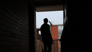
Before shooting I looked around the area for things (like colour and shape) that might stick out and help me create a unique looking ‘world’ within the scene. I wanted things to look cohesive so they were tied together. I found that the brick color matches the terracota of the babushka dolls that were in the house already.
Why did I choose to have such dramatic lighting? You may think its simply me being like, “well, its cool” but I found that having a silhouette of Isaac was much more interesting, and it also allowed for some flexibility in editing later because I didn’t have to worry too much about facial expressions.
Silhouettes also created a gloomier mood and made his figure look more lonely and isolated in the frame. The lighting at the back creates a new smaller frame to focuses us on the subject even more.
I have wanted to try this out ever since watching In the Mood for Love (2000) directed by Wong Kar Wai. Wong is well known for his precise framing and his creation of frames within frames. The nostalgic film is set in a the 1960s Hong Kong and gives us a voyeuristic peak into the secret lives of the two main characters.
The apartment that I filmed in was very small, and filled to the brim with art. There are frames all over the walls and trinkets on every flat surface. I personally love it because as soon as you enter the space you immediately get a sense of the personalities of the home owners.
Same goes with the apartments from In The Mood For Love. The

As well as colour I wanted to try and link up shots with the shapes in the frame. This may not have worked as well as I’d liked because there wasn’t a clear reason to do so.
I’ve been thinking, is ok for things to just be pretty or look cool?
I’m not completely sure and I think my final answer is that it depends on the sitch.
I have a constant urge to do just that, and with this project I’ve been trying to stamp that out. But the thing is, visuals always have an affect on the viewer, whether its because it affects the plot, or creates a memorable feeling.
I’ve had to keep checking in and rewatching to check for whether it just looks gratuitous.


