Wk12_Monster Reflection

Monster from Kai-feng Wang on Vimeo.


IDEAS

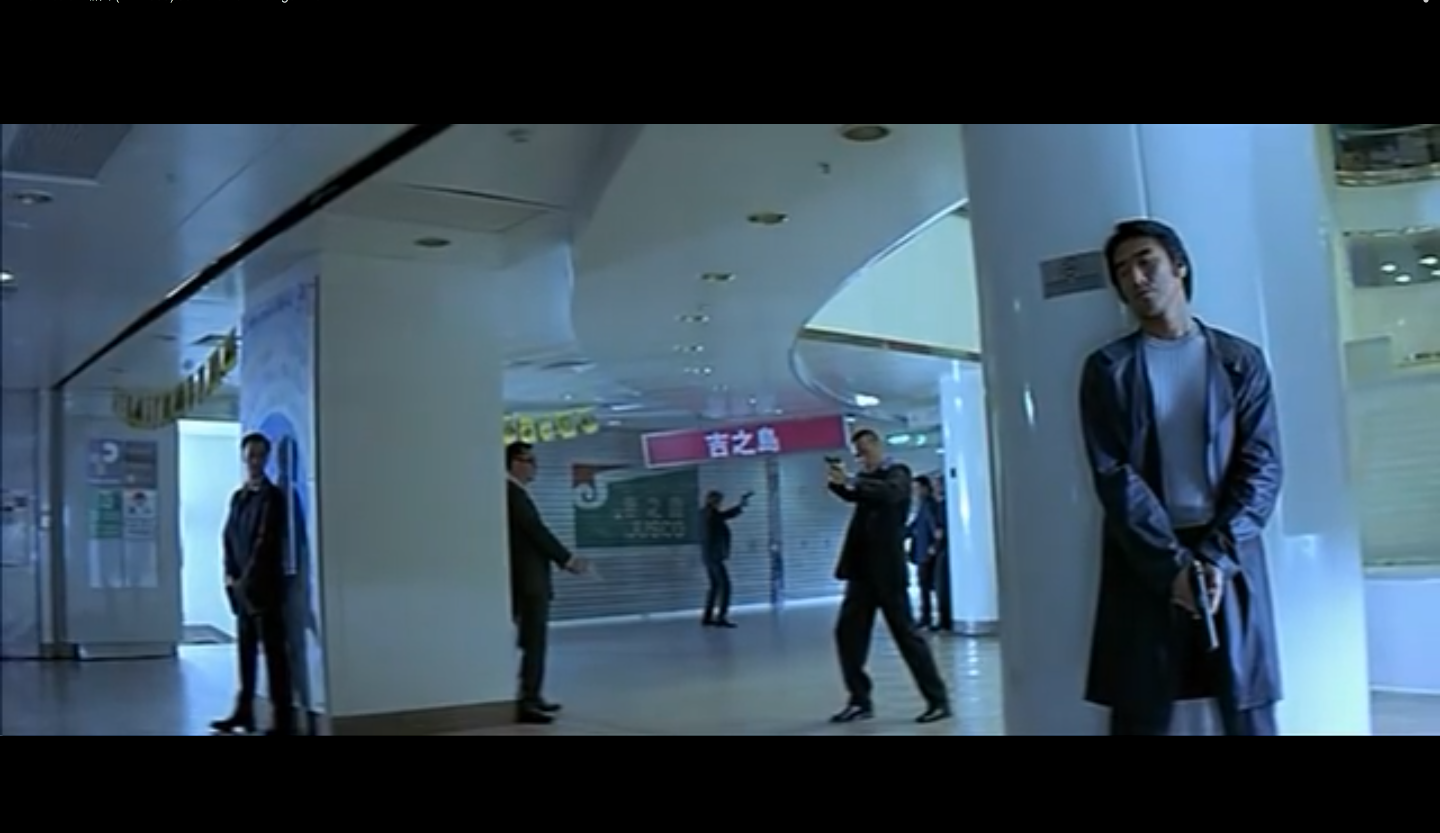
In my latest shooting, the original idea is from Johnnie To’s The Mission (1999). Actually, I have learnt something from the gunfire scene in a emporium which I have talked about in my previous posts. This time, I try to achieve a mise-en-scene as Johnnie To have done in his The Mission.

Screenshot 2015-06-03 02.02.01(Johnnie To’s The Mission)

Monster_composition

(Monster)

Mise-en-scene

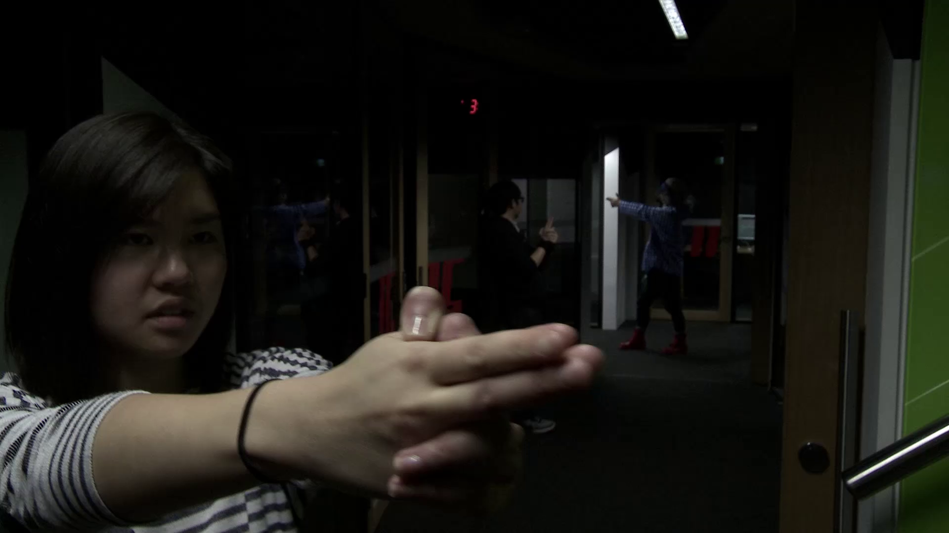
As I mentioned in the last post, the space in the ‘Shopping mall scene’ is expandable because Johnnie To purposely place characters in particular spot creating a 3D space. This idea inspires me that the space in editing suite is very deep and concentrating. Therefore, I position Evelyn in the foreground, Henry in the mid-ground and Aki in the background in order to full fill the space. The composition creates a rhythm that leads audience to watch. Evelyn start retreat away from the stairway, while Henry is approaching forward. Finally, Aki, the furthest one, stands at the end of path way to cover the front.

In addition, the lighting is very dramatic in the editing suite. I just put characters at the spots where the light can highlight them. There are two reason makes me do this. First of all, characters are popped from the dark background. The contrast of brightness and darkness helps audience easily see them. Secondly, the dramatic lighting kind of give me a feeling of intense and horror so I think I should put them there.

Performance
Screenshot 2015-06-04 18.11.38

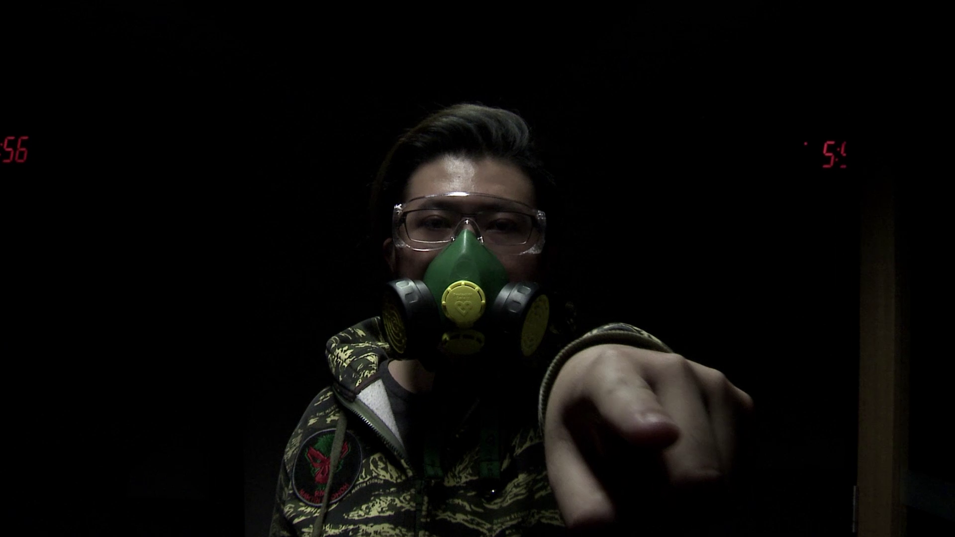
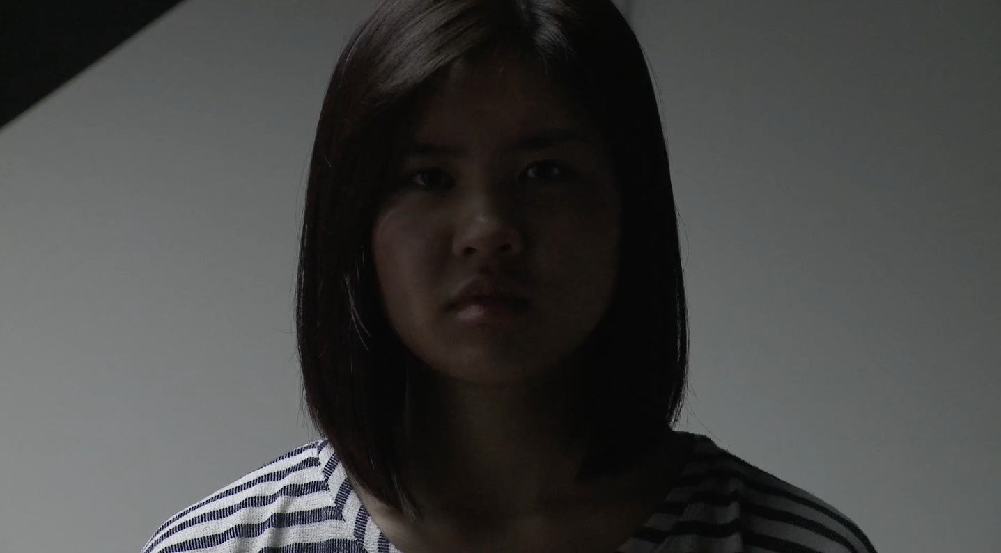
It is interesting that many people think Evelyn’s performance is so great. Robin asked me casting Evelyn is just an accident or your purpose? Of course, it is on my purpose… Honestly, Evelyn gives something special to me. Her serious looking expresses a feeling of sorrow and fear (Well, when she is not laughing), she naturally has a sadness in her eye with which she can communicate with audience emotionally. Robins reveals that the last close up shot on Evelyn evokes a mood of gloomy to him. For the last close up shot, I would like to talk more about it at this point. Before shooting this close up shot, I have shown Evelyn the footage in which a close up on masked monster. To provoke a character’s own emotion, sending a message to their mind is the best way. This technique that I learnt from Errol Morris who show a pictures of something to his interviewer before starting to interview. Perhaps, the subject does not notice how they look like but I believe psychological level would highly influence on superficial way, including body language or facial expression. In other words, what a person thinks of affects how they look like.

It is notable that how I control characters’ performance in my mise-en-scene. Actually, my method is simple. What I did was watching the viewfinder and telling characters that what they do, such as where they should stand, how they should act like. Well, it takes a time and it needs patient to do this. The key of controlling a scene is communication. Personally, I need to communicate with all of my characters, no matter they are the prime actors or just the supportive actors.  I think this interaction is very important. Most of time, actors do not know what director thinks about. Therefore, director should tell the actors the imagination in his mind, mapping out the scene.

Dolly shot (Track in and Track out): 

My investigation aims to explore the effect of camera movement. I consider that the use of dolly shot is building up a tension in the scene of shopping mall in To’s ‘The Mission’. In the scene, To employs a serval of medium close-up shot, he tracks the camera into characters’ face. Then, he uses a wider shot along with tracking away from the characters The main purpose of dolly shot reveals actors position in the scene to show the relationship among them. Therefore, I employ the similar way to construct my monster scene. However, the technique does not work as the same way as Johnnie To’s scene. At this point, the camera movement emphasise on character’s psychological activity. When the close-up shot is tracking in, it evokes a feeling of gloomy rather than a intensive situation. Perhaps, the music and sound effect affects on the image, which we would talk about in the next paragraph. Anyway, I achieve Johnnie To’s style on a technical level, but ‘Monster’, on a conceptual level, is different from Johnnie To’s ‘The shopping mall’.

Video vs Audio

vlcsnap-2015-06-04-18h32m48s215

Sometimes, the appropriate audio would achieve a great effect on video. ‘Monster’ provokes audiences’ psychological activity, but my friends tells me the sound effect is so great and it makes me feel scared. I am confused on the relationship between audio and video. I begin to ask myself ‘does my image create meanings? or ‘does the sound change or create the meanings of my image?’

Robin tells me that nothing could work alone. Such an effect achieved not only is due for one aspect, but it is also because other aspects are functioning.

I watch ‘Monster’ again and mute it. As a result of the muse-en-scene effect, the image is still powerful. The video delivery a message to me. The lighting, the performance, the composition, the camera movement create a nervous atmosphere in the scene. But it loses a rhythm of the cuts. Undoubtedly, sometimes audio is more powerful than the video. In this case, it is not.  Music and sound effect enhance the image but audio does not change or create the meanings of the vision.

Wk12_Inspiration

My project aims to explore the relationship of the camera, characters and space. This idea is inspired by a famous Hong Kong filmmaker Johnnie To who is famous for manipulating the camera and characters in a particular space. To is able to create an atmosphere that he wants by moving the camera and characters around in the space.

In his very first film, The Mission (1999) is an excellent example to explore how To create a tension in his way of using the camera. ‘The shopping mall scene’ is the most remarkable one throughout the film in which To composes a fantastic scene as he carefully make a plan within the camera, characters and space. The story happens in an off-time emporium where five bodyguards are sending their boss back home. However, someone employs killer to assassinate the boss. Once the first bullet is triggered, the gunfire war starts. At this point, To also begins to build up a tension with his intelligence.

Composition and Character Position
Screenshot 2015-06-03 02.02.01

In one of the shots, To has a brilliant mind as he creates an excellent composition. He utilises a wide shot to cover all characters in the shopping mall. To’s space is expandable and 3D rather than flat and gloomy. A dynamic scene, which consists of four layers, is generated by composing all characters in particular spots.  Placing one bodyguard with a pistol in the front creates the first layer in the foreground. Four individuals are hiding behind pillars in the middle ground as the second and third layers. The last layer is the farthest one in the background by positioning a character in the center of frame.

The space is so expandable because of the illusion that To creates. The importance of character depends on the size of them. The first character occupies most of space in the frame, in other words, he is the most impressive one because he is the biggest. Other people in the second and third layers looks less noticeable. The furthest one is the least considerable one because of the smallest size. To brilliantly creates a rhythm in the space as the gradual change of character’s size.

Camera Movement

Screenshot 2015-06-03 02.02.59

The camera movement gradually builds up a tension in the gunfire scene. It is a combo of dolly shot with which the atmosphere becomes more tense. In fact, To is a director who always moves the camera in his every film. Camera movement is equivalent of Johnnie To’s personal style. Back to the emporium scene, the dolly shot enhances the intensive situation where the bodyguards confront an accidental gunfire war. How does To do that?First of all, he slowly pushes the camera to the characters. Although the characters do not have any body movement, the tracking makes the image dramatic. Secondly, after a few shot of tracking into characters’ face. To cuts to a shot of tracking back that is a wide angle, revealing the unknown space.  A serval of tracking in shots are medium close up that shows characters’ expression but audiences do not know where they are in this space. Therefore,  the function of tracking out shot tells audience the idea that “what is really going on here?.

The spaceScreenshot 2015-06-03 02.02.59 copy

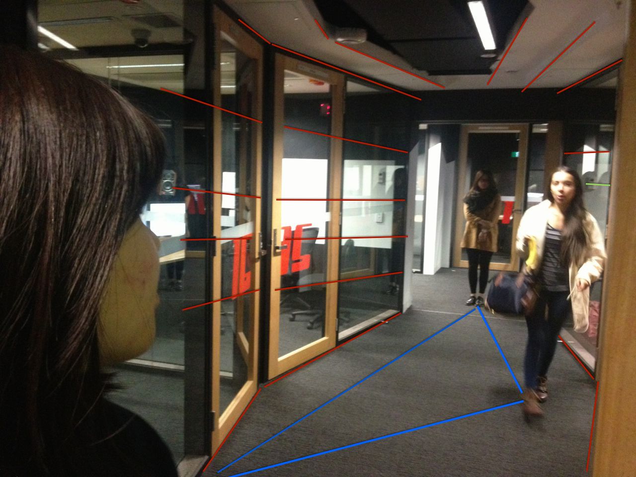
For my final project, I decide to do it in Building 9 basement, the editing suite, because I see the depth of this space. I think the reason that To chooses a space like shopping mall is because he also observe the depth as well. The emporium is wide open and deep enough to create dramatic composition. Compare to the mall, editing suite has only one narrow laneway and is a close space rather than open. However, the space is still deep so that I am able to create something there. I consider the narrowness is not a bad thing at all because less factors bother me. Although wide open space could be more creative, I might do not have such a ability like Johnnie To to manipulate everything in the scene.The scene

Wk_10 Point of View

vlcsnap-2015-05-19-01h01m21s93

In the scene of Brain Cancer, the last shot is notable. It is very interesting to discuss what kind of a message that was delivered through cinematic language.

First of all, I intend to make a handheld shot from Veronica’s point of view, but this is not an actual point of view but her imagination.The purpose of this shot is to let audience into Veronica’s mind, a brain cancer patient’s world. All I do is trying to experience. I start to think of what a dying person would do at the end of his/her life. Does she/he care the result, face it or ignore it? Is she/he aware of how people think?What is she/he, maybe lost, maybe happy, or maybe nothing?
vlcsnap-2015-05-24-23h24m10s165

So, this shot starts at the position where Veronica stands as a her point of view. Then I start to move forward with camera act like a walking person approaching to the table. Staying on the MRI paper for couple seconds aims to create a good flow of storytelling. In my opinions, even though the individual is a dying person, he/she is unable to completely get rid of the trauma on her/his psychological level. Therefore, I chose to stares on the MRI results, because the cancer still matters.

vlcsnap-2015-05-24-23h24m23s48

The frame leaves the paper and slowly tilts up. Interestingly, the next movement that I am inspired by a famous Hong Kong filmmaker, Johnnie To, who made this particular shot in his film ‘Life Without Principle (2011)’. As I assume this shot that is Veronica’s imagination rather than a merely POV. So the camera is freely flying around the space. I take the camera to pass by  Julie’s face and the camera is going through the windows and Julie to the dark behind her. Conventionally, it is not allowed to do this as a POV shot because the shot represents an individual. However, this is an individual’s imagination, so it is freewill. Finally, I think this maybe a good ending for this scene.

vlcsnap-2015-05-24-23h24m40s230

However, when I show to someone else, some of them do not reckon this is Veronica’s point of view shot, nothing more than a normal shot. That really interests me as I want to know what make its meaning change. It is notable that Robin asks me why I keep the stillness of at the beginning of the shot rather than starting to move immediately. In my intention, this short stillness is created for a smooth transition between shots. The previous is a objective shot framing three characters together, then it is cut to a subjective shot of Veronica’s point of view. This stillness is going to make audience believe that the shot is subjective. It is because the change from stillness to mobile represents the essence of this shot has been different.

Wk10_Brain Cancer Shooting reflection

Over the weekend, I have made a short scene called ‘Brain Cancer’. This scene consists of four shots. Although the number of shot is few, the shots, for me, are impressive. However, there are a serval of adjustments during the process.

Dollyfigure 1

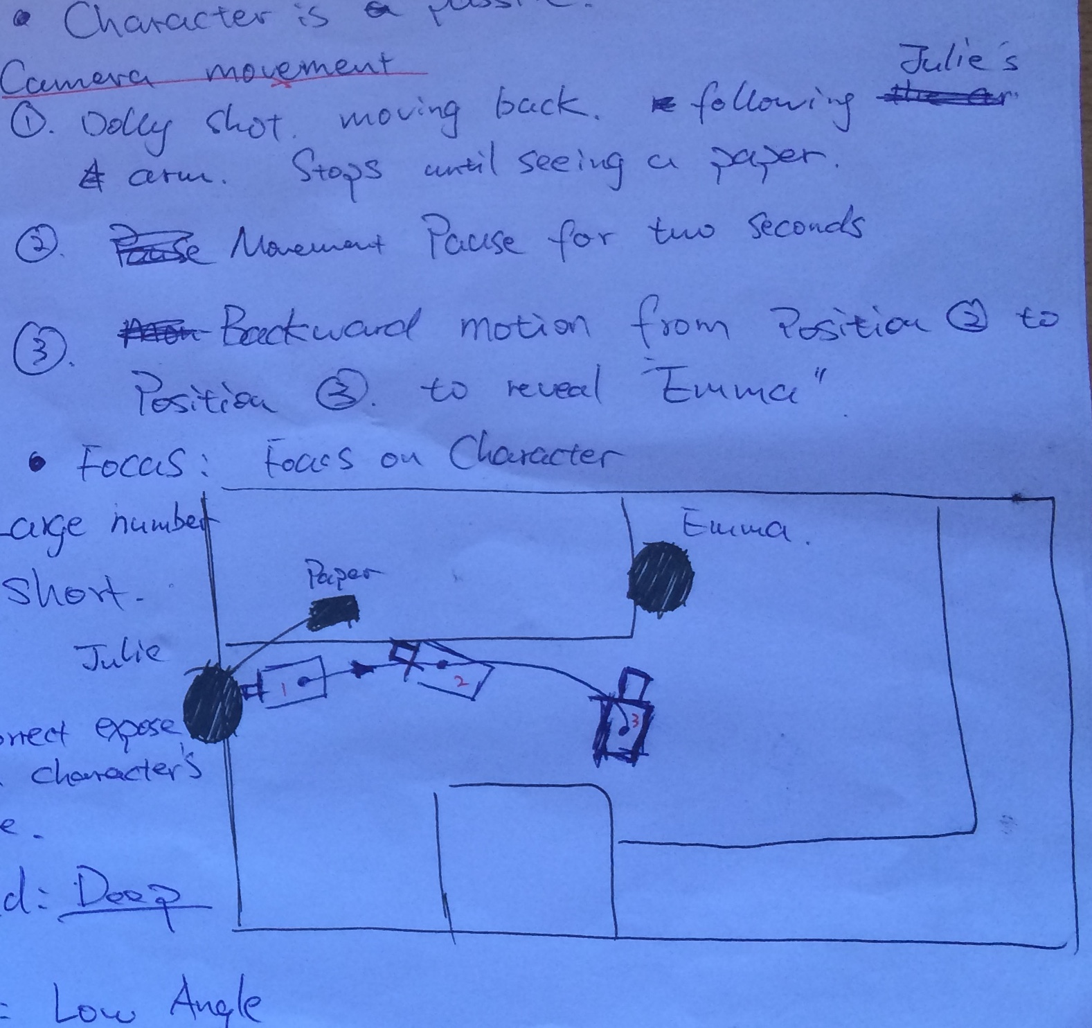
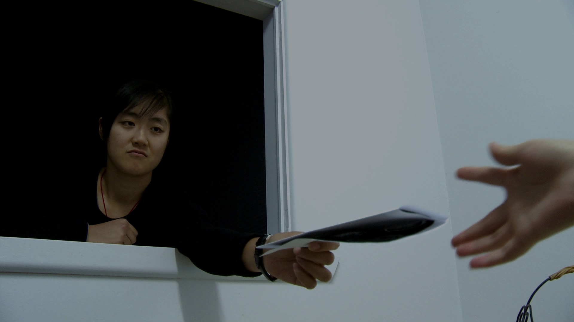
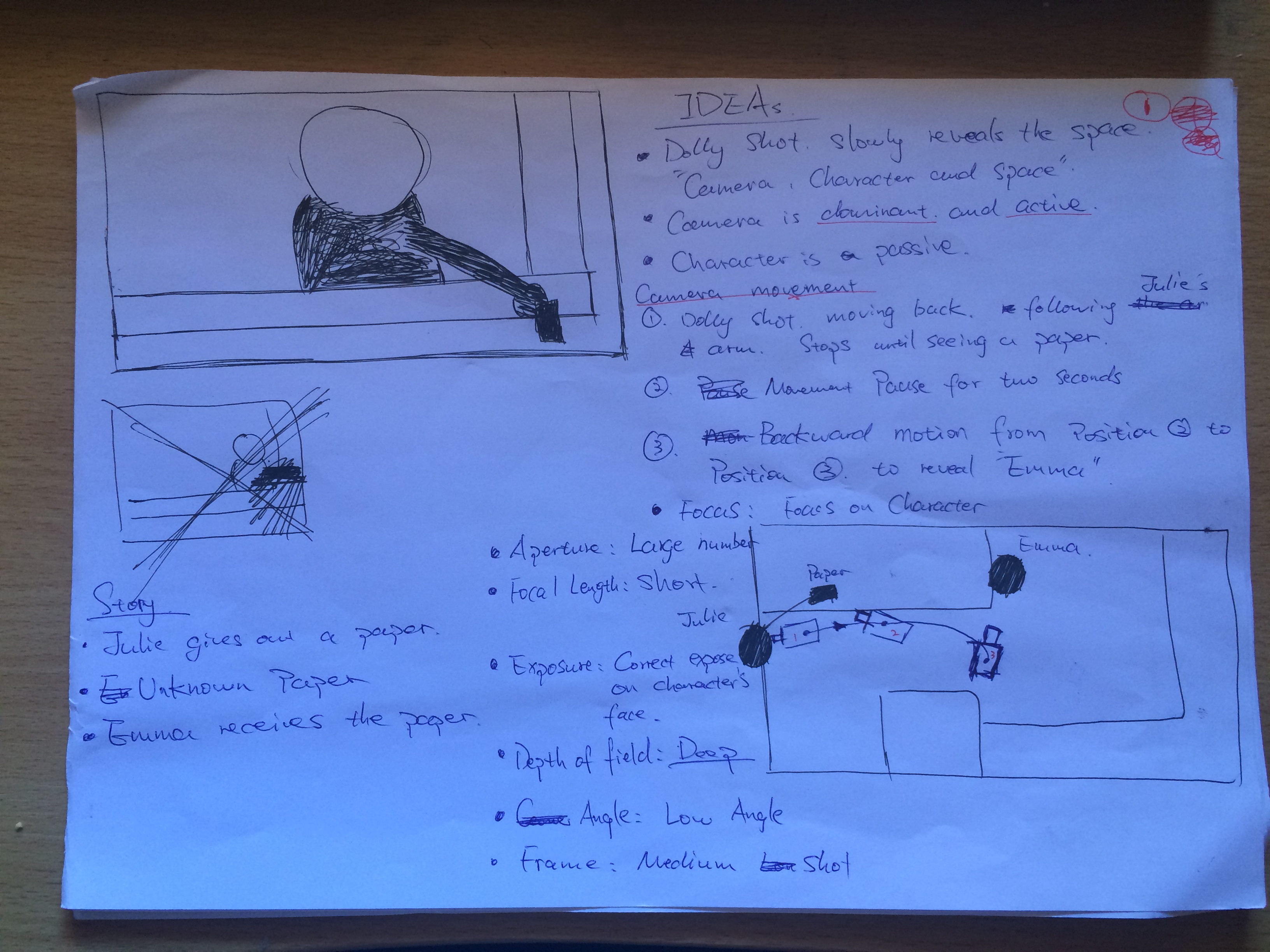
First of all, the dolly shot cannot be finished due to the space that was too narrow to move. My intention that the dolly shot compose with three movements (see, figure 1). However, I consider the transition would be very abrupt and ugly between the process of 2 and 3. Therefore, my finally decision was stopping my camera at the 2nd movement. If I were making this choice, another question was arise. ‘How do I continue my movement without doing movement 3?’ The dolly shot supposed to show two characters in the scene, Julie and Emma. Without movement 3, it cannot reveal Emma at the end of this scene and it would lose the continuity while cutting to the next shot that shows Julie and Emma together.vlcsnap-2015-05-19-01h00m20s218figure 2

So, I use Emma’s hand. It is not necessary to illustrate Emma’s complete appearance but I can show her partial body with which the shot convinces audience that someone else exists simultaneously. Showing Emma’s hand achieve not only achieve a great transition between shot by shot, her hand also create a dynamic vision. Even though the shot is slight changed, it seem to be much better than I thought. Thanks for the constraint of space.

There are some continuous problem from shot 2 to shot 3. I found that Emma’s performance is disconnected in these two shots. Her eyelines do not match. In shot 2, Emma is talking to someone off-frame and she looks at the direction. Shot 3 is a high angle wide shot in which Emma does not looks at the subject that she did in the previous one. She suppose to looks at Veronica’s head when she is talking to Veronica. So she should put her head up a little.

vlcsnap-2015-05-19-01h01m09s148figure 3

vlcsnap-2015-05-19-01h01m21s93figure 4

Another problem is the focus subject. The distance between Veronica and camera was out of the focal range. I could not focus on Veronica when I try to film. It is because I did not get enough space in the kitchen. My body has already been as close to the wall as I could, however, it does not really help. Therefore, I chose to focus on Emma who is amid Julie and Emma but this is not ideal decision in my mise-en-scene intention. Nevertheless, the shot is acceptable. Even though Veronica was not sharp like Emma, she is clear enough to notice.

Week 10_PLANNING ‘Shooting day’

This shooting is an experiment to achieve my project. My main idea is exploring the relationship between the manipulate of camera, the position of character/s and the constraint space.

This scene describes Veronica (Starred by Evelyn), who is diagnosed as brain cancer, and she does not want to tell his boyfriend. Her two best girl friends Julie (Polly) and Emma (Lisa) attempt to resolve this situation. Veronica is sad and depressed but she does not want to hurt her boyfriend because she loves him. Julie and Emma try to help Veronica out but they do not really understand what Veronica is thinking.

According to the story above, what I try to achieve is how I emphasize the connection among three characters in the space. I find a way to reveal each character following one shot and another rather than start with an establishing shot showing all characters.


Starting shot

1st(Figure.1)


The first shot is a dolly shot starts with a medium close up on Julie who leans on a window between kitchen and living room. The shot begins to pull back away from Julie following her extensive arm as a leading line to reveal the space. The motion stops until a piece of paper appears. Stopping on the piece of paper for two or three seconds, the camera is about to pan to the right to show that Emma is sitting besides the table and she looks at the direction of Julie and the paperwork hold in her hand.


The Second Shot: Reverse Shot

2nd

(Figure 2)

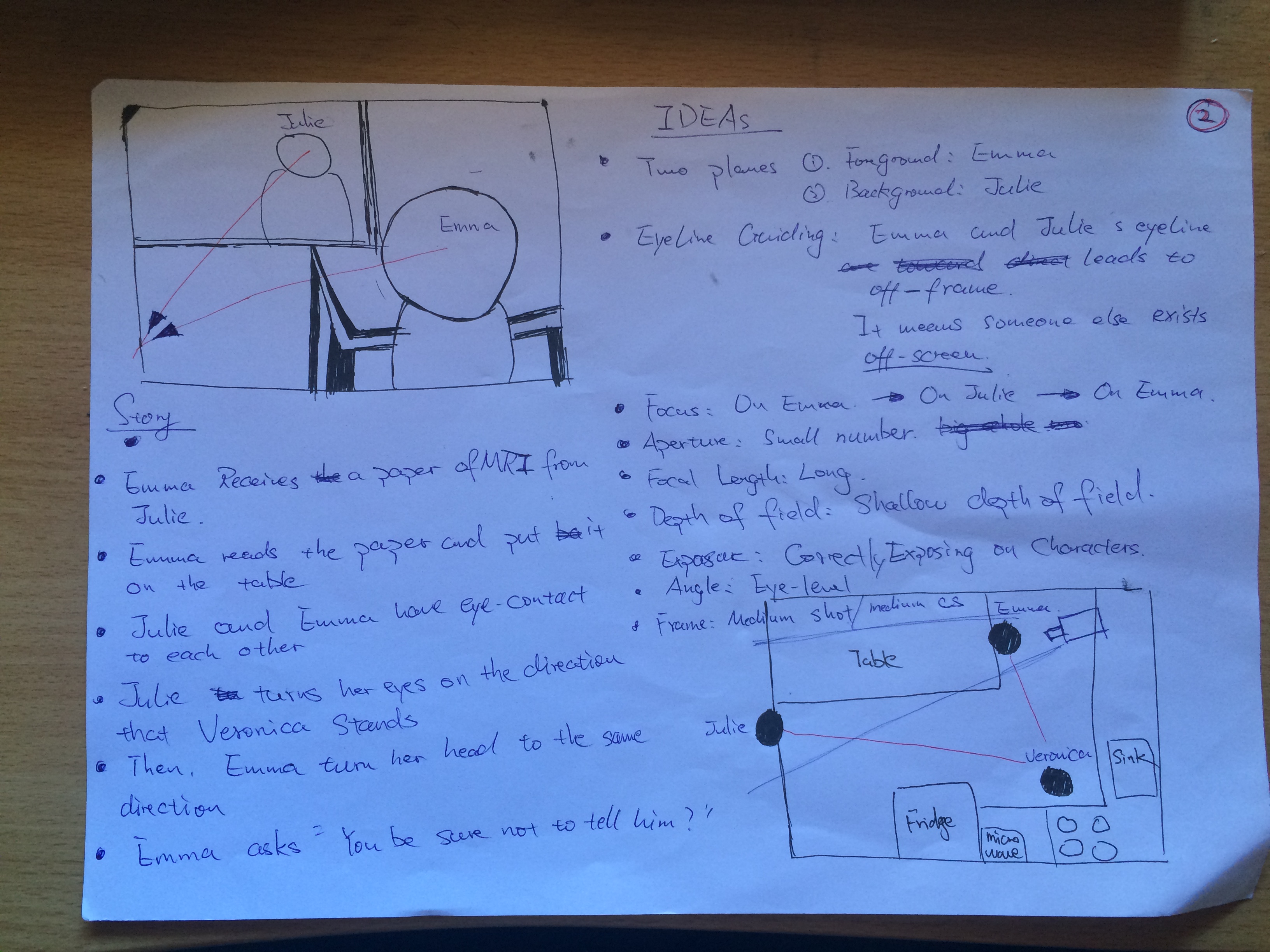
The next shot that I employ the technique of Shot/Reverse Shot by putting the camera behind Emma. See (Figure.2). This shot mainly consists of two characters, Emma who is in the foreground and Julie who is in the background, creating a different layers in the space. Personally, this kind of composition is my preference. In such a composition, there are many information that you could put into your scene because the space is rather flat, but really deep. The contrast of size and the brightness/darkness contrast is creating a visual effect that attracts audiences.

In this shot, Emma picks up the paper and she looks at Julie. For a very short moment, Julie and Emma have a tacit communication by eye contacts. They seem to understand something and They turn their eyes to the direction out of the frame. At the point, I consider that eyeliner is a significant line that reveals the following content. My argument that audiences always pay attention to the character’s performance. When the character looks at something, audiences will be aware of their eye. To reveal the next shot, my decision is to ask my characters both look out of the frame.


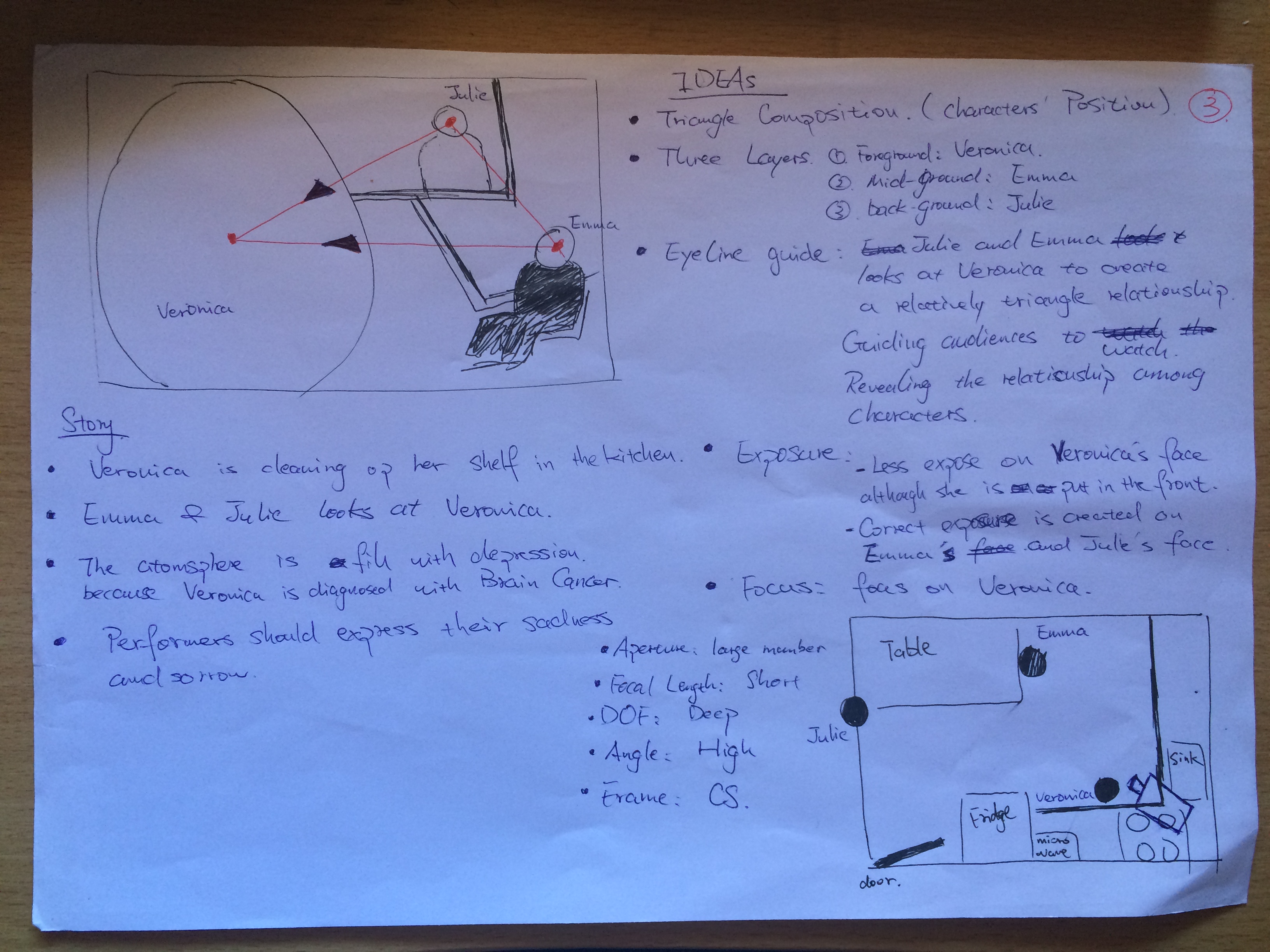
The third shot: Triangle Relationship

3rd

(Figure.3)

This shot is my favourite one in the scene. The success that I generate a triangle by arranging characters in different position in the space. Veronica is placed in the foreground, Emma sits beside the table amid Veronica and Emma in the kitchen, and Julie leans at the window that is at the background.

I think triangle is stable and attractive composition. First of all, you need three things to set up a triangle. In the story, Julie and Emma try to help Veronica to revolve the her problem. In this context, I, therefore, compose a triangle with my three characters. Veronica is the prime character in the scene so I put her into the foreground. Emma and Julie observes Veronica behind her.


Week 8 Reflective Writing: Depth of Field

The main purpose of this week’s tutorial was achieving a technique that is changing the focus while shooting. I missed Wednesday’s class, but I attended in Friday’s one.

In Friday’s class, what we were doing was filming an individual who was approaching to camera by adjusting the focus to keep the motion subject clear and sharp.

So the first thing, the most important thing, to do is marking the setting before shooting because this is easy to find out the problem while reviewing. The other thing that is making a mark on the focus so that you can know when to adjust the focus.

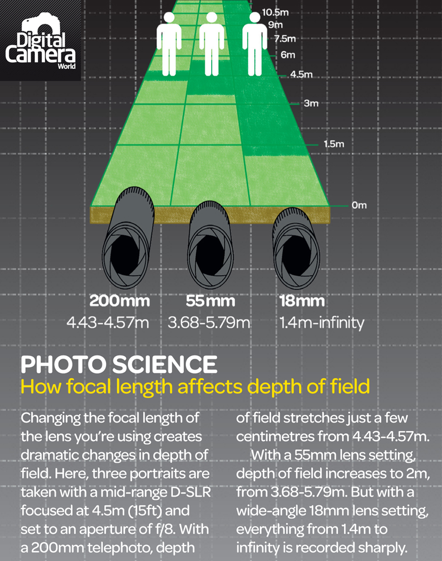
We have practised three or four times and we reviewed it. We found that the subject is still a little bit out of focus even though we used a larger aperture, like f8 which I prefer using. I thought the subject can easily be in focus with f8. There were two reasons that made me believe I was right. First of all, the larger number of aperture is used, the deeper depth of field is created. Secondly, the longer distance between camera and subject, the deeper depth of field is generated. My assumption seems to be right based on this theories. However, I missed something that is the size of focal length. The longer focal length is employed, the shallower depth of field is made. So, here is the question. I used the maximum focal length that is approximately 81mm when I made today’s shot. Even though the larger aperture is employed, the influence of focal length is significant. This was the reason that the subject was out of focus. Therefore, the next time, I may be using a much larger aperture to increase the depth of field like f11 or f16, or utilising a shorter focal length.


Deep_depth_of_field_cheat_sheet


Working the method_1: A Long Take

The first time I watched Martin Scorsese’s famous long take in Goodfellas (1990), ‘The Copacabana Shot’. Honestly, I was stunned. I couldn’t remember how do I get into the restaurant from the street outside. The reason is not I didn’t pay attention to. It is because everything is too amazing to watch at one time.

In the long take, every frame is carefully elaborated by Martin Scorsese. The camera follow two main characters in a lane way inside the restaurant. The amazement is the environment. Martin Scorsese has done a wonderful job by manipulating people in the space. Travelling through the lane way, you enter a busy kitchen where everyone is in a hurry to work. Every character is doing their own thing like you are really experiencing a scene of busy kitchen.

Personally, the attraction of long take is much more fascinating than the magic of montage.

Week 5 Reflection

In this week’s tute, we move on to ‘Performance’.

In the French term, ‘miss-en-scene’, performance is one of the important factors which convey cinematic message to viewers.

Robin shown us a succession of footages about acting. I’m too sure about this point, I can feel there is a relationship between camera and characters. In a motion, which is the more dominant role, the character or the camera? does the actor leads the camera, or does the camera technique achieve actor’s performance?

In one of the footages, a woman is arise in a bedroom with two men sleeping beside her. Her performance is very dominant and powerful, although she is only a women with two men in the same room. The actress is the central part of the scene. She leads us to reveal the story that she just slept with two guys and now she hangs around in the room finding something else. The camera has to follow her movement rather than as a simply observational role in the hotel room.

But I think this relationship is not simply but elaborated. This would be an interesting section to research.

Week4_Reflection #2

In Friday’s class, we filmed a short scene following the formal process. We assign ourselves into specific roles for this project, such as actors, boom assistance, sound operator, camera operator, first assistant director, cinematographer and director. That was an excellent experience because we had a great collaboration in the process.

I was responsible for operating a camera. The core of this role not simply presses the ‘red’ button on a camera,  but also preserves a good quality of images. How good is it? The basic requirement of good view could be generally measured by two main aspects: under focus and correct exposure.

So these were two major things that I had to do before rolling my camera. If I were shooting, the first thing I would do was turning on the ‘Zebra’ button, this is normally functional in a professional camera,  to see the level of exposure in my viewfinder; secondly, I suggest to focus on character’s eyes when a cameraman tries to make a correct focus. Ideally, you could close-ups on character’s eye with the maximum focal length in order to easily check the correction. If, however, it was still not clear enough, sometimes you could use extension focus, this function is dependent on your camera, to get a closer look.

After reviewing the clips, I found a couple questions. So I reflect. Our location is in narrow space, a back stairway in building 5. Using a tripod is not a good way of shooting in a narrow and small space because you cannot operate easily. Your movement is limited. Instead, a handheld camera is really useful. It is less limitations for camera position. You could definitely play around the space like a master. One shot, but only in my imagination,  I really like if I handheld my camera. I could easily connect Lucy and Charlie by following the railway of stairs. There is no doubt, it is a naturally leading line connecting two characters.

. So overall, shooting on a tripod is kind of a constraint on your own options, and even worse, on your imagination. Hopefully, I could make this shot next time.

Week_4 Research and Reflection

Mise-en-scene

Mise-en-scene, also known as ‘the plastic of the image’, is a filmic technique which includes setting, lighting, costume and makeup, staging and performance, and finally, the framing of the shot that give us its composition. In original French, Mise-en-scene literately means ‘putting into the scene’. This notion briefly explains that filmmaker choose what to be shown in the scene.

According to Andre Bazin, the essence of mise-en-scene is depth of field and long take. These attracted Bazin for two essential reason:

1. It maintained the unity of space and the relationship between the objects within the space.

2. It gave the spectator, according to Bazin, the freedom to direct his/her own control over the viewing process, including what to look at it, in what order, for how long, and to to make their own synthesis of viewing process. Together they maintain ambiguity – the existential ambiguity present all around our life – of that space.

Montage

Montage is the creation of  a sense or meaning not objectively contained in the image themselves but derived exclusively from their juxtaposition.

Also, Andre Bazin describes editing as a ‘series of either logical or subjective points of view of an event.’ Dealing with sound films,  Bazin lists three  motives for cutting:

1. As a purely logical descriptive analysis of the narrative.

2.As a psychological analysis from a character’s point of view

3.As a psychological analysis from audience’s point of view.

Bazin, however, opposes classical and expressive editing on the following counts. His statements refers montage style as ‘Trickery’. Bazin consider the psychological cutting within a scene  does not add anything to the intent of the scene. If the scene has only one simple  meaning why insult the audience’s intelligence with needless and obvious close-ups? Contrarily, if the scene is complex why presuppose only one meaning?The meaning is not in the image, it is in the shadow of the image projected by montage onto the field of  consciousness of the spectator. In Bazin’s point of view, the expressive cutting removes the freedom on the part of the spectator to select for him or herself and removes whatever existential ambiguity may be present in the scene.

Decoupage 

The French term, decoupage, has no English equivalent. Its literary definition is “to cut”, but is better described as construct in filmic language.

Noel Burch, in Theory of Film Practice, defines the three terms for which decoupage is inter­changeably used for as: 1) The final form of a script replete with the required technical information. 2) The practical breakdown of the film’s construction into separate shots/sequences prior to filming & 3) The underlying structure of the finished film, which has probably deviated from the original “decoupage.”