What I Watched This Week 4/4/16

Zodiac (2007) dir. David Fincher

Fincher crafts an elaborate film about obsession and details, woven through true events from the Zodiac killings in the 1960’s and 70’s. Jake Gyllenhaal’s performance stands out. ★★★★


Russian Ark (2003) dir. Alexander Sokurov

This ambitious film was shot in one 90 minute take in the Hermitage Palace in St Petersburg, Russia. The end result is an absorbing journey through the history of the palace, that at times is a touch ambiguous, but I couldn’t look away. ★★★


Bridge of Spies (2015) dir. Steven Spielberg

If someone ever made a biography of my life, I’d want Tom Hanks to play me. The cinematography is incredibly beautiful and the story (based on true Cold War events) is well told. ★★★★


Suspense! (1913) Dir. Lois Weber.

The first thriller silent film by one of America’s first female directors. It features some impressive triptych editing, and is surprisingly advanced for its age. ★★★


Aquamarine (2006) Dir. Elizabeth Allen Rosenbaum

A classic teen girl movie, featuring a tiny Emma Roberts. There’s not much technically impressive about this movie, but it is good fun. ★★

The Art of Noticing

One of my train sketches.

One of my train sketches.

John Mason’s Researching your own practice: The discipline of noticing (London: Routledge), describes different forms of noticing and how these can help us to become better professionals, encouraging us to be ‘mindful rather than mindless’ when it comes to noticing. (page 37).

Part of our discussion in the workshop touched on how noticing, marking and recording is important in the media industry as well. For instance, a writer has to notice people and their traits and characteristics to aid them in creating complex and unique characters. The best fiction has its roots in reality, and interesting characters can be found everywhere in real life if you take the time and attention to notice them.

This rang very true with me, as I have also dabbled in writing and drawing, and my subjects are almost always humans. I spend an hour on the train to get to uni in the morning, time which I often spend listening to music and observing the people around me. Trains, for some reason, always gather the most odd and interesting characters, which are fun to sneakily draw.

Learning to draw has definitely opened my eyes to notice many things that I didn’t usually before. For example, once I painted a study of a nose, and afterwards I’d constantly notice the way the light hit someone’s nose and how this revealed its construction and how I’d go about drawing it.

Whilst I did this type of noticing subconsciously before, after reading Mason, I intend to do it more often and more consciously.

Editing in ‘Enemy of the State’

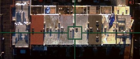
One of the aerial shots in ‘Enemy of the State’

Tony Scott’s Enemy of the State (1998), is a 90s action film that addressed themes of authority and security that are highly relevant even to modern audiences. At its heart, however, it remains a true action film, starring Will Smith as a lawyer who finds himself in the midst of a plot to compromise the privacy of United States citizens.

From the outset, Scott sets up the fast pace of the film through the opening credits. Editing and cinematography work hand in hand in this sequence to establish the idea of surveillance. Shots of cameras, tinted blue, are rapidly cut together almost like flash frames, amongst POV shots from security cameras and satellites. The ‘found footage’ style of these shots make them seem more realistic, and enhances the idea we are constantly watched, even outside the fictional world of this film. It is through discontinuity editing in this sequence allows the editor to convey a disconcerting to the audience.

These surveillance shots are used frequently throughout the film. A majority of scenes involve the main character, Robert, being surveyed by the NSA. The use of cross cutting between Robert, and what is happening to his character, and the NSA characters creates the idea that these scenes are happening concurrently, even though the characters are not in the same room, and the scenes were not filmed at the same time. Also, insert shots similar to those of the opening sequence here provide the point of view of what the NSA characters are seeing through their cameras and satellites. The combination of these different shots elevates the action, as it allowed the editor to cut rapidly between different shots, and show the action from the perspectives of the different characters, as well as the perspective of the omnipresent security cameras.

Narrative Structure Exercise

  1. What is the ‘controlling idea’ (Robert McKee) of your portrait? I am interviewing my sister who is transgender. The controlling idea of the interview is how she copes with this challenge, especially through creating costumes.
  1. How is your film structured? My film is going to be structured largely through voice over narration in the form of the interview. It will follow certain rituals in my subject’s life, in a ‘day in the life’ type style.
  1. What do you want your audience to make of your interviewee? I want my audience to gain some insight into the life of someone who is transgender, and to realise that although this concept may be slightly strange and unfamiliar to them, she is just another person with the same hopes and dreams as anyone else.
  1. How is your portrait being narrated? My portrait is being narrated by clips from the interview with my subject. This will make it seem personal.
  1. What role will the ‘found footage’ play in your portrait? The found footage in my portrait will be largely clips from 1940-60s videos that focus on stereotypical gender (particularly women’s) roles and appearances. This will contrast with my interviewee, who despite transitioning to a woman, still does not the encompass stereotypical woman.
  1. Does your portrait have a dramatic turning point? I’m not sure my portrait really has a dramatic turning point. Whilst it is communicating a narrative about my subject, it doesn’t follow the three act structure precisely, besides having an opening and closing.
  1. When does this turning point in your portrait and why? If any part can be called a turning point it would probably be in the final moments of the project where I will attempt to emulate the process of transformation, symbolic of transformation of gender, which I’ll try to reflect through my interviewee’s costuming craft.
  1. How does your portrait gather and maintain momentum? My portrait gathers momentum by beginning with simple introductory statements, such as the interviewee’s name, before delving into deeper and more personal narration.
  1. Where will your portrait’s dramatic tension come from? The dramatic tension will come from the building and combination of different images, the found footage and original footage. I will cut between shots of my interviewee answering questions, shots of her working on her project, and found footage that will reinforce the theme of the film.
  1. Does the portrait have a climax and/or resolution? The climax of the film will be a shot of my interviewee dressed in one of her costumes, signifying the completion of the transformation.

These questions definitely incited me to think more deeply about my project and lead me to decide I needed to make some changes to make my project more engaging and effective. I struggled to answer a few of the questions, which made me think that I needed to put more thought and planning into the construction of my project. Hopefully this exercise will lead me to create a better final product. As Rabiger puts it in Directing the Documentary, (2009), 5th Edition (Focus Press), this exercise did lead me to “think hard about [my] story’s essentials, which is the spade work of creativity.”

The Three Act Structure


M. Rabiger in Directing the Documentary (2009), p284-7, outlines the three act structure, or more broadly, ‘the escalation of pressure up to a crisis,’ that is present in most works of fiction, especially Hollywood cinema. Rabiger contends that this dramatic curve can be seen even in songs, dances, mimes and more, so I decided to test this theory with one of my favourite songs, ‘Never Going to Give You Up,’ by Rick Astley.

The song opens with an instrumental introduction, signalling the beginning of the First Act. This sets up the melody of the song that will be present throughout. The melody is upbeat, and instantly recognisable, communicating to the audience that the main scope and focus of this song is to be a chirpy pop song that will get stuck in your head all day.

The inciting moment for the song is perhaps when the vocals kick in, with Astley singing ‘we’re no strangers to love.’ The onset of these vocals starts to outline more clearly for the audience the narrative of the song, and the hypothetical conversation the lyrics are having with a different character, i.e. Astley’s love interest.

As the verse beings, the tension escalates, conveying the beginning of Act two. The lyrics outline Astley is ‘never going to give you up’, perhaps indicative, through the repetition of the verse, his struggle to make clear his feelings. We come to gain a greater understanding of the singer’s feelings and intentions, and are invited to feel empathy.

The climax of the song lies about three quarters of the way through, as the verse becomes constantly repeated, and eventually fades out until the end of the song, together with the instrumentals. Here the song is resolving itself, emphasizing the notion ‘I just want to tell you what I’m feeling,’ and released the tension of the dramatic arc that had been building up to this point.

Of course, the narrative of a song is very simplified compared to that of a film or documentary, but I think this demonstrates that Rabiger’s theory applies quite well even to popular music.

The Cinematography of ‘Zodiac’

Fincher’s trademark BEV tracking shot creates an eerie mood in ‘Zodiac.’

The film Zodiac (2007), cinematography by Harris Savides, uses specific aspects of the shot to manipulate what is communicated to the audience. The cinematography is crucial in emphasizing the setting and tone of the film, notably in the opening shot. The camera pans horizontally along a suburban neighbourhood on the 4th of July; a usually cheerful celebration in a usually friendly neighbourhood becomes ominous through the slow pan, and the low key, high contrast lighting, and the repetition of the eerily similar houses. The long shot allows us to see the outlines of the people in the shot; we get a sense of them through their body language, but not their facial expressions, and the shot therefore becomes impersonal, almost voyeuristic. We have not met any characters before this shot, and this point of view could potentially be that of the killer’s. This sets the mood and theme for the film: paranoia and obsession.

Savides creates a rich tonal landscape in both day and night scenes. The historical setting (1970s San Francisco) is recognisable through the colours and forms. The night scenes are especially effective, using high tonal contrast, emphasizing rich, deep blacks. Spotlighting focuses the audience’s attention towards details the director wants them to notice, as well as hide elements. For example, the face of the killer is often hidden in shadow in the murder scenes, allowing him to blend into the dark background and creating suspense by hiding his identity.

Furthermore, framing also guides the audience’s understanding of Zodiac’s narrative. In the murder at the lake scene, the woman stares off screen at the killer. Although we cannot see the man ourselves, we assume that he exists in the off screen space as the female character sees him. This expectation is later gratified when he is framed within the on-screen space and enters the scene.

I HEREBY DENOUNCE THE EFFECTS OF SOCIAL MEDIA

Screen Shot 2016-04-11 at 8.31.19 pm


It’s only Monday and ‘Murica has already delivered the goods.

The highlight of the news today is the Southern mom shooting up her children’s iPhones with a rifle, denouncing ‘the effects social media’ as the cause of her children’s disobedience and disrespect. The whole incident was filmed, on what I can only assume is another iPhone, and ironically posted on social media. Naturally, as a blossoming media practitioner I found this interesting on a variety of levels.

Firstly, the mother’s overwhelmingly negative view of social media is noteworthy, as it highlights a distinct discord between her (the older generation) and her children (the younger generation). This generational divide is quite common, not only in regards to 21st century emerging media, but also throughout history. When the printing press became easily accessible, older generations were concerned that children would spend all day reading and never go outside; when radio was introduced, similar concerns were expressed. Fear of change, especially fear of changing, emerging media, is cyclical; change is almost always met with a negative reaction.

DailyMail author Anneta Konstantinides writes that as the children watch their phones be destroyed, “the only outlet they’ve ever known to a social life disappears.” This reinforces the generational bias I discussed earlier, suggesting that the author believes that children no longer know how to socialise outside of social media. One could certainly argue that social media is a large part of how 21st century kids socialise, but is difficult to substantiate the argument that it is the only way they know how to socialise. It’s not my place to comment, but one could suggest that the mother’s reaction is more a reflection on her method of parenting than the presence of social media in her children’s lives.

Moreover, the incident is an interesting case study in terms of the saturation of the media in our lives, and the speed with which news travels.


Mise en Scene in Wes Anderson’s ‘The Life Aquatic with Steve Zissou’

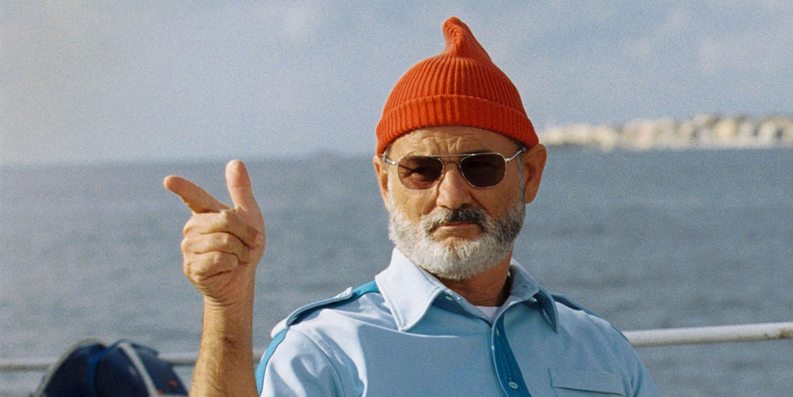
Above: Steve Zissou (Bill Murray) in his classic outfit.


Wes Anderson is well known for his strong visual style. The principles of Mise en Scene are strongly at work in every shot in The Life Aquatic with Steve Zissou.

Most notably, film’s colour scheme is crucial in creating the look and feel of each shot. Primary colours reign supreme: the red of the crew’s beanie’s the blue of their uniforms, and Anderson’s trademark yellow constantly present. By placing repeating colours throughout the frame, Anderson creates a sense of harmony within each shot’s colour scheme. Where these colours are absent, is it done to great effect, such as the all-white colour scheme of Hennessey and his crew, emphasizing the difference between the two teams.

The film’s staging recalls strongly traditional theatre and classic Hollywood films like Casablanca. Characters are arranged carefully in the shot; framed by other characters and the environment. The characters are often arranged in a stage-like formation – facing the audience. Moreover, the acting is frequently stylized and humorously dramatic, especially noted in the way the actors interact with each other. The shot of the Zissou team in special operation mode all jumping one by one over the tennis net is one that stands out. This style of acting further communicates the film’s quirky, humorous genre.

Anderson also manipulates space in framing his shots. Subjects are frequently placed centrally to the shot, framed within symmetrical set design. Similarly, characters are also placed at opposing ends of the shot to create balance within the frame.

Stage craft is further echoed in the camera movements. Anderson frequently pans horizontally across the screen. Often, the action happens on a flat plane – the camera follows the actors as they traverse horizontally along the screen with the camera. The sets are designed to allow for this, especially in the cut out set of Zissou’s boat.

Week 6 – Lectorial

Part of today’s Lectorial was about story and narrative. Story is important in constructing media texts, as it can frame our experience of the world. It is essential to how we communicate as human beings, helping us to make sense of our lives and the world around us. This point reminded me of an experiment by Fritz Heider and Marianne Simmel called ‘An experimental study of Apparent Behaviour,’ conducted in 1944.  Subjects were asked to view a short video which featured a bunch of geometrical shapes moving around at varying speeds, and were then asked to interpret what had happened. Most of the subjects assigned personalities to the shapes, creating a narrative out of simple moving geometric forms. I think this relates to Brian’s point that human beings have a convulsion to make narrative sense of our lives, and how our brains are hard wired towards narrative and story.

Story telling conventions can help us to structure our own stories. Generally, all stories have a protagonist, who drives the action in the narrative, and is central to the narrative’s turning points, as well as an antagonist, who causes change and in trouble for the protagonist. Other conventions, such as the three act structure, are almost ubiquitous, particularly in Hollywood cinema. However, narrative conventions are not limited only to the cinematic medium.

Joseph Campbell’s theory on the monomyth of the ‘Hero with a Thousand faces’ (1949) is also interesting. The TED Talk by Matthew Winkler embedded above is a helpful illustration of this idea. Campbell proposes that most protagonists, or heroes, in narratives throughout history follow the same pattern of events. This mono myth exists in all human cultures, and relates back to the first point that story is essential to us as human beings, as a way of reflecting on our own lives through symbolic stories.

The Art of the Interview – Masterchef Style

In the spirit of Louise’s lecture on ‘the art of the interview,’ I decided to focus this post on the function of this ‘art’ in one of my favourite guilty pleasures – you guessed it, Masterchef.

The interviews in this show, as with most reality TV shows, are interesting because they are recorded after the action has occurred. It’s always a bit strange to see a contestant talking how much they want to win a challenge, when you already know that they already know if they won or not. It’s a prime example of interviewers asking the right questions to get the response that they want. Moreover, they have already been assured to be ‘good talent’ because the casting directors for the show have made sure that the contestants work well in front of the camera, and the other contestants.

Masterchef is the only reality TV show I can watch because of the high production quality, which also extends to the settings of the interviews. They are recorded in a controlled studio environment, where the lighting and sound is manipulated carefully, and the backdrop relates to the show (usually cooking utensils or something else relevant).

Of course, this type of interview is different from, say, interviews for a documentary, but it is still an interesting example to look at.