Week 11 – Class Discussion & Consultation reflection

Wednesday Class:

In today’s class, we were introduced to Korsakow, it was a software that allows us to put multiple clips into one, this will in order us to find similarities in between and discover the connections between yours and the others. I have never considered using it for my project so I didn’t expect too much before we learn how to operate it, but once I combined them and played them in the same frame, the similarities in between each other become very obvious. Combining with Hannah’s feedback from Thursday consultation, since I am using different colours and locations in each clip so I need to show constancy amongst each of them. So in my case, I think this is a tool that good for comparing, find similarities; differences and refining.

Came with questions:

  1. I was planned to film and edit two version for each colours(first is the designer’s initial intention when designing the location; second is something opposite to the colour and the place). Is this necessary?
  2. I will do 4 to 5 colours which means if I am editing two version, I will end up to submit at least eight video clips in total. Will this be too much that distract viewers from focusing on each one of them?

Consultation Summary:

  • Hannah, Emma, and Vikki all suggested that each one of them is significant themselves so don’t put them in as one clip if I combine them together, the features maybe soften.
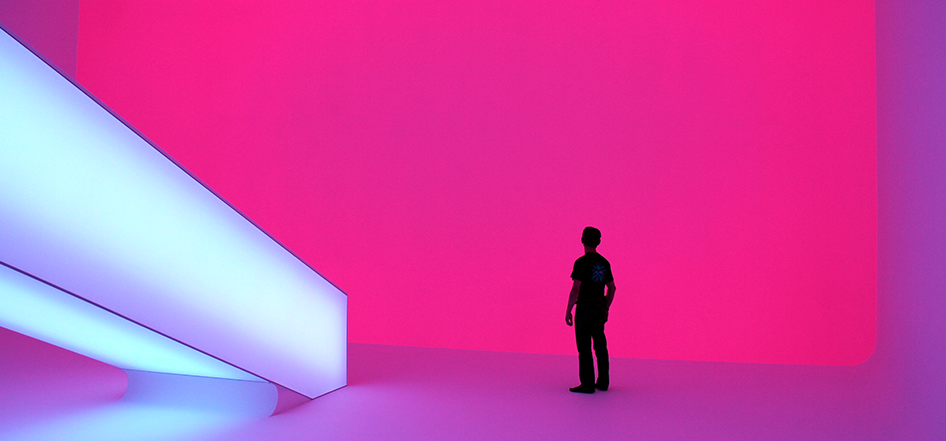
  • Two version is not necessary. First, it is too much to have ten videos to submit at the end, and second, the pink version I showed during the consultation, they think has already delivered what I am aiming for this project.
  • There is a constancy needed in each video, such as the same character used in each video clip, because they are filmed in different places, constancy; similarities will link them together as a series.
  • make sure each clip is no longer than 20 seconds, first is not to let the viewers get bored and second is to keep the constancy.
  • Question solved 🙂


– Constancy – 

Instagram tag

Hand gestures, movements

body movements

same character

same length for every clip

– colours – 

Pink = bored

Green = Disgust

Yellow = scared

Purple = joyful; satisfied

Fifth colour? To be decided


week 11 – PINK AND GREEN

To remind myself, I need to write my aim for this assignment on the top of every blog:

  1. No one has ruled that everything must have a particular meaning. To challenge this ordinary rule, I will do something opposite to a particular subject’s original aiming or meaning.
  2. Colours do have a particular meaning/ interpretation as well, I will also look at the reason why it’s being designed in this color as well.


Pink – bored.

Pink is such a fantasy colour which usually used to represent girls in a gender role, and most people do think pink to be a typical representation of girls and cute. According to my experiences from the last task, I have proved that the emotions created by colours will also vary by the tone of colours. This location has a dark, gloomy pink light which I guess the initial objective is to let people who are busy with their daily life to have somewhere to chill and relax. However, since the light is too dark that is hard to read there, the seats are also not so comfortable to sit for too long, so I guess the designer’s initial target wasn’t reached. And the moment I decided to film here, I am already challenging the designer’s intention. The first time I see this place I didn’t think the pink light has created any sorts of relaxation, it has actually brought tension to me.

Media:

Green – Disgust

Green is a colour that usually used to represent health; growth; nature; energy; youth etc. I have done a quick survey on what each colour means to different people, overall, colour green usually owns a positive meaning to most of the people. Tree is another element in this location, people always link green with trees or something growing, so I guess the meaning of these wallpaper is used to symbolize two things, firstly,  this metro construction is growing fast and strong. So they have used greens to represent the renewal and growth of the place. Secondly, trees is can give a meaning of calm and relax, which in this case the builder/ designer are using greens to let pedestrian feel calm and peaceful, at least not being affect by the noise level in this construction. 

However, the interpretation will differ on the viewer’s background. Like the few Chinese friends I asked, they said the colour green prompt them to think of ‘wearing a green hat’ which is used to refer to a woman who cheats on her lover. To pick a totally opposite meaning, I have made green to be completely negative – ‘Disgust’.

After Filming: 

I decided not to use a green light for colour green, because it contains more elements than the other locations, except for colours it also have leaves, branches which is much more complicated than the other full coloured background. Moreover, trees or colour green are a symbol for natural, but led light is not so much suitable for a natural concept, even I am try to challenge this concept but I want just the emotion to challenge the concept not something else.

Media:


Week 10 – Class Disussion

Through the discussion with Hannah and the rest of the class, I have finally listed out the two key aimings that I am looking for throughout the project.

The Big Things:

There is no law saying that everything must have a meaning with it. But people are so obsessed for those purposes behind things that we see in our daily. There is nothing in this world that has to have a meaning to it, because we may have ten different interpretation between ten people. Background, experience, religion, etc. are all possible factors that differ a person’s understanding to a subject.

My project is going to challenge this idea that nothing must contain a meaning, why does pink must represent a girl and why does blue must represent a boy? Colours do have an innate meaning like what we see in movie ‘InsideOut’, I am going to manipulate a subject and a colour in an opposite way to how it was designed to be.

As I did for the past assignments, I am not going to put music for this project neither, but I have tried to edit one of the colour with music. Although since music is another essential element for any media piece to highlight its emotion, meanings, and because this project is aiming to challenge an ‘opposite’ idea in between colours, emotions, and our environment. I don’t want anything more than that to affect viewer’s interpretation, and I hope only the colours, the character, and the emotion can be sufficient to let the viewer understand my intention.

Small Things: 

Project Four – Preperation & Inspiration

Aim:

From last task – How do colors differ a subject’s original emotion/ meanings?

Extend to this task – There are so many things that are not used in the way it was designed to be, there are places or subjects that have so many characteristics which different people have a different interpretation of them. What I will do is to highlight the other characteristics of a subject or a location.This will challenge the idea that ‘everything must have a meaning to it’.

Plan:

  1. List all the locations that I will be shooting
  2. Do test shooting to decide whether use cellophane paper or not
  3. walk into the location, write down what I feel when I first walk into the location or first see the subject
  4. write down what is the opposite meaning/emotion to the subject/location
  5. start filming!

Ingredients: 

  • Tripod
  • Camera to film
  • cellophane paper?
  • a model

Class discussion: 

  • Rober Crona’s ‘interstitial moment’ has prompted me to think about what my project what to focus on, where I want to draw my audience’s attention to? I didn’t use any sound or music in any experiments for the last task because I think music might take the focal point and create other feelings to the video.
  • At the end of Cuellar Brown’s work, where the part of the video is being played there was a quote appeared on the sky background which I have found so impressive. It’s not about anything that relates to what I will be doing for my final project, but I find it’s true that even there are all those layers of sounds and images but depends on each audience’s perspective or experience they will hear and see a different version of the video.

Inspiration: 

Through research for this task and the photographers I used to know, I have listed out all my inspirations or the photographers that I considered to be similar to what I want to do. Firstly, is Tuca Tombolini who shoot a series of the desert which is completely different to what we used to think of a desert. A desert is somewhere that no one is able to live there with no water and growing, under his camera all these barren desserts seemed like a candyfloss, sweet and soft.

Tuca Tombolini

Richard Mosse

I have been to his exhibition in NGV around two years ago, that was the first time I have encountered with his work, before I knew how did he create this series I was shocked already by the power of colours. Instead of having bits of pink in this series, I really like how he has turned everything into pink not red. This series was filmed and photographed in Africa where there was a war going on when he went for filming. When people talk about a war or fighting, bloody red we emerge in our head for sure. I believe his work has the closest idea to my final project concept because pink is such a girly, playful and a fantasy colour. No one would think of using bubblegum pink to describe the war, but he did, in an ironic way.

 “If you’re trying to make people feel something if you’re able to make it beautiful, then they’ll sit up and listen. And often if you make something that’s derived from human suffering or war, if you represent that with beauty (and sometimes it is beautiful) that creates an ethical problem in the viewer’s mind. Then they can be confused and angry and disoriented, and this is great because you’ve got them to actually think about the act of perception, and how this imagery is produced and consumed.”

______Mosse Richard


James Turrell

This is an artist who works with colour, lines, and lightings, Mia suggested me to look at because I was considering whether I should use colourful lighting matching the background colour.


Task three Pitch reflection post

I am so happy to hear those positive feedbacks from the panel, as I mentioned I still not hundred percent sure on what exactly I will do for the final project, so they tried to inspire me with artists and photographers who work with colours and emotions. ‘Optimism Filters’by Corrie Baldauf is one of the examples given by Sophie, and there is a big sheet of colour filters being held up by the subject to highlight their emotion. I think this is a great example because Corrie Baldauf’s work is also emphasizing emotions, it’s sort of saying colours are a way to bring optimism to you. While listening to Sophie’s explanation on this photographer, lots of pictures emerged in my head, how can I use the bold colours of cellophane papers to highlight different emotions. I am doing something a bit different, but I think this photographer’s work still gave me some inspiration to prompt me to consider how can one colour highlight the opposite meaning, such as yellow is a happy colour but I use it to highlight a sense of bored. 

Paul said he liked my idea as he has never encountered anyone who has worked with colours using a physical filter like cellophane papers because post-production is so much easy to control and it’s too powerful in nowadays. If I have more time I will explain that the idea came from William Eggleston’s inspiration, in the photographers or film makers that I remembered, he is the first and the best photographer to me who contains colours and associate with emotions. During the time he started photography, the post production is not as powerful as what we have now, but through the use of colours, all the subject in his work looks emotional. Since I knew him I really want to try something similar, but since I don’t have a similar scene like him (old cars, motels etc.) so the idea of using cellophane paper has emerged. 

To sum up the feedback I have received were quite negative and motivated for me to extend this idea further, yet there was one thing Paul mentioned with cellophane paper is that he is worried about the purchasing of the whole range of gradients (colour), I thought about this for long after the pitch, the next thing I will experience on will be to include more than one colours in the subject to see if the cellophane paper will still cover the original gradients and colours of the subjects, I will use contrast colours to see what emotions or feelings can they create.


Task three Pitch

Moving from task two, my experiments for this task were explored based on how do colours affect the way audience view a piece of media; and how do colours create emotion to a media piece.

For the first and second experiment, I used cellophane papers covering my camera to see if these colours can bring any emotion to the subject I shoot. When I look at the videos, the clips were seemed to play in slow motion or like a scene from an old film. At this stage, it was clear that colours will definitely create something different to what we see with naked eyes. I think the problem would be in the background because there are too many things going on at Federation square, so for the second experiment, I changed the background to full-color background matching up with the cellophane papers. I was quite satisfied with this experiment as it has started to demonstrate how colours can create emotion and feelings to viewers. But I was not so satisfied because the emotions didn’t differ by the change of colours, for example, the dark blue colours create a sense of mysteriousness and so does the other colours.

I was quite satisfied with the result because it has started to demonstrate how colours can create emotion and feelings to viewers. But I was also not so satisfied because the emotions didn’t differ by the change of colours. The third experiment I have worked with post production because I was thinking during the filming that colours on cellophane paper are too dark which I didn’t really like it at the very beginning. I have edited two versions: the first version has the similar effect to cellophane paper (SHOW PICTURE), the difference is I filmed at white background.

Final project:

Moving along to the final project, I haven’t decided what more I want to explore based on the idea of colours and emotions, so I went back to look at what has prompted me to look at colours. And it was what I could feel as an audience from the photographs I took for last assignment was quite the opposite to what I can feel at that place. The running; shouting; sweating I heard and I felt from that location was being softened by the cold green colour tone. For the last project, I think I might want to explore how colors might create feelings or emotions is opposite to the subject’s actual feeling or emotion. For example, a hot sunny day, if I adjust the colour tone, will it look like a sunny day but in cold weather?

Task three – Refining post

Throughout the progression of this task, I would give 8 out of 10 for the satisfaction of what I have done for this task. Exploring upon how do colours affect the way audience view a piece of media and how do colours create emotion to a media piece. So far, I am satisfied with my results because I have learned and discovered from these experiments. Firstly, colours can definitely differ how the audience will a piece of media, even though I didn’t prove this until the last experiment but I believed that the first two experiments have demonstrated to me the use of colours will create a different effect to what we see with naked eyes. Secondly, the same colour but darker or softer will create a huge difference, such as dark green looks creepy but light and softer green colour give a sense of energy and youth.  Like what we have discussed in class, there are patterns in my media, but I didn’t make patterns to notice new things, instead, once I decided to focus on colours and emotions I have tuned myself to discover all those colours around me and why do they exist in these certain places. Colour is a strong and flexible element to use in all different area, which is definitely worth to discover further.

Once again, the consultation we had was very helpful especially its a discussion in a small group, I was a bit unsure about what to explore further just before the consultation, the discussion in a group has given me a lot of good feedback and suggestion which led me to complete experimental three. Hannah and other members in the group have affirmed my progression moving from the first to the second experiment, and this has become a huge motivation for me to continue to explore further into a larger project which is project four. Until I have completed three experiments and preparing for my pitch, I didn’t have a clear direction on where I want to go further for the last project, so I went back to the initial point to remind myself what has prompted me to focus on this theme. The cold tone has softened the shouting; running; sweating on the sports court, all I can felt as an audience was the cold weather. And yes, this is where I want to go further! Each colour has an innate interpretation which contains a message that allows the viewer to understand in a certain way, for example, pink is a reflection of girls, then people will remember that ‘Hello Kitty’ must be something for girls. Going back to look at last assignment’s work reminded me a lot recently, why and how did colours have all this different meaning and interpretation?  I will explore from this point, I wish I can discover how might colours create an opposite meaning or emotion to the subject’s actual looks. e.g. A crowded market, can the use of blue cellophane paper or a cold-tone filter bring down the noise and hotness just by looking at the video/photographs?

In conclusion, other than things I have learnt on media making, by going through the struggling and challenges in this task I found one thing very important to remember is: when you are stuck in the middle of something or feeling lost, go back to your initial point and ask why did you start to do it, this might give you the answer of where you should go or at least this will give you motivation.


Task Three – Experimental three

Recipe:

Title – catching colours(emotion) on white

This time I will keep the background as simple as possible, if white works well together with the white clothes, I might choose all white background. Post production for this experiment, and two version of editing will be done at the end. First version will be to create a similar effect as the cellophane paper but not as deep as it, and second version will be a refine version after receiving feedback from friends.

Ingredients:

  • All white background
  • All white clothes
  • A model
  • Something to shoot with (DSLR)

Method:

  1. Find an all white background for shooting
  2. Model stand in front of the wall or background
  3. Ask the model to repeat the same movement over for several of times
  4. Edit first version
  5. Post production, add different filters to each clip, filters need to be in different colour but not as deep as the  cellophane paper
  6. Show others and get feedback from them: what emotion does each filter create?
  7. edit the second version of this experiment

Reflection: 

While the process of this experiment, I must be very careful in choosing background because I want the white clothes to stand out from the background so I cannot use pure white background, but I also want the background to be in one colour or at least to be simple otherwise the issue from the first experiment will reoccur again. I edit two versions in this experiment, the two of them will be repeating the same movement but they are filmed in two locations. Since the start of this assignment, I am so glad that we have building 10 access because there are so many colourful places available to use. Moving from the suggestion I received from the consultation, Hannah and students in my group gave me a lot of useful suggestion for my next process, since the first and second experiments were produced with physical filters – cellophane paper, they suggested me to try post-production for this experiment. Which I thought it would be worth to try because I considered the colour of cellophane papers were a bit too heavy and thick to create emotions and let emotions be differed by the change of colours.

After I have finished editing the first version, I was lost and confused when I have watched the first version. I added filters straight onto the video which has created a similar effect to cellophane papers. Myself as the producer and audience watching this video, it has once again created different feelings to people actually viewing the subject/place with naked eyes, but the constant change of colours didn’t differ the emotion. I struggled in the edit suite for a long time thinking what I must change to edit the second version, then I showed the video to different people for a quick survey. Their answers were just the same as I expected, neither do they feel different emotion out of the first version, few of them told me that the dark colour tone enhances mysteriousness to the subject in the video, but the same emotion continued until the end of the video.

In order to improve this situation, I took one of the suggestions for the survey to not only add colours into the video only because my theme is colour, but try and manipulate the colour tone by adjusting the colour of shadowed, highlighted areas. The colors are in the sequence of green; red; blue; yellow, the first clip with green in the shaded area created contrast with the rest soft colours because the level of colour tone creates different feelings as well.

Media (Colour on White):

First edition –

2nd Edition (correct edition) –

Task Three – Experimental Two

Recipe:

Title_colour on colour

In the first experiment, I was working with the landscape to see if colours can affect viewer’s emotion when viewing the media. As the result wasn’t the same as I expected so in this experiment,  I am aiming to test how might different colours will test out colours on people. What I will do is to get a person with blank face in front of the camera, by changing different colours of cellophane paper and the backgrounds, I want to experiment if the colours influence the way audience to understand a media piece if the subject of the media piece is a person instead of a landscape.

Ingredients:

  • A camera that allows me to do filming and photographing
  • backgrounds with single colour
  • All white clothes
  • cellophane papers
  • scissors to cut the cellophane paper
  • rubber band

Methods:

  1. Filming a person with different colour of cellophane papers
  2. Do every colours with cellophane covered in front of the lens first, and then use scissors to cut a hole in the middle of the cellophane paper
  3. Film another video with the cellophane paper around the lens but not covered
  4. After shooting five colours of cellophane, look back to them, compare videos with and without the cellophane papers
  5. Select and edit to a complete video
  6. keep the rest of footages for reflection

Media:

Reflection:

According to the result of the last experiment, I have decided to let my ‘model’ wear all white for the shooting because the colour of  cellophane paper was a lot thicker than I thought it would be, for this experiment I am adding more colour on the background so I chose to use white to balance the colour. The white worked very well in this experiment, and I was very happy how I have moved from the first to the second experiment. I think this is a quite a big step towards my final project. To reflect on what I have done on the cellophane paper, so far I think colours can affect how people view a photograph or a video. People will have an innate interpretation to each colour even it might differ from cultural background or experiences, for example, blue can be a colour symbolizing sad and gloomy etc.  However, since the cellophane papers’ colour is very deep and a bit dark as well when they are covered in front of the camera, so the subject even she has a blank face which I have planned to let her act in a blank face because I want to see what does audience feel out of each colour. But the subject is now represented mysteriously in the video, I think it is because of the dark colour in the video, even though the full coloured background is vivid and bright.

What is cleared for now is colour can obviously influence the way we view a media piece, it might create the sense of a flashback scene or it might let the ‘actor’ looking grim or serious but colours do create emotions. The reason why colours can create different emotion I am guessing its because they will differ by other elements in the media piece as well, as the result, for the next experiment I will try to get rid of cellophane paper but use post-production which is filters to manipulate emotions. I think I will still ask a person to be in my video instead of photographs because human faces are more readable and understandable than a landscape or architecture. And I will also keep using all white clothing in the video because white can shows each colour very well.

Class discussion:

  1. Are you making patterns to notice new things or are there patterns out there in the world that you are trying to notice? It’s actually the other way around, since I have decided to work on colour as my theme, I started to notice the colours in RMIT or in my daily life. I have tuned myself to discover the patterns in my daily life.
  2. Are you glimpsing in or observing slowly? What are the differences? In my case, colours are very obvious even I am glimpsing, but when I am observing slowly, there are more and more colours being discovered throughout the process.
  3. How is the medium (photography/ video/ sound) you’re using to notice shaping what is available to be noticed in the media?  As I am doing both video and photography, I feel like videography is more open to audience whereas a photograph is capturing the moment, so it’s more closed for imagination.
  4. How is the particular technology you’re using (iPhone, DSLR, Zoom recorder) shaping what is available to be noticed?  The quality between iPhone and DSLR are very obvious, DSLR we can adjust the focal point, the shutter speed, etc., these can manipulate how the audience can notice throughout your media. For example, I have photographed a water bottle the focus is on the bottle, and the rest is being blurred then this is deliberately leading the audience to look at your focal point.
  5. What does your media pay attention to?   Colors and emotions
  6. Would you position what you are making as a documentary, nonfiction, experimental or somewhere in-between? I belive myself to be making a experimental more because there isn’t a storyline behind
Skip to toolbar