Purple – Joyful
Purple, is a colour that I don’t really look at very often, the only thing I have with colour purple was the movie ‘InsideOut’ where purple was a character of fear. In order to get inspired, I went on Instagram and typed in purple to see what photos were tagged in photos, what are these photos’ common point. After browsing hundreds of purple tagged photographs I have written down a list of words that I will use to describe purple:
- strong
- darkness
- powerful
- dark power
- the dark side
- stillness
- hush
- mysteriousness
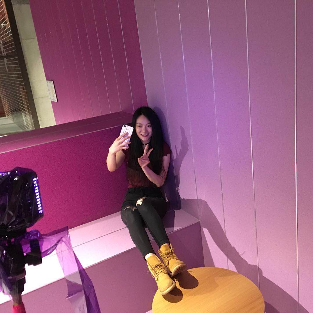
This place is designed as a study area, a place for chatting and gathering I guess, anyway it is not designed for shooting. To film in this location is already challenging the designer’s intention, and I think this is another constancy since every location I chose to film was not for designed for photographers to film or shoot initially.
After research and survey, I used purple to represent joy and a sense of delight. I remember near our classroom where it was colored in purple, lavender purple, and red, I will use both of the purples for the background. I am not sure if it’s only me or everyone has the same feeling that purple gives people a sense of stillness, it looks so powerful and mysterious. What is the opposite to stillness? of course, the answer is movements, I am not meaning crazy dance moves but slightly moving hands; nodding heads or swinging arms to highlight the sense of joy and delight.
I filmed this colour for twice because, at the first time, I can see joyful from the colour but the sense of stillness was still very strong. While editing the first version, I was also considering what are the ways that can help me remove the sense of stillness but also represent the sense of joyful. The changes I am going to make for the second shooting is first, use a brighter light on the character or the parts that I want the audience to focus at. Secondly, add more movements in.
Media: