Keyboard Shortcuts

I like changing the rates of shots, as annoying as that is, so for me using the ‘R’ key to change the rates of clips just by dragging is uber cool.

In the process of finding these short cuts, I also learnt the difference between a ripple edit and a rolling edit: a ripple (‘B’ for whatever reason) affects the whole sequence, moving any media past the edit point forward or backward to compensate for the change. Conversely, a rolling edit (‘N’, because sure, whatever) doesn’t do that, simply absorbing the edit by changing the length of only the relevant media.


Blood Simple

This scenes has been edited pretty conventionally, in terms of shot-reverse-shot, continuity, etc. It maintains continuous action, a realistic-looking eye line and a believable soundscape, minus a few moments where the sounds are exaggerated for dramatic effect. This is mostly during cutaways, such as when the fish is placed on the table, the cigarette is extinguished and the gun is cocked.

The way the scene was edited implied to me that something horrible was going to happen: the nervousness and the power imbalance between the characters was emphasised through sweat and acting, and the fact that a certain amount of distance is maintained between them. The repetitive groaning or whatever that is – it may have been the ceiling fan – also added an ominous tone, as we weren’t entirely certain what that sound was.

I didn’t really understand why the one guy had to go to the bathroom to throw up, I wasn’t sure why that was kept in. Maybe it was just to add suspense, so that it would seem like he’d burst out and just shoot the other guy in the head or something. I also thought that the way the scene continued past the exit of the assassin suggested that perhaps his victim might be still alive, but I don’t really know.

Directing Actors

I remember really liking this lecture, but I don’t remember why. My memory is really bad.

One thing I recall is the concept of dumbing down the greater aspects of the scenes for the actors. This is interesting to me, since I’m someone who loves a story and couldn’t imagine even trying to act without knowing everything there is to know about a character and his journey.

Not that I ever want to act.

Or maybe I do. I don’t really know. The practice intrigues me to some level, and probably more so than directing. I’ve been directing a little bit after this lecture, and I did take on some of the advice from this lecture, not so much in the way I actively direct, but more in the way I treat actors.

I mean, an actor is the face of the film. The person behind the camera could be anyone, and while we can’t exactly throw that person out a window and keep going, there will be a far more noticeable and unfixable change if we threw out the actor. Likewise, if the actor walked out. And the tone of the film and the quality of the performance is dependent on the mood of the actor of the time, meaning that we have to cater to them in some way, all the time. We need to be honest, but kind, and we can’t just assume that they’ll know exactly what we want right off the bat.

Acting is a difficult trade, probably – in my opinion – a more refined craft than directing. It’s one thing to tell someone how to act, another to do it. I think part of being a good director is understanding how to tell the actors what you want them to do, and part of that is understanding the practice of acting.

Taxonomy

Everyone’s so worried about the definitions behind digital documentary. I mean, so what? We know what it is, how does it’s varying forms question it’s taxonomy? Just give it a big name, that hasn’t been a big problem before (‘plant’ is a pretty broad term, for example, as is ‘film’, as is ‘thing’), I doubt people will care if we have a broad term, which is in fact has a fairly refined definition, comparatively. Stop finding issues in things that don’t matter.

Blow Up

Antonioni uses the actors to establish a lingering fascination with their movement, especially of Vanessa Redgrave’s, who’s poise and form fascinates the photographer. The framing often presents her as if in a picture, framing her presence within wooden brackets or behind stained glass. Not being overly familiar with the film, I’m only making assumptions, but I’d say that she is presented as if she is an art piece being observed by the photographer. Occasionally, parts of the set obscure his character, meaning that the focus of the scene is clearly on the woman.

It zoomed, I don’t know why it zoomed but it zoomed and it looked good. I am most impressed. Perhaps this action highlights the idea of the woman being captured by a camera, rather than being seen through someone’s eyes. Not sure.

I like how antsy the woman is, and how relaxed the man is. It makes it more jarring when he leaps across the room to answer the phone, but I think that just showed how he was in complete control of the situation, he chooses when it becomes more frenetic, not the pacing woman.

Developing A Crew

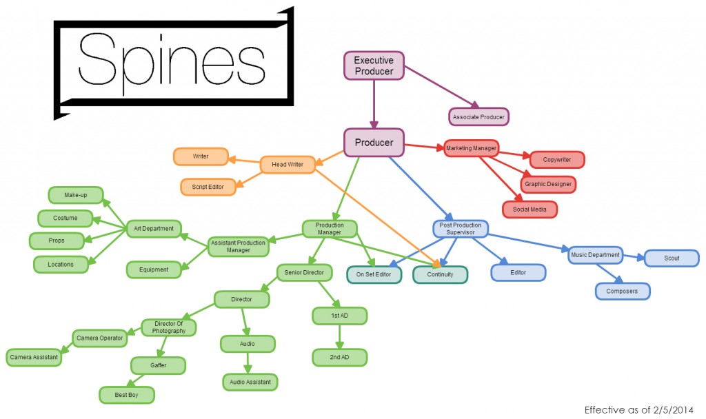
SpinesStructureSo in reading this extract, I was reminded of when myself and the other producers of Spines attempted to construct a meaningful and logical structure for the project. I noticed some major differences, especially in the placement of the Art Department, which in this case becomes a responsibility of the Production Manager, rather than the Director. This seems like a bizarre twist, but our logic is that the Director changes episode by episode, meaning that the Art Department needs to maintain a consistent aesthetic throughout the series, something varying directors could attempt to upend.

Another difference is that of continuity, or the script supervisor, who is also ruled by the production manager, as well as having a shared authority figure in the Post Production Supervisor. Again, this is dictated by the changing directors.

Perhaps it’s wrong to mess with the grand structure of modern film, but perhaps we’ll learn why we should – or shouldn’t – follow this matrix. I guess.

Lighting

I’ve always been interested in lighting, and I feel like this is an area I have some knowledge in. Within the lecture and the tutorials we were taught how to set-up the kino, redheads, blondies, fresnels, dedos and LEDs, plus what differentiates them and how we compensate for variances in colour temperature and harshness/softness.

Ultimately, since we are using lighting in our short film, it’s very relevant. Our project takes place entirely within a house, meaning we have to make the characters clear and the emphasise the action using the lights, as well as maintain continuity within shots.

Lenny

Where do I begin with the Lenny?

I think it went really well, barring the strange mix-up with the audio. For whatever reason it became fuzzy and nigh-incomprehensible. Anyhow, everything else I was happy with. We got the major shots we needed, we seemed to function adequately as a group, we were happy with the final product.

None of us were particularly new to filming, which I guess was a bit of a downfall for us. We were uninspired and didn’t really learn anything different. Well, they didn’t, I don’t think. I’d never directed anything, so it was frightening to tell people what to do. Ultimately though, our actors were fantastic so they pulled us through it. Yay for them.


Lighting Lecture & Tutorial

Lighting is an area I’m pretty familiar with. The most memorable bit of information that was new to me was that a fresnel light is so named for the lens within the light, which gives it a greater difference between a spot and flood-focused beam. I enjoyed learning that.

I don’t like dedos. I like kinos. I like LED panels. Red heads annoy me but I appreciate their existence. C-stands are like my favourite kinds of people. I don’t enjoy learning about electricity. I find it shocking.

I’m just gonna crawl into a hole and die now.