A4: My creative process

So far this, brainstorming and shooting for this exercise had been a joy!

I am interested in exploring how we can connect people by showing how they have similar gestures.

touching the object with the thumb in the same movement, visually interesting but also shows how both characters are thinking


Have I tried to cram too many ideas into one exercise?

Absolutely, so now its time to detox. I was imagining an extravagant complicated piece of ART that jumps between timelines and is all intricately tied together. But that turned out to be a lot harder than I thought SUPRISE SUPRISE.

INFLUENCE FROM ASSIGNMENT 3

My interest in cats as a theme..

Image result for aliens film catsImage result for aliens film cats


In my last assignment I had a great moment with an unexpected talent. Gizmo, an erratic nervous dog followed around my actor during the shoot because he was probably wondering what the heck we were doing, and was excited by the energy of the room. In doing so Gizmo ended up creating a great ending to one of my better trials of the exercise. I couldn’t have predicted or planned this out, which is quite the opposite of what we try to do in The Scene in Cinema but I think that its acceptable but as a director I made an instinctual choice to keep Gizmo in the house to begin with for more of a busy atmosphere.

Without such a great mistake with my last assignment, I may not have been as ok with the cats prowling around in this exercise.

Cats and Decoupage- Cat Eye View?

Here I am babbling on about how I’ve made this huge creative decision to keep the cats in, when I’ve realised that maybe I didn’t have a choice in the matter. The cats were a PART  of the apartment. They were part of the deal and were non-negtioble.

And by golly these were needy cats. They would often jump on Isaac during a take or deliberately walk, quite slowly, right in front of the camera. I really think they knew what they were doing, but that’s just me. I was getting increasingly frustrated by this until I thought that I could take advantage of this. There’s something captivating about the way cats move. They are graceful and indifferent sometimes, but also can become highly attentive without warning. I spent some time just following cats around

How did it affect the way I covered the scene?

I’d like to say that I was maybe subconsciously influenced by the way the cats were watching us, but I think that could be wishful thinking. I liked the way the cats watched us, they were passive observers for the most part, but also occasionally seemed intrusive. I’ll try and explain this better, Sometimes they would watch from afar and let us (Isaac and I) do our thing but then they’d come in real close and pick up on our mood quite affectionately. They could climb up to ‘high angle’ places and then suddenly drop below the table. This certainly inspired me to be more creative with my use of multiple angles, and as a result created a more interesting coverage of the scene. I say the word interesting too much, but in the case, by interesting I mean thought-provoking and not too basic like how I might normally shoot a scene.

For example, the cats made me look at the floor a lot, which made me look at our feet. No, not in a fetishy Tarintino way, like just as an educational thing.

(Feet from that movie)

As a result, I tried to include the cats in the scene to create a mood. The mood is affected by the pacing of how the cats move.

I also decided to include a cat at the beginning to give off the sense that we are waiting as an audience for something to happen, for someone to arrive at the apartment.


The first shot to me suggests that I have the same view as the cat when looking out the window, and it equates me watching outside for someone to come home. The silhouette look matches the shots I have of Isaac coming up the stairs unifies me and the cat as one pair looking out the window. and it also My aim is to have the cats seem like they are being watchful for me as well.

The Long Take

At the end I have a sort of long take of Isaac, I couldn’t help myself. I feel like have a shot that stays with him while he is going through his room looking at the note again brings us back to the present. The lack of flashbacks also helps the story converge at the end.

More feet, what a feat

This scene comes from a film that we watched in class called Red Dessert. This scene is highly stylised and simply captivating. The director Michelangelo Antonioni has an amazing eye and intuition for audience attention. I really enjoy observing the angles the two characters create with their feat.

In particular the third shot where we see the woman create a triangle with her legs, the way she crosses her right over her left to smooth out the news paper to notice that “it’s todays” I can imagine her craning her neck over as she adjusts the paper. Just focusing on a part of the body we never really notice to express what the character is doing as a whole is so refreshing and fun to watch.

Those shoes are so pretty too, it would be a shame not to show them really.


A4: framing choices/ justifying mistakes :/

My scene is about loneliness I think, so I consciously tried to create a feel of isolation. In this post I will attempt to explain some of my choices in framing and mise en scene and how they came about.

All the little meticulously placed artworks on the walls and careful choice of decor suggests that this apartment is very lived in and was once homely. It seems odd that only one person is now seen in it. Isaac can be seen through the sliver of the door, as if he is being peered at; perhaps by someone who doesn’t want to interact with him too much, regardless of eyelines. It also find satisfaction in the way he lines up with the 3 visual panels from the left. The lighting also gives a clue that the characters may not be in the same place.


I wanted this white cup to stand out, but not in an overly intrusive way, just subtlety. Its the brightest part of the frame but only by a tiny bit. To do this I moved the rest of the mugs back so that they would sit under the shadow of the shelf above. In the shot I also changed the focus to emphasise the “lonely” placement of this white mug which was suggested to be the mug of Isaac’s partner.

Before shooting I looked around the area for things (like colour and shape) that might stick out and help me create a unique looking ‘world’ within the scene. I wanted things to look cohesive so they were tied together.  I found that the brick color matches the terracota of the babushka dolls that were in the house already.

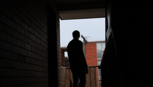
Why did I choose to have such dramatic lighting? You may think its simply me being like, “well, its cool” but I found that having a silhouette of Isaac was much more interesting, and it also allowed for some flexibility in editing later because I didn’t have to worry too much about facial expressions.

Silhouettes also created a gloomier mood and made his figure look more lonely and isolated in the frame. The lighting at the back creates a new smaller frame to focuses us on the subject even more.

Image result for in the mood for love frame within frame

I have wanted to try this out ever since watching In the Mood for Love (2000) directed by Wong Kar Wai. Wong is well known for his precise framing and his creation of frames within frames. The nostalgic film is set in a the 1960s Hong Kong and gives us a voyeuristic peak into the secret lives of the two main characters.

The apartment that I filmed in was very small, and filled to the brim with art. There are frames all over the walls and trinkets on every flat surface. I personally love it because as soon as you enter the space you immediately get a sense of the personalities of the home owners.

Same goes with the apartments from In The Mood For Love. The


As well as colour I wanted to try and link up shots with the shapes in the frame. This may not have worked as well as I’d liked because there wasn’t a clear reason to do so.


I’ve been thinking, is ok for things to just be pretty or look cool?

I’m not completely sure and I think my final answer is that it depends on the sitch.

I have a constant urge to do just that, and with this project I’ve been trying to stamp that out. But the thing is, visuals always have an affect on the viewer, whether its because it affects the plot, or creates a memorable feeling.

I’ve had to keep checking in and rewatching to check for whether it just looks gratuitous.


…and now a post on transitions

How do you go from one scene to the next?

In class we talked about how different films go from scene to scene in a meaningful way. I hadn’t given much thought to how much transitions affected how we remember the last scene and how we will feel entering the next. But they are a lot more important and can be very powerful to the movie as a whole.

THE LOST WORLD: TRANSITIONS FROM PLACE TO PLACE

I went home after class with transitions on my mind, and immediately I was reminded of a scene from Jurassic Park  The opening sequence of The Lost World: Jurassic Park establishes the shock and excitement about to unfold in the rest of the film. A rich family is on the beach about to have lunch, the mother calls for her daughter to come and realizes that something is wrong. When she finds her she screams with her mouth wide open. Her scream is high pitched and piercing. In a hard cut we see Ian, played by Jeff Goldblum, yawning. I like this transition because its not too explicit e.g having a close up of their mouths or lining them up in frame exactly. We instantly see the connection between the two characters because the ‘scream’ (which is continuous) takes over the scene and is links up the  to the next shot.  The scream transitions too and begins to sound more metallic and screechy. For a brief moment between the woman screaming the the sounds of the train screech, the sound is almost musical, like the classic violin high pitched suspense sound effect used in horror movies. This is unnerving because of how relaxed Ian is, yawning, completely unaware of what just happened.

The artificially blue back drop behind Ian with a Palm tree mimics the tropical setting of the scene before, but seems off. Our realization that he is not in the same place is confirmed when we are shown in a tracking shot that Ian isn’t really in the tropics, he is at an underground train station.

Ian is now linked visually and meaningfully to the tragic death of the girl in the opening sequence. This transition is memorable and exciting because it presents us with so much information at once while introducing us to completely new character and setting at the same time in a dynamic way.

WHEN HARRY MET SALLY: TRANSITIONS OVER TIME

I recently revisited one of my old favorite movies with transitions on my mind and paid close attention to how it subtly notifies us of jumps in time and location, sometimes big and sometimes not. When Harry Met Sally (1989) directed by Rob Reiner, follows the relationship of Harry and Sally over 12 years as they date other people, watch their friends get married and develop as individuals.

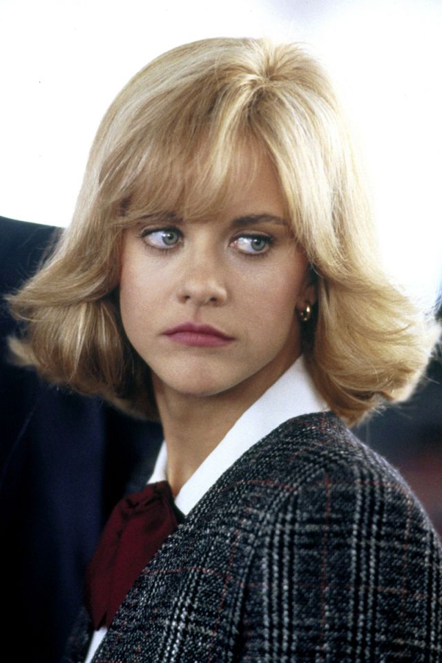
Another thing that might not immediately seem like an important part of the ‘transition’ is the change in costume and hair. 80’s hair is terrifying to me and I am glad that I missed out on it. But nonetheless, the change in Sally’s hair over time. Having such a dramatic change of hairstyle jumping from one scene to the next, notifies us that lots of time has passed. These photos are in chronological order to the film, in the first one Sally is a studying to be a journalist when she first meets Harry, the second is when she bumps into Harry at the airport 2 years later and the third is when they bump into each other again a few years later in a library in New York.

Image result for when harry met sally sallys hair Image result for when harry met sally sallys hairRelated image

The same thing can be said about the use of Harry’s beard. Harry goes back and forth between having it, and growing it out between the times that the main characters come in contact. It is also worth mentioning that whenever Harry has his beard, he is going through a rough time because he is depressed about his ex wife. When he gets himself together again he is clean shaven.

Visually stunning scenes of the seasons also give us a sense of time passing over the years. The front cover features a bright autumn background. We also see beautiful establishing shots of the heavily snowed on New York city, people barely able to trudge through the street.

A pivotal point in the film is when Sally has break down over her ex getting married. She calls Harry and he  rushes over to her house to comfort her late at night. The end up in bed together, and the next morning is extremely uncomfortable, for many reasons. A slow cross fade is used to pull from the night time to morning the next day. The difference in brightness (going from soft yellow light of the bedroom at night to bright bluish natural light) is slightly jarring which emphasizes Harry’s expression of complete disbelief. Sally, who in contrast, is completely content is rolling her head around, and tossing her insane perm about, and all over Harry’s face. Her hair move around in all directions an  We see him uncomfortably wince his eye as her tendrils of hair poke into it. So much is going on already. This transition of Harry and Sally kissing to the next shot allows us to guess what happened without giving too much information. The camera pulls back during the cross fade, creating a confusing effect where we are given more visual information to look at, but it is still all blurry. The cross fade transition is notably slow, making it difficult to see anything that is going on.


This creates the feeling that we too, are waking up slightly confused from the last scene. This pull back movement also reveals Sally’s smile first and then then, as more enters the frame we can see Harry’s shocked face,  which further emphasizes the dramatic irony that Sally does not yet know about how Harry feels about the situation.

This transition is visually interesting but also allows us get a sense of what is about to unfold.


Idea development for Assignment 4

As usual I have too many ideas and now clear way of forming them into a cohesive exercise. I need to find a happy medium between what’s practical, and what’s exciting to me. To do this I have listed some things that I’d like to explore further in the course. But one thing sure about is that I am DONE with long takes.

To decide on what I want to explore I have made a list of the top ideas that have inspired me this semester:

  1. The observational method of filming movements of an actor by first watching them complete an action and then deciding on coverage AFTER.
  2. The idea that cinema is more than the story, or that the story doesn’t even matter as much as we think. The way the camera moves, the way a scene is covered, expresses what words/the script could never fully articulate. That’s the what we go to the movies for.
  3. How do we go about moving from one scene to the next? Its a lot harder to move between locations that it seems.

How can I take something aLONG with me from my LONG TAKE?

What I got a better feel for in A3 was how to work closely with my actor in a way that makes them comfortable and brings out the best in them. I also got a good feel for pacing, and utilizing a space.

This post has been edited of the course of my process. I have included parts in italics which are the updates on the thoughts I’d had previously explain why they didn’t work out and what happened instead. 

It boils down to how I want to try and show a strong and complex emotional connection between two people, without ever showing them together in one shot. I’m imagining a conversation with gestures and no words.

e.g Isaac looks up and she looks “away”

I have taken inspiration from Her (2013) which shows a lot of scenes JUST with the main characters face. Since Samantha doesn’t have a physical body, the way she connects with Theodore is just through voice. We see him react to her voice and its very intimate and endearing. It explores the subtle moments of longing, loneliness and love that I almost feel embarrassed to watch, because it’s so personal. 

I can’t imagine what my final product will look like but for now I’m gathering smaller ideas that I want to include. I’d like to capture subtle facial expressions and cut them together to create deeper meaning.

update 20th Oct: My inspiration from extended to listening to the soundtrack while I edited to keep the same vibes consistently through the scene with the rhythm of the cuts. Here is the song I listened to.

I JUST had an idea that I could connect their gestures too. I’m imagining that there is a break up letter being written by Cara. She hesitates as she writes and crumples it up when its done, but keeps changing her mind and smoothing it out again. I will cross cutting his action with Isaac packing his bags (hopefully the audience will make the connection that he is doing this because he has read the letter), Isaac will smooth out his clothes before he folds them in his bag. I’m also imagining an uncomfortable part where he leaves. What I have to be mindful of with this is making sure it doesn’t end up looking like a lame coffee commercial about “smooth tasting coffee” or something. UGh.

(update 20th Oct: this never happened because I found that the actions we had were more than enough to fill out the length of the scene and express what I wanted to. I have found that I tend to draw out actions a lot by have a lot of coverage of the one movement. On paper ‘Paul sits down’ could take 1 second or 30 seconds depending on how is does it. In my case I tend to lean towards the 30 seconds.) 

Moments I’ve imagined:

He tenderly touches the collar of one of her old shirts which Cara could be wearing in her shots.

Isaac goes to make two cups of tea but realises what he’s doing and doesn’t.

Thematically connecting Cara lifting her pen to Isaac opening the door to his apartment.

I also have an idea that there will be a “supercut”; just an intense series of fast cuts of action where the scene will crescendo. All the sounds from every location (including flashbacks) will come together in this section.

But has this now become a plot point instead of a subtle gesture that can create an overall feeling!? I guess I won’t know until I actually try it.

I have to be careful that I don’t make this an effects piece. I very much want it to be about the overall feeling. I want the decoupage to tell the story NOT  the voice over/ explicit actions of the actors.

But at what point does it become a cheesy plot point? e.g throwing a bunch of flowers for no reason!?


CHOOSING A LOCATION

We walked around a lot. The side streets around the apartment we were planning to shoot in had a very different aesthetic to the inside of the the apartment. There was a lot of graffiti and hard rubbish on the streets. This made it difficult for me to walk around with me camera and not trip over while monitoring what I was filming.

In my mind I’d like to have Isaac arrive at the apartment as a suspenseful thing by drawing out the time he takes to get there. This meant a lot of shots of him walking toward the building, which meant including the background, or so I thought at the time.

I decided to omit a lot of the shots we had of Isaac walking through the street because it added another location to think about. As you can see from the thumb nails there so many different colours and places, this makes things too complicated and I want something that looks more limited in colour palette. 

Instead I used some shots of him going up the stairs where the contrast was so high that you could barely tell where he was. The actual room where we shot at was on the lower lower level but I had lots of shots of him going upstairs to imply that the room was on a higher level. I thought this would make the scene more interesting because its even more isolated and high up, kind of like a light tower.

Disaster strikes

Two actors couldn’t make it. So we had to shoot everything in the same place because the only person available to be in it was me, with Isaac on camera. How did this affect me story? Well surprisingly not by much. Instead of playing with location and I decided to play with timelines. Now that we will have to shoot everything in one place due to travel time and the days we have left, I’d like to play with the idea that the characters are in the same place but at different times.

THE SCENE FROM HER

I like how in this scene we can’t see Samantha at all but we can still feel the way the intense relationship that she has with Theodore. In particular when she tells him to “lie down,” he slowly and carefully lowers himself onto the bed as if she has her invisible arms around him and his gently taking his head into her lap. see 1:07 minutes.

exercise 11: Observing Actions

OBSERVING OUR ACTORS MAKE US BETTER DIRECTORS

Unfortuntely my group of 3, completed the exercise incorrectly, but we still learned a lot! We were supposed to each complete the SAME action from the script in hopes that our different ways of doing the action would evoke ideas on different ways of shooting it. Each of us accidentally completed a different action each which made it more difficult to compare results. Perhaps it was the over excitement caused by the long list of actions we could choose from to shoot, or maybe it was just careless reading of the prompt. But the whole idea of this exercise was to OBSERVE the way our actor moves, and from that to determine the way we should cover them in the ‘scene’.

I think this is a fascinating idea, that the way the decoupage can be inspired by, or reflect on the way someone moves. The idea that the actor is guiding the shots is a very different way to how I would normally try to shoot a scene. This exercise shakes us loose from the sometimes tedious planning and story boarding that comes before we even begin block out a scene.

Rob walks with short but distinct steps. I like this. Its very different to you you’d think he would walk considering his (very very high) height. After watching him walk up and down the hallway I decided that I’d like to just capture the whole thing.

The actions in the script stated: 


Here is what we ended up shooting for this scene  https://drive.google.com/file/d/1Zzx0BipDqWH0uCLwwQoR8rUxRZJ-4oLC/view?usp=sharing

How abrupt! But I’ll try to explain.

How could Rob’s interesting walk tie into some kind of meaning for the script? In this short scene, I’d imagined that Rob was sort of walking without purpose, not in a hurry to be anywhere because he was unsure about what he was meant to be doing. The turning point comes when he realises something and he immediately turns back and this time RUNS the other way.

Being much shorter than Rob I noticed that as I followed

him in the first shot, that it was at quite a low angle. But this worked because it allowed Rob to fill up the frame and seem more weighted in the shot, like his walking was tasking or troubled. My shaky hands, although admittedly not deliberate, add to this frivolous vibe. Its all about that vibe.


I like the way I timed swinging the camera around Rob’s shoulder with the sort of naturalistic timing that he might have taken to register that Isaac was there.

Rob also changes his expressions very quickly, from calm to suddenly worried. So I replicated this by just doing a hard cut to his face around the other side. It is implied that he is calm as he walks up, and I think that this suddenly cut to his face works because its not ‘too cheesy’ by showing him gasping after seeing Isaac. This quick cut is disruptive and really gives the feel that Rob was caught off guard I think.


Usually I try to squeeze in some close ups (of facial expressions) out of habit and to simply have the satisfaction of joining them up to mid shots in the editing room, but I’m very glad that I didn’t go with the perhaps ‘easier option’ this time and actively tried to shoot something in a way that I wouldn’t normally. By having a mid shot of Rob’s face it allowed us to have time/ room to, in the same shot, have him run away out of frame in a non-awkward way without stressing too much about focus pulling.

What would I have done differently?

To really send the message that Rob is wandering around, half minded, It would be better to slow it down even more. Maybe I’d try and shoot it from a different angle to make his movements more laborious. Also the shot seems a bit under exposed.

ANOTHER EXAMPLE FROM CLASS


From class, I really liked the way Jonah shot John in this scene. The actions being:


I really like this for a number of reasons. Firstly that the scene is dynamic without having the camera have to move too much, which emphasises the dramatic way John moves. The framing is also satisfying to the eye. and the perspective makes the bench look like it is basically begging John to slide down it. The end point of the bench lands in smack bang in the middle of the frame which, could seem like too much but for the purposes of this shot works well and is very playful and fun.

John’s bright red jump adds a great eye catching pop of colour and really emphasises his actions against all the neutral colours of the rest of the frame.

side note: I couldn’t help but think that John has the elegance and assertive poise of a sugar glider.

This activity has reminded me how rewarding it can be to first consider the individual qualities of the actor, things that they not even know about themselves.

EXAMPLE OF ACTOR AND COVERAGE IN SYNC

This clip comes from Baby Driver (2017) directed by Edgar Wright. From about 35 seconds is where things get snappy and the highly gestural actions of the actors sync up with where the shots cut. This film overall is very sassy and exciting; this opening scene sets us up for the highly stylized ride ahead. I find the scene hilarious because Baby’s actions are so erratic and theatrical that we forget that this whole time his bum is planted firmly in his car seat. It takes a great physical actor to make create such exciting movements while seated.

When Ansel Elgort slowly turns the steering wheel (1:14) the camera dollys right as if he is turning the camera himself, the camera slows and comes to a halt as he lifts his hands which is subtle but super cool. When he jerks his whole body back with the music we immediately see a wide mid shot of his torso which pulls us back as an audience into the car.

Exercise 13: matching shots with lighting

How do you make a scene up with shots from different places? Well that’s what we tried to find out with exercise 13! The point of this activity was to play close attention to the way we light our subjects so that the shots are consistent in relation to one another.

The class split in half to complete this exercise. Here are some screencaps from my groups work.

Choosing an all white wall may have seemed like an easy way out, but it is deceptively simple. This is because  by having nothing much in the background, our attention as a view is drawn to the details of our subjects faces, picking up on how the light shapes them. In our establishing shot, there is no clear direction from which the lighting shines, although soft and flattering, this means that even lighting must be created for the rest of the scene. Also in the first shot Sophia is about to speak so we should have anticipated that her face should be more lit in preparation for her close up maybe.

In the second shot of Sophia where she says her line, the lighting comes from above, creating a dramatic shadow under her eyes and chin. I don’t think that this is the most popular choice for most conversation scenes, but if matched up well it might not matter.

Unfortunately in the third shot, the lighting on Isaac’s face is a bit flat. but at least the lighting on the wall is soft and has a nice gradient. To me we didn’t manage to match up the scenes well in terms of lighting on his face because in the first shot, you can clearly see that there is meant to be more light on his face. But in terms of colouring, it is very consistent and might fool someone!


The tessellated green background came as a bit of a surprise but works. It would have looked better if the wall was further back to make it more believable because it seems like the wall would have been further back in the establishing shot. The eyelines are slightly off in the shot with Madeleine, it also would have looked better if Madeline was under less flat lighting. This final shot of Jack is very cool, placed in the center of the shot with his arms crossed he looks like an important character in the scene. I’m not sure if I would have kept the light source in the scene since it is a bit too bright and distracting, also in the establishing shot, the ceiling seems much higher and probably wouldn’t have lights low enough to appear in frame at that front on angle.


This was my favorite of the three.

Despite the third shot of John having uneven lighting that might not be possible within the room they are in, to me it doesn’t matter. The mood is overall tied together with this final shot. The dramatic lighting that cuts off at his eyeline somewhat distracts from the fact that the shot isn’t in the same location as the first two. The change in wall paint colour also doesn’t seem to have a negative affect because we can’t see what it might look like in the establishing shot. I think this scene also works because the overall colour pallete is muted and murky, so the slight change in wall colour isn’t noticeable.


THE SHAWSHANK REDEMPTION LIGHTING OVER 3 SCENES

Here is a back to back comparison of the 3 scenes I will be referring to. To me, these scenes are a good lesson on how light can be very different for different people in a shot, but still make visually logical sense. There is a clear direction that the light is coming from in each scene, which wouldn’t necessarily create the same effect in real life on set, but we accept this lighting as the reality of the scene because it just works.

The scenes that I found come from the film The Shawshank Redemption (1994) directed by Frank Darabont and Red’s character is heartbreaking.There are 3 scenes with Red throughout the film where he is required to check in with authorities about whether he feels “rehabilitated.” Lighting is used to establish and remind the audience that this has happened before. The three times that Red comes in to be questioned, the lighting and camera movement are similar and create a kind of template for the interview. This plays into the idea of the mind numbing repetition, and infuriating formalities of prison life. This repetitive set up also implies that the other many interviews have been omitted from the film. The point of these scenes are to show that Red has been detained for almost all his life, and that nothing has changed.

Now back to the scenes!

We first see an intimidating establishing shot of the authorities all seated at a table, blooming natural light coming in from behind them. This lighting highlights their figures and shrouds their expressions, portraying them as faceless, indifferent  members of a powerful group. We immediately get a sense of the injustice of 5 people against 1. This expressive backlighting also sets up the power dynamic for the scene. The 5 men look divine and important. Red does not.

In contrast to this, on both of the first two interviews, the lighting does not favour Red at all. In image two, he seems flat and as a result, uninterested, like he isn’t trying. This matches up with his acting because he has clearly done this a million times, his words are rehearsed and falsely enthusiastic.

The lighting on the wall behind Red also ‘makes sense’  because we can see a panel of light to his left that matches the shapes of the windows we had previously seen in the shot before. If he had have been placed directly in the block of light, there would have been a much more different affect, he might have looked too over exposed or just too bright for the scene in general, even if that lighting was ‘real.’

In the third screen capture of Red (in the denim jacket) He is well light on the face, but he still doesn’t seem powerful in comparison to the panel. The lighting is causing a shine on his face that makes him seem shocked on unprepared, emphasizing that he is under interrogation. The way he enters the room is hasty and nervous, he sits down quickly as he if can’t bare the thought of wasting their time.


The third version below is where (spoiler) Red’s application to leave prison is accepted. The types of shots and camera movement are THE SAME but the LIGHTING HAS CHANGED! This is very exciting to me. The scene feels completely different because of the way the light hits Red.

Red commands the scene with his movement; he slips in and out of the shadows by moving forward into the frame. This time he seems in control, taking his time. The way his face is hidden by the shadow as he enters the room prepares the audience for a grand statement, like someone who is walking into a spot light on stage. It’s like he has paced into the room to reveal his face when he wants to, telling them, “its me again, get ready.” 

The rather high contrast, directional lighting comes at an angle to his face, which is much more flattering. The way the blinds create this striped textured light on him makes him seem different, and paired with his badass attitude towards the panel, he seems mysterious and in cool.

https://www.youtube.com/watch?v=cGo5rXUAH2o