Satine descends on her swing in a high angles LS. In the background we see all the people at the Moulin Rouge. The use of the long shot has enabled Baz to juxtapose Satine as the singular ‘sparkling diamond’ and her masses of fans. The high angle shot has given her power and authority over these fans. They are looking up to her and admiring her. She is their idol and role model, everyone is in awe of her presence. The red curtain at the top of the shot reminds ther audience of the theatricality of the event. It is framing the action we see. Satine has her back facing to the camera to maintain the mystery of this iconic figure that everyone has been speaking about. Cut to LS from ground showing masses of men in suits looking up at Satine. This repetitive costuming gives a patterned effect when displayed using the LS. This also helps to highlight Satines individuality as she is the star in a room full of men dressed all in plain black and white. Cut to CU of Christian and Talousse. Their heads are close together in the frame, they are making conversation but their eyeline remains facing up towards Satine. They do not make eye contact with each other, again highlighting Satines ability to capture the attention of a whole room. Cut to EXU of Satines profile, she is gazing down at her fans. This eyeline also maintains the mystery but she slowly moves her eyeline up to reveal herself to the camera and the audience. Baz then fades to a birds eye CU shot of satine falling backwards. This foreshadows Satines health issues and future tragic death. The change in colour tone and use of a cross fade rather then a cut signifies to the audience that this scene is from a different point in time and not part of the linear narrative. Cut TO CU of Satine, front on facing camera. She is making direct eye contact, addressing the audience and demonstrating her strength as a character. Camera zooms on MS of Christian and the Duke. They are positioned on wither side of the frame. This demonstrates their rivalry. They are back to back which presents them as opposing characters. They are both fixed on Satine which foreshadows their future competition to win the heart of the same woman. MLS of Satine swinging on swing as she is descending from the roof. CU of the Duke staring at Satine, his face is stern. The CU captures the power in his face and represents him as a stern character who knows what he wants. This hints to the audience that he will be a antagonist. Camera zooms to MS of Christian and the Duke, they frame the shot and are both on polar opposite ends of the shot. The zoom effect helps to highlight that both men are simultaneously coming to a realization that Satine is the object of their affection. ECU of type writer. Reminds the audience that they are being told this story and that it is being narrated to them from the future. This also enables them to accept the flash forwards and foreshadowing as they know that the events being shown on screen are historic and have occurred in the past. Christian, the narrator is already aware of how the story pans out. The text spells ‘the duke’. Baz then cuts to a CU of the duke. The music gets heavier and becms more dramatic to hint that the duke will be the source of a plot twist. Birds eye shot follows satine winging round the room in a circular motion. Mid shot with the bottom half of the frame showing masses of men with their hands raised. The op half of the frame is satine swinging on the swing. This shows the contrast between Satine and the number of men with their hands raised up towards her. It highlights to the audience that she is a very popular performer. Cut to MS of other Moulin Rouge performers, they are dressed in bright bold colour and there are 4 of them in shot. By then cutting to a CU of Satine in her elaborate, sparkling outfit Baz is demonstrating that Satine is the most popular performer. She is at a level higher then the rest of the girls. This also foreshadows the problems Satine encounters with the other girls as they betray her due to jealousy of her success. LS of Satine in the center of the frame. Her sparkling silver outfit contrasts the black suits of the men who are surrounding her and framing her in the center of the shot. Quick cuts between Satine preforming, the men waving and shouting, the back up dancers and Christian and the duke. These shots are intercut at a faster pace as the pace of the music builds up. This increases the tension amongst audiences and highlights the frenzy that Satine causes every time she preforms. She is a catalyst for action and drama yet she remains calm and collected. CU of a mans hand as he holds out the diamonds. CU as Satine takes them from him. Highlights materialistic world that Satine is a part of. Where girls sell themselves in exchange for money and commodities. Foreshadows the future themes of the film including money, greed and the importance of love over valuables. MS high angle as Sating flings herself upon masses of men fanning money at her. She is surrounded, trapped in a world where she can be bought off.
22/3
This section focuses on the juxtaposition of shots to create contrast and tension between the action on screen. By intercutting between 2 opposing shots the audience get a jarring effect. This forces the audience to pay attention to the action and take on an active rather then passive role as an observer. It is a technique often used by film makers when they want the audience to be participant in the film. They want each person to have their own differing take on the action and question what is occurring. Juxtaposition can highlight the polarizing effects of the actions that are occurring on screen. It can create meaning in 2 shots that may otherwise not have had a strong meaning or room for interpretation.
The Kuleshov effect is a theory created by Lev Kuleshov that demonstrates the effects of playing one shot directly after the other. Kuleshov showed the same image of a man 3 times over. Firstly he showed the mans face and intercut it with a shot of a coffin. The second was the face followed by a bowl of food. The 3rd was the face and then the image of a woman on a daybed. The 1st combination was said to evoke feelings of sadness. The second evoked feelings of hunger and the 3rd the feeling of lust.
The audiences mind automatically fills in the gaps and creates an association between the 2 images. The first image primes their expectations and the second one provides the necessary detail for the audience to create meaning. Even though the 1st images in the sequences were the same each time, our minds automatically play the 2 unrelated shots as a loop, which creates meaning and evokes emotion.
16/5
When preparing for a scene some directors like to block the actors 1st and construct the scene from there. Others have an idea of the way they want the scene to play out and position and instruct the actors from there. These methods will be different with different types of films. Action films may be centred around elaborate camera sequences where actors will have specifically choreographed movements that play into the scene like the cogs in a clock. This is done in order to maintain a certain flow and consistency and keep the audiences attention. For more dramatic films the focus should be on the subject matter and story line. It is important to have the actors creating authentic and natural performances. They should essentially be living in the moment and following instincts in order to give a genuine and honest performance. It is therefore important that the camera works around them. In these scenes the footage, camera movement and editing should not be identified. It should be as subtle as possible and contribute to telling the story as honestly as possible.
A shot can be a difficult thing to give a definitive description. This article sums it up as ‘ what is being photographed between the words action and cut.’ It can be a single second consisting of a still shot or an elaborate 10 minute long shot with continual camera movement and repositioning. Both create very different effects and contain different amounts of detail but both are considered a single shot.
15/5
Todays class exercise consisted of a group filming exercise. Preparation for this included setting up the camera and checking the sound connections. On these cameras it is possible to record 2 separate audio simultaneously. This can be advantageous for many reasons. It enables you to record to different things, possibly 2 things that are occurring simultaneously at different locations or on different sides of the set. It also enables you to record the same audio at different levels. This is advantageous because it gives you more freedom to experiment with variables in the audio. If there is too much contrast between different sounds you can turn one audio recording up and the other down to make a more cohesive and balanced product. In the future I would like to experiment with recording the 2 channels, having one on automatic settings whilst experimenting with the other channel myself. This will give me a constant result that I am able to compare with the variables in my own experimentation in order to understand the effects.
When setting up the boom, or other external audio recording devices you are able to set the receiver to Line – this is used when you are using an appliance other then a mic, Dynamic – recording the action that is occurring in the present moment using a microphone that doesn’t require a power source e.g is battery operated or Audio 48 Vault. This last option allows you to operate a mic that does not contain batteries or its own power source. Instead it takes 48 vaults of the camera power in order for it to operate.
2 different types of microphones. Dynamic – doesn’t need power (sometimes battery operated). Condenser microphone – more sensitive, audio recording such as dialogue.
On set there were also a few considerations with the boom. We had to give the boom operator an idea of the freedom they had to operate the boom before it interfered with the shot. Lighting and shadows were also a consideration in order to make sure the boom could not be seen. Reflections another consideration that we should have taken into account and did not consider until we hit the editing rooms. When operating the boom we aimed to position it above and in front of the actors as sound is projected forward. We also had the tip of the mic pointing forward under the impression that the tip of the mic had a stronger, more powerful and more direct recording ability then the rest of the mic, unsure if this is the case?
The MK and A Generation
Mary – Kate and Ashley are twins who created an empire for themselves beginning with film and branching off into TV series, fashion lines, perfume ranges, books, dolls and various other toys and collectables allowing consumers to buy into the MK and A phenomenon. Their films contained various story lines but were all centred around their relationship as sisters and more specifically twins. The world seemed intrigued and fascinated by this and MK and A began their own film revolution. Their work fits into the broader category of teen movies but their films slotted into a genre of their own. As the stars of the films audiences would flock to the cinema of the premise that they are seeing a film staring the girls, irrelevant of the story line. They are the centrepiece and focus of their blockbusters providing teenage girls around the world with a role model and idol to look up to. What effects did these films have on their audiences? Did people care about the quality of the film they were about to watch or did they simply want to witness a visual wonder of 2 mirror images prancing around on screen together, getting themselves in all kinds of trouble and adventures because of their familiarity in appearance. Did people expect to see films lower in quality and content or did they merely accept this because they were watching a MK and A film? Substance in these films always seems lacking. Often the story line consisted of the sisters jetting off to an exotic country and going on an adventure. Plot twists were almost always the same, over protective or dysfunctional parents, the love interests, the nasty girl and a small time criminal from who they capture and save the say. The same story line seems to unfold numerous times with the only variable being the difference in exotic country in which the action unfolds. As a young girl I must admit I was absolutely enthralled with every one of them. Does using twins, MK and A in particularly, prime audiences in a particular way? In their films the narrative is written specifically for the girls, does having the restrictions for the film having to involve twin sisters make it easier or more difficult for the writers? As a director are the film conventions they follow different? Did the MK and A revolution contribute to the star driven culture of films today? A culture where audiences associate a film with the iconic face and figure they see in screen rather then absorbing themselves in the characters they are playing.
Scene Analysis:
It Takes Two 24:06
(This scene depicts 2 twins who were separated at birth and their discovery of the others existence )
Tilt up, dolly in a circular motion anticlockwise around girl A as she walks up the staircase. Cut to a POV shot, slight low angle zooming in on the painted portrait that appears to be a mirror image of the girl herself. This shot is overlaid with horror music to give the scene comedic satirical humor. Camera then captures a mid shot of girl A from a high angle and moves to a low angle to highlight her fear. This action almost gives the painting a presence as it appears to be the paintings POV. The movement then gives the effect that a spirit has escaped from the painting and is encroaching on girl A. Jump to mid shot of girl A from behind, zooms in and paired with ‘jump sound’ as she turns around in shock. POV long shot panning across as a ghostly looking woman strolls down the corridor. Low angle ECU zooms in on paintings eyes. Cut between mid shot of girl A and ghost figure, pitching them against one another. Pan and tilt down, following girl A running down spiral staircase to almost birds eye view from the second floor of the house, girl A is running out the front door. LS tracking backwards as kids run towards camera and out of forest. LS of girl B on football field from behind. LS front on. Cut to medium shot as she catches the ball. Girl B turns and runs away and camera cuts back to LS to show the rest of the players in the frame chasing after girl B. Track right past parents on side lines, this gives the impression that the camera is part of the mob of running players. LS girl B running towards camera. Cut to medium shot of her running towards camera. Tracking from behind as girl B runs into forest. Cut to CU of parent on side line. LS panning right following girl B into forest. ELS – LS panning left then right showing girl A running into forest. MS girl A running towards camera. MLS side on tracking girl B right into the forest. LS tracking girl A left into forest. MLS girl B running right. LS-CU swaying left and right showing girl A running. CU on her feet. LS girl B running right. Swipe right to LS girl A running left. Cut to LS, both girls run into each other and fall over in the centre of frame. MS girls sit up and face each other. CU girl A screams, CU girl B screams. MS with girl B dirty in the frame, girl A crawls towards her. MS, with girl A dirty in frame, girl B facing her. CU girl A, CU girl B. This depicts the heightened shock. The scene goes from elaborate, fast paced, LS` with lots of action packed into the frame, then works its way closer and closer, as the girls get closer and closer. The final meeting and realization, is concluded using the CU to display the girls emotions.
???
I expect The Scene In Cinema to be a highly film based studio. I understand the focus to be primarily on what the audience sees and experiences. This can include the visuals, the images and action that is on the screen. The audio that accompanies it, whether this be audio that matches the visual or contradicts it in order to create questions amongst audiences and demand that they consume the material actively in order to gain an understanding of what they are viewing rather then just passively consuming the footage and processing it with the same meanings and messages as everyone else. The cutting and editing of these 2 elements will also be key in creating a final cohesive product and determining the way in which it is received. I hope this studio will contain allot of practical, hands on learning because I believe that the only true way to get an understanding of something is to physically do it yourself. I hope that this studio will allow me to tailor my interests to the work we create. I would like to have artistic influence and creative control over the visuals contained within my media artefacts. I would like to learn different methods and creative processes to broaden the ways in which I approach an artistic project. I would like to expand on the different techniques and tools I can use to create and develop ideas. I would like to improve my story telling skills and work on creating an engaging and cohesive story. I also like the idea of communicating narrative in alternative and more experimental ways. To sum up, I would like to be able to create cohesive pieces that incorporate artistic and creative elements in order to make them more engaging and diverse story telling methods.
Introduction to coverage –
Coverage determines the way an audience receives the information they are being fed. Particular inclusions of emissions can inform the audience in a particular way. Directors often include and even highlight certain aspects of action, they show close up shots of detail or zoom in on elements of the shot that are important to the progression of the story. Showing a scene where majority of the items in the shot are stationary whilst one/or a few particular elements are moving will put emphasis on those objects. This can foreshadow future events occurring’s in the story line. Similarly emitting certain subject matter can create intrigue and mystery amongst viewers. Coverage and framing directs peoples attention. The camera can zoom in or cut to particular information. Balance is an important consideration when framing a shot. It is important to get the ratios correct. An unbalanced shot with disproportionate composition can disorientate audiences and distract from the story line. The rule of 3rds is another important practice. This is a common practice in both film and photography. It involves dividing a frame into 3rds horizontally and vertically in order to create 9 squares. Many cameras have a digital 9 square divider accessible on the viewfinder. The theory is that if you place points of interest on the lines or intersections the viewer will intersect with the image more naturally then if you place it in the centre.
Economical coverage is also an important consideration when filming. Films and scenes are not generally shot in chronological order. If possible film crews generally try to capture the wide shots and work their way in. Beginning on a wide shot can be beneficial in a few ways. 1 A wide shot allows you to capture an entire scene. Therefore if things go wrong and certain variables come into play that hinder footage at least there will be coverage of the whole shot. This footage can be used as ‘filler footage’, as plan B if the closer and more detailed shots couldn’t be captured.
Production Team Reflection
In the collaboration with Signal I shared the role of Production Manager with Nicolette. Together we were responsible for overseeing the coordination of the whole project. We had to organize groups and delegate roles. We ensured every team was told their responsibilities and understood the breakdown of tasks. We created documents that were accessible by everyone with information about the overall aims of the project as well as a calendar with all of the important dates.
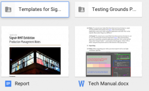
Initially we worked with the tech team to organize the technical requirements including templates, these were used as a base format for everyone to insert their films and footage so the size and shape of their work would suit the elongated, horizontal format in which Signal projects the work. Formats and saving and exporting requirements were also communicated to the class to ensure everyone’s work was consistent and could be easily edited together and compatible with the technology at Signal. The tech team was responsible for collecting everyone’s work on an external hard drive which we then compiled and curated an order for, for the Signal exhibition footage.
We then worked with the PR team to ensure a Facebook event was created, as well as various flyers and posters to promote the event appropriately, these had to be approved by Signal. We had promotional posters which were pinned up and handed out at various locations. Booklets with portraits of each student, thumbnails of their work and a blurb summing up the art, there were primarily for people who attended the opening in order to inform them about what they were viewing. A website was also set up with this information as well as other information from the Specific to Site course, this is to be used to promote the Signal exhibition as well as inform interested participants and possible future students about the course. I assisted with some of the editing of the website by compiling thumbnails of students work and inserting them into a webpage. The PR team also organized for the event details to be broadcast over the Uni radio.
We worked with the documentation team to organize the documenting of the exhibition process, this documentation was then to be edited by the editing team in order to present at the media night. The documentation team took photos of each student to be used for the portraits on the website and booklet. This team also collected various pieces of students work in order to compile a trailer for Signal, this was posted on Facebook for public viewing. This work was also used on exhibition night to present to other students as a demonstration of our work through out the semester. This team also produced a PowerPoint as visual stimuli to run in the background through out the speech summing up the course.
Lastly we worked with the instillation team who was responsible for collecting material for the media night and organizing a means of presenting it. We fed them details of exhibition times, room location and layout and the various facilities available to present our work. Their role was to collect extra essential material and curate, which works would be on which screens e.c.t
Communication was a vital part of the production manager role. I set up various Facebook messages for each group in order for them to keep in contact with each other and update me about their progress. As well as keeping in contact with the other students Nicolette and I also had to conduct various conversations with the staff at Signal to coordinate flyers, posters and other promotional material. This material had to be approved by Signal and various requirements had to be met including the incorporation of the Signal logo at a certain size and the use of the city of Melbourne logo, which also had to meet various size and location requirements. Contact was also made with Brian involving information regarding the media exhibition night such as times, locations, facilities and layout restrictions. These had to be communicated to the instillation team in order for them to organize the exhibition night.
Extra promotion Nicolette and I tried to organize included sponsorship by various companies who may have been willing to provide discounted products in order to draw crowds to the Signal exhibition. Unfortunately this proved to be too costly. We also tried to organize food and drinks to be available on opening night on order to create the essence of an official event. Unfortunately alcohol was prohibited as Signal is part of City Of Melbourne. Food was also going to be difficult to co ordinate because it required staff presence and monitoring which again proved too costly. Instead we settled for a casual opening which consisted of a brief speech and dinner and drinks afterwards at a near by bar.
Other challenges throughout the process included communication challenges. Some groups were constantly available, willing to take on extra work to ensure a smooth exhibition and create the best possible opening event. Others were hard to get in contact with, they didn’t respond to messages, Facebook posts and emails and were not willing to pick up the slack. This left roles unfairly divided with some taking on allot and others taking on minimal work. Many team members took initiative to come up with their own ideas and input their own creative influences, others struggled to show initiative and take control and responsibility of their roles. There were also communication issues when communicating with teams and Signal, when various people are involved in the same job we were often receiving different and contradictory information from different sources which made the process confusing.
The importance of leadership. The production team was required to delegate tasks and divide up roles. We had to show responsibility and initiative and ensure everyone was on top of their tasks. We had to be available for communication and assistance when groups were unclear with what they were doing or how it slotted in with other teams work. Especially we had to unite the different groups and bring everything together
As a part of Specific to site I have learned the importance of connecting your environment with your work. Art can be particularly effective when it is specifically designed for a unique art space and alternative way or presentation such as Signal or Testing Grounds.Quality is essential when presenting art and a simplistic piece that is executed well can be far more effective then a lo fi piece with lots going on that has all been thrown together without thought or consideration. It is important to connect your work with other elements of your life. The process of reflection can give you new insights to your work. Reading articles and observing your surroundings and then connecting these to your work can stimulate new thought processes and cause your work to evolve and adapt into art that is more likely to be engaging and intriguing to audiences.
Project 4 Reflection
The Journey is a piece that focuses on transportation, in particular trains. It is a multidimensional piece containing different size trains, running in different directions. I wanted to focus on the different layers within transport systems visually as well as literally. The intricate connections within the transport system help maintain a sense of flow and movement within the city. I view my work as a microscopic demonstration of the interconnections on a larger scale. My piece is a zoomed in view of the links and lines formed through this system. I find it fascinating to visualize the city from a birds eye view and imagine all the intricacies of each bus, tram and train, all travelling simultaneously and crossing over at pinpointed locations. Everything is timed and scheduled and if 1 minute thing goes wrong it can throw off the whole balance and hinder the system. At its best, the system runs like clockwork, a series of cogs and mechanisms that work in unity to maintain a solid and consistent flowing motion.
I was highly influenced by the architectural concept by On Sou Fujimoto that we discussed earlier in the year. This looks at the relationship between the human body and the structure of cities. It highlights the relationship between the 2 seemingly unrelated things such as the way that traffic flow is similar to the circulation of blood in our body or the way that buildings are composed to create space and energy and allot the city to breathe much like the functions of human lungs. In a way everything that has structure, flow and motion will have some sort of a circular system to it. E.g cogs in a clock, chains on a bike, the motor in a computer or engine in a car. “We raise blinds and lower shutters as we do eyelids, animating the house like a secondary body, ensconcing or rejecting light into our spaces.” Man made creations such as the public transport system often subconsciously stem from our understanding of our own body.
Each day there are different carriages transporting masses of people to different locations. People are simultaneously living their lives side by side but may be unknown to each other and never come across one another again. Most trains take on the same form, shape, size and colour but each train has its individual purpose. Each one is suited to a specific group of people, living within a defined geographic region. I wanted my work to communicate the urban, metropolitan environment so unique to Melbourne. Transport is an essential part of our modern and innovative city.
In my readings I looked at the concept of ‘reflection’, by mirroring, overlapping and repeating these visuals of train I wanted to highlight their true importance in the daily lives of civilians as well as tourists. I also looked at reflection as a personal and soulful process of rediscovering history and pondering the ways in which our past can affect the future. Travelling on public transport often provides an opportunity for individuals to undertake a reflection process. This can be a very nostalgic. When we are forced to spend time alone it gives us the space and freedom to think. On the train we look out the window and watch the world pass by, simultaneously we see our lives flashing by. We get lost in thought before we are snapped back into the present by the passing of an unusually close tree or electricity pole.
Reflection is also my way of mirroring and repetition the audiences environment within my work. The location of Signal is metropolitan and is right next to Flinders Station, the heart of the train stations. Many viewers will have just walked past the station or travelled to Signal Via train. When watching my work audiences may still be able to hear the sound of trains in the background. I wanted audiences to be able to draw links between my work and their surroundings in order to evoke an essence of familiarity and conjure up a sense of de ja vu.
I edited my piece to have trains running simultaneously, overlapping and running in layers, similarly to the way the run in real life, especially at busy train stations like Flinders Street. I wanted them to consume the foreground, mid ground and background to communicate this layering. I also chose to focus on movement with my editing, I moved my images from one side of the screen to another. I had them clashing and experimented with the linear movement of the trains.
When editing my sound for Signal I wanted to maintain the focus on transport but switched my attention from trains to walking. This initial method of transport can be very therapeutic and grounding. It brings you back to the hear and now and can strengthen the ties between an individual and their environment. I overlapped the sound of various shoes walking on various surfaces. I recorded heels walking on wooden floors, runners walking on a gravel path, canvas shoes on concrete, thongs on grass and boots on dried leaves and twigs. You can tell allot about a person by these sounds, are they busy/laid back, formal/casual, adventurous/reserved? Listening to the alteration in pace and tempo can give you an insight to someone’s destination and what their day to day life might be like. One of the first things an actor does to get into character is to take on the walk. Do they walk on the balls of their feet or sink into their heels, stand up straight or slouch and scuff their feet, walk pigeon toed or with their feet facing out, do they lead with their head, hips or feet? Observing these things can be key to gaining an understanding of someone’s personality.
TELEVISION, MEMORY AND NOSTALGIA
Amy Holdsworth Print Pub Date: August 2011 Online Date: October 2011
Media & Culture Collection 2012, Series: Palgrave Macmillan Memory Studies
http://www.dezeen.com/tag/sou-fujimoto/


