STYLE

A film’s style, a director’s style, or even a movement’s style provide the viewer with a plenitude of analytical content and once you latch on to these patterns, a new world of cinema can be unraveled. A film’s style in particular as posited by Bordwell and Thompson refers to the distinctive pattern of techniques we find in a film–may they be choices in mise-en-scene, cinematography, editing or sound–and relates to their overall organisation with in the filmic form. Scorsese hones a very unique style, one replicated in part by many contemporary directors today (David O. Russell, Paul Thomas Anderson) exemplifying the quality and importance of his stylistic influence.

A common Scorsese trait is to tend to the story of a single, desperate character, burgeoning on the edges of a certain social group, and to track the intricacies of their movements; usually following them up as they rise (sometimes literally) through the ranks and always following them down as they descend into the pit of madness they themselves curated and their exile from their chosen (sometimes the greater) society. As acclaimed Aussie film critic David Stratton writes “There’s so much information stored inside him it’s as though he’s bursting at the seams; he talks in a rapid-fire style as though he doesn’t have enough time to describe everything he knows. He’s like a character in a 1930s movie.” Such personal characteristics are directly channeled into the style of his films; their crammed nature and extended runtimes are simply homes for the plethora of information and detail Scorsese feels the need he has to convey.

The Sounds of Silence

Sound–the underappreciated little brother of video, of image. Just yesterday I helped a friend out on his short film, a situation where I was in control of sound recording, and I’ve since come around (in combination with another interview project I completed for class) to the importance of the medium. It’s a fidgety, delicate element of cinema and one that requires the greatest of care–as anyone who’s worked on anything surrounding it is sure to know.

As a Robert Altman devotee, I can speak for the value of the medium; Altman was renowned for his accomplishments in sound in cinema, producing a multitrack recording technique which presented overlapping dialogue from his multiple actors, wholly emphasising a balance between style and realism in the sonic area. It wasn’t uncommon in an Altman production for all actors on set to be hooked up to a mic, and many never knew whether they were being recorded or not.

A small note from Bordwell and Thompson’s reading this week struck me as particularly interesting, something I had possibly noticed in passing when watching big action blockbuster films: “Most contemporary sound mixers drop in about a half-second of silence just before explosions and other loud noises.” It seems like a deathly obvious thing but its ingenious power can truly be felt in films like Fury Road or Blackhat.

Vivre sa vie‘s sound strikes a balance between naturalistic (dialogue, environmental sound–many French New Waves catered to this style) and highly artificial (scoring), and this contrast has only left me wanting to follow Godard’s works only more.

My body is an ugly masterpiece that lives off the beauty of sound.” – Chad Sugg

beginning: NAR, middle: RAT, end: IVE

What a wonderful, diverse world we live in; storytelling is an ancient art, and the platforms that are available to us today posit some of the most exciting and grand possibilities in the universe of narrative. Film, put bluntly, is my obvious favourite of these, and when a story is told with the most perfect of graphic and sonic accompaniment the results are nothing short of fireworks. Personal favourites of mine tend to adopt a understated or simplistic approach to narrative, but a great portion of my list does delve into the depths of storytelling. Other favourite narrative characteristics include: a consuming sense of ambiguity (and especially in the ending) [eg. The Lobster], lead characters who are loners or introverts and have been discarded or dismissed by the greater society at hand (eg. Taxi DriverDead Man), a holistic approach to universe and in turn narrative form (eg. The Tree of Life), anything remotely regarding the space opera likings of Star Wars, characters with underlying voyeuristic tendencies (eg. a large portion of Brian De Palma’s works) and especially naturalistic, verisimilitudinous French dramas (eg. Éric Rohmer’s body of work).

Upon my initial viewing, this week’s film, Mystery Road, left me wondering why the course coordinators specifically chose this film to represent the narrative week; but after further discussion in class I had come around to it, and Australian film as a whole. The notion of a sequel being released in a few months eased my dissatisfaction with the major plot points left blowing in the wind at the film’s conclusion (the final shootout’s authenticity and volatility definitely aided my enjoyment). But from what I saw, it’s the people that are the monsters, not the dogs.

Director of Photography?

Brian De Palma is a cinematographic gem; his works exert a vivid visual tour de force, capturing the true essence of cinema with every possible trick in the book. In a scene from his forgotten masterpiece Phantom of the Paradise (1974), De Palma pieces together a multitude cinematographic technique in a single (or double, due to his proficient use of split-screen) flowing take. The entirely of the shot (which focuses on a rehearsal by the film’s leading antagonistic band, The Juicy Fruits) poses itself as a tracking shot, following a car as it traverses backstage in one frame, and the band’s musical practice in the other. As it begins it centres on a long establishing shot, eventually alternating between long shots (focusing on dialogue between two or so characters) and concluding with quick a pan/zoom–from the car on which The Juicy Fruits are congregating, to a medium long shot of the Phantom, and eventuating in a close up of Swan, the film’s antagonist.

In this the frame is perpetually mobile, providing the viewer with a continuous look into the actions of the unsuspecting victims as the Phantom leads his opposition into oblivion. In the space of just 3 minutes, De Palma manufactures a wholly cinematic scene, utilising the camera to its full mobile extent and with it a lather of creeping tension. While De Palma tends to make his cinematographic choices as obvious as possible, opting for the artificial rather than the naturalistic, other directors, such as Zodiac‘s (2007) David Fincher who designs his clean visual style around the nuances of camerawork, see cinematography as the key to a film’s heart. Fincher is infamous for his perfectionist nature, known to force actors to reshoot a scene an insane amount of times (98 for a 6 minute sequence in The Social Network (2010)); stressing the importance of cinematography in its involvement with the overall film form (that, or his actors really just suck).

MEEZ-AHN-SEHN

In the cinematic world, a setting, an outfit or the colour of a light can exist itself as a character within a film. The city of San Francisco bleeds through every visceral frame of David Fincher’s Zodiac (2007) just as the three respective European locations in which the films of Richard Linklater’s Before trilogy (1995-2013) [Vienna, Paris, Peloponnese] breathe life into the conversations and happenings between its two leads, giving birth to crucial context in which the film’s events unfold. Through these location choices (with a little help from Linklater’s inspired direction), dialogue is given room to flow within each location, representing a different chapter of the character’s lives, with each portion a unique (yet undoubtedly European) look and mood, natural and authentic. On the opposite end of the spectrum we are given an auteur like Wes Anderson, who is famously (or infamously, depending on your taste and tolerance for aesthetics) known for his artificial and manufactured settings, often opting for custom purpose-built sets, stop-motion animation and miniatures (many exteriors in The Grand Budapest Hotel (2014) are minis).

R.W. Fassbinder’s haunting The Bitter Tears of Petra von Kant (1972) exposes the beauty of mise-en-scene in every frame; the entirety of the film’s 2 hour duration is spent closed in the bedroom of one Petra von Kant, no action taking place any further than a few metres from her bed (again, setting existing as its own character). As the tale progresses, Petra’s reliance on make-up to cover the insecurities and shortcomings of her highly stylized and material life is attended to heavily, with the change of a wig and switch of an outfit defining each five parts of the narrative. Here, Fassbinder exerts complete control over his actresses (all female cast!), Petra herself receding from a drunken buffoon into an unaccustomed reserved nature by the film’s conclusion. The Bitter Tears of Petra von Kant also exists as a perfect how to guide of the technique of blocking; the emotional frailty of characters’ woefully defined by their steps, their overlapping bodies as they slump side by side on the edge of a bed.

Form (or the use of expectations and its ability to engender meaning)

Debuting in the heart of the 90s, Todd Haynes’ Safe (1995) stunned critics and audiences alike, findings its eventual place in film history after being voted the best film of the 1990s in the 1999 Village Voice film poll. On the outside, Safe may appear simply a drama, elevated by Julianne Moore’s phenomenal (and breakthrough) performance, but within, thanks to the meticulously expressive hand of Todd Haynes, the film operates on multiple levels. Stretching its metaphorical meanings from a methodical allegory for the AIDS crisis in the 80s to acting as the cinematic definition of the feeling of anxiety, Safe is bursting at the seams with symptomatic meaning.

Through the gracefulness of Hayne’s creative talent the film is able to convey these themes and ideas without appearing as preachy or overbearing. Haynes reserves an exuberance of explicit meaning and opts for simplicity and subtlety to drive the core message to viewers. With this he achieves (at least by my definition) narrative perfection; the ability to craft a gripping and investing story while lacing it with poignant social commentary which bleeds from every frame.

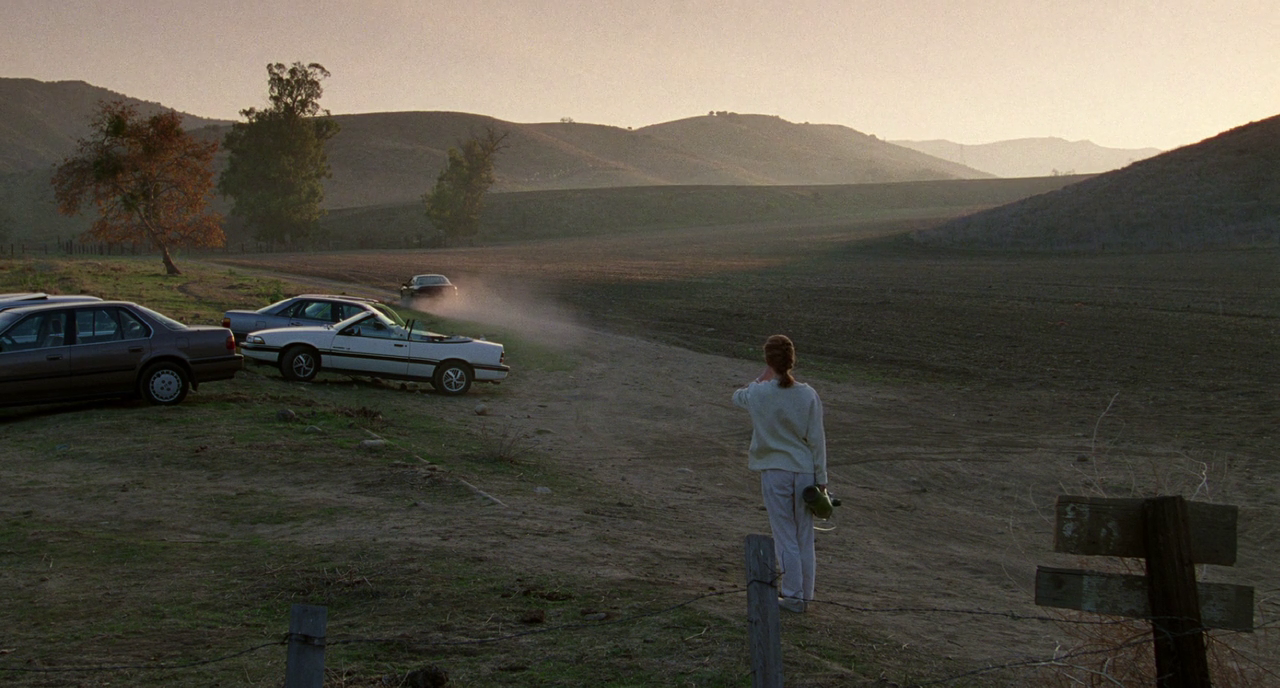
It’s easy to tell Haynes put his heart and soul into this feature, composing each and every shot for maximum emotional reach, aesthetic beauty and symbolic prowess; he frames Moore (as Carol before Carol) in ways that act as an extension of her isolation within her materialistic lifestyle, working in complete control of every facet of the frame. Moore is shown endlessly trapped within the confines of her designer San Fernando villa, shot hovering on the peripheries (even in her own garden, Haynes positions her lost amongst her own jungle, a slow zoom out wholly encapsulating these emotions). Sound design here also plays an enormous part in capturing the ambiguities of Carol’s disease, the perpetual whir of electricity detailing her deterioration and superimposing the sound of silence during the film’s brooding first act. Thematically, Safe (to me at least) defines the feeling of anxiety; the hopelessness of an explanation and an understanding from others which is epitomised by Carol’s final relocation to Wrenwood, and to a greater extent, the enigmatic Lester (pictured on the poster).

Safe remains inexplicably ambiguous. Audiences formal expectations are toyed with even from the film’s theatrical release poster. Contrasting the insanely polished look and feel of the film with a gritty, and in many ways trashy (colour balance is off, text is scattered and raw), poster, Haynes and co. attempt to mask the film’s prejudices. If you saw that poster and said you expected a first-class drama run solely by Julianne Moore which pokes hints as self-help culture and speaks volume and the materialistic state of Western society, you’d be lying.

EXPERiMENTAL FiLM

If anything, this reading (Experimental Film) reminded me of how badly I need to watch Koyaanisqatsi.

Experimental film is something of a delight to filmmakers, built upon a certain freedom of expression unobtainable in traditional cinema. Modern auteurs such as Terrence Malick have taken strides in uncovering the potential of the experimental and been able to express the most omnipresent of emotions and ideas within a single 2 hour period; from the universal scope of The Tree of Life (2011) to a more personal and contemplative To The Wonder (2013), Malick presents his films with little to no real dialogue, an unforgiving and undoubtedly poetic visual journey which truly explores the heart of cinema itself.

As suggested in the reading, experimental films can sometimes be misconstrued by a wider, public audience. Some more so based on their accessibility to the mainstream audience and others finding condemnation by those unwilling to take the works at anything more than face value. Terrence Malick’s latest (masterpiece) Knight of Cups (2015) currently holds a 43% on Rotten Tomatoes (take it as you will), yet it sits among the highest rated films on RogerEbert.com (when I saw this film at the cinema, 8 people in a room of maybe 15 walked out. I have never had this happen before).

Similarly, Harmony Korine’s recent avant-garde crime drama Spring Breakers (2013) received polarising reviews on release. Opting for a more mood-driven free-form narrative than the traditional film, and starring Disney cover girls Selena Gomez and Vanessa Hudgens, the film was quickly and controversially dismissed as sexist and as reinforcement for rape culture; on the other side of the argument, many critics saw the film as feminist and empowering for females. As Rolling Stone brilliantly asserts, the film enforces “a kind of girl-power camaraderie that could almost be called feminist”, linked to Korine’s determination to “do the most radical work, but put it out in the most commercial way (…) to infiltrate the mainstream”.

In many ways, the film’s criticism is ironic; a film satirising the superficiality of modern society and today’s generation’s obsession with “highly stylised pop culture media” is dismissed as superficial and attacked for presenting itself as “highly stylised pop culture media”. We can take this as a sign that experimental film is not for everyone, failing to find a home in the hearts of the mainstream audience; but more importantly, experimental film’s powerful effect on those who can come to appreciate its place in the cinematic landscape, its ability to inspire and mesmerise the few who choose to follow its radical and unorthodox methods.