Movies I watched this week – 18/03/16

Week #2 babyyyyyyy. Quite a heavy week in retrospect.


There Will Be Blood (2007) dir. Paul Thomas Anderson
12/03/16

The final step in my efforts to complete PTA’s filmography; not exactly a let down as such, but definitely my least favourite of his works, simply because of how painstakingly engaging they all are. Daniel Day Lewis’ career is not something I have followed in the past but by god does he prove his worth here. Truly a grueling and committed performance. TWBB‘s first half is without a doubt its highlight. Heartaches like this don’t usually come in the first ~20 minutes unless you’re watching something like Up, but from the get-go the film exists to force Daniel Plainview’s pure and undying ambition onto you. With Radiohead’s Jonny Greenwood scoring, TWBB excels in all areas audio, infectious symphonic strings bathe the Southern Californian plains. Haunting, but less inspired than the remainder of PTA’s catalogue. ★★★★

Don’t Go In The Woods (1981) dir. James Brynan
13/03/16

Watched in light of the Video Nasties phenomenon/discussion in my Pop Culture in Everyday Life course. My friend and I have dedicated ourselves to completing the list (the only previous entry I have seen is The Evil Dead), so we selected 4 from the list and began the challenge. Enveloped by poor acting, dialogue, editing, pacing and just about everything else under the sun, Don’t Go In The Woods is purely laughable. Ridiculous to the point of hysterics and confusing in terms of all character motives. The Room of slasher films. You’ll never guess where they went. ★

The Burning (1981) dir. Tony Maylam
13/03/16

Part 2 of Ye ol Video Nasties. Pretty much a better Friday the 13th than Friday the 13th. Joyous to see Jason Alexander in his first acting role. ★★★

Anthropophagus (1980) dir. Joe D’Amato
13/03/16

Part 3: if you don’t enjoy gore, chances are you won’t enjoy the climax of Anthropophagus. There’s morbid, and then there’s Joe D’Amato. ★★

The House by the Cemetery (1981) dir. Lucio Fulchi
13/03/16

Part 4, possibly the only one with any decent artistic merit (The Burning maybe), but here, Fulchi embraces the horror genre. He is the zoom master. Stunningly shot. ★★★½

The Graduate (1967) dir. Mike Nicols
14/03/16
rewatch

What is there to be said about The Graduate that hasn’t already been said? A friend likened this to the works of Antonioni and I couldn’t agree more; inward emotion expressed outwards through the environment. ♪ In restless dreams I walked alone ♪  ★★★★★

Ballet Mécanique (1924) dir. Fernand Léger, Dudley Murphy
15/03/16

A experiment on the coexistence of man and machine, the organic versus the mechanic not in rivalry but in contrast. Here, we begin to see the human body as a machine in itself, each limb working as a cog in an instrument. The scoring shares similarities to Death Grips.

The Dante Quartet (1987) dir. Stan Brakhage
15/03/16

La Jetée (1962) dir. Chris Marker
15/03/16

The Illustrated Auschwitz (1992) dir. Jackie Farkas
15/03/16

We Have Decided Not to Die (2004) dir. Daniel Askill
15/03/16

Un Chien Andalou (1929) dir. Luis Buñuel
15/03/16

Double Indemnity (1944) dir. Billy Wilder
16/03/16

Is it just me or do all close-ups of Barbara Stanwyck seem to glow? ★★★★½

The Strange Love of Martha Ivers (1946) dir. Lewis Milestone
16/03/16

Viewed in glorious 35mm. An utterly absurd tale from beginning to end. A young Kirk Douglas shines. Anyone have any statistics surrounding the number of lung cancer patients in the US in the 1940s? ★★★★

Mulholland Drive (2001) dir. David Lynch
17/03/16
rewatch

Viewed in glorious 35mm. The ending has never scared me this much until now. Goosebumps. ★★★★½

Week #3 Reading – Remaking Media and the ‘now’

I feel as if I need to email this to the people who ran my media class in high school, they could learn a little something something from these writings. In particular, Gauntlett’s citations from anthropologist Tim Ingold strikes me as essential:

→ “it’s about learning with media, rather than learning about media”

To put it simply, the subject of media was not run particularly well at my school, which could be attributed to a range of problems. Deemed school-wide as the bludge subject, classes were often packed with students looking for some free time (an excuse to play game on their laptops) or an easy workload (extensions were given out at a consistent rate). Teachers possessed a distinct lack of authority in the class (in year 10 we had our own fight room in the back (see embedded), and once centered a whole class around our own stand-up comedy show) and struggled to engage the class in all possible areas.

FIGHT SELFIE

A photo posted by Sam Harris (@samuelharris) on

I once got 90% for an assignment I didn’t submit. The end of year exam in year 11 had a crossword on the back for students who finished early, and at that, the crossword didn’t have even half the words in it that you had to find. I dropped the subject the following year. But I suppose in a way it wasn’t entirely the teachers’ fault. The content of the course was tedious, usually a single OneNote page distributed by an illiterate email, more often than not a fill-in-the-blanks surrounding media techniques (media techniques, alwaaaays media techniques), never a proper engagement with ‘media’ itself, and when it came to the practical application of anything learnt in the class the level of creativity from the majority of students (bludgers) was substandard (though when the few students actually did good, they did really good). The subject itself fought valiantly to stay relevant but in the end never attempted to change with the continually changing landscape, and ended up drowning in its own mess.

Gaunlett’s Introduction (first reading) comes to me as kind of vague (a problem that would likely be overcome by actually reading his book) but he seems to be saying a lot and doing not much, big concepts, little coherence. My lack of understanding in a way may also come from the fact that I still haven’t fully grasped the idea of what media is. So far to me it seems to be whatever people want it to be, lacking a sense of clarity in not so much a single definition, but a general sense of direction. There seems to be a lot of “think of media as this” or “don’t think of media as that” and I’m beginning to feel overwhelmed.

Here, his ideas about the “twin peaks” stand out as key info; one attending to the inspiration and optimism of everyday creativity (the constant sharing of images, thoughts, arguments on social media; a platform created to encourage us to express ourselves), while the other focuses on the troublesome and pessimistic nature of data exploitation and the idea of “computerised capitalism” (it’s not hard to see what he means by this, a quick google search on metadata in Australia will get you well on your way to understanding). But Gauntlett is less concerned with the idea of them competing against one another and more concentrated on their coexistence. To perfectly summarise, he attempts an analogy: “with the necessary skills, you can make some effective weapons out of wood, and maybe you even live in a society where the use of wooden weapons is enjoying a resurgence, and some people have been seriously injured; but these observations could not be used to prove that trees are a bad thing“.  The two peaks are situated side by side.

In the second reading, “What kinds of knowledge do we need now?”, Gauntlett attempts to lay down concrete theory by providing a series of steps surrounding the important kinds of knowledge in understanding media today:

“→ How things work (technical and economic knowledge)
→ How things feel and fit (emotional and embodied knowledge)
→ How to make a difference (creative and political knowledge)”

or put simply: know your limits → know your surroundings → allow yourself to be creative.

I guess what I’m trying to say is I wish my high school media course was anything like this course now, more interested in the current state of the media industry, focused on its evolution and the idea of learning with media rather than just about. A proper commitment to the material at hand. This is the first step to a more holistic knowledge.

(also funny to see how ashamed Gauntlett seemed to appear about having his computer asking him questions, as if he realised his mistake but thought it too late to change anything).

EXPERiMENTAL FiLM

If anything, this reading (Experimental Film) reminded me of how badly I need to watch Koyaanisqatsi.

Experimental film is something of a delight to filmmakers, built upon a certain freedom of expression unobtainable in traditional cinema. Modern auteurs such as Terrence Malick have taken strides in uncovering the potential of the experimental and been able to express the most omnipresent of emotions and ideas within a single 2 hour period; from the universal scope of The Tree of Life (2011) to a more personal and contemplative To The Wonder (2013), Malick presents his films with little to no real dialogue, an unforgiving and undoubtedly poetic visual journey which truly explores the heart of cinema itself.

As suggested in the reading, experimental films can sometimes be misconstrued by a wider, public audience. Some more so based on their accessibility to the mainstream audience and others finding condemnation by those unwilling to take the works at anything more than face value. Terrence Malick’s latest (masterpiece) Knight of Cups (2015) currently holds a 43% on Rotten Tomatoes (take it as you will), yet it sits among the highest rated films on RogerEbert.com (when I saw this film at the cinema, 8 people in a room of maybe 15 walked out. I have never had this happen before).

Similarly, Harmony Korine’s recent avant-garde crime drama Spring Breakers (2013) received polarising reviews on release. Opting for a more mood-driven free-form narrative than the traditional film, and starring Disney cover girls Selena Gomez and Vanessa Hudgens, the film was quickly and controversially dismissed as sexist and as reinforcement for rape culture; on the other side of the argument, many critics saw the film as feminist and empowering for females. As Rolling Stone brilliantly asserts, the film enforces “a kind of girl-power camaraderie that could almost be called feminist”, linked to Korine’s determination to “do the most radical work, but put it out in the most commercial way (…) to infiltrate the mainstream”.

In many ways, the film’s criticism is ironic; a film satirising the superficiality of modern society and today’s generation’s obsession with “highly stylised pop culture media” is dismissed as superficial and attacked for presenting itself as “highly stylised pop culture media”. We can take this as a sign that experimental film is not for everyone, failing to find a home in the hearts of the mainstream audience; but more importantly, experimental film’s powerful effect on those who can come to appreciate its place in the cinematic landscape, its ability to inspire and mesmerise the few who choose to follow its radical and unorthodox methods.

Week #2 Lectorial & Experimental Film: Editing

edit

verb

  • to choose material for and arrange it to form a coherent whole
  • to expunge; eliminate
  • to prepare by deleting, arranging, and splicing, by synchronizing the sound record with the film, etc.

Editing is one of the most underrated techniques in the world. While watching a film most people fail to properly acknowledge the beauty of the edit. If you walked out of the theatre and quizzed your friends on their favourite aspect of the film, how many do you think would pick editing as a highlight? Much of this arises from the fact that the majority films these days are generally edited coherently, ensuring basic temporal and spatial continuity–and it figures, editing is so frequent and camouflaged that it becomes hard to notice it, let alone grade it. Some will say that good editing is editing you don’t notice at all, and other citations range from “Movies become art after editing“, and “The film is made in the editing room“. So in order to fully appreciate the edit it’s necessary to take it back a step (or in this instance step all the way to the opposite end of the spectrum) and look at bad editing: the infamous basketball scene from Catwoman (2004).

It doesn’t help that the scene is deeply cringeworthy at a base level (how you gonna do that in front of those kids, Catwoman?); the sporadic and haphazard editing only makes the scene incomprehensible and, in many ways, unwatchable. What could have been achieved in less than 20 cuts is done in ~130 of the most purposeless and ugly shots of the 21st century. The cuts hold no weight and bear no tension, lifelessin comparison to the masterworks of a Leone or Kurosawa. Catwoman itself was a disaster, so its incoherence can’t be entirely blamed on the editors (Halle Berry later blamed Warner Brothers: “Thank you for putting me in a piece of shit, god-awful movie… It was just what my career needed.“), but when the job is put in the right hands, the results can be electrifying.

As touched on by Jeremy Bowtell in the week #2 lecture, editing is as much about the ‘spaces between‘ as it is about juxtaposition and the combining of parts to create new meaning. Film editor Walter Murch (2005) [whose credits include Apocalypse NowThe Godfather: Part III and Jarhead] argues not only that ‘the cut [should] reflect what the editor believes the audience should be feeling‘ at a certain moment, but should ‘advance the story‘ and ‘occur at a moment that is rhythmically interesting‘. So when these suggestions are applied to a film like Catwoman, where does it rank? If random and volatile zooms and cuts are your thing, then obviously you’re in heaven, but to the average person the frequency and meaninglessness of the editing is jarring. Sometimes it’s beneficial to keep things simple.

A film like La Jetée (1962) relies heavily on editing; its existence is central to its use of, and with these restrictions Marker succeeds in creating something wholly unique and wonderfully spellbinding. An album of b&w photographs, a few simple cuts and a little help from an insightful narrator is all it takes to build a world from the ground up. A scene doesn’t have to be a violent flurry of transitions, like in Catwoman, but more a methodical and structured arrangement of shots, like in the scene below: Sergio Leone’s The Good, The Bad and The Ugly (1966).

Morricone’s scoring here also plays an enormous part in the creation of tension between the three central characters (a touch easier on the ears than Mis-Teeq’s Scandalous) but at its simplest it remains one of the most sweaty-hand producing scenes ever put to screen, achieved in half the amount of shots in Catwoman‘s basketball scene and with a 100% higher success rate. A true emotional high.

Here, less is more, but excess isn’t always detrimental. Take the stairway shootout from Brian De Palma’s The Untouchables (1987) as the perfect example:

Utterly absurd but undeniably engaging; a true nail-biter. De Palma’s trademark slo-mo (and intimate focus on set pieces) elevates a basic gunfight into a gritty, edge-of-your-seat extravaganza complete with high-stakes pram down the stairs action (coincidentally also scored by Morricone). All in all, there is no one perfect way to edit. Much of the style depends on context, genre and overall meaning, the emotions attempting to be conveyed or the tension attempting to be exuded. The beauty of the edit is something to be appreciated, no matter how many times it involves Halle Berry groping a man on the court.

The Wizard of Oz & In Bruges: The Modern Fairytale

In many ways, the use of colour in The Wizard of Oz (1939) is its greatest achievement. From the grounded, sepia tones of Kansas in late 1930s America to the glistening glory of the Technicolour dreamscape which stretches beyond Oz’s furthest reaches, Fleming’s decision to paint the opposing locations’ respective landscapes in such drastic contrast in one way or another defines both the film’s success and reputation. In a world where the use of colour in film is taken for granted and is often employed without inspiration (see Man of Steel, majority of the MCU catalogue), Oz’s commitment to expanding the representation of colour and portraying it as an object of desire in a time when black and white film stock rule can only be seen as revolutionary.

In looking to escape the tedium of agricultural life and the economic disruption of America’s Great Depression, Dorothy (Judy Garland) turns her desires inwards and finds within herself a livelier environment: the spectacle of Oz, the ultimate wonderland, vibrant in every observable aspect, achievable only through the use of Technicolour (Dorothy’s slippers were adjusted from silver to ruby to take full advantage of the vivid process). Additionally, the studio’s employment of the cartoonish visual style present in Oz adds to the location’s idealistic appearance; for Dorothy, Oz is a utopian dreamland envisioned out of dissatisfaction with her immediate and muted environment and MGM’s creation of gorgeous matte paintings services this idea brilliantly.

Coincidentally, another film I watched this week which addressed similar themes was Martin McDonagh’s neo-noir crime comedy In Bruges (2008). Wherein The Wizard of Oz explicitly contrasts the idea of stark reality and escapism through fantasisation, In Bruges mixes the two notions and meets in the middle, allowing itself to source much of its humour from this balance. In many instances the film’s location, Bruges, Belgium, is referred to as a ‘fairytale town’. In a heated and crucial moment, the film’s antagonist, crime boss Harry (Ralph Fiennes), reveals the nature of one the hitmen, Ken (Brendan Gleeson)’s, next assignment via phone call: to eliminate his partner, Ray (Colin Farrell) after a botched assassination attempt. In conclusion, Harry confesses his pride in his allowing of Ray to experience the beauty of Bruges, declaring that “[he’d] like to go see Bruges again before [he] die[s]” and likening the city to a “dream”, before ending with call with “give me a call when he’s dead”. Here, the association between lightness of the idealistic ‘fairytale’ land and the grimness of the actual situation makes up much of the content which brands In Bruges both hilarious and as the modern day fairytale.

As opposed to Dorothy’s longing for escape in The Wizard of Oz, Ray’s feelings towards Bruges are quite the opposite; Ray longs to escape the proposed ‘fairytale’, at one point in the film drawn to suicide because of his actions there. Although in the 1930s, the idealised notion of fleeing to a ‘fairlytale’ land as a diversion from one’s monotonous and strenuous existence was epitomised in The Wizard of Oz, in today’s day we are aware as a society that places such as Oz do not exist. The idea of simply running away from the hardships of our given lifestyle has been debunked and we as forced as a people to come to terms with reality. Here, we are upon an age where Bruges is the new Oz. The Wizard of Oz ends with Dorothy returning to Kansas, finding herself captivated by the idea of home being the one and only place she needs: “There’s no place like home.” In Bruges defies this norm, and ends with Ray being stretchered off into an ambulance, his chest punctured with bullet wounds as he comes to terms with the fact that maybe that’s what hell is: “The entire rest of eternity spent in fucking Bruges.”

Lofi Media Self-Portrait

3x audio recordings

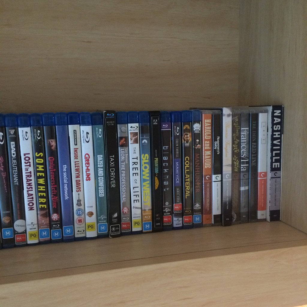
  1. blu-ray: the simple sound of me putting a disc into a player. I am very much a supporter of physical media (blu-rays, DVDs, CDs, vinyl).
  2. trambience™: a general tram ambience sound. Since moving to the city last month public transport has become central to my way of living. Always moving.
  3. typing: writing is something I enjoy doing, though sometimes you can hear the backspace key being spammed; I am also a bit of a perfectionist so more often than not writing is something I also find difficult.


3x pieces of video

cinema from Samuel Harris on Vimeo.

  1. cinema: to this day I remain a fan of going to the cinemas, an experience unmatched by any home entertainment system. Very much a film buff.

rainy day from Samuel Harris on Vimeo.

2. rainy day: my favourite kind of weather, such a emotionally strong and poignant time of day. In the same way that the video is framed, I also feel very much like an observer.

bookstore from Samuel Harris on Vimeo.

3. bookstore: Readings on Carlton is one of my most recent discoveries; a store which caters to all my interests, from film to literature. The shortness and shakiness of this video in one way or another symbolises my relationship with books, as reading is something I take pleasure in yet to have read my fair share of classics, important titles, etc.


6x photographic images

IMG_7994

  1. family: as scarcely as I openly appreciate my family, they are in many ways central to my life and identity.

IMG_6126

2. girlfriend: if mum wasn’t still washing my clothes every weekend, she would probably top the list of most important people in my life. Every moment is a joy spent with her. 

IMG_6180

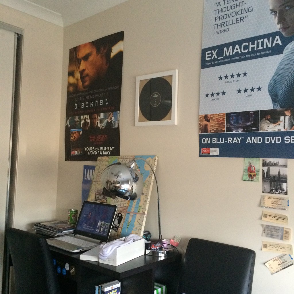
3. my melbourne room: making the move to the city was a huge step in my life, and this crammed room on the corner of Flemington Road will become my sanctuary for the next ~year. Equipped with everything of importance to me. 

IMG_6133

4. my actual room: my Melbourne setup is fairly similar to my one at home. Dressed to encapsulate my identity with material objects (blackhat and Ex Machina top 5 of 2015).

IMG_6178

5. sample of my collection: goes hand in hand with my first audio piece. Only a miniature representation of my entire collection (over 300 films, several TV show boxsets, the usual etc etc). Taxi Driver is forever my favourite, while Phantom of the Paradise/Frances Ha/The Tree of Life/Lost in Translation/Miami Vice all tie for second place.

IMG_6095

6. ‘the arts’: to be honest, I got lucky with this photo (maybe the best I’ve ever taken). Now it has the pleasure of acting as a symbol for my appreciation of the arts in all their forms.  


This task proved somewhat difficult, although in the end I am more than ok with the final result. If these 3 media components can in any way communicate an idea of my identity then this is what it’d look like.

Movies I watched this week (and a bit) – 11/03/16

In order to incentivise blog posts I have decided to detail a brief log/review of the films I’ve watched each week. Posted Fridays.


Safe (1995) dir. Todd Haynes
03/03/16
rewatch

Review written for Letterboxd:

Inexplicably ambiguous. Haynes puts his heart and soul into this feature; he frames Moore (as Carol before Carol) in ways that act as an extension of her isolation within her materialistic lifestyle, working in complete control of every facet of the frame. Moore is shown endlessly trapped within the confines of her designer San Fernando villa, shot hovering on the peripheries (even in her own garden, Haynes positions her lost amongst her own jungle, a slow zoom out wholly encapsulating these emotions). Sound design here also plays an enormous part in capturing the ambiguities of Carol’s disease, the perpetual whir of electricity detailing her deterioration and superimposing the sound of silence during the film’s brooding first act. Thematically, Safe defines the feeling of anxiety; the hopelessness of an explanation and an understanding from others epitomised by Carol’s final relocation to Wrenwood, and to a greater extent, the enigmatic Lester. This is a horror film. ★★★★½

The Suicide (1978) dir. Todd Haynes
03/03/16

Inherent Vice (2015) dir. Paul Thomas Anderson
05/03/16

Review written for Letterboxd:

“They told me I was precious cargo that couldn’t be insured because of inherent vice.”
“What’s that?”
“I don’t know.”

A trivial quest of a film, not as indecipherable as many have protested but undeniably shares many similarities with a puzzle box on first viewing. Phoenix is the most lovable, bumbling pot-head ever acquitted to the screen. Also boasts some of the funniest moments of PTA’s filmography (here, here and here to name a few). Slow zooms are crucial. ★★★★½

In Bruges (2008) dir. Martin McDonagh
07/03/16
rewatch

Almost a 21st century rendition of ‘the fairytale’; Bruges is the new Oz. ★★★★★

Holy Motors (2012) dir. Leos Carax
08/03/16

Carax’s scathing critique of the contemporary film industry is really a goldmine. More thoughts to come after well warranted rewatch next week. ★★★★½

Stella Dallas (1937) dir. King Vidor
09/03/16

It was a pleasure to witness this in all its 35mm glory, Vidor’s eye for composition in order to produce to most viable of emotional responses is a strength to be admired. Moved both a little too fast and a little too slow for my liking, Vidor clearly trying to compress as much content as possible into a 100 minute runtime that the film’s final act becomes a constant back and forth motion (while some transitions throw the delicate story years into the future without much more than a fade). All in all, Stanwyck truly is the glue that holds everything together in this truly heartfelt picture. Also features one of the most melancholic endings ever put the screen. ★★★½

The Lady Eve (1941) dir. Preston Sturges
09/03/16

Hilarious. Stanwyck again steals the show, leading an admittedly wonderful ensemble on a wild trip across the high seas. Sturges’ clearly possessed a comedic talent that was years ahead of its time. The Lady Eve is concrete proof that rom-coms aren’t simply throwaways. ★★★★½

Audit: ‘Media is Everywhere’

A short walk from campus led the group and I to Melbourne Central; both the shopping centre and train station possessed an abundance of media, a hub for all things advertisement, which in turn presented itself as an easy target for our task. Media is everywhere, especially at the one place where advertisement rules all: a shopping centre. One thing caught my attention, as much as something of the like can in a society where the commercialisation of historic landmarks is nothing far from the norm:

IMG_6147

Shot Tower Museum
Entry via R.M. Williams”

Of course, I have no idea how long this has been here, whether there are other entries, whether it is on task or even counts as ‘media’, or if it is just an overtly paranoid observation taken during a task where the aim seemed to be to critically survey the idea of advertisement media: but I viewed this flag as another example of the new integration between our regular, everyday lives and the idea of media as an ecology. An inescapable unification, one that doesn’t necessarily need to be escaped from, but is spreading in an all-encompassing manner which molds the way in which we exist as human beings in today’s day, and is expanding in a rapid and camouflaged motion.


Other things we noticed included:

UP HIGH

  • Digital billboard advertising everything from Usain Bolt (he sprinted down a running track and smashed through 3D text so my guess is he’s doing something for shoes) to the latest Samsung Galaxy Gear
  • A long, draping Myer flag (if I remember correctly it featured a model??? someone confirm)

MID-GROUND

  • Storefront advertisements in nearly every shop
    • The Nike store sported a looping video of a new pair of shoes (pictured)
    • An exuberance of sale posters
  • Many on-ground billboards featured an element of interactivity: from Fanta bubbling popping games to QR codes plastered on the frames

BACKGROUND

  • Depending on the product they were selling, or the mood they were creating many stores intensified their attention to lighting (pictured)
    • Bright white/blue LEDs for electronics stores such as Samsung and Telstra, as opposed to:
    • Warm reds for HOYTS Cinema, and:
    • Easy-to-digest, welcoming lights exhibited in most retail stores

IMG_6139IMG_6142IMG_6145

In searching for “ALL types of mediated communication including how many times you interact with your smartphone”, I also found that I slipped my beloved phone a whopping TWO times to interact with it in ways other than to snap a quick pic (both times conscious of the fact that I was committing treason against myself and my investigation). Funny pictures of dogs were observed on both accounts.

At this point I still can’t answer the question as to what media actually is, but I’m almost certain in the fact that it is everywhere.

I’m not a blogger

I’m not gonna lie, blogging is not something that I do or have done, nor is it something I have ever given much thought. Sure, I have delved into the depths of the abyss that is tumblr (who hasn’t?), but where that site is much more focused on creating an appearance based on reblogging whether it be through a regurgitation of images or small pieces of dialogue, and exists as a place where you present yourself as simply a curator of your own digital image, real(?) blogging requires your own direct input. Original ideas. Higher order thinking, where the mindlessness of scrolling and alt-clicking is a far cry. And to be honest, stretching my own ideas from single concept thoughts into paragraph long accounts frankly scares me.

But as Cal Newport so heavily reiterated in his “Follow Your Passion” is Bad Advice talk, in order to succeed one must “systematically built up a rare and valuable skill then use it as leverage”: so here I am. Here I am, at the base of ten-thousand-step tall staircase that leads (ever so eventually) to the towering pinnacle of existence known as real life, in an effort to sharpen my craft. And as Newport continues to write (or speak, whichever cognitive mode you choose to embrace), he expands on the idea of ‘The Passion Trap’, exclaiming that “the more emphasis you place on finding work you love, the more unhappy you become when you don’t love every minute of the work you have”: which to me comes a blessing, because at this point in life I don’t have that strong idea of what I want to be, or where I want to go, and in turn I guess I have avoided these disappointments (or have yet to discover them). And with this I will continue to be flexible and take it as it comes, when it comes.

On a journey to not only to “not follow my passion”, but to “be so good they can’t ignore you” too, I guess.