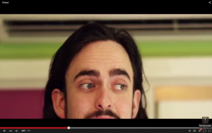
In this sketch, we wanted to see the effect of replacing well composed shots with poor framing, aiming for a comedic effect. We chose to frame the shot with Sam’s head cut in half by the bottom of the frame, meaning you can’t see his mouth as he talks. The top half of his face remains somewhat expressionless also, adding to the humour. The extra head-room looks wrong and the uncomfortable positioning of Sam draws attention to this, especially since nothing else is going on in frame apart from the dialogue.
Originally we tried shooting this so that Sam was cut in half by the side of the frame, however this didn’t have the same effect. This might be because – from experience – it seems more likely to poorly frame something vertically than horizontally, or because it cuts of entire features such as his mouth.
We also drew from the Aunty Donna sketch comedy video Cresps. This video features one poorly framed shot of a character among other perfectly framed characters, including other shots of him. This lone shot has a jarring effect, but in the context of the otherwise well framed video, it’s funny in its absurdity. He is shot in the same way we ended up shooting Sam for this sketch (see picture below).
If we were to further this idea to make it clearer, we could have used a similar technique and put this jarring shot of Sam against a well framed shot of him, with a cut away separating the two.
