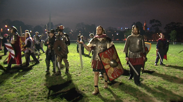
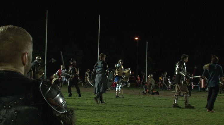
Nearly every shot of our final film had some sort of colour correction done to it. We had a lot of shots that were grainy due to a variety of things as well as colour correcting to a more cinematic aesthetic.
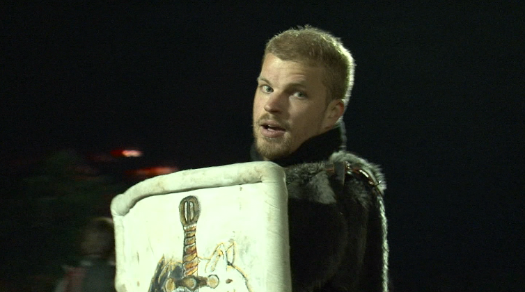 Original shot.
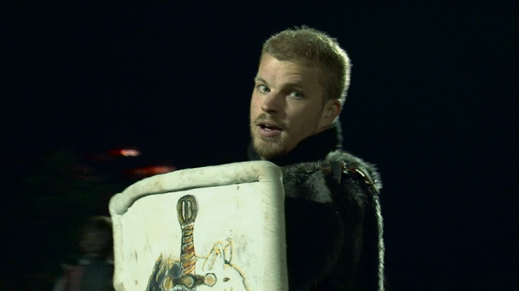 Mid-tones more blue, emphasises the shadow and makes the shot darker. Reduced output levels to darken and made highlights pinker to change colour on the face.
Fixed mid-tones to more orange, makes the image slightly brighter and more cinematic. Lowered the output and made the shadows more blue to make it a bit darker.
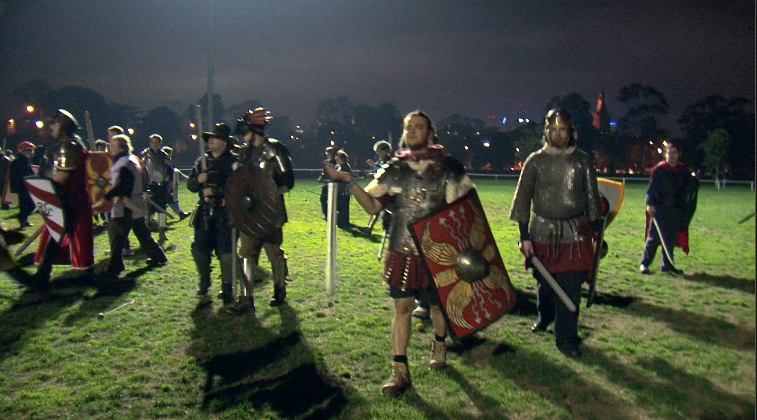 Bought down the output levels and made the highlights greener, this made the image darker. Shadows are a darker blue, contrasting the light blue mid-tones. Visually it looks more appealing and ominous.
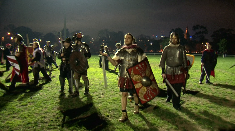 Raised the input levels to create more depth in the shadows. Midtones and highlights were made more green to make it look more vibrant, also highlights the red in the shot.
 This image appears cooler than the original by making the master a deep red for warmth in the mid-ground and green in the midtones to emphasise the grass in the foreground. More yellow/pink in the highlights makes the image look brighter.
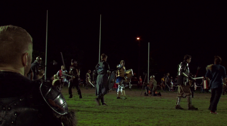
Bought the brightness to -5.7 and contrast to -0.2. We made the shadows warmer, midtones greener and highlights pinker, resulting in a warmer and somewhat sharper looking shot.


