Over the last week I have been looking at how faces are lit in films. This was brought to my attention last week in class when we were studying the concept of ‘offside’ lighting, which refers to the natural or artificial lighting setup where the ‘primary’ side of a subject’s face is cast in shadow, while the other side, the ‘offside’, is illuminated. This style of lighting creates definition in the subject’s face. When I did Photography as an elective last year, I discovered an easy way to determine the ‘primary’ side of person’s face within the frame. We looked at Steven McCurry’s infamous photograph of ‘Afghan Girl’, the iconic National Geographic cover. I was taught that the primary side of the face is the one which has the subject’s eye in focus or where the eye is centred in the frame, or the side of the face which is showing the most. Thus, in the photograph below, the primary side of the face would be the left and the illuminated offside, the right.
To get a better idea of how offside lighting worked, we conducted an experiment in class using sunlight streaming through a window to light the different sides of my face.
Since this exercise, I have been paying particular attention to the differences in the way faces are lit in contemporary films (like the ones I am constantly bombarded with at the cinema I work at) and comparing these to much older films, like the ones I have been watching for my cinema course: Histories of Film Theory. For example, almost every shot in Batman Vs. Superman: Dawn of Justice (Zack Snyder, 2016, USA) evidences offside lighting. There is an interior scene at the character Alfred’s house, that utilises natural light streaming in from floor to ceiling windows, showcasing an expansive forest background. (Unfortunately however, I cannot find a video or image of this sequence anywhere). This lighting style is similar to other recently released films such as The Hateful 8 (Quentin Taratino, 2015, USA) and Deadpool (Tim Miller, 2016, USA).
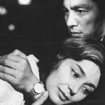
I have realised that the lighting style in older films, particularly French New Wave films, is rather different. For instance, Hiroshima Mon Amour (Alain Resnais, 1959, France) employs a soft lighting style, but the studio lights seem to face the subject’s much more directly than in contemporary films, and thus the character’s faces are illuminated more evenly. Similarly, with Vivre Sa Vie (1962, France) Jean Luc Godard lit the protagonist Nana (Anna Karina) straight-on in most scenes. This makes her face appear flatter and more two-dimensional in a way.
To be honest it is difficult to say which lighting style I prefer, because even though the earlier directors, like Resnais and Godard, created less definition in their subject’s faces, the films are so beautiful in almost every way that it doesn’t bother me at all; the lighting just fits in with the aesthetic of the overall film. Nevertheless, looking at the footage of my own experiments in class, it is clear that lighting the offside of the face creates more depth in the frame and seems to result in a much more ‘dynamic’ lighting style. Ultimately, I think there is a good reason that lighting for film has developed in such a way that offside lighting has become the norm. However, it doesn’t mean that lighting the ‘onside’ of the face is necessarily any worse, as exemplified in the iconic visuals created by French New Wave auteurs.


