Schedule and Research Question

In our first class for week 8, we looked at creating a schedule for ourselves for the rest of semester and thought about possible research questions.

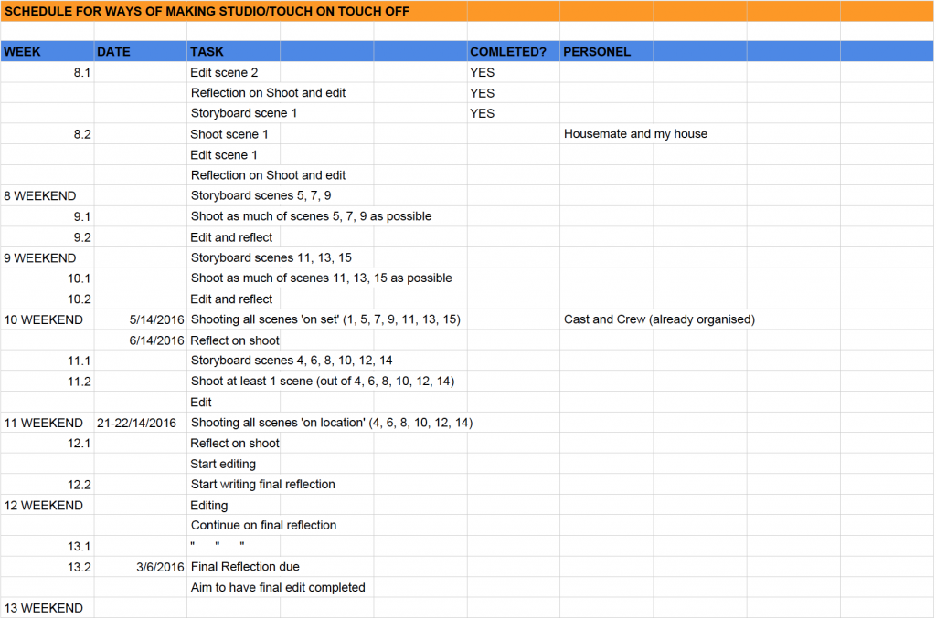
From my brainstorming I created this schedule for myself, which is incredibly daunting, because there is so much I need to do in the next couple of weeks. However, I’m just going to do try to do as much as I can, without getting too stressed and without compromising the quality of my work.

Here it is:

Screen Shot 2016-04-27 at 2.58.57 PM

My possible research questions are:

How can I best design and compose a sequence of frames for a short film?

How can I work within the limits of my role of DoP and create a short film I am proud of (even though a lot of the film production is out of my control)?

How can I create an interesting short film, in terms of cinematography/shot construction, paying particular attention to highlighting the background as well as the foreground of the frame?


First ‘test shoot’ reflection

Last weekend I did a test shoot for the short film I am DoPing, just with one of the writer/directors and the main actor. This was quite spontaneous (we thought we ought to create a trailer for our pozible campaign) and thus I hadn’t storyboarded in advance. In effect, it became an interesting process: shooting the scene organically and talking out the shot construction with the writer/director as we went. I do think we would benefit from having a storyboard with us on the day though, just to make sure we have all the shots we need.

There were a few things I realised while shooting this scene, which will help to prepare me for the ‘real deal’. First and foremost, my own tripod that I was using on the day, is far too short, it doesn’t even extend up to the main actor’s eye level. Thus, I will need to hire out a better tripod from RMIT for the proper shoot and will need to double check that the tripod will fit onto my camera. In saying this, I will most likely bring along my own tripod as well, because it is super easy to use and works well for quick/whip pans. Secondly, I almost ran out of one full camera battery after half a day of shooting, so I may need to think about sourcing another couple of batteries for the days we are shooting on location. I do have two batteries, which should be fine for the days we are shooting at a house (because I will be able to charge one while shooting with the other), but I think it would be good to have another backup battery just in case. The last issue I had was to do with focusing. We had a lot of sun on the day and we were shooting outside, so the glare did not help, but I found it particularly difficult to make sure subjects/objects were in focus purely by looking at the small digital screen on my camera. I wish I had an eye piece so I could look at the screen up close in darkness, or have a monitor setup (which is unfortunately not possible with my camera). However, I did find a slightly better alternative than looking at the digital screen, which was to change the camera setting to photography (rather than video) and look through the view-finder to focus and then swap back to the video setting. It also would’ve helped if I had brought tape with me to mark positions for the actor, as well as mark focus points on my camera’s focal rim. Nevertheless, it was all a learning process and it will help to make my shooting method better for next time.

Below is the director, Max’s edit, as well as my ‘alternate’ edit of the footage we shot. It wasn’t too hard to cut the scene because we had a good long take of the entire sequence, which we could cut back and forth from. However, I found that I couldn’t use quite a few of the shots we got because they were either breaking the ‘line’ or they felt jarring because they weren’t different enough from the shot preceding them (they were less than 45 degrees ‘apart’). I think this would be easily solved with the use of storyboards and a bit more planning. These edits would also benefit from some good quality sound recording, but unfortunately we were limited to my camera microphone on the day.

Max’s edit:

My edit:

Week 7 Presentation

For the rest of semester I am planning to do test shoots for the short film I am DoPing, which is written and directed by two people from my work. The film is called ‘Touch On/Touch Off’ and it is about a 20-something-year-old guy called George who decides not to go to work due to his negative Myki balance. Instead he chooses to go on a ‘Ferris-Bueller’-esque adventure around Melbourne, bumping into an ex partner and meeting a new ‘flame’ on the way. This light and dreamy storyline is paralleled with the storyline of his work friend, Claudia, who does actually go to work, which ends up being extremely chaotic and comedic in a slap-stick kind of style. After many angry calls from his boss, George finally manages to make it to his job. By the time he gets there the cafe has already settled down and George is feeling a new sense of enlightenment after his morning off.

One of the writer’s main wishes for this film is that it becomes something that people will want to watch more than once. So there are a few characters who turn up in the background of various scenes and little sub-plots happening behind the main point of action. This is something I will need to keep in mind when I am planning and shooting the film. A lot of shots will need to be framed as long shots, or I will need to shoot them with a wide angle lens, so that the audience can view what is going on in the background of the scene, as well as the foreground.

In terms of the logistical and technical means of shooting this film: we are shooting half of the exterior scenes on Saturday 14th May, the cafe scenes on Sunday 21st May and the rest of the exterior scenes on Sunday 22nd May. I will be using my DSLR camera and tripod, we are hiring sound recording gear and lighting (this hiring also comes with the people who will be doing our sound recording and lighting for the film), I will hire a dolly from RMIT if we need it and the props for the cafe are being organised by our two production designers. The catering for the three days of shooting, as well as some of the props and gear rental will be funded by our Pozible campaign of which we have already raised two thirds of our target and we still have 21 days left to go! We also have a producer, first AD and sound designer on board, which will make things much easier for all of us.

So, my plan from now on will be to create storyboards for every scene of the film in collaboration with the writer-directors. Every week I will choose a scene from the film to test shoot, working off the storyboards as well as doing some more improvised kind of camera work. Where possible I will try to do the test shoots at the actual location they are set in, using the actors we have already cast, but if this is not possible I will use whatever and whomever is at my disposal. The purpose of these test shoots is to make me feel comfortable shooting the scenes on the actual day, as well as giving me a feel of what shots will work best with the story. As a result of these test shoots I am hoping that the film, and more specifically the cinematography, will turn out to be something I am proud to show my family, friends and fellow peers.

Developments for Week 7’s Presentation

Unfortunately I haven’t been able to do multiple ‘developmental’ posts on what I am planning to do after week seven for this course, because I needed to sit down with the group of people I am planning to make a short film with and actually read the script and meet the cast and crew. Thus, up until this week, everything felt very up in the air, as I was not sure exactly how much I was going to be involved with the making of the film, or if it was even something I wanted to be involved with.

On Wednesday I had a meeting with Max (the writer and co-director; a graduated creative writing/script-writing student who finished at RMIT last year who I know through work), Rhys (the other co-director; also an ex-RMIT student and a friend from work), Ruby (one of the production designers; ex screen student at Swinburne) and Phoebe (The First AD and all-round organiser; has studied at Deakin, VCA and in New York). Earlier in the day I had been sent the script for the first time, which I loved, but already knew would need some revising. The meeting was a very collaborative process; even though I was a little apprehensive around people I didn’t know at first, everyone was very welcoming and encouraging of bringing new ideas to the table. We talked about changes to the script, for instance, there was originally a scene that would need to be shot on a tram, which was going to be very difficult. Max has since re-written the sequence to be set on a train platform instead, because all we really needed was a myki machine.

We also discussed the tone and vibe of the film, as well as looking at certain pieces of literature, music, TV programs and films that had influenced Max’s writing of the short. These include shows like Portlandia and Broad City, Wes Anderson films and the film clip for Bjork’s ‘It’s Oh So Quiet’. This was probably the most beneficial part of the meeting for me, because it gave me an idea of the kind of cinematography that would suit the film and some things I could refer to for the ‘feel’/style Max is going for.

In addition, we talked about what each person would be in charge of doing and what dates each of us would be needed on set. I am going to be DoP for the film and possibly assistant editor. I would have really liked to be the main editor for the film as well, however, with what I am planning to do for my investigation for this course I will have heaps of footage that I will be able to edit myself anyway. At least for the moment, my plan is to do ‘test shoots’ for the short film, and my reflection about this process is what I will be assessed on. Each week I will select a different scene to shoot (either inside or outside of class time), storyboard the scene, and then use whoever I can to act in the scene so I can get an idea of the kind of shot construction I might want to create.

Research Post 3

Over the last week I have been looking at how faces are lit in films. This was brought to my attention last week in class when we were studying the concept of ‘offside’ lighting, which refers to the natural or artificial lighting setup where the ‘primary’ side of a subject’s face is cast in shadow, while the other side, the ‘offside’, is illuminated. This style of lighting creates definition in the subject’s face. When I did Photography as an elective last year, I discovered an easy way to determine the ‘primary’ side of person’s face within the frame. We looked at Steven McCurry’s infamous photograph of ‘Afghan Girl’, the iconic National Geographic cover. I was taught that the primary side of the face is the one which has the subject’s eye in focus or where the eye is centred in the frame, or the side of the face which is showing the most. Thus, in the photograph below, the primary side of the face would be the left and the illuminated offside, the right.

To get a better idea of how offside lighting worked, we conducted an experiment in class using sunlight streaming through a window to light the different sides of my face.


Since this exercise, I have been paying particular attention to the differences in the way faces are lit in contemporary films (like the ones I am constantly bombarded with at the cinema I work at) and comparing these to much older films, like the ones I have been watching for my cinema course: Histories of Film Theory. For example, almost every shot in Batman Vs. Superman: Dawn of Justice (Zack Snyder, 2016, USA) evidences offside lighting. There is an interior scene at the character Alfred’s house, that utilises natural light streaming in from floor to ceiling windows, showcasing an expansive forest background. (Unfortunately however, I cannot find a video or image of this sequence anywhere). This lighting style is similar to other recently released films such as The Hateful 8 (Quentin Taratino, 2015, USA) and Deadpool (Tim Miller, 2016, USA).

I have realised that the lighting style in older films, particularly French New Wave films, is rather different. For instance, Hiroshima Mon Amour (Alain Resnais, 1959, France) employs a soft lighting style, but the studio lights seem to face the subject’s much more directly than in contemporary films, and thus the character’s faces are illuminated more evenly. Similarly, with Vivre Sa Vie (1962, France) Jean Luc Godard lit the protagonist Nana (Anna Karina) straight-on in most scenes. This makes her face appear flatter and more two-dimensional in a way.

To be honest it is difficult to say which lighting style I prefer, because even though the earlier directors, like Resnais and Godard, created less definition in their subject’s faces, the films are so beautiful in almost every way that it doesn’t bother me at all; the lighting just fits in with the aesthetic of the overall film. Nevertheless, looking at the footage of my own experiments in class, it is clear that lighting the offside of the face creates more depth in the frame and seems to result in a much more ‘dynamic’ lighting style. Ultimately, I think there is a good reason that lighting for film has developed in such a way that offside lighting has become the norm. However, it doesn’t mean that lighting the ‘onside’ of the face is necessarily any worse, as exemplified in the iconic visuals created by French New Wave auteurs.

Time Splicing Exercise

After editing my abstract exercise and trying out a ‘time splicing’ effect (explained in a previous blog post) I decided I would shoot some material better suited to the effect. Most of the shots I had taken for the abstract exercise were static; so this time I wanted to get shots with lots of movement in them (whether it be the camera moving or things inside the frame moving). I thought that any type of movement would enhance the ‘time splicing’ effect, however, I later found out that this wasn’t necessarily the case.

I had picked out a walkway lit beautifully with early afternoon light, the sun was creating bold shadow lines on the concrete ground and black walls. There were heaps of people passing through the area, making the location a gold-mine for capturing movement. My crew and I decided we would shoot a static shot and a hand-held shot in the walkway so that we could experiment with different types of movement during the editing process. The shots we got were visually dynamic because of the high contrast of the shadows and bright sunshine, and the intensity of the movement within the frame against the sharp lines.

After applying the time splice effect (by cropping each shot into 10 different columns, layering them and then moving each one 3 frames apart) I came across some interesting discoveries. I realised that it was best to have movement within the frame, rather than camera movement, because the effects created by time splicing are much more prevalent and contorted when there is fast action passing the camera. When the camera moves it just creates a weird, almost checkerboard effect, where you can tell there are ten different columns within the frame, that are separated by time, but it doesn’t really add anything new or interesting to the shots. I came to the conclusion that I would rather watch the shot below without the time splice effect, than with it.

I also found that the best effects were achieved by shooting fast movement and movement that takes up the whole frame (thus the camera needs to be close to the action). For the video below we had the camera on a tripod which was shooting from a high angle, framing the walkway on a diagonal. As a result, the people walking by come into frame on the left, further away from the camera, and then walk increasingly closer to the camera before leaving frame right. The ‘kaleidoscopic’ effects which I was going for (when the movement is repeated several times in consecutive columns at almost the same time, creating a fast-paced rhythm to the movement) were only really achieved on the right side of frame, when the subjects were closest to the camera.

Thus, if I were to do this exercise again I would not only shoot from a static position, but I would also have the subjects move past the camera much faster and either have them walk closer to the camera, or increase the focal length of the camera’s lens.

For the static shot I tried to use Adobe Speedgrade to colour grade the edit, as I said I was going to try this out in my last blog post. However, I really struggled with using the program and found that I could get the same effects much more efficiently using Adobe Premiere Pro. To enhance the ‘kaleidoscopic’ effect of this shot, I played around with a few other effects in Premiere. For instance, I used ‘Turbulant Displace’ to get the psychedelic wave effect in the video below.

Reflection on Dolly Exercise

Last week in class we experimented with using a dolly camera setup. I am really happy I got the chance to do this because it was something I had never done before and I had written about wanting to try it out in my initial blog post for this studio… so now I can tick that one off my list!

Above is a video of all the ‘good’ takes we shot; and by ‘we’ I mean Gabe, Tim, Polly, Bridget and myself. We each had a turn of acting, directing and DoPing a shot, investigating various ways we could frame, focus and move the camera. Please ignore the audio for these videos; we didn’t use an external microphone because the dolly made it difficult to have cords running off the camera, but we discovered pretty quickly that it would be necessary to have a uni-directional microphone because the dolly track makes a lot of noise.

Initially we experimented with having the actor in the scene move before the camera (and having the camera follow) to see if this changed the effect of the shot in comparison to when the camera moved first and almost ‘predicted’ where the actor would move. In all honesty, I don’t mind the sequence either way (whether the camera is leading or following). Obviously the aim of the game is to have both the camera and actor’s movements synchronised, but often this is almost impossible; thus the director needs to make a motivated decision as to whether the camera should lead or follow the actor’s actions. If I had to decide between one or the other, I think it would be best to have the camera lead, because if the camera is lagging it can just look like the DoP wasn’t keeping up with the action.

I directed the last shot in this video (the dolly forward), with Bridget as my DoP and Polly as my grip/focus puller. Aside from the framing, I quite like the shot because the dolly forward as Tim walks towards his ‘student’ makes the scene feel rather dramatic and builds Tim up as an overbearing, ‘scary’ character (which is also helped by his dominance in the frame, as he appears much taller than Gabe, the student). The way Tim leans over Gabe and whacks the exercise book down on the table also adds to his ‘interrogating’ persona. Nevertheless, I struggled to get the framing right for this shot. In some respects I like ‘framing option 1’, because Tim remains at the centre of the frame the entire time, which encourages this audience to focus on his actions. However, the end frame of the dolly feels imbalanced because Gabe takes up the left side of frame and then there is just a lot of negative space on the right of frame.
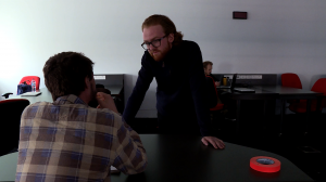
Screen Shot 2016-04-11 at 10.07.48 PM

So I tried to fix it in post by cropping the shot so I could make the end frame into a normal, symmetrical, two shot.
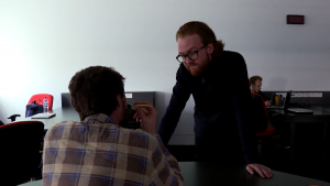
Screen Shot 2016-04-11 at 10.08.18 PM

However, this didn’t work either because it made the beginning look odd: Tim walks slightly on the right of frame and then there is all this negative space on the left side of frame.

Screen Shot 2016-04-11 at 10.08.06 PM

If I was to try to do this shot again, I would experiment with setting the dolly up on a slight diagonal so that Tim would be centred in the frame at the beginning of the shot and then he would end up being on the right side of frame by the time he got to Gabe. In addition, I could play around with the positioning of Tim in the space.

I think this framing problem could have also been helped if I had have been able to see the camera display screen on an external monitor. As a director I didn’t want to interfere with Bridget or Polly too much, but this meant that I couldn’t see what was being shot the whole time. I could make sure that the start and end frame were where I wanted them to be, but I couldn’t really get an idea of how the camera would move through space until we played it back after the shot was taken. With this in mind I asked if we could use the monitors in our next class. We ended up doing a multi-camera exercise with the monitors, which was beneficial because the whole class was able to view what was being shot through three different cameras at the same time. We were also able to match up our ‘shot-reverse-shots’ in real time, rather than waiting until post, where they sometimes don’t work out (often because eye-lines don’t match up) and then it is all too late to fix.

Most of the time for the stuff I am shooting I would not need a monitor, because I don’t mind directing as well as operating the camera. However, I think if you are having a large crew (with a grip, a focus puller and DoP) it would definitely be advantageous to use a monitor, so that the director can see exactly what is going on in the frame, without getting in the way of everyone else.

To colour grade these sequences I applied an adjustment layer on Adobe Premiere across all of the clips. I think this method may have made a few of these shots too dark, as I was trying to compensate for the over-exposed shots. If I was concentrating on colour correction I would go through each shot separately to attempt to fix some of the white balance and exposure problems. I think I might focus on this more in my next edit and try to use Adobe Speedgrade, which is a specialised colour grading program that I have not trialed before.

Overall, I loved playing around with the dolly and I am considering including a tracking shot in whatever I end up shooting in the later part of this semester. I think the movement of the camera is subtle (as long as the movement is motivated) and smooth when the camera is placed on a track. I generally prefer this type of camera movement over hand-held or steadicam movement, unless there is a need for a ‘shaky’ or more realistic style of camerawork stemming from a documentary aesthetic. Using a dolly was also an easier way to employ camera movement in a technically professional manner, because we could mark our start and end point on the track and then mark our camera focus rim in accordance with the camera’s distance away from the focal point. The precision and fluidity that the dolly offers gives this method one up over hand holding the camera, which can make it  far harder to keep the subject in focus.
Reflection on Week 3 Prompts

In week three we were told to write a list of actions, locations and people we thought we interesting and could potentially use in a film… this is what I came up with:

List of actions:

  • Smoking
  • Injecting
  • Surfing
  • Dancing
  • Kicking
  • Lighting something on fire
  • Going to the toilet
  • Flushing
  • Kissing
  • Ripping

Locations:

  • Mccracken ave stairwell
  • Lonnie’s backyard
  • Jan Juc upstairs balcony
  • The hideout
  • Merri creek
  • Edi gardens
  • Monty’s desk area (with all the plants)
  • Gub’s farm
  • Monty’s airey’s house
  • Zenelli flower shop
  • Milkbars (st georges rd, separation st, reid st)
  • Sacred Heart
  • Fran’s house
  • Ineke’s belmont house
  • piedemonte’s
  • French patisserie on lygon
  • Italian bakery/deli on lygon st
  • Melbourne cemetery east

People:

  • North fitzroy postal workers – ‘so rude’
  • Zenelli flowers lady – crazy – ‘darrrling’
  • Family: Mum, Dad and Hannah and how they experience grief in different ways and how seeing the body in death may make a difference to acceptance.
  • Casey and monty and their instruments
  • Ineke and her art or her autism
  • Jack/fran/Blaise on homosexuality
  • Jules on getting stalked
  • Architects at different stages: Dad, Arlee, Jules, Tom, Bao, Laura

The most helpful thing I got out of this exercise was thinking about locations I could use, because it’s often something I leave up until last minute (and I usually end up just using my own house). It got me thinking about other people’s houses or outdoor locations that have interesting spaces that would look good on screen.

I am most likely going to be doing a drama piece (not documentary) for my project this semester, because I would like to work with a friend who has just finished the creative writing course at RMIT (majoring in screenwriting), as well as some friends who are actors. In saying this, writing a list of interesting people did spark some ideas on short documentary films I could create, using the stories (and most likely interviews) of people I already know.

On another note, I was thinking about the kinds of films I would like to be involved with in the future and this is what I came up with:

  • Original
  • Conceptual and creative
  • educational/thought-provoking/intelligent
  • Entertaining
  • Money-making, but not purely made for the money (I would love to see a film I worked on in the cinema)
  • Cinematic
  • Fun
  • Motivated filmmaking style, subtle, but beautiful

If it’s possible, I would love to create a film this semester that encapsulates all of the above… well, maybe not the money-making side of things. Why not start my future now?

Research Post 2: The Lobster

For my second research post I have decided to continue on with what I started doing in my first research post by writing about the films I have been watching in cinema and how I may apply particular filmic techniques into my own work.

I have recently been reflecting on how working at a cinema has been one of the best educational tools I could have wished for. Even though this is just my ‘crappy’ part time job I am doing while studying at university, it has taught me so much about how the cinema industry works: how filmmakers, distributors and exhibitors make their money from films, why money is so important in the industry and why target audiences matter, as well as learning about films simply through watching and listening to them.

Interestingly, in this post I am going to talk about a film that did not even get shown at the cinema I work at; most likely because it is labelled by most as a ‘foreign’ film. It is called The Lobster (Yorgos Lanthimos, 2015, United Kingodm) and did surprisingly well on a very small, 4 million dollar, budget.

The film is set in a dystopian future where everyone must find a life partner, otherwise they will be turned into an animal. The main character David (Colin Farrell) goes to a ‘match-making’ resort where he hopes to find his life partner. The lighting design for this film is (in my opinion) absolutely stunning. There are a couple of scenes within The Hotel which are warmly-lit with low tungsten and candle-like illumination, thus making the settings feel romantic and cozy. Ironically all of the lighting is completely artificial (you can see the lamps placed around the rooms), which seems to suggest that this ‘warmness’ is a cover for the very clinical/artificial match-making process (with a dark ending for most involved).

What also struck me about this film is how everything is a little bit ‘off’. All of the characters are odd: there’s something ‘wrong’ with almost all of them. For instance, there is a man with a lisp, a girl who always gets nosebleeds and a man with a limp. The quirkiness of the characters and the dystopian story are reflected in Lanthimos’ use of framing. The positioning of the characters and objects in the mise-en-scene often feels imbalanced and slightly disorienting. For example, Lanthimos will position a character on the left side of frame while they’re having a conversation with characters on the left side of frame (but offscreen). Usually directors would place the onscreen character on the right side of frame when they are talking to characters on the left, because there is something that feels spatially ‘correct’ about that ‘complementary’ kind of formula. Whether this is just because we as an audience have become accustomed to this way of framing from watching other films or because there is something ingrained in us that understands how space works between edits, I’m not sure, but there is something off-putting about ‘breaking’ the rule of thirds in this manner that works so well with this film.

Amongst a million other things I could say about The Lobster, it has inspired me to really think about the meaning behind my lighting design, as well as encouraging me to break the rule of thirds once in a while (only if it is for a motivated reason of course).

Abstract Exercise and Edit

I had written about the abstract vision exercise Gabe and I did in week two in another blog post where I mainly discussed the technical process of shooting. Here I want to talk about the editing of these abstract shots and the abstract sounds I recorded with Annick.

At first I just started playing around, seeing how various shots would cut together in different orders. There seemed to be no clear unity between the shots, so I began to try to connect them through different effects. I created a split screen mirror effect and repeated the same shot in different ways. I also tried to colour grade the clips similarly (the most obvious being the black and white filter). My favourite edit is the cut between the ‘two-headed’ statue and the reverse shot of where the statue is ‘looking’.
Screen Shot 2016-04-01 at 1.59.17 pmScreen Shot 2016-04-01 at 1.58.58 pm
Prior to creating a split screen effect there seemed to be no purpose to the shot; but when I changed the position of the statue in the frame it seemed to link the two shots like a traditional shot-reverse-shot continuous edit.

I also experimented with an effect I learnt last semester called time splicing where you crop a frame into separate columns, layer the separate clips of the same shot on top of each other in your editing time line and then methodically move each clip a couple of frames later than the one before. The clip I was using didn’t feature much movement, but I realised that when there was movement across the whole frame it created an interesting rhythmic effect where the action slowly transferred from one column to the next. This is an exercise I would like to investigate more throughout the semester.
Screen Shot 2016-04-01 at 1.56.33 pm
After listening back over my abstract sound recordings I decided to only use the sounds I really liked, which limited the amount of layering I was able to do with the audio tracks (because I only liked two of the recordings we got). Instead of going for a realistic soundscape I decided to go for something more abstract. I used the recording of a pedestrian-crossing to juxtapose the nature shots we filmed (for example the shot of the spider web). I then used the intense sound of a water fountain to layer over the vision of a man-made statue.

This week I discovered the importance of playing around in post production, because there is so much more you can do with vision and sound when you aren’t limited to creating something that looks continuous or realistic.