About Matthew Duong

I might update here from time to time.

Exercise 8 | Reflection

During shooting of exercise 8, we wanted to have the foyer we initially planned to use for shooting and have a light to have the effect of an indoor lighting scene using the fluorescent lights. However due to a faulty plug we moved to a new location down the hall, which I argue is a foyer in the western direction.

What I got out of shooting in this location is having make do with the equipment we had. We had no extension cable for more freedom in setting up the light so we had to make do with the limited range of what we had. We also were shooting at the shortest focal length, given not much room to zoom further out however I was happy with the shot. When shooting the exterior shot I tried out different angles and frames to see what would flow better from the previous shot. Some issues we found was the exposure and contrast of the light in the shot due to the buildings’ shadows. We would start the shot then when we pan over towards the street the shot would look over exposed. In hindsight, what would’ve diffused the situation would be to shoot with an N.D filter and increase the aperture for lesser contrast between the two settings. However as I’ve learned, it’s much easier to comment on these things rather than keep them at the forefront of your mind during filming.

Given more testing of shots and if I was more assertive in my direction I believe it would benefit these exercises. I often let other people tell me their opinion on the project at hand as I feel I’m not quite qualified to know if what is being shot is going towards the objective as I feel it gives a sense of unity within the project however being more assertive in saying ‘this is what the shot I want’ and ‘this is the lighting I need’ could also benefit my directing style. Perhaps what would benefit is using the vocabulary of film such as hard, soft, blue, red when describing lighting and being more thorough when talking about framing would also help. Though given the complications, I feel them beneficial as it gives me a reference point in how to problem solve on the fly for the future.

In post, I noticed the shot in the opposed elevator shot in A was noticeably more yellow than the blue of the two-shot of the elevator which I believe is from not switching our white balance from our previous shot. In the close up shot however I had Jacky stand much closer to the window and not even close to the opposing wall (where the elevator resides). This was because I wanted the framing with a shallower depth of field of the outside view behind him. I felt this shot was done really well combined with the exterior shot however the first shot I felt there was too much video ‘noise’ in the shot. Perhaps with a more prepared first shot this scene would look and flow more consistently.

Colour and Light | Reflection

I had a bunch of untouched footage meant to be for creating a video later on in the year lying around. However, I was just playing around with colour correction and found it quite relative to the process we have been learning in class. In this instance however, the process would be in the edit. More specifically what would/could I achieve with the shot I was playing around with it.

Left is raw, right is colour correction

The scene, lit by a soft light coming from the sun coming through the clouds from above due to minimal reaching shadows. However the shadows or lack there of any distinct shadows could be a bi product of the soft light within the frame. My main question is, what does light have to do in relation to colour? In this instance, the lighting generally being around normal daylight levels (5600k) would point to a more blue tone to the scene. Conversely, had this been a sunny day rather than a cloudy day, the scene would feel distinctively more red.

Keeping in mind the ‘blueness’ of the shot, I wanted to highlight that more with some colour corrections that I searched upon YouTube and other sources.

Having learned this tool, I felt it would help me understand the significance of colour of a shot in relation to the lighting within it. Therefore, understanding that it is a generally blue scene I wanted to highlight that, putting in more blue tones in the colour corrector and enhancing the blue shift within the shadows, midtones and highlights. However what was acquired did not feel quite adequate of the scene, it felt artificial. So I put in another colour correction with the bigger wheel and had to balance out the blue tones with more green, only slightly to bring up the colour, bringing more contrast to the scene however still retaining that blue hue.

I feel the scene can be akin to a crime film similar to the Jason Bourne series which depict its scenes within cities that have a similar colour to them than to the edited shot I’ve come up with. It gives the impression I feel, to a working class city, one that has a cycle where life goes on regardless of whichever character is the main focus of the shot. The blue hue also gives a feeling of cleanliness and dullness associated with these crime films. The wide shot using a shorter focal length also is to contribute to that to a deeper depth of field.

From what I’ve learned about the colour of light, it can be used to determine a scene and edited further to highlight the feeling it insinuates. Lighting not only is used to light a scene correctly, but also to establish the setting and in some cases a scene may benefit from different types of lighting as long as it is consistent.


A System Interlinked | Film Light Reflection Exercise 3 & 5

Upon Week 4’s filming exercise I believe I fell into the hole of getting work done rather than creating a piece for its intended purpose. Well in this purpose it was to learn however the point was the script and the instructions. I think my group mostly ignored the instructions however I believe that we did intend on creating a product that was at least consistent with what we (the film makers) were attempting to achieve.

With Robin being super critical of our decisions, I believe it was great experience learning or perhaps re-calibrating the mind to think about film. Knowing what a shot has to do in relation to the overall scene and what the scene serves to the film. Things like lighting continuity, what the lighting serves to paint the scene indoors or outdoors, cloud or sunshine, making it look like it is the same room. A lot can be achieved within the misdirection of film, which is something I’m learning more about. The purpose I guess, is to break out of the mould of thinking about shooting in a location being in the same location as the script suggests (if that makes sense). You can give the illusion of having the same location in a shot when in fact your two corresponding shots can be shot on different days, locations or setting (ie. the lighting change) and one must accommodate those changes for consistency required for the scene’s purpose.

For our group’s work, if I had my time again constructing different shots in different parts of the room to get a gauge on what I can and can’t do and to understand the environment of the scene better I suppose. In terms of shot selection, shooting several shots. I understand now that I did not read the script and instructions properly to their intention. Having an establishing shot within a scene written like this was a knee jerk reaction to receiving the exercise. Next time I will have a better understanding of the purpose of shooting a scene like this. Since they are different scenes I actually made it harder on myself for shooting as the one continuous flow of scene. One thing essential when shooting a scene is control, control of the lighting, the camera, the actors, background etc. is important. The more I can control and understand the easier it is to construct a shot for its intended purpose. I feel after listening to Robin’s criticism that I can better understand what problems I might have with constructing a shot can be avoided if I were to change the fundamentals of the shot. Things like shooting at a different angle to not show the light from the window, having a tighter shot so less of the background is showing. All these things contribute to my overall understanding of constructing a scene using what is available rather than what extra things need to be done.

La La Land “Audition Scene” | Lighting Analysis

Damien Chazelle’s La La Land pursues the musical feel from the New Hollywood and Classical Hollywood by mixing stylistic composition of scenes and sets with contemporary style of film making. In the audition scene in particular the scene shifts from a conventional back and forth between Emma Stone’s character Mia and the interviewers conducting the audition. However the gravity of the scene can be felt as this is the final audition for Mia, it was all or nothing in this moment. She wanted to give it her all but also wanted the respect she so desperately wants to perform in a comfortable space. The lighting change in the scene to have a spotlight effect with her as the subject blacking out anything other than the dark curtain behind her which was probably an intended effect of the light to not only light her from the front down at an angle (indicated by the shadow of her hair and head on her neck) but to also drop off onto the curtain to illuminate an silhouette of sorts around her. The key light also points to using a front on down angled soft light to perhaps represent a stage light in the scene with the key light being flat on Stone’s face leaving little fill light. The light seems to be diffused enough for it to spill onto the fill areas of her face.

The effect it insinuates is a familiarity with musicals, in particular would be stage musicals. With the backdrop within the scene it would have this effect, which Chazelle would probably have drawn significant inspiration for shooting not only this scene but many others within the film. He pursues this desired effect of mixing contemporary drama storytelling with what feels like classical Hollywood musical transition into song (Robinson, 2016). The curtain could simply serve as a reminder of classical Hollywood in Chazelle’s eyes within this scene.

What would be difficult in this scene is to provide a fair contrast between Stone and what would be intended to be darkness. I believe the light would have to be fairly spotted whilst running through a filter to reduce the exposure of the light to achieve a Hollywood musical feel with the spotlight effect on the main focus on screen. Another hypothesis of achieving this shot would be to decrease the aperture lens (greater f stop) to reduce the light and to use a harsher light to light the scene. However given the curtain looks fairly in focus indicating a larger depth of field it is less likely the case. The scene was probably achieved by finding a balanced aperture lens to achieve the contrast within the scene and having a single light the subject.

Robinson T 2016, ‘La La Land writer-director Damien Chazelle on subverting the things he loves most’, The Verge, viewed 19 March 2018 < https://www.theverge.com/2016/12/7/13862752/la-la-land-damien-chazelle-interview-ryan-gosling-emma-stone >
La La Land 2016, DVD, Summit Entertainment, Santa Monica, CA, Directed by Damien Chazelle

Lighting in Art | PB 1

A wide shot of a 3 portrait standing rectangular windows equidistant from each other with the middle however appearing to be the corner of the building. The shot is separated into the three windows with the origin of the light source appearing to be coming from the top left corner of the room which is blocked by the wall in between the windows. The light seeps out the three windows that creates a hard lighting effect indicated by the distinct edge of the shadows created by the illumination. On the right most window the light passes through an orange filter that creates an orange hue outside of that window. The scene also appears to be Fill Lighted by the reflection of the source upon the cream walls creating a secondary but noticeably darker shade. The lighting effect could be said to be soft as they do not create hard shadows however it can be difficult to discern as the reflective light resides within the shadows created by the main key light.


Not quite my tempo | PB 1

This scene is generally a two shot that switches between J.K Simmons’ character (Terrence Fletcher) and Miles Teller’s character (Andrew). I’m going to focus on the mid shots of Simmons and Teller that are cut between from [0.20]-[1.29], in these two shots the lighting stays consistent in each one however each shot have slight distinctions to their composition of light.

From this shot, it is lit with a yellow soft light from the left hand side of the actors and camera, looking down on the subjects. There seems to be more focus of key light on Miles Teller (on the left side) as he is the focus of this shot, with band members in the background being lit by the spill. It could be possible that the light is more spotted on Teller or there are simply more that one source lighting teller to make him the subject of this shot. This way of lighting gives the impression that the lighting is coming from the lamps in the room. Also there seems to be some fill light to bring up the shadows so they don’t contrast as much as to the rest of the room (which is dark). This gives the feeling that Teller is the subject of this shot however compared to Simmons reverse shot it can be quite vastly different.

In this shot used, Simmons has very little key light falling upon the front of his face. It seems as though the key light is being lit from above him, giving his features a more refined and (in purpose of the scene) more menacing look. Overall, the lighting can be described as soft as we do not see any hard shadows however it is still harsher to that of the reverse shot of Teller. The key light on Simmons also gives the impression it is coming from a light on the roof of the room. The lighting also suggests that there is a soft fill light that is flat on Simmons to fill out his features. It would help reduce the heavy contrast that could be created by the key lighting alone and gives the shot a balance from the harshness of the key light.

Whiplash 2014, DVD, Sony Pictures Classics, CA, USA, directed by Damien Chazelle

Lighting Exercise | PB 1 Reflection 2

The exercise we did today with reflecting light off a white and/or black cardboard enlightened me to different possibilities that I can think about when lighting. Or as to say, actually being shown how to go about properly lighting a subject or set. Generally, I learned that direct light from a lamp with no filter or medium to pass through creates a hard lighting effect and the desired effect you want in the scene is dependent on where the light source is in relation to the subject.

Upon some reflection it got me thinking about lighting according to the available light and what I can do with simple tools to manipulate the scene. I’ve never really thought about using a surface for light to bounce off but when I ever see behind the scene pictures of shoots or sets there will always be a reflective surface that a lamp would project into, I’ve just never paid that much attention to the purpose or composition of that. What this achieves I believe is a softer light if you need to light the fill side of the scene and conversely, I thought about not lighting the subject directly but to bounce the light off a surface (which I now have taken notice of in many behind the scenes footage) and create a soft light for the key lighting. This would mean that the key would be even more dimly lit or non-existent for a scene to look natural.

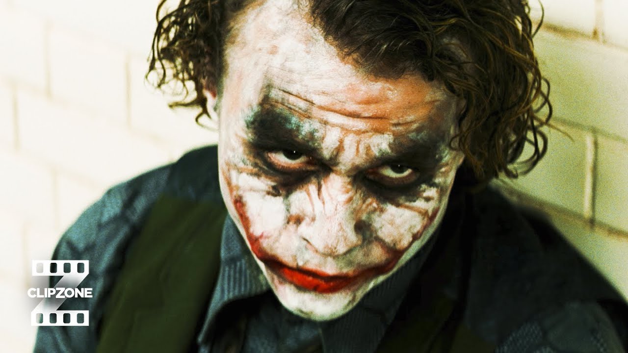
We also touched upon how to think about lighting a scene according to the scene desired. For our demonstration we looked a subject directly lit by the lamps and to think of how or why it should look if we were shooting for a scene in the direct sun. Reflecting on this was insightful as I thought about many movie scenes or hypothetical shoots that would encompass artificially creating a scene with the light. One film scene that comes to mind is the interrogation scene between Batman and Joker.

This scene ,being obviously lit in an artificial space, came to my mind upon trying to understand how to artificially light a place to look as it is intended. Understanding how light would be used to illuminate this scene that goes from lit to dark in an instant. I thought about how to compose a shot like this and the lighting and camera-work needed to create a piece for its intended setting such as the outdoors or within the halls of a building.

I intend to continue thinking about film differently from an analysis point of view, as each class rolls on I still reflect upon on more and more aspects as I discover them.

Film Light, Broadening my Mind | PB1 Reflection 1

Film light took my interest before the semester. Keeping in mind that this will be my last studio, I wanted to make it something that would combine theory and practice as an amalgamation of what I’ve learned and experienced so far. I’m excited about the prospect of learning about ‘film light’, lighting in my youthful understanding of film is just ‘lighting’ for the sake of lighting a scene. To provide or emphasise key features of the characters, however my understanding is that they just do this and the purpose it serves. I would like to understand how they do this, in that what day conditions combined with set lights create certain moods or atmospheres for the shot in mind.

Having spent the first week already in class, my mind has been opened to how to think about lighting a scene. Terms such as Hard Light and Soft Light that can be applied to all the films I view but also in real life. Something that Robin pointed out is thinking about a shot that you see in real life or film and how to go about recreating that shot on a camera. Things like understanding where the source of the light comes from and the diffusion of the light depending on if it passes through anything. Even from the first week of classes I have learned so much and opened a new way of analysing when it comes to film.

In this course, I’d like to broaden my way of thinking when it comes to analysing and creating film. Where as previously mentioned in class by not only thinking about lighting, framing or camera movement but combining all those factors to create a worthy piece. One project I’ve had in mind for a while ever since I’ve seen the studio pitch is that lighting a character/s in different scenes that represent different moods, I envision the subject to recite poetry and change their mood based on the lighting and it will reflect on their articulation of the recitation and the lighting. Having this vision in mind, I think it would be a good exercise in creating a piece with all my prior and current knowledge on display.