Behold, our end product! I’m pretty proud with how this turned out. Following up from all our previous iterations, we eventually came up with a prototype that utilised Cinemagraph, clearer and more concise reviews, and sound effects as transitions. Post-production was easier than I thought it would be, and it was great fun editing the entire thing.
*Edit: The link to our final report is here.
On Monday, I showed Seth the sketches we had come up with so far. He said that it was pretty interesting how we have progressed from one discovery to the next, and recommended that we put them all into our presentation on Friday, and show the studio how we came to our final prototype.
That led us to think about our final presentation, and how we might structure it. Seth had already given us a basic framework in one of his posts. All was going well, until we came to the part where we were to evaluate what we had done so far, and come up with a proposition that we would further elaborate on in our final report.
We referred to the readings and found that it was quite difficult to link them to what we have done, at the same time answering the question and the studio’s prompt. One thing we did come to think about, though, is the word “transmedia”.
This word, according to Henry Jenkins, basically means “across media”. He was the first one to popularise the term “transmedia storytelling” or “transmedia narrative”, which represents “a process where integral elements of a fiction get dispersed systematically across multiple delivery channels for the purpose of creating a unified and coordinated entertainment experience.
Thinking about “transmedia narrative” as an idea, we looked at reviews – specifically cafe reviews – and how they are usually done in the form of words and text. As in our prototype, we take the review content from traditional text reviews, and disperse it across a different delivery channel, which is online video. We therefore redefined it through this “transmedia” process, and seeing as how reviews have non-narrative structures, we ended up with something we would like to call “transmedia non-narrative”.
We’re not sure if this would make a valid proposition, but hopefully all goes well in tomorrow’s presentation. We’ll wait to see what kind of feedback we would receive from Seth.
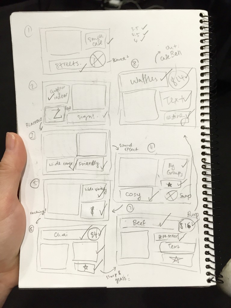
As we were drawing out the storyboard shown in my previous post, we decided that for our prototype, apart from using the ambient sounds from the café, we would also incorporate other sounds such as knocks, taps, and snaps. This would help us make a transition from one frame to the next in a more fun and interesting way. We also want to try and look for some sound effects that may help us in this area.

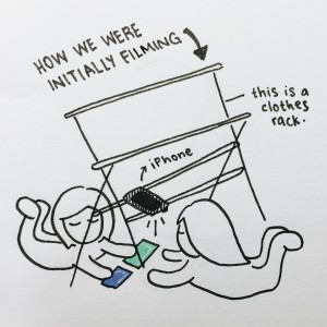
Seeing as how we were having quite a difficult time with filming our video review against a wall, we decided to get hold of a tripod that could do the job for us. We were lucky enough to get a Manfrotto tripod from one of Jia Jia’s friends, and we were able to alter it such that it faced the floor (pictured above).
We figured that this would be a great start to our prototype, and chose to film our video review against a cream-coloured manila card. Just as we began to film, we realised how messy it was to think about what would go where – whether the photos would come in first, or the text, or simply how the entire sequence would be like – that we decided to stop everything and first sketch out a storyboard.

We too thought about how we might we might transit from one frame to the next, and after we had done that, we also used the storyboard as a checklist to ensure that we had everything we were about to film.
Filming went better and faster than expected once we had the storyboard settled, so that was good. Most of what we had drawn went according to plan. The next step would be to edit our video with the Cinemagraphs we would be making out of what we got from our Stovetop visit.

Jia Jia and I decided to head to Stovetop today to film some stuff for our prototype. When we were there, we chose a spot that allowed us to film with ease, which was right in front of the counter, at some seats just slightly outside the café.
We wanted to try something out with Cinemagraph, a program that allows selective movements in a video footage. We planned out a simple storyboard, then took a couple of videos of the café and also ordered some food to munch on while we were at it.
It was a little difficult to coordinate, because we didn’t want to disturb those around us with a tripod, but at the same time, it would be difficult to create a Cinemagraph with videos that were in any way shaky. Because my DSLR’s vibration reduction (VR) function isn’t all that great, handheld videos were quite a task. So, we decided to shoot some of the footages on my iPhone 6, since its VR function is much more accommodating.

After that, we discussed how we might improve our travel video reviews in a way that would make it more informative. As can be seen above, we also came up with a rough idea as to what we would include and what we would say for our prototype. Rather than saying things like “So delicious!” as in our previous sketches, we thought about how we might construct our sentences and phrases a little better so that it would serve its purpose as a review, giving viewers proper insight on a particular dish or drink.
We plan to film the scrapbook part of our prototype tomorrow.
I remember when I first discovered Cinemagraph – it was about a year back, and I was playing around it with my brother. I had gotten a new skateboard, so we were making random Cinemagraphs out of the movement of its wheels, and just having a whole lot of fun together.
I was quite intrigued with how it worked and how the developers made it so easy for people to create GIFs like this. Seeing as how we found videos rather distracting, Jia Jia and I decided that we might settle for using Cinemagraphs, which was neither entirely video, nor entirely photograph. We felt that it might be an interesting concept – it wouldn’t be as dizzying as a video, and it wouldn’t be as dull or stagnant as a still image.
We plan to film some footage at Stovetop tomorrow with Cinemagraph in mind.
Following up from the previous sketch we did, we decided to try one out with the video footage that we attained from Koko Black. Using the same concept, we changed the photographs in the sketch to videos (that were added in post-production).
However, we found videos to be a little too distracting, especially if our whole idea revolves around scrapbooks. Having text and video appear at the same time may not make things easy for viewers, considering that they would have to shift their attention from one element to the next.
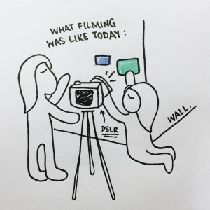
As we were filming (the rest of) this sketch earlier today, we had quite a tough time with the DSLR! Unlike when we filmed with my iPhone 6, today was a little more difficult because we had to estimate the placement of the photographs and props on the wall, without really looking at the DSLR’s screen. Back when we did it with my iPhone, it was much easier to look at the screen and see where each element was being placed in the frame.

We were worried about how we would do our prototype, because we have a couple of interesting plans for it and we’re not so sure if it would be as feasible by filming it against a wall. Perhaps it would be easier if we reverted to having it done on the floor. But then again, how would we ensure the quality of the entire video? We began to think of ways that we could have the DSLR face the floor, and at the same time, make filming the scrapbook faster and easier for us.
We decided to spice up our previous sketch with better quality photographs and also nicely printed text for our travel video review. We chose to visit Koko Black along Collins Street.
I like how the entire place had a very brown, rustic theme, and as we were taking photographs of the place, we decided that we would properly edit them before having them printed out so that they would look much nicer and clearer. We failed to do that in our previous sketch, which is probably why they turned out so dark and dull. We also took a couple of video footages for a slightly different sketch that we wanted to try out.
After that, we discussed about what we would achieve over the week, and some other sketches that we would be working on. We went to Officeworks later to get Blu-Tac and some manila card. We were thinking of doing this new sketch we were planning on a wall instead of on the wooden floor of Jia Jia’s apartment.


This is because we previously shot our sketch with my iPhone 6, and the overall quality of the video was reduced because we had to zoom in to get a better view. So this time, we want to start using a DSLR to improve the video’s overall quality, and for that to happen, it would be much easier to have it on a tripod and have the whole thing done on a wall, instead of having the DSLR – which is much bigger and heavier – face the floor.
We plan to film it later this week, so hopefully that turns out alright.
I was at a friend’s place today, looking as he scrolled through Facebook. As he was doing so, he told me about how he hated the way Facebook’s videos would kick off in the background, even if you don’t intend for them to play. He disliked the way it did that due to its tendency to eat up his data allowance.
This got me thinking, especially since I am in the ‘Online Video Experiments’ studio. Could it be that Facebook is trying to promote their video capabilities? I find it quite smart, really, but also a bit of a nuisance, as can be seen from how my friend isn’t a fan of it.
But with that, I have managed to discover many more videos as compared to previously, when I would have to click on a video just to watch it. It reduces the effort, all the while giving Facebook users a short preview of the video. It’s definitely more effective, because usually people would voluntarily play a video only if the thumbnail looked attractive or if it had an interesting title. Or at least, that’s how it goes with me.
What a way to push the boundaries of online video in the social media sphere. It’s effective in its own way, not so much in the content of the video, but in the way it puts itself out there, straight into the user’s hands without having them to ask for it.

