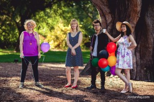
And . . . that’s a wrap.
We’re finished! Finally, I can get that damn song out of my head!
But seriously, it’s a huge relief to be done and I’m really proud of what we’ve created. Which of course isn’t to say that it’s perfect, because it’s not, but I’m happy with it all the same.
It is worth looking at the aspects that didn’t work, however, as that’s part of the learning experience. So I’ll start my reflection by looking at some elements that I feel didn’t work, and then moving on to the lighter side of what did.
Downside no. 1: the storyline.
Ok, ok, ok. Rohan was right. I’ve said it and I’m not going to say it again! While the narrative of the girls chasing Elvis is definitely clear, and I think suits the tone of the song, the attempt to reference Disney characters is not as obvious. While I don’t actually think this hinders the audience’s enjoyment of the story, it is an element that we failed to create accurately. I think we were on the right track with trying to create a fun link between the different characters, but Rohan’s suggestion that they needed to be larger-than-life was right, as we underestimated how difficult it would be to establish characters in such a short space of time.
Downside no. 2: the colour grade (or lack thereof).
Right from our first conception of what our music video would look like we decided that a light tone could be created by a warm, almost retro-style colour grade. We stuck with this goal right until the end, and this week Jenny put the finishing touches on a bright grade to apply to various different scenes. Unfortunately, when taking a step back and watching the whole video from start to finish, it was clear that the grade (although looking very nice in small doses) was far too high on saturation, creating an aesthetically unappealing cartoonish effect. We had punched up the greens where, given the footage was so green already, we really should have focused on the yellow for that retro look. By the time we made the discovery it was unfortunately too late to create another grade so we went with our original footage, which was fortunately very pretty anyway.
Upside no. 1: the cinematography.
Which brings me to Jordan’s marvellous cinematography. While I had originally suggested the Royal Botanic Gardens as a location because I believe it is impossible for them to look ugly on film, Jordan’s shots really made them sing. His composition but I think particularly his use of the natural light gave us aesthetically pleasing shots that suited our bright, clean tone. The footage was particularly helpful in that it supported the slightly weaker narrative in keeping the audience engaged through its aesthetic appeal.
Upside no. 2: The editing
I don’t think I’m tooting my own horn here by saying I think the editing was quite successful, as it was truly a team effort with everyone pitching in and a lot of credit too going to Rohan for his feedback and advice at every stage of the editing process. As I mentioned above, conveying this narrative in such a short space of time proved much harder than we thought; it’s a bit ironic really because it’s a short time in which to tell a narrative but a long time to keep an audience engaged for with no dialogue. I feel that we were able to edit the video in such a way that it is engaging, visually interesting and also fulfils its obligations as a music video in that there is a focus on the artist, Abby, both as the main character of the story and as the singer of the music. When we showed Abby our fine cut she was overjoyed, and after all I think that is the most important thing as the video should ultimately be a tool for her to market her song and her brand as an artist.
