Popular Cinema reflection week two

As a bit of a history geek, I found this week’s cinema reading particularly interesting. Aptly named The Hollywood Studio System (1930-49) (by Douglas Gomery), it described how in the early years, American cinema production was dominated by eight companies. The big five (Warner Brothers, RKO, 20th Century Fox, Loew’s and Paramount) and, to a lesser extent, the little three (Columbia, Universal and United Artists) held an oligopoly over the film market due to many factors, including their control over channels of distribution and exhibition. Today, we think of the three aspects of the film industry (production, distribution and exhibition) as being relatively separate, but during the reign of the studio system it was the big companies’ ownership of theatres that enabled them to not only gain the biggest audiences for their films but drive out competitors who had nowhere to exhibit their own films.

In the seminar, we furthered this discussion of the history of the studio system and looked at the way it defined our ideas of ‘mass culture’. The studio system, along with the invention of mass-communication systems such as the telegraph, created the idea of a ‘mass audience’; large groups of people could now not only experience the same product, as they had previously with books and newspapers, but in the case of cinema, they could experience it in the same way. As a result, there was a perception that audiences would therefore get the same meaning out of film, and this was an idea we challenged in the seminar. Could it not be true that audience members, with their different contexts and backgrounds, would each experience a film very differently? This, we concluded, is the more popular opinion today, but it’s clear that the debate surrounding mass audience is still very relevant, particularly in relation to popular culture studies. The discussion took me back to year twelve media, when we studied media effects theories such as the Bullet Theory (popular in the time of the studio system) and the more recent Uses and Gratifications Theory. The theories present different hypotheses regarding the effects media has on its audiences and the different ways in which audiences can engage with a text, making them very relevant to our discussion last week.

The ethics of photography (OTF reflection week two)

When you take public transport to and from university, it’s impossible not to notice the amount of people looking at their mobile phones. Whether they’re listening to music, scrolling through social media or taking a call, it certainly makes you wonder what commuters used to do on public transport as little as fifteen years ago.

On my way home from uni on Tuesday night, I happened to be standing behind a young woman – probably about my age – who, like so many of those around her, was using her phone. Glancing at her screen, I noticed that she was flicking through an extensive catalogue of photos. Considering that our reading from Susan Sontag this week was entitled On Photography, I took the opportunity to look at some of these now everyday objects in more detail.

The first thing I noticed was that it was not immediately obvious where these photos were coming from. Rather than appearing on a Facebook or Instagram feed, they took up the whole of the mobile’s screen – leading me to remember last week’s discussion of the importance of a physical frame or lack thereof.

The sequence of the pictures also interested me. The pictures seemed to come in groups, but I couldn’t find any tangential connections from one group to another. Some of the pictures were quite beautiful, reminding me of Sontag’s assertion that photography is becoming like dance and sex in the sense that is a commonplace art form that is not frequently recognised as art. Some of the pictures I assumed were taken by professional photographers, and therefore were likely to have been made with art in mind. However, even some of the pictures that were clearly taken by amateurs for other purposes – holiday snaps to share with friends, selfies to show off a new look – had an artistic quality that couldn’t be denied.

Fashion pictures turned to cartoons turned to screenshots and then came the photos that interested me the most: two or three close-up pictures of some shaky letters scratched into a human wrist. It was obvious for many reasons that this was no stylised professional shot; this was a self-taken photograph of somebody’s (successful) attempt at self-harm.

The woman in question seemed not to be fazed by these pictures that certainly shocked me, and I can’t judge her for that as I have no idea of the context. Perhaps this was a retrospective picture from a friend celebrating a year’s recovery from depression, or my judgement was really off and it was somehow faked. However I must admit finding it an unpleasant surprise how, with only a slight, half-second squint, the woman swiped away the picture as she had the Spongebob cartoon and shots from the latest fashion week.

It brought me back to what I found the most interesting part of Sontag’s reading, which was her discussion of the ethics of photography. She writes:

“Photographing is essentially an act of non-intervention. Part of the horror of such memorable coups of contemporary photojournalism as the pictures of a Vietnamese bonze reaching for the gasoline can, of a Bengali guerrilla in the act of bayoneting a trussed-up collaborator, comes from the awareness of how plausible it has become, in situations where the photographer has the choice between a photograph and a life, to choose the photograph.” (Sontag, Susan; On Photography; 1973; Penguin (Harmondsworth); p.11-12)

I found this statement to be particularly interesting as although it was written in 1973, I feel it is particularly relevant in this age of citizen journalism. Often I have seen footage on the news of a vicious beating or racial attack, and have wondered why the person behind the camera was not offering to help. As Sontag suggests, there seems to be an ever more popular view that is is acceptable to photograph rather than intervene (the two actions being mutually exclusive in her opinion).

However, in the case of the picture I saw on the tram, we have to look at the ethics a little differently, as the same person taking that picture was the victim. Firstly, I think this brings up the interesting idea of the ‘social media generation’; are we so public with our lives, so constant in our broadcasting of our own cultivated images that we now even post selfies of our attempts at self-harm? Perhaps this is an argument in favour of social media, that we can be open and share our pain, but that depends on the reaction of the viewer.

This brings me to the other side of photography ethics that Sontag refers to: the ethics of the viewer. Sontag writes of the way viewers are distanced from the events of a photograph, suggesting that, “A way of certifying experience, taking photographs is also a way of refusing it . . . most tourists feel compelled to put the camera between themselves and whatever is remarkable that they encounter.” (Sontag, Susan; On Photography; 1973; Penguin (Harmondsworth); p.9-10) While Sontag here talks about tourists using photography to make the unfamiliar familiar, I think that her statement can also apply to the desensitisation we have to what we see in photographs. Despite the perception we have that photos are concrete evidence of real events (another of Sontag’s points), the one-dimensional, neat encapsulation of a moment distances us from it’s true consequences.

In constantly seeking to ‘frame’ the world, are we costing ourselves the opportunity to react to real life events both as the photographer and the viewer?
I did some writing in Reading Space and Place

The prompt was to write about a place that fascinates you. Here’s what I came up with (and it’s mostly fictional by the way, so don’t judge me):

It is nearly impossible to describe what drew me to London, only to say that I was driven; it was more than mere impulse, or – that horrible, whimsical term ‘wanderlust’. I’ve never felt that wanderlust accurately describes what goes through a seasoned traveller’s mind; it diminuitively fails to encapsulate the constant longing, the all-consuming hunger for the next trip; the new Jericho. This is how I have always felt about London. Somewhat inexplicably and completely irrationally, it has long been the backdrop to all my aspirations and dreams. I say irrationally, because there is no actual, tangible reason why this has always been the case. Tourists, as distinct from travellers – those casual meanderers of westernised interest points, those who have the dreaded ‘wanderlust’- tourists can usually point to why they want to see a certain place. “Oh, were quite keen to experience the New York lifestyle,” they coo, while lying by the Sofitel pool. By contrast, I could never say for sure what it was about London that so absolutely, convincingly lured me in. I never wanted to see Big Ben; I didn’t want to ride the London Eye. We had politicians and overpriced ferris wheels where I was. But I still wanted to see London.

On The Frame reflection week one

Like all the best subjects – nay, all the best things in life – On The Frame started with an outing. To begin to understand the significance of framing, Dan sent us to the NGV on Thursday to have a look at some paintings.

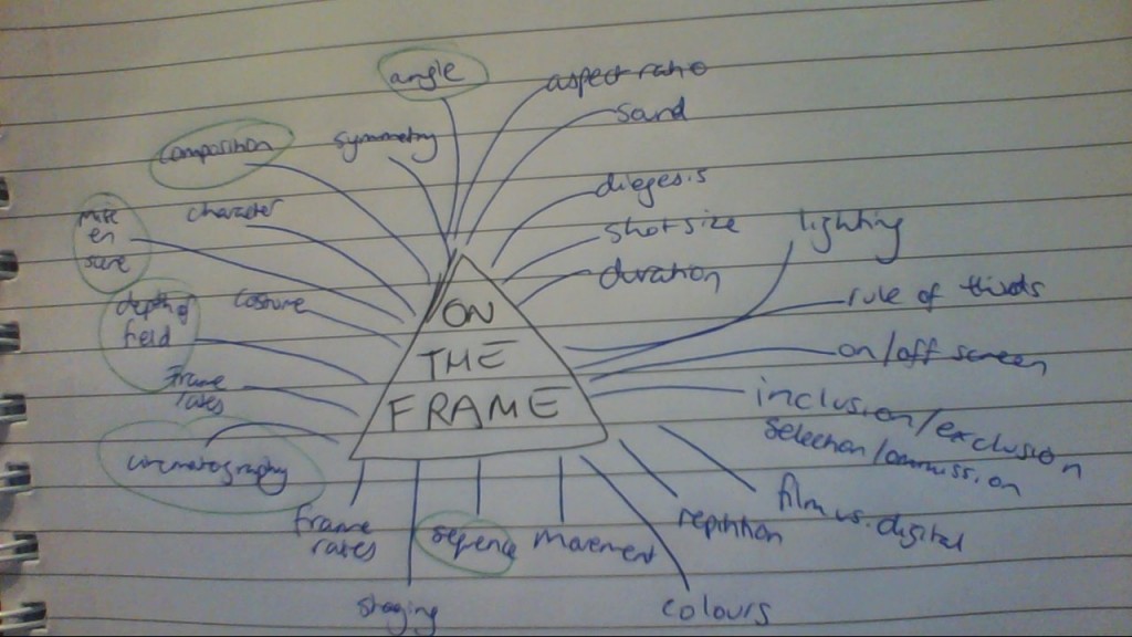
The previous Tuesday’s class had been an introduction to the subject (and to each other), and as part of that Dan had asked us to brainstorm any and all terms that came to mind when thinking about the things we’d be learning this semester. This is what we came up with as a class:

Snapshot_20150724

You’ll notice that some of the phrases are circled. That’s because Dan asked us to pick four or five of these elements that interested us the most and that we particularly wanted to learn about. In case you can’t read my terrible pig-scratching hand-writing, mine were:

  • Mise-en-scene
  • Composition
  • Angle
  • Depth of Field
  • Sequence
  • Cinematography

Okay, I know that’s six but I thought ‘cinematography’ covered the others.

When we got to the gallery, Dan told us to find three artworks that addressed our four or five elements (I dropped cinematography for this task) and discuss them, including references to the actual, literal frame (or lack thereof).

To be honest, I found the gallery so engrossing that I kind of forgot about the task; with only one picture noted and only a quarter of the exhibits explored I was kindly informed via loudspeaker that the gallery would be shutting in half an hour. Hence why you’ll notice all of my selections come from the medieval European collection.

1. The Virgin and Child by Simon Marmion (1425-89)

The Virgin and Child

Picture sourced from http://www.ngv.vic.gov.au/explore/collection/work/4166/


I picked this painting because reading the description and observing it closely I felt it spoke to my elements of mise-en-scene and depth of field. The picture’s description mentioned how the Virgin Mary is pictured here not in a biblical scene but in a contemporary European setting, with blond hair and fine features that were idealised at the time of production. Furthermore, the mise-en-scene of the way Christ is laying in Mary’s arms is supposed to refer to other depictions of ‘La Pieta’, a popular image in medieval times of Christ dying in a weeping Mary’s arms (despite the fact this is never actually described in the bible). Furthermore, I found the depth of field quite sophisticated if only in the sense that it is aesthetically pleasing; there is quite a long expanse behind the foreground – I think I counted six layers. The frame of this small painting (about A4 size, I would guess) was plain brown wood, which I thought served to highlight the vibrant greens and blues worn by Mary.

2. Rest on the Flight Into Egypt With St Catherine and Angels by Paris Bordone, 1527-30

Paris Bordone Italian 1500–1571

Picture sourced from http://www.ngv.vic.gov.au/essay/paris-bordones-rest-on-the-flight-into-egypt/


I found this picture to be quite beautiful, and I think part of the reason for this was its composition (one of my elements). I think the artist uses the concepts of the rule of thirds points of interest to create that quite clear diagonal line from bottom left to top right made up of the subjects’ heads. I think the use of that diagonal to separate the main subjects from the background is somehow very pleasing to the eye. As part of composition I thought this picture also spoke to my element of angle, as the picture seems to be painted from just below straight on (or eye level), adding to the height of the action created by the composition of the diagonal and the placement of the cherubs in the tree.

3. The Crossing of The Red Sea by Nicolas Poussin, 1632-34

The Crossing of the Red Sea

Picture sourced from http://www.ngv.vic.gov.au/explore/collection/work/4271/


As we were limited to paintings and drawings rather than sculpture, photography or multi-media, I found sequence the hardest of my elements to find represented in the gallery. I chose this painting because I think it evokes movement the best out of the works I saw in the gallery. The way the clouds and waves are positioned to the right of the frame makes it seem as though they are entering the picture, and I think this effect is added to by the way the subjects are reaching to that side; one man is even in the act of pulling another out of the waves, adding to that sense of movement from right to left. I thought the frame was also significant in adding to this sense of movement. It was a large painting (maybe six or seven feet long by four feet high) and it was bordered by a very thick golden frame, inlaid with an intricate design that I felt combined with the chaotic busyness of the picture to evoke movement.

Popular Cinema seminar one summary

Question of the day: what is popular cinema?

To answer this question posed by our tutor Tyson Wils, we first had to look at how to define popular culture. For those in the contextual study this may have been an easy question but I had to take a quick look at the readings to help me out. I found Raymond Williams’ definition in A Vocabulary of Culture and Society a particularly interesting one, because it described the word culture‘s origins in the Latin verb colore, meaning inhabit, cultivate, protect or honour with worship. I thought it was fascinating that even going back thousands of years we could see the relevance of this definition to pop culture today: the idea of ‘honouring with worship’ and ‘protecting’ seem to me to be very applicable to the way avid fans today really appreciate and defend their favourite works.

Further breaking down this discussion of pop culture, Williams describes the two parallel definitions of popular, that are ‘of the people’ (linking in with the idea that pop culture such as pop music is inherently opposed to elite or high culture) and ‘well-liked’. But the particularly interesting point Williams raises 9that was emphasised by Tyson as a focus of this subject) was the idea that there is something “calculating”, in Williams’ words, about the term popular; there’s this idea that pop culture is designed to be liked and bought.

Tyson reiterated this point when writing up a prompt for our reflections, referring to films that “try to offer something new/sell themselves as offering something new.” It was with this statement that he asked what films we might then classify as popular cinema. A good starting point for this thought might be the breakdown of pop culture into industrial, cultural and aesthetic factors that Tyson and Williams both referred to. Maybe these are the areas that a film must succeed in to be considered popular cinema? The immediate thought in my mind was the recent superhero films; box-office successes, they have not only individually gained fans but collectively created a fictional world and comic-book-to-film aesthetic that has captured minds. The superhero genre is almost a sub-culture of its own – is that what we call popular cinema, and popular culture?

Aaaaaaaaand we’re back

Howdy all (she says, assuming that someone is reading this),

Image sourced from https://therfexperiment.wordpress.com/2014/11/02/the-r-f-expermiment-the-emperors-new-face-part-1/

It’s semester two and I’m back at uni. In second semester, media runs a little differently: instead of all going through to a ‘media two’ subject, we students in our second semester get to choose a ‘studio’ that we’ll be enrolled in. We’re mixed in with kids from media four as well and end up in specialised classes of about 25. I was fortunate enough to get my first preference, which is the On The Frame with Dan Binns. As the name would suggest, it’s all about looking at the importance of the cinematic frame within the wider world of media production, and I’m keen to have a look at some great films and make more of my own media.

I’m continuing on with my literature contextual study this semester with the subject Reading Space and Place. While last semester’s Textual Crossings tied in really well with media, this subject is much more literature-based, which I’m actually quite excited about as a dedicated bookworm. I’m the only media student in the class, which excites me as well because I’m just waiting for some talent from my creative-writing-major classmates to rub off on me.

Finally, my elective for this semester is Popular Cinema, part of both the popular culture and cinema studies contextual strands. I think this will tie in really nicely with my studies in On The Frame, so I’m looking forward to really getting into the nitty gritty of what makes a film a pop culture success.

Technically, I don’t actually have to blog on this site anymore. On The Frame’s weekly post will go onto a Blackboard blog, and there’s nothing from the other two subjects that needs to go on here. However, I think I’m going to keep on keeping on anyway. I’ve grown quite fond of this blog, as it’s a good way for me to pool all my learning and work in one spot. So, I’ll be aiming for three posts a week: a copy of my On The Frame weekly reflective posts to Blackboard, a copy of my in-class weekly seminar summaries from Popular Cinema, and (if there is one) the writing exercise from Reading Space and Place (often a creative piece).

Because after all, I do it for the fans. 🙂