‘Decoupage’ by Luis Bunuel (WK 2 Reading)

Decoupage is done on paper, planned out before production. It’s crazy to think that a whole film can be contained on sheets of paper including exact length of shots. Although we know from personal experience that decoupage can easily evolve on set.

Bunnel talks of decoupage as the ‘cinematic embryo’ on film. By this he means it’s the element that brings film to life. As Robin said you may have a good script and good actors but without decoupage you are left with theatre, not film. Its intriuging that avant-garde filmmakers in France have proved that opposite can be true. That a film with no performers, based entirely on objects and made with simple photographic techniques, can turn out to be a good film.

An isolated shot means hardly anything. What makes a shot special is its spatial and temporal relationship with other shots that build the scene. This film ‘rhythm’ and decoupage are seen as one in the same.

Its interesting that Bunuel attempts to establish an approximate notion of cinematic art through a simple formula.

Cinematic Art  = lens + decoupage + photography + shot

He describes the lens as an indiscrimate eye without predujice but comanded by man, the filmmaker. Resulting in ‘the puriest expression of our time’.

Luis Bunuel

WK3 EX Train Scene

Robin is talking about how we don’t do enough work He is right. Note to self, do some work.

We started class in WK4 Tute1 by viewing everyone’s edits of last weeks exercise. Its interesting how different the edits are, even those of the same group who used the same footage. Everyone has different ideas on how a scene should be covered and no one idea right or wrong, although some are more aesthetically pleasing then others.

I wasn’t in attendance last week as I was sick. So editing the exercise was interesting for me. I felt an actual editor who had nothing to do with the production of the film.  I enjoy editing, so it was a nice change to simply edit something that had already been shot for me. I found myself acting like the typical editor and wishing there was more coverage so I have more freedom in cutting the piece together. From editors perspective more coverage is always better, but for the DP they don’t want to waste time shooting things that they don’t need.

There wasn’t much coverage for the beginning of the scene so I decided to use a long take that establishes the scene and lingers right up until the man asks for the handkerchief. I think this actually worked well as it conveys that silence of two strangers on public transport and then leads into the dialogue. This shot particular has too much head space although it could look good if it was actually shot on an old train as it would display the cabin and any interesting detail. I decided to cut on the action in this scene as the movement distracts the viewer from the cut itself. The cut from the two shot to the close up emphasise the care the man is taking with the handkerchief and details the womans face. I finished the scene by cutting between profiled close-ups of the two looking at each other to create some tension and possibility of romance, followed by a two shot of them looking into each others eyes. I believe my editing of this scene succeeded in assisting a connection between the two characters. In hindsight I would have made the last three shots (of the two looking at each other) linger a little longer and not cutting reasonably quickly between.


Scene Analysis – Se7en ‘Box’ Scene

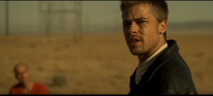
For my scene analysis I picked the ‘box’ scene from David Fincher’s Se7en. I chose this scene because of its dramatic nature and interesting camera angles.

The camera follows Somerset with a downwards tilt as he crouches to open the box before cutting to a close up of the box, emphasising the significance of the box. It cuts to a close up of Somerset showing the care he is taking and then cuts to a more dynamic angled close up of the box as it is opened.

two shot

Mills steps into the foreground reducing John Doe to a blury sillouette, out of the depth of field. Interestingly this will be the last time that Mills ignores him. This close up shows the curiosity and concern on Mills face. It cuts to a long shot from Mills perspective of Somerset opening the box which emphasises the distance between the characters so we get the idea that Mills won’t be able to see whats in the box. After a CU of the box being opened we are shown a CU of Somerset’s reaction of opening the box which then quickly cuts to a CU of the box as you see Somerset’s figure jump out of frame in shock. It quickly cuts back to a MCU of Somerset’s shocked expression and then back to box. All this cut quickly together is really effective especially with the silence of the barren environment.

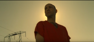
We are then shown a shaky close up of someone in the helicopter looking down at them showing that whats about to happen isn’t just between the three men. This is followed by a fast blurred pan to Somerset’s face accompanied by tension building music. As the music escalates in tension so does the speed of cuts. The next close up Somerset is from a low angle as if it’s from the perspective of the box itself and shows the detective trembling intensely before running out of frame to Mills. It cuts a low angle MS of Doe with his head haloed by the sun as if he has achieved his religious zealous purpose. It low angle really emphasises his power in this moment.

John Doe

The film then cuts several times between an ominous ECU of Doe and and a panning MS of Mills pacing comparing Doe’s calm to Mill’s angst. This is interrupted by a helicopter ELS of Somerset running in panic towards the other two men. It cuts to an even lower angled shot of Doe as he gains more power of Mills. This shot is obscure as it is slanted and creates quite a dramatic effect in this case. Although generally I don’t enjoy Dutch tilts. As the big reveal drops Fincher cuts on the motion of Doe turning to Mills from a medium to a close up, maximizing its impact.

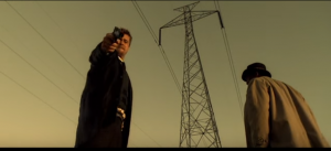
As Somerset arrives out of breath the camera pushes in on his arrival establishing the rest of the scene as an intimate life or death drama between only the three men. It cuts various medium shots of Mills and sometimes Somerset with more close up shots of Doe’s face emphasising his evil words and his power. Once there Mills discovers his dead wife was pregnant the camera cuts to a tight close up of Mills as to witness Pitts emotional performance and the characters internal struggle. The gun is in shot but his face is the only thing in focus as the character’s emotion is at the forefront here. These shots are from a low-angle not to make the Mills and Somerset seem powerful but so its from the perspective of Doe on his knees. A flash of Mills wife ends his internal struggle and the scene cuts to a close up of Doe as he closes his eyes, which clues what is about to happen. Mills taking the shot is captured with a long shot from behind Doe which quickly cuts to an ECU of the gun being fired and then back to long shot as the body drops. I found this to be an interesting and dramatic way of covering the shooting without being too graphic. It cuts to the helicopter signifying that this killing with resonates beyond the three of them out into the world.

Mills shooting

This is followed by slanted low angle two shot of Mills continuing to fire down at the Doe and by nature of the angle, us the viewer. Its as if Fincher is declaring that we are equally deserving of wrath.

Fincher frames Mills and Somerset in a two shot with their back facing each other with both men looking off-screen in opposite directions. There relationship is permanently severed by the act of revenge. Fincher finishes with the helicopters POV tracking Mills as he walks into the desert with his lost humanity.

This scenes coverage is made up of interesting angles and lots of close ups to express emotion and to deliver drama. Not to mention the character are composed beautifully against the vast country landscape. Furthermore, these shots are edited together to build tension, angst and later panic to create a truely dramtic scene.


Reading Reflection: Shots and Blocking

‘What is a shot, anyway?’ 2009 in Reilly, Tom, The big picture : filmmaking lessons from a life on the set, Thomas Dunne Books: St. Martin’s Press, New York, pp. 16-18.

‘Blocking is overlooked and undervalued’ 2009 in Reilly, Tom, The big picture : filmmaking lessons from a life on the set, Thomas Dunne Books: St. Martin’s Press, New York, pp. 93-97.


A directors decides how he will cover a scene by first determing where the actors will be and what they will be doing. They director and DP will then decide where the camera will be placed for the first shot aka. the master shot. Generally all other shots are derived from the master.

A scene could be covered with a single shot or contructed by a series of shots. A director may choose to cover a scene with a series of several shots quickly intercut to build energy. Contrastingly they could cover the scene in one long extended shot which may for example feature complex  choreography and camera movements.

Blocking is the precise staging of actors in order to facilitate the performance of a film. How a scene is blocked has a dramatic effect on the final outcome of the film. Its all about choreographing the scene, deciding where actors will sit/stand and move amongst the scene. A line thats delivered by an actor directly in front of another will imply a different relationship to the same line if its delivered from the other corner of the room.  The blocking should be planned by the director, many however bring the cast on set to see what feels right and try different things. The reading talks about this techniques as being flawed as it undermines the directors role in controling the scene. Woody’s approach however involves deciding on the shot with the DP then laying out the scene with stand-ins. When he is happy with the action, camera movement and composition he will hand it over the set the lighting crew. This way the actors have no or little input into the scene which means its entirely his vision. As a director, this is what a film should be, your vision of the film. A director should block each scene on how it will connect to the next and how it all comes together in the context of the whole film, not on what an actor feels in natural. This can all be summed up in the last line of the reading ‘actors should act, directors should block scenes’.

Class Relfection Wk 2 Tute 1

We watched a clip from the movie Margaret in which shows the lead up to a bus crash. As a class we discussed the coverage of the Scene.

It was commented that the shots were quite intimate with the close up shots. The use of the reflective surface of the shop windows was interesting. She was looking at her self in a self-absorbed way and that’s how she spotted the bus driver was wearing a cowboy hat. There are a lot of implications/associations in the scene. For instance you don’t actually see that she sees the bus drivers cowboy hat through the reflection of the glass but its assumed.

We also watched a scene from the TV series Mad Men which features two people at a bar. The coverage of the scene was quite simple. It started with a tracking shot to establish the bar and to follow the characters into position at the bar. The rest of the scene was covered with two shot MS/MCU in which both characters are featured in each. This scene would have used two cameras. We know this because the continuity in the acting and lighting is perfect. Furthermore, it would be the most practical way to shoot the scene.

Afterwards we viewed another bar scene from the TV show Gossip Girl. The opening shot tilts down to establish the bar. The two actors aren’t even in this shot but the sound edit leads us to assume they are. The perspective in this scene is noticeably different from the Mad Men scene and more intimate. A lot of the shots are over the shoulder or dirty shots, jumping around from MS, MCU and CU shots for variation. This scene was probably shot with around 5 different camera setups. A lot more effort seems to have gone into this scene then the similar scene from Mad Men.

We watched a bar scene from another film  which was a lot more complex and varied. It features more camera setups and more camera movement such as a tracking dolly shot in at the beginning. The angles are varied and covers the scene from many different perspectives and not just shooting from one side of the bar for example. Furthermore the extras seemed to be used to motivate camera movements and to connect shots together. The scene has a total of 18 shots but only 7-9 camera setups. Which means they were adventurous and creative with their shots.


Basics and Coverage

Today was our first class of The Scene in Cinema. It was good to see Robin again and lug out the ol’ Sony EX3. We started by going through the basics of camera operations. Firstly by setting up the tripod and camera, practicing panning and tilting and then adjusting the focal length, aperture and focus.

Later on we watched a student video which displayed some great creative coverage. I found it compelling not because of what happens within the film but how it goes about capturing it. The shots are quite lengthy but they are made interesting with various dramatic techniques for instance the use of perspective within the film. An example of is a shot where there are a triangle of people all looking at one of each other and switches to each of their perspectives. It’s a fantastic effort that this film was created in one day by students like us.

Clockwork orange displays a lot of locked off wide shots with everything in focus. The wide angle lens reduces the amount of shots they need to cover the scenes. There is so much detail and information in a single shot that it isn’t necessary to quickly cut between various angles etc.

We compared this to a similar scene in ‘A Lucky Man’ where basically the same thing is happening but the coverage is very different. There are a lot more shots, many which are tighter and have a shallower depth of field to direct our focus. Furthermore, the shots aren’t all locked off, there is some camera movement and zoom.

Both of these films depict a similar scene in a very different way. Both are incredibly interesting in their own way. Comparing them reminds me about how the same topic in film can take so many different forms which results in a totally different piece of media.

Reflection on Final Music Video

Music Video for Anxiety by Mollusc 

https://www.youtube.com/watch?v=uco_wDitX40&feature=youtu.be

The final cut of our music video is complete. It’s been very useful to go through the process of creating a music video from the conception of the idea, pre-production, production and post. It’s interesting how many little things we changed along the way from the original plan. However the core of our final cut of  Anxiety remains true to the video we set out to create in week one.

There are many ideas that never came to fruition for our music video whether it be for practical reasons or simply a change of mind. Originally we planned to incorporate slow-motion paired with long black fabrics and clouds of coloured powders. I’m not sure why we didn’t get around to using the fabric as I feel like it would have spiced up the video a bit. However, we chose not to use the coloured powders as it was going to be too messy in the studio. So along the way we ditched a few ideas but they were always replaced with something else. For instance, Andrea’s cameo appearance wasn’t really planned.

Like all projects we came across a few difficulties and made mistakes but this is to be expected. Its easy to look back at a project you’ve spend so much time on and pick out things you wish you could change. There are a few elements of the final music video that don’t work as well as they could. For instance, the white backdrop pictured below is distracting when majority of the video is dark and they are intercut quickly. White backgroudnTableau Shot

I feel similarly about the tableau shot which also has a white backdrop. It would look a lot more dark and mysterious with a black background. Although I think the real problem with this shot is how static it is. This is our fault, we should of offered more stage direction to the extras and given them choreographer moves to do, rather than have them idling awkwardly. Lastly, One of the shots of Emma and Mo singing has noticeably harsh lighting. Its quite distracting and somewhat unflattering and when cut quickly with the other shots it ruins the continuity and visual appeal. Actually some of my prefered shots are underlit if anything. For instance this image below in the woods, detail has been lost in Emma’s face and the whole image is a bit grainy but I like the style. Its mysterious. Harsh lightingLOW LIGHT SHOT

On the other hand there are countless things I am very happy with in terms of our video. I give props to Andrea for her fast paced on the beat editing that retains the video’s momentum. I love some of the overlay effects she did for instance the transparent editing of the leaves below. Its kind of odd with the green against the orange but I am surprised how good it looks. Furthermore the blurred overlay of the extras and the leads created a spooky Gaussian blur type effect. It really added to the witchy feel.

lEAVES TRANSPARENTTRANSPARENCY DANCE END

As I’ve said before one of my favourite shots is the projection of the warm torch-lit leaves on the leads faces. I’m very pleased with how this shot ended up turning out in the final cut. Especially with the warm torch light acompying the bright orange hair of Emma and Mo. I was also quite happy with how the extras dance sequence turned out and how it was intercut amongst the whole video.

Leaves on faceRED AMONGST DANCE

We have worked hard on this video and I think the final product is reflective of that. I think we are all very happy with how it turned out. It was a pleasure to work with such a fine group and I hope they all do well on future projects. Also thanks for the great semester Rohan, have a good one.

Over and out for the last time summer school,

Luke


Blog Life

I’m writing here to admit that I should of blogged more earlier in the summer semester rather then pump half of them out in the last week. It’s been a bit hard with moving house and not having internet. All this on top of working more than I normally do of late. At least I’ve learnt to stay on top of my blogs for the busy semester ahead.

I’ve come to a bit of an issue tonight though. I finished work and came to the RMIT library to finish off my last couple of blogs including the Final Music Video Relfection. Unfortunately, Andrea came across some difficult issues with the export, which is quite common and can be quite hard to figure out what you’ve done wrong.  Luckily Rohan and her figured it out although the video won’t be online until about 11pm tonight. The problem here is that I have to see the video so I write my Final Music Video Reflection. I actually haven’t even seen the fine cut as I was moving that day and Andrea has been doing majority of the editing. I guess its somewhat my fault for not being overly involved in the post-production side of this project.

I think I found a solution.. ahh the security gaurd in the library is yelling at me so i have to go ahddf

Overall Set Report – Three Nights of Filming

At the end of all our shoot dates we acquired sufficient footage to create our music video. Looking back one thing I would change would be the number of days spent shooting. We filmed on three separate dates. One outdoor shoot and two studio shoots. I think we could have easily gotten away with just doing one day in the studio and just being well organised. Especially seeing by the last day everyone’s enthusiasm had dropped a little bit.

To recap the purpose of our outdoor shoot was to capture footage of the ‘witches’ running through the bush in the night. In terms of equipment we were well prepared with a Canon 5D, 70D, a mix of lenses, tripods, 3 portable LED light panels, some torches and a homemade reflector. The various lighting gear was paramount in the night-time shoot and allowed us to shoot at night. My main regret is not lighting the scenes more, both for dramatic feel and to avoid opening the aperture too much. As this led to difficulty in keeping all our shots in focus and it this shows when reviewing the footage.

For the first shoot we all adapted to our roles quickly. Andrea directed, Ella filmed, Jenny was in charge of the projection shots and I lit the scenes. We automatically set up dynamic that would continue for the next two shoots.

Our second shoot was in the studio. I was excited for this one but also a bit weary as I don’t think any of us had much experience working in the studios. It was fantastic to have that level of control though as opposed to the outdoor shoot. The first thing we had on the list was to get footage of the leads singing with the projections of the leaves we had shot the night before on their faces. We had a lot of trouble with the projected footage in terms of calibrating it so it matches with what the 5D was shooting on in terms of frame fate, shutter speed and frequency. We played around until we minimized the flicker as much as we could. Fortunately the projection of the leaves on Mo and Emma worked perfectly, particularly because it would only be visible for short amounts of time. It ended up being quite effective with the warm torch-light illuminating the leaves matching the bright orange hair of the singers.

After getting a few more shots of the lead singers we called the extras in. Originally we were planning on using the smoke machine for some of these shots but after testing it once it filled up the entire room for about 30 minutes so we found it impractical. Not to mention we were worried that if the smoke escaped the studio it would set off the fire alarms.  We primarily shot the extras dancing, as well standing in a witchy circle and staring down the barrel of the camera creepily. By now we had figured out how to connect the camera to the large LCD television in the studio and we used this as a monitor so we could all see things more clearly. At the time we probably should have been more weary that what we saw on the television wasn’t necessarily what the footage would come out like in terms of color and brightness etc. In saying this, it definitely helped having that monitor. The dance scene turned out quite dynamic with all the women wearing black with the black background with Mo and Emma standing out with their bright orange hair.  This shoot was the efficient and most succesful of our three filming dates.

The third and last shoots purpose was primarily to get shots of Mo and Emma singing the song. We ran through the song multiple times both on black and white backgrounds. Personally I thought the white didn’t work to well but the black looked great. Furthermore, we obtained some more shots of extras in a tableau style shot. I think this could have worked a lot better if we gave them more stage direction and created more movement within the frame. To wrap up our three days of shooting we decided to have some fun and shoot some cameo shots of Andrea which mostly involved her smashing grapes on her face. It was a bit of a laugh but it actually looked really good.


Animation in Music Videos

Not all music videos contain real people. A lot rely on the work on talented illustrators and animators to create colorful and detailed worlds to entertain us and often tell a story. The digital age has brought countless animated videos but I’m just going to talk about a few that stand out to me.

The video for Feel Good Inc. by the Gorillaz is one I’ve grown up with seeing on the TV and I’ve always thought it was fantastic. Acording to the band its inspired by Japanese animations with the colors, textures and tones. I love the world they create starting with sky high tower above a futuristic industrilized city.

https://www.youtube.com/watch?v=H8Qp38qT-xI

The 1985 video for Dire Straits Money for Nothing combines real-life footage and animation to create a ground breaking video. It’s actually widely accepted as the first depiction of humans as CGI characters in pop culture. It may not look like much now but it really was the first of its kind and it still retains that charm for me. On top of switching from real-life to animation, the stage footage of the dire straights performing is partially rotoscoped-animation with bright neon-colors matching the record sleve which I thought was very 80s.

It’d be a crime to talk about animated music videos without mentioning the techno-wizards Daft Punk. They take things a step further by creating an entire feature animation acompinied by their songs with the 2003 Interstella 5555: The 5tory of the 5ecret 5tar 5ystem. Each track from their album Discovery has an animated episode in the story of the abduction and then rescue of an interstella pop band. While technically a film, the sci-fi follows a common music video convention of no dialogue and minimum sound effects. Its a perfect example how well music can be combined with animation to convey a compelling story.

Here’s one of the hit songs One More Time which was also a standalone music video