Everyday Media

An everyday blog about media by everyday blogger Louise Alice Wilson.

Month: September 2017 (page 2 of 2)

Blog Post: Week 7

Blog Post for Week 7

This week in class we attempted to get more comfortable with focus pulling. First off we got into small groups then we took our camera’s out and found a spot to shoot.  We then applied a piece of tape to the side of the focus ring and began to mark the tape with specific focus lengths, depending on where our actors were standing. I thought i’d look further into focus pulling so decided to analyse the use of it within a film. Below is a clip from The Young Victoria (Jean-Marc Vallée, 2009).

Within a four and  a half minute segment this film utilises numerous focus pulls.


Focus Pull #1 – 0:01

The first focus pull is used to exaggerate the number of glasses on the table, which is also seeks to exaggerate, the opulence of this party and the wealth of it’s attendees. The focus pull is quite beautiful, first we see the first glass in focus, then it switches to the second, skips a glass, switches to the third, then skips through a bunch more hitting specific glasses as me move through the entire row.

Focus Pull #2 – 0:11

The second focus pull switches between capturing an item of food on the table, to switching focus to the host of the party: King William. Directing the viewers attention to who William is looking at. Indeed it is a concerned face, as he stares at his niece (Queen Victoria) as she looks as astutely back at him.

Focus Pull #3 – 0:26

The third focus pull allows us to detect which person Lord Melbourne looks at, as he speaks to Victoria, also informing us also as to who he is speaking about.

Focus Pull #4 – 01:25

The fourth focus pull, pulls us away from Lord Melbourne and Victoria’s conversation, to the other side of the table where the Duchess of Sutherland and the Duke of Wellington begin to gossip about them.

Focus Pull #5 – 02:04

The fifth focus pull is used to intensify the King William’s feelings on confusion as he looks around the room, focusing on the orchestra in the back and then switching to a bright candelabra over head.

Focus Pull #6 – 2:13

The sixth focus pull allows us to see who King William is signalling at to turn off the music. This constant use of focus pulls to change focus on specific characters makes the audience feel as if there attention is constantly being darted around this room. Create an overall sense of complexity to the interactions and goings on of tonights event and simultaneously Victorian Society in the 1800’s.

Focus Pull #7 – 3:48

The seventh focus pull once again switches between two characters: Victoria and Queen Adelaide, tracking alongside King William’s conversation. We first focus on the woman who he is talking about and then switch focus to his wife, as she attempts to stop him from speaking, as he is beginning to embarrass himself.

Focus Pull #8 – 4:15

This focus pull almost brings us back full circle as we switch from attendees of the dinner, to the Duchess of Sutherland and the Duke of Wellington as they once again gossip about what is going on.


Until next time,

Louise Alice Wilson

Blog Post: Week 6

Blog Post for Week 6

This week during class we were asked to compile a series of images that inspire us. I decided to make it more specific by picking a bunch of images that inspired me specifically for the shoot we have coming up.

For our upcoming shoot the main themes are:

  • Shooting at Night
  • Suburbia
  • Australiana
  • Vintage Vibes (More specifically 70’s Australia)
  • Surrealism

The images below are shots that relate specifically to our themes and could be used as inspiration or guiding material as to how to include or utilise these various themes within our own shoot.


Angel Olsen – Shut Up & Kiss Me (Music Video)

This image of Angel Olsen ticks all of our theme boxes.

Shot at night – check. This shot seems to utilise some kind of large white light, plus the locations streetlights to create a blanketing of white light over the whole scene.

Suburbia – check. There’s something about blanket white lights that just scream suburbia, maybe its their association with Coles and 7-Eleven.

Australiana – not a specific check, but it does feature the Americanised version of this – Americana. The oak trees, the wide roads, the 80’s Merc, the large blocks.

Vintage vibes – check. Old school car, sparkly wig, 3/4 flares.

Surrealism – somewhat check. Music videos always seem to feel somewhat surreal. I guess thats because the rules of that world are often quite different to the ‘real world’. The obscureness of this shot, lends itself to ideas of surrealism. Her sitting on that car, the random truck behind, the sparkly wig. The logic isn’t directly obvious.


Arcade Fire – Sprawl II (Music Video)
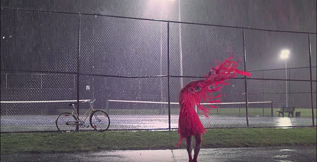
Shot at night – Check. This shot also utilises blanket white lights to caste a bright white light over the whole scene, as well as utilising the tennis courts spotlights.

Suburbia – check. Nothing more suburban and family orientated than a tennis court, field and a bike.

Australiana – check. This is an American video clip, but tennis courts can read as being super Australian, as sport is a massive part of our identity and youth culture.

Vintage vibes – somewhat check. Tennis courts and sports in general are often seen and pitched as being vintage. I think it’s that association with a time gone by, youth and nostalgia.

Surrealism – check. Pink avant grade dress, random dancing in the rain. Like Wuthering Heights but the more modern, depressed version.


Julia Jacklin – Leadlight (Music Video)

Shot at night – nope.

Suburbia – big check. Nothing more suburban than a local high school that exists purely in shades of vintage brown.

Australiana – big check. Julia Jacklin is quite literally the queen of Aus-core and all of her videos revolve around exploring a uniquely Australian aesthetic.

Vintage vibes – big check. I assume this local high school has barely changed since it was built in the 60’s. It’s quite reminiscent of the place we’ll be shooting: The Thornbury Bowls Club.

Surrealism – somewhat check. Julia Jacklin’s videos often featuring her dancing through nostalgia places, like she’s walking through a dream, or exploring a memory. That in itself feels surreal, or at least toys with some surrealist notions.


Julia Jacklin – Pool Party (Music Video)

Shot at night – nope.

Suburbia – mos def. Julia Jacklin grew up in the Blue Mountains and she seems to shoot all of her videos there. I wouldn’t be surprised if this was her own house, or the house of a relative. This house screams 1970’s Australian suburbia.

Australiana – big check. Definitely, see above.

Vintage vibes – big check. Definitely, see above. Plus, she’s wearing a plaid skirt and calf length white socks!

Surrealism – Somewhat check. See above.


Lorde – Green Light (Music Video)

Shot at night – Yup. Though it’s not evident in this shot, this music video was shot at night and makes great use of the gilded city streets and neon lights that appear post 6pm. I love the lighting setup of this shot. The front room lit with a green light, like a fluorescent bulb but to the extreme. And the back lit with some kind of blue light. These two colours bounce off of each other and Lorde’s pink dress, to create an interesting interplay of colour.

Suburbia – this is most definitely urban, it’s shot in Los Angeles to be exact. Even though this music video has an urban setting I do feel that the way that it explores the setting is very similar to the other videos. You have this character walking around somewhat lonely streets bathed in light. Inciting feels of nostalgia, exploring themes of youth and the effect of space on actions.

Australiana – nope. Though that dude in the background does look pretty janky.

Vintage vibes – nope. This video feels more timeless than vintage, like a clip that could be from the 70’s or from the 2010’s.

Surrealism – not really. This video feels more real than some of the others. There’s something about a large city that lends itself to feeling more real than the suburbs. Like the suburbs could be a dream or a delusion, but a city is large and bustling and linked in to everything else that it must represent reality.


Lorn – Acid Rain (Music Video)
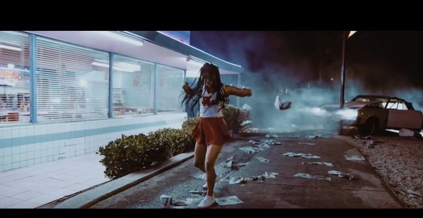
Shot at night – yup. This shot, similar to the one above, features a girl dancing around at night, bathed in neon lights, streetlights and headlights.

Suburbia – yes? Some kind of 50’s America kind of suburbia, where cheerleaders would be hanging out at the local diner.

Australiana – not at all.

Vintage vibes – Yes. That 50’s diner and cheerleader outfit says it all. This clip is certainly playing with nostalgia as well as old school archetypes.

Surrealism – Yes. I’m pretty sure the premise of this film clip is that this cheerleader crashed into that pole and is imagining this entire scene while she sits unconscious inside the crashed car. The whole film clip feels like Michael Jackson’s – Thriller, but reimagined with a female lead and a 50’s time stamp.


Sticky Fingers – Gold SNAFU (Music Video)

Shot at night – hell no. Shot during the afternoon with no UV filter and totally blown out images.

Suburbia – The Sydney version of it.

Australiana – Yup. Who else has an influx of these 70s’ 80s’? 90s’? concrete box structures, that we decide to use as shops.

Vintage vibes – For sure. The whole video has a 70s’ vibe to it. With characters wearing matching caramel two piece suits and silver aviator reading glasses.

Surrealism – Nope.


Tame Impala – The Less I Know The Better (Music Video)
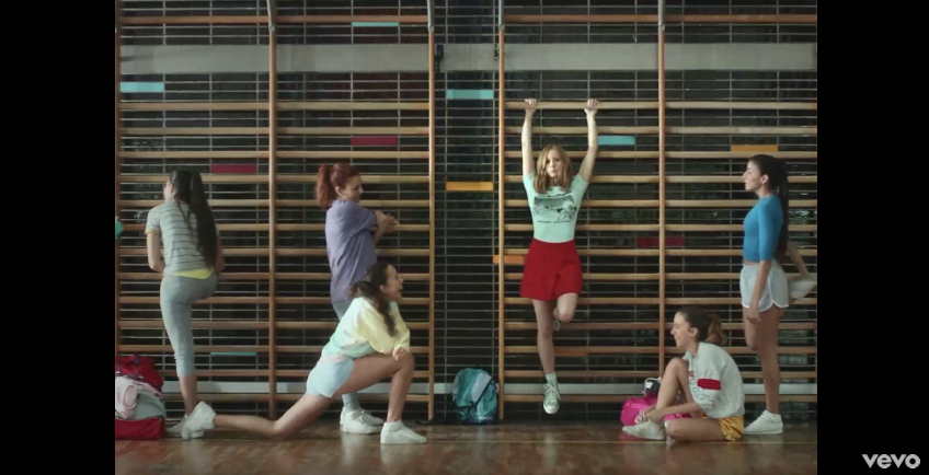
Shot at night – nope.

Suburbia – potentially? There’s something about high schools that always feel suburban. Unless we’re talking about one of those New York City high schools…

Australiana – nope.

Vintage vibes – Yup. Cheerleaders in colourful outfits always feels a little vintage.

Surrealism – Yes. This shot is not surrealist at all, but later there are shots of giant monkey hands reaching down and scooping people up, which is pretty trippy.


The Knife – Pass This On (Music Video)
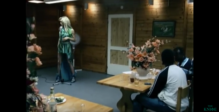
Shot at night – Yes.

Suburbia – Some kind of strange European version of it.

Australiana – Nope. But those wood panels wouldn’t look out of place at a 70s’ RSL.

Vintage vibes – Somewhat. This clip feels like it’s been set in the modern day, but is happening in a space that is vintage.

Surrealism – Somewhat. This singer trips me out, she feels like she’s somewhat metaphysical.


Yall – Hundred Miles (Music Video)

Shot at night – Yes. And they make masterful use of this rooftop basketball court, with the dilapidated buildings in the background.

Suburbia – Yes, but he Barcelionian version of it.

Australiana – Nope.

Vintage vibes – not really. But these girls do feel a little ‘Virgin Suicides’ with their long hair and matching tennis outfits.

Surrealism – not really. Why does people dancing always feel a little surreal though? Is everyday life that restrictive.


Until next time,

Louise Alice Wilson

Blog Post: Week 5

Blog Post for Week 5

This week we completed a lighting exercise where we had to make use of lighting present within the natural environment. Soon we’ll begin shooting our own projects, so i’m keen to investigate lighting further in preparation for that. Thats why i’ve decided to search through Film-grab.com to find some lighting setups that I really like, and perhaps take inspiration from.


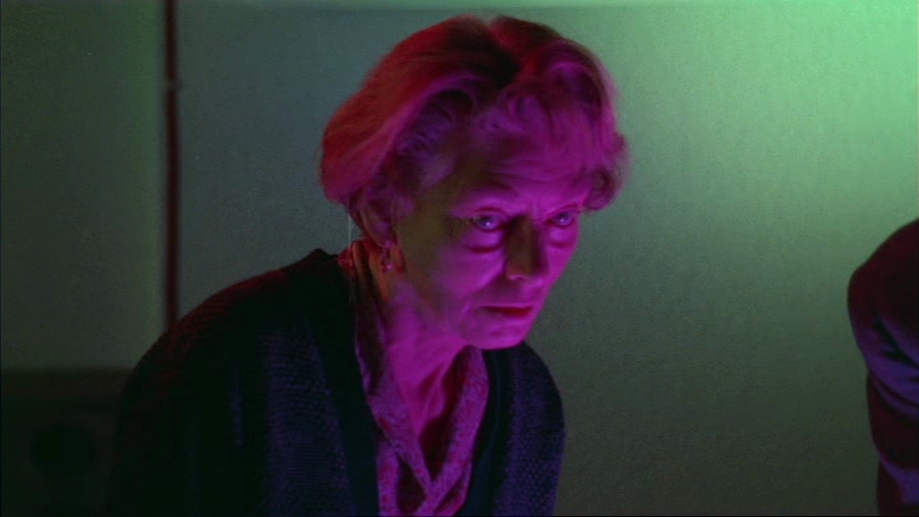
The Sorcerers (Michael Reeves, 1967): 

In this shot it looks like they’ve used a three point lighting setup to light this character, utilising three differently coloured spots. The backlight looks like a deep red colour, whilst the fill is a green colour and the key light is a deep magenta. The use of these three lights adds a great amount of depth to the characters face, whilst accentuating her wrinkles and eye bags with their strikingly hard light. The three colours however obvious they seem upon initial viewing, meld seamlessly into normality after a good few seconds spent staring at this image. This woman strikes me as an interesting mix of frightening, curiosity inducing and mournful. Overall it’s a really interesting lighting setup that i’d be keen to imitate one day.


Silver Linings Playbook (David O. Russell, 2012):

This lighting setup seems relatively simple but who knows? It seems like they’ve used a large soft white light to light the room and used a white spot with barn doors to create a directional light that hits Jennifer Lawrence directly, highlighting her in this relatively flat image and scene. The flatness of this scene is the most impactful thing about it. I’m sure they could have used multiple lighting setups to light the staircase, room and doorway to add more dimension and interest. But the flatness works well to dull the room and add weight to how Lawrence’s character is feeling in this drab environment.


Prison (Ingmar Bergman, 1949):

The soft focus on this characters face is interrupted by the clarity of her eyes also highlighted by a directional spotlight. Nowadays such an obvious effect may be considered gaudy but it’s highly effective. The spot does well to direct the viewers eye to look directly into that of the characters and to distort the rest of her face into a shadowy mass. In this scene we get a sense of the characters soul, hidden behind the eyes, disconnected from the physical body as we stare into her depths. I’d love to sneak this into a shot and hopefully get away with it.


Love (William Eubank, 2011):

Supposedly Stanley Kubrick paved the way for ‘Practical Lighting’, which is the utilisation of lighting visible within the frame to light the scene. William Eubank makes great use of practical lighting in this shot, casting a soft glow over the entire room. Presumably there is another, or perhaps multiple soft lights that are also helping to light the characters face. I also really love the green caste over the entire frame, but presumably this was an effect done in post. I must experiment with this.


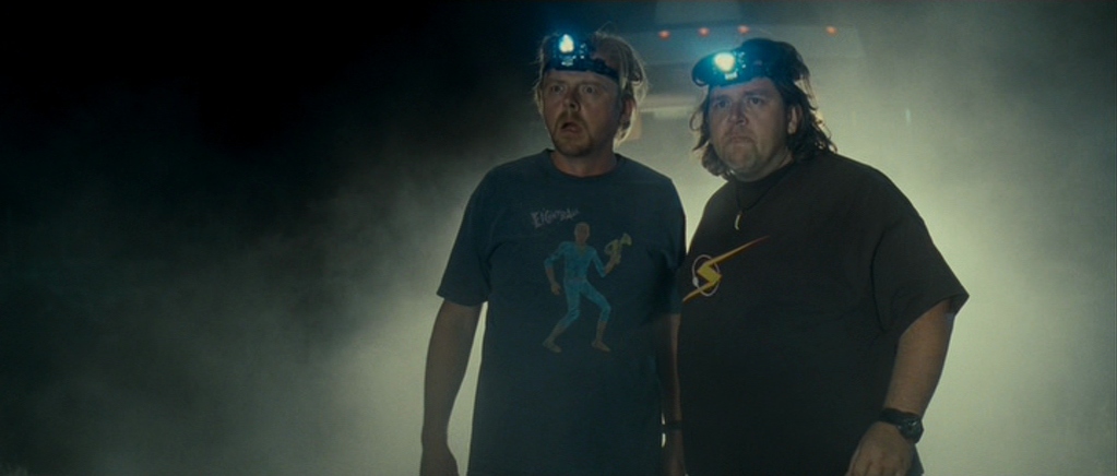
Paul (Greg Mottola, 2011):

Lawrence Sher also makes great use of practical lighting in this scene; to caste an ominous glow around his two lead characters. The daggy headlights are great also, I just wish this shot was framed differently. Stacking them right in front of the truck (or whatever it is behind them) makes the image look messy, especially with so much blank space on the left hand side of the screen. Maybe if the truck had been more to the right hand side of the frame, leaving  a smaller amount of ‘talking space’ on the left hand side of the frame. These characters are also lit front on by some kind of soft light.

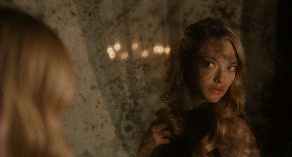
Chloe (Atom Egoyan, 2009):

I’m a big fan of mirrors in film and this shot utilises this antique mirror well. We get a dirty over the shoulder shot of Chloe as she looks at herself. Her face lit on the right hand side by a soft white light, exposing half her face and leaving the left hand side in shadow. Cleverly the de-silvered parts of the mirror also caste various black shadows over Chloe and the frame itself. Chloe is also backlit by a soft light, allowing the back of her head to still look bright and blonde within the left hand side of the frame. The bokeh lights in the background adds dimension and intrigue to this shot. I looked up the cinematographer and of course it’s Paul Sarossy ‘Canada’s most prolific and awarded cinematographer’.


New Nightmare (Wes Craven, 1994):

Mark Irwin makes great use of a hard white light to turn Freddy Krueger into a black silhouette. Utilising that hard light he creates ominous black shadows streaking out from each of his fingers, reminiscent of the blades he has on his left hand. There are also some practical lights viewable in the frame lighting the crowd of people. Assumedly they were also lit with a seperate light.


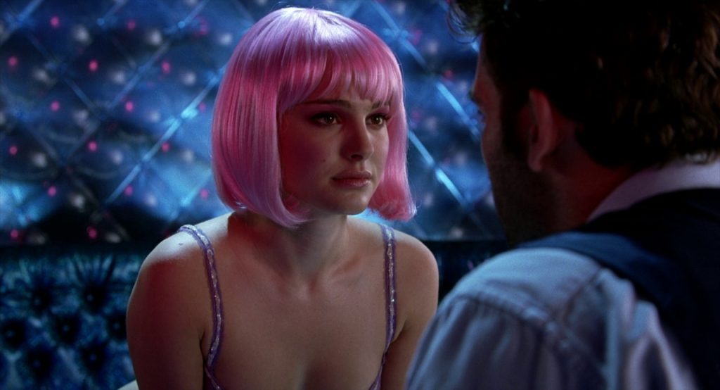
Closer (Mike Nichols, 2004):

This scene is visually one of my favourite in all of cinema history, is that bad? I dunno. Many others love this shot also, as i’ve seen it recreated by multiple artists. The lighting setup seems relatively simple. Natalie Portman is lit via a simple three-point lighting setup. With a white light for the back and fill light and the key light is pink. Clive Owen seems to be getting some of the spill from Natalie’s pink key light, then his back is also sit with another white light. Then the wall behind them is also separately lit.


Deep End (Jerzy Skolimowski, 1970):

Relatively simply lit, using a soft white light to illuminate the right hand side of the characters face and the window in front it. The soft lighting makes this shot and the character look somewhat dreamy. Though I mist admit that I’m more into this shot because of it’s composition than the use of lighting. Having those bright red and green buttons, out of focus, on the right hand side of the frame add interest and intrigue to this shot.


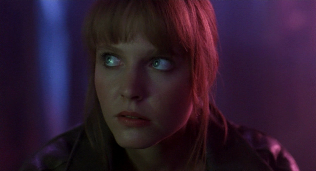
A Nightmare on Elm Street 4- The Dream Master (Renny Harlin, 1988):

Another great use of three-point lighting and coloured gels. This character is front lit with a green-ish light, the key light is purple and she is backlight/almost side lit by a pink light. The neon colours add dimension to the image and make it a lot more visually interesting. Horrors are a great genre to push the use of coloured lights, as it seems to fit in with that ‘world’ easily. And adds to the sickening but enjoyable vibe of the overall film.


Until next time,

Louise Alice Wilson

Newer posts

© 2024 Everyday Media

Theme by Anders NorenUp ↑

Skip to toolbar