http://vogmae.net.au/classworks/2011/manipulateheremotions.html
manipulate her emotions
(2011)
Makers: Madeleine Featherby, Melanie Gleeson and Zachary McSweeney.
The K-Film Project I choose is “Manipulate her emotions” because the first time I’ve seen this was at the first lecture of the course and I was stunned by how amazingly done it is and kept wondering in my mind until now, how they did it? It’s simple and straightforward but the idea is really interesting and immediately attracts viewers.
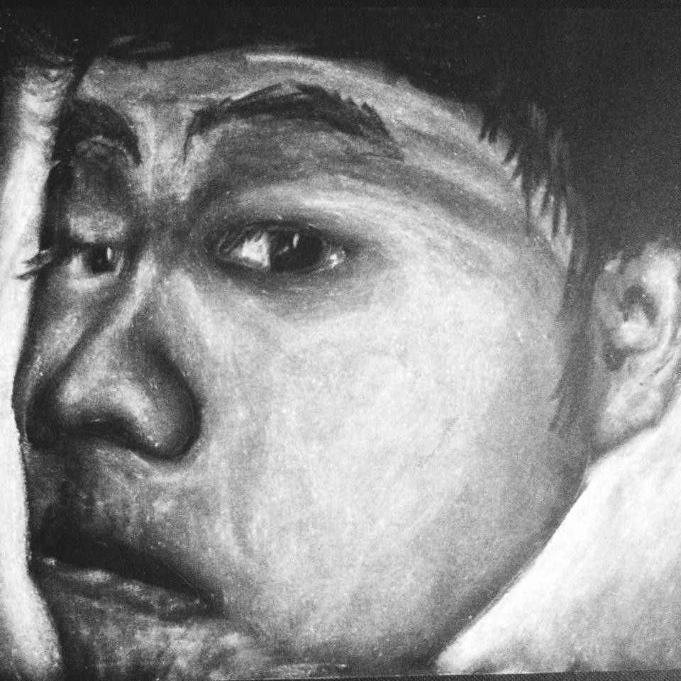
First, the idea is well thought and really straightforward. One actress, expressing a diversity of emotions and sentiments. A continuous soundtrack.
The best thing they have done is let the user decide and play around with the emotions ,as opposed to the confines of media with fixed chain of events and sequence, the composition of narratives in K-films are not just determined by the developer, but also by the user. (Sawhney, N, Balcom, D & Smith, I 1996, ‘HyperCafe: Narrative and Aesthetic Properties of Hypervideo’, in Proceedings of the Seventh ACM Conference on Hypertext, Hypertext ’96 (New York, NY, USA: ACM, p.5). the pattern of the K-Film is also simple but really effective for the audience to realize and understand it at their first impression. One main clip with larger size display to show the emotion that user click, and other 4 small displays to show the other options for the viewer to just drag the mouse their to check and see.
By delivering such straight up K-Film, the makers have succeeded at their first impression because normally and often, people hate to wait to watch a clip without skipping it because they always want to explore, not just sit there and view a slow clip that of course they are wondering about the other clips and effects.
Moreover, the interface allows the viewers to see the side emotions by just drag the pointer over, without having to click it. It then brings up the curiosity of viewers wanting to see the rest of that specific emotion that attracted them in a bigger view. And as long as the pointer is not at a clip, the clip actually stop and stay still as an image, when the main large display keeps going on, which makes the whole sequence looks really nice like a beautiful collage of a girl’s different emotions. And I’m not really sure but as long as I leave a clip and her face does not stay still nicely, I drag my mouse again to have another nice image of her face, then I do it with the other, so that the whole thing looks nice so that overall, I enjoy dragging a pointer all over the screen, which is considered as a successful act of one viewer to the film project. I guess this small thing really plays an important part in this film that not everyone realize.
Another key to this project is the audio. The choice of using pure sound from the room, from her movement, her sighs, and the continuous background music all add up perfectly, making it a real unique and abstract film, which attract the viewers.
People have different mood at different time. Giving the user the choice to choose the available emotion that they are also having, or even just because they like the actress face that way, makes it flow successfully. The only part that I didn’t like was some of her emotions weren’t clear enough, between happiness and sadness with the tears that confused me. Maybe more actors and more acts would have been better and more interesting. Because even though the user get to choose, there are only 5 options for them to select, and as long as they have selected more than 2 , they started to guess the rest and get bored. Viewers expect something that changes their whole expectation, their guesses, a twist; a different flow of acts might be better.
Overall, by giving the audience a choice to actually “ manipulate her emotions”, thanks to the selection of the perfectly interface and pattern, this K-Film has successfully deliver their project and executed it nicely at viewer’s first impression. In my opinion, Korsakow should just be simple, straight forward and smartly delivered like this project.
