Art is arguably one of the most subjective things in the world of existence. It is a form of creation, which in turn is a way of bringing into being ones perspective.
What does all this fancy-talk mean? Well, it means that when a work is being created everybody will have different opinions on how that work should be. This is what we faced when collaborating to colour grade the music video. Up until this point the decisions had been fairly easy to make, as it is a narrative video there were straightforward ways in which things were done.
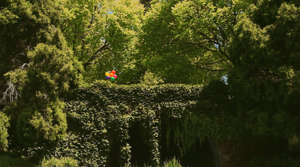
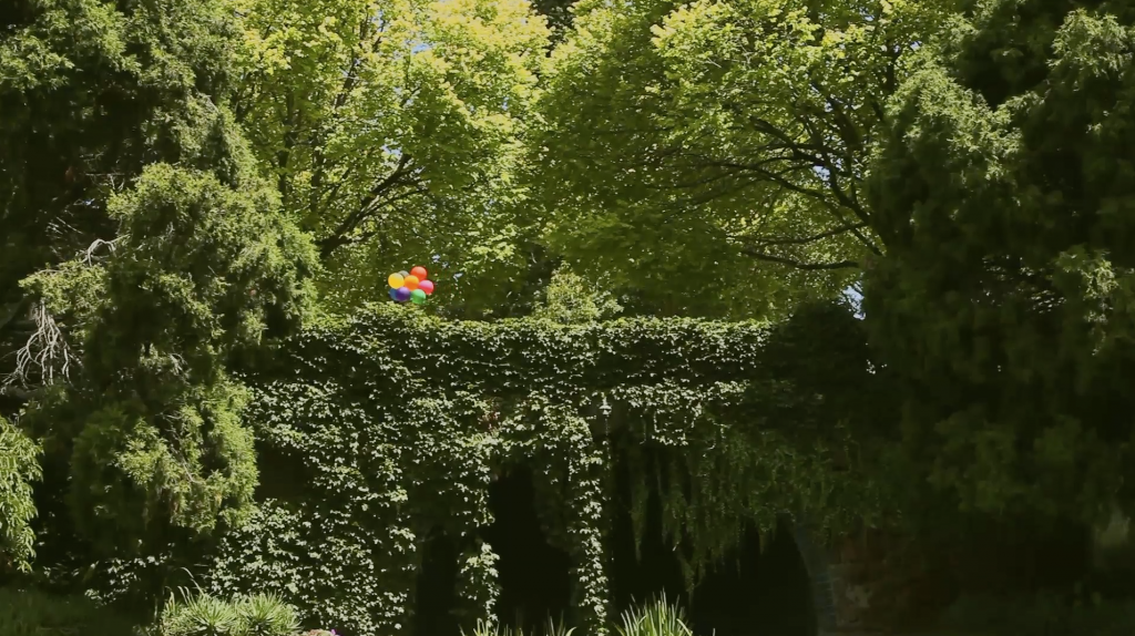
However, when it came to choose a font and colour grade – differing opinions came forth. Should the video have warm tones, cold tones, what type of warm and cold tones? All these questions came forth and there did not seem to be a middle ground. Here are a two of the different grades:
Although being very subtle differences, they do very much impact the final emotion of the piece. This however is still a very subjective thing and is a matter of personal opinion. Currently, there is still no sure fire method for deciding how our group will settle on a final colour




Leave a Reply