Tag: uses of photography

Final Project: Uses of Photography


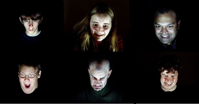
Alas, the final photography project has been done. The title I have chosen for my photography project is : Digital Heroin. I chose the name because it has become a phenomenon. When read article about Iphone dependence on the internet, a couple of words kept popping out; Digital, addiction and addicts, drugs, heroin, malaise, technology. The phrase “digital drugs” are used several times which inspired me to use ‘Digital Heroin’.

Starting from the presentation, I was very eager to start my photography project. Like any other startups,  I have lots of imagination where I wanted my project to head to. I was inspired by the TV show black mirror, that taught me the harsh reality of human nature with digital technology. I was a fan of the show and thus it gave me the Idea to do this project.

Over the blog I have updated some progress I had done. I pursued the project slowly, due to procrastinating and and threatening deadline. I had many conundrums trying to brainstorm and create a concrete plan for the project. The most problematic one was trying to decide if I want to capture life-candid observational shots, or scripted but true-to-many people images. Brian suggested I tried to go outside and try if the candid one worked. After practicing for a couple of days, I concluded that it was utterly hard to do so. I managed to take a couple of great shots, but no more than even remotely enough to communicate my message.  I decided to scale back to the first inspiration.

I asked many friends & colleagues about things people do on their phone that people find annoying, and used my own experience. Although I want to show our reliance the best way possible, I still want to add aesthetically value to the image, to communicate my own style of photography.


These are some of the sketch I did for the project. There are multiple scenarios involving a person and a digital phone, mostly singular photos. I also wanted to add abstract images, mostly associated with light pollution (or simply too much light).  There are basic scenarios , like a person doing selfie, a person holding their phone at mainstream places, but there are ideas that I like to experiment with, even though when it comes to the day in the studio,  many of the ideas didn’t work out.

One of the technical challenge I experienced was coping with my the dark nature of the project with my own camera. I used the RMIT studio 2 times. During the first, I experimented and played with my own camera. It was incredible an fun and I managed to get a lot of good pictures.  I figured if using my own camera would make as good pictures as this, then borrowing high quality camera from RMIT would make even better pictures. But, the exact opposite happened. I loaned a canon 5D Mark but the results were very different from what I anticipated. The quality is better, but I can’t seem to get the pictures that I wanted. Maybe because I was more accustomed to using my own camera, and using 5D is trickier and more complex.


When I presented the particular style of photo I wanted to pursue, I coined the term “chiaroscuro” as a principle. One of the panel judge suggested I looked at Philip Toledano because my Idea sound vaguely familiar (first left picture on the left page). Philip toledano photographed people’s  candid expression while lose themselves playing games. With their comment and advice I continued to think of ideas. The pictures on the right page are some of the shots I took. You can see there I did what I planned, I used the mobile device as the primary source of light. Sometimes the phone’s brightness isn’t powerful enough/sometimes too powerful, that post-production has to play it’s part.  The studio provides lighting equipment and reflectors that I utilized in some of the shots.

After producing and post-producing the photos, I started to assemble & arrange the photos into a photobook. I had no knowledge how to create a photobook, but I saw examples from Bella Capezio (guest lecturer) and together with the readings it gave me some perspective on how I should assemble mine. A further trip into Pinterest and with the help of a friend I then juxtaposed the pictures together and try to make a coherent narrative.  Since my photobook didn’t exactly have a narrative, I decided I would arrange it more categorically. The photobook is an even greater medium to communicate your photos, so figuring out this part was an interesting challenge.

I created an empty space within the first few pages and i put a rectangle that resembles the size of a phone.  Here I wante to implement the idea the digital phone is part of life, hence it is part of the photobook as well.  Besides some of the picture I also put small captions about typical social media behaviour. I continued putting my images in using tips my friend gave me.  My self-portrait and the phone platform is the opening I wanted to give. And the ending (with the picture of a person holding 2 phones) I thought the image serves as a  candid closure that binds the rest of the images together.  I feel that my book overally jumps around with the image and the message, it didn’t create a linear narrative, and it’s more like “the image speaks for itself”. I hope that people who ‘read’ the book can relate and also find it entertaining & aesthetically pleasing.

Overally I was very proud and satisfied with what I have done. I prepared, presented, and consulted with Brian about the message I want to send across. Even though I would have done a lot better If I didn’t procrastinate as much, I feel like I’ve achieved my goal for the project. Photography has taught me how to communicate with people explicitly & implicitly through visual images. It is challenging,  and needs focusing on the many minor details. But effectively sending the emotion that you wanted is a rewarding work.

week 12, Enter


Week 12 has been the most challenging yet.  I have been experimenting and taking photos, but I haven’t produce enough. I tried taking street candid photos, but I met challenges. First, taking the photos in broad daylight to highlight my concept does not help when the sun overshadows the digital screens. Taking the photos at night solves the problem, but then another problem is that trying to sync together the studio photos and real-life concept is very tricky. Aside from the aesthetic difference, I can not figure any way to link the two photos. So after talking to Brian again, I decided to drop the street photos. I feel like I could focus more on formulating my message If I use the TV show as a source of Inspiration. I found a couple of websites that could help me construct the message & style. Another thing I need to improve is the variety of subjects. I did many self-portraits to say I am also ‘in the problem’ but I think with more people i can give a powerful message in the picture.

Looking back over the past 11 weeks I’ve seen my use of photography growing and changing. I have better understanding of my own style and I understand better how to direct my own project. Looking forward in seeing how this turn out

Final Project Presentation

Last Tuesday (week 10) everyone presented in class their plan for the Photobook project. We had guest teacher to come serve in the panel to give comments and opportunity for students to ask question & advice.  A very intimidating but very useful class, everyone explained their idea brilliantly and all of their ideas are impressive.

I explained during the 2 minute Presentation what I have learned so far about the Uses of Photography. With the first and second project Brief, I’ve learned to draw upon my own style through my inspirations. While I still can’t put a name to it, I understand what sort of photos I like to take. With the second Project Brief, I learn about the relation of photographs and narratives. I learn the unique process of telling a story using images. All of what I’ve learned so far has motivated me into my idea for the final assignment.

When Brian Gave an online questionnaire to the class about our future goals, I said that I want learn to work in a studio environment. But I didn’t manage to do that in the first assignment and it wasn’t possible with the second. So I am going to try it for this assignment. Brian has taught the class about studio lighting in week 3 so I will practice from there.

My Idea for the next project comes with inspiration from the TV show ‘Black Mirror’. Black Mirror is a series that shows how technology can pragmatically affect how society works. I want to make a Photobook that shows how dependent we are with our digital screens, in particular our smartphones and laptops. I want to do this because I am one of those people. I want to emphasize the reliance of digital screen as an alternative source of light. Especially at night time.

Presenting and asking for suggestion helped me to consider if my idea is pursuable. The next step is to find the right equipment and right setting and think of ideas where digital screen and people’s face can be most exploited. I will consult with Brian while brainstorming through google and Pinterest.

And so Week 9 Goes

I want to fly


Brian taught the class more about our so-to-be conceptual project and the way which we will publish it into a concrete print. The class talked about “Reading the Photobook” by Gerry Badger.  A further discussion from Bella Capezio, what is really needed in a photobook?  In the article, Badger cited many artist opinions on what they think a photobook is, and each quote varies. Badger cited Lewis Baltz that pointed photography as “a narrow but deep area lying between the novel and the film”, and Raplh Pins that photobook is an autonomous form “an event itself”. These artist touched upon the photobook as somewhat abstract form of storytelling, but another expert opinion, John Gossage noted that photobook has four qualities. “It should contain great work. Secondly, it should make that work function as a conscise world within the book itself. Thirdly, it should have a design that complements what is being dealt with. And finally, it should deal with content that sustains an ongoing interest”.

I feel in a sense, that what all the great commentators try to say is that photobook has to transport the viewer into the new fiction world, filled with the author’s subjectivity but allows the viewer to conjure their own meaning from the book. One particular point Gossage said is that all works of the photobook are fiction. We (the class) somewhat agree with the comment as compiling the photobook by the author cannot exclude the author’s personal meaning. The photobook must somehow represent the author’s idea, whether or not the images are nonfiction. The author’s personal interpretation is hence what is ‘fiction’ in the work.

Even though opinions on the photobook varies, Badger (and Brian) concluded that a photobook requires several elements:

  • It requires the photographer’s conceptual core. The conceptual core is required before the whole process starts. It is the guiding light and the heart of the project.
  • A photobook requires sequence. It is arranged with a beginning, a middle and an end. juxtaposing the images is important in delivering the idea you want your audience to get
  • It requires a layout. While some might think the design isn’t as important as the content, the book’s layout is an opportunity to further give context and allows for creativity to run wild. A good layout can create an atmosphere set before and while reading the photobook.

Soon everyone in the class has to stand in front of a panel of judges to deliver our ideas and our understanding of the course so far. I still haven’t figure precisely what concept I want to pursue, just like the guy in the picture looking blankly at the parrot.  I want to do studio-based project, Because that is one of my goals I told Brian during the first few weeks of the class. I want to try and see what I can play with a controlled environment. I’ll try to ponder some more around the weekends and see if I could come up with any more ideas.

Inhabitants of the Cat Cafe.


So for my photo essay, I decided to do a series of the cats in the Cats Cafe.  My friend showed me the cafe she usually goes to where you can play with the feline tenants once and I was hooked. The cats looked incredibly mesmerizing and we became best friends. They sleep, they play, they eat and they’re loved by many. Cats are my soul animals and I was very excited to do this project. With the permission of the cats and the cast of the cafe I started to plan the sequence in which I want the story to turn out. Since this is a photo essay, captions will be limited only as a preface of the series.

For equipment I kept using my Panasonic Lumix camera, which worked good, and produced good quality pictures. I did not use external flash because flash is prohibited, so I complimented my camera with a tripod instead. There are some disadvantages I received from using my camera though, Because the brand is fairly new in the market, it is hard to find different varieties of lenses. Panasonic lenses are not provided by the A/V loan so I had to stick with the lenses that I own.  As a result of this the angle of the photos are not as diverse as I wanted it to be. But with the limited equipment I still managed to get most of the style that I wanted.

In creating the photo Essay, Brian told us that we have to consider the sequence which the photos connect to each other. I remembered he said that we should consider what atmosphere we want to leave the audience/viewer in. We have to conjure the exposition of the place, the complications and rising actions, the climax, falling action and resolution. I find it challenging to create a sequence for the cats, because the cats act spontaneously and my time in the cafe was limited. But there are some definite checklist to mark for some of the shots and those are:

  • establishing shots
  • sleeping shots
  • cats playing shots
  • One photo with the owner
  • cats eating.

I figured the right sequence would be the start and end activities of the cats, from being playful to being tired.

Because of cats, I want to leave the viewers in a feeling of warmth/fuzzy and furry. I realized now how much it affects how I edit the pictures. I shifted all the temperature of the images into a warmer tone and purple tint. I also want to make the pictures look somehow retro/taken from a film camera, So I added the fade effect and lower the shadow tones. There are some challenges I face editing the pictures. Some of my friends (the cats) have black fur, which is problematic with my camera. To stop my friend from looking like a black blob with eyes, I have to increase the shadow and the blacks element of the picture. But this creates a overly fade look on the picture which is unpleasant to look at. I overcome this with my playing with the exposure, contrast and the highlight.

Overally I was please with the result of the photos Even though there could be a lot more improvements. With more preparation I could create a better sequence and possibly even better shots of my friends. The project has taught me that creating a textless caption requires critical and creative thinking on the spot, added with good preparation beforehand. Because you never know what you are going to get from your subject, you have to solve any possible problems that might come. And one more thing, now I have new friends because of this project!


A visit to National Gallery of Victoria

On Tuesday week 7 the class visited the National Gallery of Victoria to visit some of the photography exhibition to see talented works of art and hopefully get inspired by them. I saw many incredible and intriguing photos, from Bill Henson, William Eggleston, to an Indonesian contemporary photographer Edwin Roseno, the Exhilarating photos of Amusement parks by Carsten Holler, and incredibly minimalistic yet beautiful landscape by the artist born from the same land as Brian, Derek Henderson. It is very inspiring to see very different works inspired by various circumstances. Seeing all the creative works reminds me a quote from Paul Schrader that “True creativity comes from restrictions and limitations” and watching a video of Anna Akana (Youtuber) talking to an artist. Creativity comes from playing and tweaking your capability in the limited boundaries you have. That’s what makes creativity.

An big room is dedicated to William Eggleston. He is credited for introducing color photographs in the photography world. One of his first colour photograph , the guy holding the trolleys, is one of my favorite. He likes to take candid photographs, not necessarily street photographs, but it represents the culture he was in.

The Indonesian Photographer Edwin Roseno uses product packages as pots for plants, showing the direct relation between nature-then-processed result. In his description “Green Hypermarket” is Edwin’s way of how consumable packages have been a utilized in Indonesian homes. After serving it’s commercial purpose, the packages are then used by Indonesian people for plants, changing its value to preserve life.

All of the photographers in NGV inspired me to pursue my own creative style. All of their dedication in their work deserved respect. Below are some of the Picture I took in the exhibition


Essays in Pictures

"Light my soul in the white night"

Today Brian gives us a deeper insight into our project brief, an explanation further of Photo essays. Like storytelling, photo essays are made to tell a story. and such, like a story a photo essay needs a structure, even in the compilation of the images. It needs a foundation that can make sense to the readers.

Like storytelling,  a photo essay needs a beginning, middle and end. The photos then articulate the particular lifestyle of the project, but in photo essays the images are the primary storyteller, not the story itself, the captions compliment the pictures,  giving a visual sensation and a relief of imagination.

When planning the narrative structure of the picture, Brian told us there are some things we should consider:

  • Exposition, rising action, complications, climax, falling action, resolution
  • How do you represent conflict in photographs?
  • How the photos interact with the stories when the viewers see them.
  • How to represent a normal style of life ina highly aesthetic manner

He showed us 4 main categories when constructing a photo story

  1. Establishing Image: context and environment
  2. Action image: capturing action and interaction
  3. portraits: essential to any story
  4. close-up or detail image: need to identify significant detail within the overall scene

and one important thing he told us when we are starting the post-production.

Figure what sort of atmosphere/emotion you want too leave your viewers when they finished seeing the video

Brian also showed us some of photographers which I will talk about in the inspiration part of the blog. Afterwards we got onto our exercise. For this week Brian wanted us to be in a group to make a short 7 picture photo story with the theme “The exchange”. I did mine in RMIT connect the kind of exchange we chose was the exchange of information. this is one of the photos that we made (sorry Michaela, but I look decent in this pic!)


Coming up with Ideas

Progressing further into the month, I had a love & hate relationship with my bed.  My bed kept flirting with me to put my body on it. I have work to do.  but then it put on this blue sheet and and it somehow pats itself, and I couldn’t hold it anymore.

Anyway, during this peaceful Labour day I start to brainstorm ideas I want to do for my second project brief. I decided to do a mimesis on Duane Michal’s work, around the whole concept of how his photography works, and that is a self-expressed story. The unique style of Duane Michal’s and his flexibility photography style caught my attention. He succesfully expressed the questions and visualized emotions and thought he has in hi mind. He is expressing the reality of his state-of-mind and I love that he is brave enough to do so. I like to call that behaviour “not giving a f*ck to society” .As I posted before his work usually revolves around love, mortality, philosohpy, sexuality. But since I react like a 5 year old when talking about sexuality, I wouldn’t indulge in that topic. Instead, I would focus the theme around technology, Friendship, and Happiness. I want to visualize something that I have in my mind for a while now. The things that I have brainstormed were mostly expressions I want to tell the world, about technology and self-imagery, One funny story I experienced, a question that has been on my mind, and one of my hidden personalities. It is a first step, brainstorming, so the ideas would have to be carved and carved until it’s perfect. For the project’s technicalities side, I have thought about the project’s process that utilize different kinds of light situations, and what I have to do to achieve it and with Brians’ suggestion, I rented a camera from the A/V loan for the photo shoot day. Looking forward to how my project turns out.

Re-live


Falling back to the well of education, I resumed the second year of University. It’s blazing hot here in Australia, and my pig-body isn’t helping.  But why am I here to nag, when I can tell you about core subject. I get the opportunity to explore more about photography, different way it is used. I read an introductory project: Photomediations: A Reader and I learned that popularly photography is divided into 2 aspect; photography as art and photography as social practice.

Photography as art is explainable by itself, you’ll mostly associate it with it’s value, exhibitions, galleries, abstraction sometimes in need of interpretation. An extension of panting, photography as art is another medium for artist to express their sense of artistry.

The latter aspect, does not only explain that photography is an agent of social change, but it is also a representation of society, it’s behaviour with photographs, and the popular taste in photography.

The photographs above are a result from Tuesday’s practice with Brian, there were supposed to be more photos, but these ones were the only one I took with my camera.

Uses of Photography, First day

Henri Cartier-Bresson

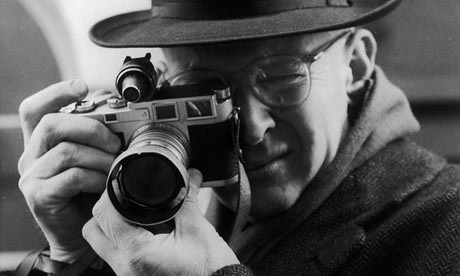
The first day of our media class, Brian introduced himself and immediately we were shown a 20-minute documentary of Henri Cartier-Bresson, a French photographer and the pro-creator of Magnum photos.  The video told us about Cartier-Bresson’s intake on photography. Famously known to create the genre of Street Photography, For Cartier-Bresson, a photographer needs to be quick (quick, quick), to get the decisive moment right. One of the most profound lesson I learned from the French photographer is not to label your photography. Because it limits on what you are capable of doing. Do not focus on what kind of pictures you take, but how you take your pictures.

Other than the incredible documentary, our class were handed with lots of canon DSLRs to start learning how to use them. With a 4-member group, we tried calibrating ourselves with the cameras and took some pretty interesting shots. The fact that it also was a sunny day makes it all the better.


Skip to toolbar