Editing in ‘Enemy of the State’

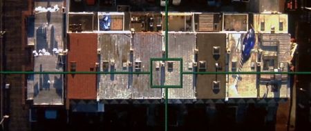
One of the aerial shots in ‘Enemy of the State’

Tony Scott’s Enemy of the State (1998), is a 90s action film that addressed themes of authority and security that are highly relevant even to modern audiences. At its heart, however, it remains a true action film, starring Will Smith as a lawyer who finds himself in the midst of a plot to compromise the privacy of United States citizens.

From the outset, Scott sets up the fast pace of the film through the opening credits. Editing and cinematography work hand in hand in this sequence to establish the idea of surveillance. Shots of cameras, tinted blue, are rapidly cut together almost like flash frames, amongst POV shots from security cameras and satellites. The ‘found footage’ style of these shots make them seem more realistic, and enhances the idea we are constantly watched, even outside the fictional world of this film. It is through discontinuity editing in this sequence allows the editor to convey a disconcerting to the audience.

These surveillance shots are used frequently throughout the film. A majority of scenes involve the main character, Robert, being surveyed by the NSA. The use of cross cutting between Robert, and what is happening to his character, and the NSA characters creates the idea that these scenes are happening concurrently, even though the characters are not in the same room, and the scenes were not filmed at the same time. Also, insert shots similar to those of the opening sequence here provide the point of view of what the NSA characters are seeing through their cameras and satellites. The combination of these different shots elevates the action, as it allowed the editor to cut rapidly between different shots, and show the action from the perspectives of the different characters, as well as the perspective of the omnipresent security cameras.

The Cinematography of ‘Zodiac’

Fincher’s trademark BEV tracking shot creates an eerie mood in ‘Zodiac.’

The film Zodiac (2007), cinematography by Harris Savides, uses specific aspects of the shot to manipulate what is communicated to the audience. The cinematography is crucial in emphasizing the setting and tone of the film, notably in the opening shot. The camera pans horizontally along a suburban neighbourhood on the 4th of July; a usually cheerful celebration in a usually friendly neighbourhood becomes ominous through the slow pan, and the low key, high contrast lighting, and the repetition of the eerily similar houses. The long shot allows us to see the outlines of the people in the shot; we get a sense of them through their body language, but not their facial expressions, and the shot therefore becomes impersonal, almost voyeuristic. We have not met any characters before this shot, and this point of view could potentially be that of the killer’s. This sets the mood and theme for the film: paranoia and obsession.

Savides creates a rich tonal landscape in both day and night scenes. The historical setting (1970s San Francisco) is recognisable through the colours and forms. The night scenes are especially effective, using high tonal contrast, emphasizing rich, deep blacks. Spotlighting focuses the audience’s attention towards details the director wants them to notice, as well as hide elements. For example, the face of the killer is often hidden in shadow in the murder scenes, allowing him to blend into the dark background and creating suspense by hiding his identity.

Furthermore, framing also guides the audience’s understanding of Zodiac’s narrative. In the murder at the lake scene, the woman stares off screen at the killer. Although we cannot see the man ourselves, we assume that he exists in the off screen space as the female character sees him. This expectation is later gratified when he is framed within the on-screen space and enters the scene.

Mise en Scene in Wes Anderson’s ‘The Life Aquatic with Steve Zissou’

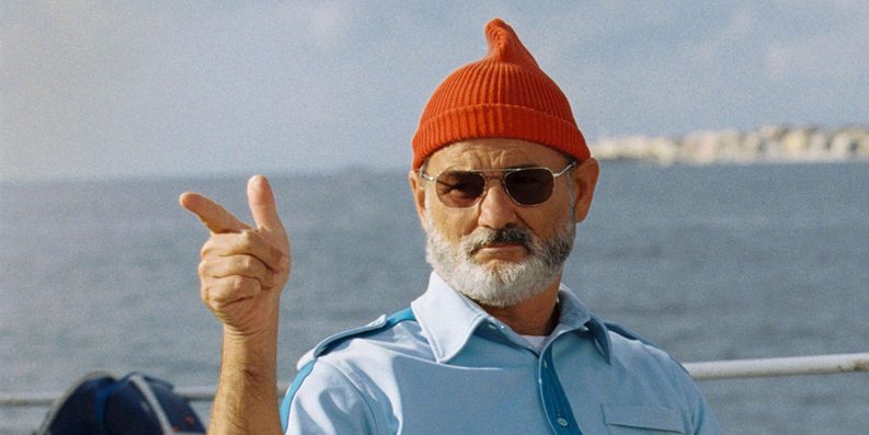
Above: Steve Zissou (Bill Murray) in his classic outfit.


Wes Anderson is well known for his strong visual style. The principles of Mise en Scene are strongly at work in every shot in The Life Aquatic with Steve Zissou.

Most notably, film’s colour scheme is crucial in creating the look and feel of each shot. Primary colours reign supreme: the red of the crew’s beanie’s the blue of their uniforms, and Anderson’s trademark yellow constantly present. By placing repeating colours throughout the frame, Anderson creates a sense of harmony within each shot’s colour scheme. Where these colours are absent, is it done to great effect, such as the all-white colour scheme of Hennessey and his crew, emphasizing the difference between the two teams.

The film’s staging recalls strongly traditional theatre and classic Hollywood films like Casablanca. Characters are arranged carefully in the shot; framed by other characters and the environment. The characters are often arranged in a stage-like formation – facing the audience. Moreover, the acting is frequently stylized and humorously dramatic, especially noted in the way the actors interact with each other. The shot of the Zissou team in special operation mode all jumping one by one over the tennis net is one that stands out. This style of acting further communicates the film’s quirky, humorous genre.

Anderson also manipulates space in framing his shots. Subjects are frequently placed centrally to the shot, framed within symmetrical set design. Similarly, characters are also placed at opposing ends of the shot to create balance within the frame.

Stage craft is further echoed in the camera movements. Anderson frequently pans horizontally across the screen. Often, the action happens on a flat plane – the camera follows the actors as they traverse horizontally along the screen with the camera. The sets are designed to allow for this, especially in the cut out set of Zissou’s boat.