Blockbuster Cinema

https://www.youtube.com/watch?v=VwCdNJsJLhc

Source

In the Cinema Studies Screening earlier this week some interesting ideas about the progression of popular cinema toward giant, blockbuster movies were raised.

The best example of 21st century blockbuster cinema is, of course, your latest Marvel movie. These are movies about high concept action, spectacle, and most importantly, excess. Excess is when the action or visuals go beyond just serving the narrative: they are meant to be a feast for the senses. Thus cinema has gone a long way since classical Hollywood films, when everything in the film had the purpose of serving the narrative, and also where continuity editing as we know it today was developed.

Modern ‘spectacle’ films have, as David Bordwell calls them, ‘intensified continuity.’ They use extremes: rapid editing, bipolar extremes in lens length, close framing and dialogue seen and a constantly moving camera.

The most recent Marvel film I had the (dis)pleasure of seeing the latest Captain America. It consisted, as you would expect, of excessive action scenes with some brief dialogue scenes that were mainly Iron Man making ironic quips. It becomes hard to follow a film when there is always so much going on, visually and audibly, but perhaps theses movies aren’t really meant to be followed. Maybe these films are just meant to be two hours of stupid fun. There is always room for thoughtful, slower films, but Marvel films perhaps owe their success to the desire of the masses to spend two hours away from the stress of every day life.
A Girl Walks Home Alone At Night

A film’s genre is communicated via the story, characters, iconography, conventions and more. Ana Lily Amirpour’s A Girl Walks Home Alone At Night plays will all of these to create a film that is an enthralling mash up of genres.

Audience expectations are key in the success of genres. The title of the film itself creates these expectations; it hints at vulnerability. Most Western audiences have had it drilled into their heads that a woman by herself at night is susceptible to wanton, evil men. However, the vampire character (Sheila Vand) is anything but weak – the night is hers.

One notable sequence begins with a tattooed drug dealer manipulating and abusing a woman, a theme typical of the crime genre. Elements of thriller and suspense are added when he catches a glimpse Vand’s character in the mirror of his car. He later meets her on the street and, believing her to be a prostitute, takes her to his home. When he makes advances on her, she bares her vampire teeth, and the tone and genre of the sequence immediately shifts to that of a classic vampire horror film. All the while, the sequence is undercut by an eeriness, due to Vand’s silence and her black veil, which makes her movements seem otherworldly.

A Girl Walks Home Alone At Night was filmed in the United States, but was written in the Iranian language and takes place in an Iranian setting. The emptiness of the world, for example, the pit of bodies that no one seems to lend a second glance, creates a sense of lawlessness and isolation more typical of Western films.


Critic Kristy Puchko said the film contained “a collision of influences.” It contains elements of Westerns, crime, romance, vampire films, and teenage angst, and feminism.

Grizzly Man

Grizzly Man (2005), directed by Werner Herzog, is a wonderfully absurd but touching documentary about Timothy Treadwell, who dedicated his life to living with and protecting grizzly bears in Alaska.

If I try to fit the film into one of Bordwell & Thompsons categories for documentary film, I think it is closest to rhetorical form. Story is crucial in creating a human connection, and Treadwell’s story is told from Herzog’s point of view. Herzog’s personal touch is evident in this narration, his handheld recording of interviews, and at times he himself features in the shot, such as when he is listening to the audio recording of Treadwell’s final moments. This means that the film is not free from bias, something which no documentary film can truly be, but it is Herzog’s bias that makes the film so effective.

Herzog’s philosophical musings and comments add insight and prompt the audience to consider his points of view. I researched some popular opinion that arose around the time the film was reviewed and found that Treadwell was commonly though to be a crazy man who taunted wild bears until they ate him. Herzog, whilst he is not afraid to point out where he believes Treadwell is wrong or hypocritical, does not condemn him. In one moment I found particularly poignant was the shot of Treadwell mourning over the corpse of one of the foxes he befriended. Here, Herzog offers his opinion through the narration, suggesting that Treadwell sees nature as harmony, but he sees it as being about ‘chaos and murder.’

The people Herzog chose to interview were fascinating, almost like caricatures of themselves. The most normal person in the film is the paid actor. They are like the magic cinematic moment Herzog shows us when the foxes Treadwell befriended run across the frame, completely unplanned. Characters such as these can’t be created – they are so fascinating because they are real.

Film Style in The Age of Innocence

According to Bordwell & Thompson, style refers to the distinctive patterns of technique found in a film, which shape the effects the movie has on its viewer.

Style can refer to the style of a film, a director’s particular style, or the style of a group of films or directors. Importantly, style is created through the choices of the director, which can be shaped by limiting factors such as technology, fashion, dominant trends or stylistic norms.

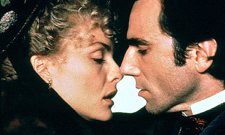
The Age of Innocence, by director Martin Scorsese, features sound as a key part of its style. The film features omniscient non-diegetic narration throughout, which provide the viewer with key information about the plot and characters. Also, the recurring orchestral score ties together the film, as it provides both emotional cues for the audience and is relevant to the setting, especially in the opening ballroom scene. Sound also directs the audience toward important dialogue, such as in the scene where Newland and the Countess whisper to each other as the opera. The volume of the other characters conversation and the background music fades away so we can only hear the two characters speaking, thus reflecting the intimacy of their conversation – they are focused only on each other, just as the audience is focused only on them.

The mise en scene, particularly the costumes and settings, reflect the film’s 1870s setting, a pattern which continues throughout the film. Similarly, the editing is reflective of the film’s style, such as the fade out to blocks of colour, yellow, red and eventually white in crucial scenes. The editing also reveals Newland’s point of view, as by rapidly cutting between detail shots, we get the sense that he is observing his environment carefully, and we get to see what notices. This is repeated throughout, thus creating a pattern with this style of editing.

Moreover, masking focuses the audiences attention, such as in the scene where the engagement ring is displayed, where everything in the shot is masked out except the ring. This technique is relatively uncommon in Hollywood narrative film’s, so it stands out as being reflective of The Age of Innocence’s unique style.

Sound in Vivre Sa Vie

Director Jean-Luc Godard’s film Vivre Sa Vie (1962) follows a young woman, Nana, who turns to prostitutions after she fails to gain a career in acting. The film is divided into twelve tableaux, which are presented as title cards without sound, in the style of classic novels. The titles of the scenes give us insight into the characters, as in the scene where Nana dances to the juke box, where the title card has cued us that she is wondering if she is really happy.

The opening credits are superimposed of close up shots of Nana from front and side angles. Accompanying this is the musical score that becomes a motif throughout the film. It fades in and stops abruptly, creating dynamic changes in loudness as the music is suddenly replaced with silence. This creates a jarring effect, as we are used to hearing a continuous musical score.

Most of the sound in Vivre Sa Vie was recorded naturally at the same time as the visuals were recorded. This meant that the only mixing was during the addition of the musical score I mentioned earlier. Although this is a natural way of recording, it does not sound naturalistic as audiences are used to hearing the polished soundtracks of films, like Hollywood films, where audio was mostly recorded during post-production, for example Foley and ADR. This also means that the sound not perfectly polished in Vivre Sa Vie, notably in the opening café scene, where some of the dialogue is almost lost amongst the background sound of the café. The background sound also cues us into the setting of the scene, as many shots are medium close ups and close ups and focus on the characters, without any establishing shots to tell us where the scene takes place.

I really enjoyed this film, perhaps that’s because I have a soft spot for anything French and I miss Paris dearly.

Narrative in Mystery Road

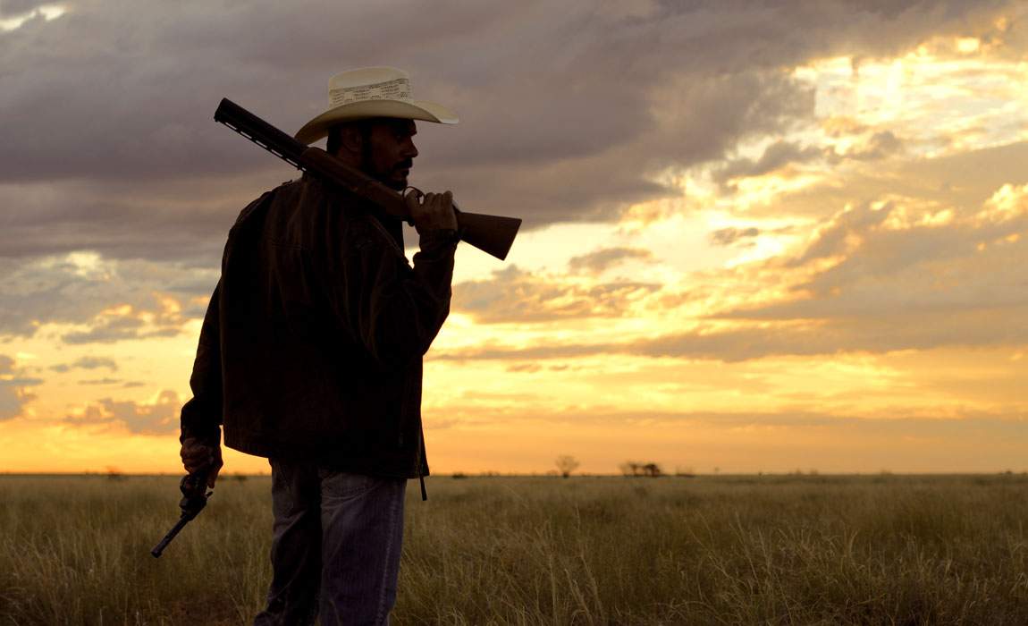
This week’s screening, Mystery Road (2013), is a filmed by Australian director Ivan Sen, following an Aboriginal detective (Aaron Pederson)who returns to his home town in the Australian outback to investigate the murder of a young girl.

Narrative refers to a series of chronological events related by cause and effect. It regards how the story is given to us, through components of film form and style, including narration, mise en scene, setting, and more. Manipulated order, frequency and duration can help us make sense of events within a narrative. We can consider how the opening of a film relates to its resolution, and the connection between this.

Time within a narrative film is usually contracted, as it is in Mystery Road. The film’s narrative spans over a few weeks, even months, yet is contracted within a two hour film. Ivan Sen creates a uniquely Australian narrative through the film’s style. Wide shots of the Outback landscape, the red dust, and Australian architecture, and the film’s characters and costume all work together to draw us into the narrative. Aerial shots of cars driving along lonely, dusty roads both serve as transitioning shots and give a sense of the vast scope of the landscape.

Aaron Pederson as an Aboriginal actor gives credibility to his role as the detective as racial tensions underscore the narrative. We are drawn into his characters view as his performance enhances how he feels isolated from the community, and yet driven to make positive change. His role as detective sees him set of a chain of cause and effect that leads to the climax of the film, but yet, this chain is not as straightforward as Hollywood narrative films. Due to limited dialogue and background music, there is more mystery and the story is not always clear, especially in the film’s ambiguous ending.

Editing in ‘Enemy of the State’

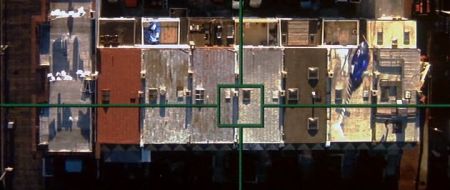
One of the aerial shots in ‘Enemy of the State’

Tony Scott’s Enemy of the State (1998), is a 90s action film that addressed themes of authority and security that are highly relevant even to modern audiences. At its heart, however, it remains a true action film, starring Will Smith as a lawyer who finds himself in the midst of a plot to compromise the privacy of United States citizens.

From the outset, Scott sets up the fast pace of the film through the opening credits. Editing and cinematography work hand in hand in this sequence to establish the idea of surveillance. Shots of cameras, tinted blue, are rapidly cut together almost like flash frames, amongst POV shots from security cameras and satellites. The ‘found footage’ style of these shots make them seem more realistic, and enhances the idea we are constantly watched, even outside the fictional world of this film. It is through discontinuity editing in this sequence allows the editor to convey a disconcerting to the audience.

These surveillance shots are used frequently throughout the film. A majority of scenes involve the main character, Robert, being surveyed by the NSA. The use of cross cutting between Robert, and what is happening to his character, and the NSA characters creates the idea that these scenes are happening concurrently, even though the characters are not in the same room, and the scenes were not filmed at the same time. Also, insert shots similar to those of the opening sequence here provide the point of view of what the NSA characters are seeing through their cameras and satellites. The combination of these different shots elevates the action, as it allowed the editor to cut rapidly between different shots, and show the action from the perspectives of the different characters, as well as the perspective of the omnipresent security cameras.

The Cinematography of ‘Zodiac’

Fincher’s trademark BEV tracking shot creates an eerie mood in ‘Zodiac.’

The film Zodiac (2007), cinematography by Harris Savides, uses specific aspects of the shot to manipulate what is communicated to the audience. The cinematography is crucial in emphasizing the setting and tone of the film, notably in the opening shot. The camera pans horizontally along a suburban neighbourhood on the 4th of July; a usually cheerful celebration in a usually friendly neighbourhood becomes ominous through the slow pan, and the low key, high contrast lighting, and the repetition of the eerily similar houses. The long shot allows us to see the outlines of the people in the shot; we get a sense of them through their body language, but not their facial expressions, and the shot therefore becomes impersonal, almost voyeuristic. We have not met any characters before this shot, and this point of view could potentially be that of the killer’s. This sets the mood and theme for the film: paranoia and obsession.

Savides creates a rich tonal landscape in both day and night scenes. The historical setting (1970s San Francisco) is recognisable through the colours and forms. The night scenes are especially effective, using high tonal contrast, emphasizing rich, deep blacks. Spotlighting focuses the audience’s attention towards details the director wants them to notice, as well as hide elements. For example, the face of the killer is often hidden in shadow in the murder scenes, allowing him to blend into the dark background and creating suspense by hiding his identity.

Furthermore, framing also guides the audience’s understanding of Zodiac’s narrative. In the murder at the lake scene, the woman stares off screen at the killer. Although we cannot see the man ourselves, we assume that he exists in the off screen space as the female character sees him. This expectation is later gratified when he is framed within the on-screen space and enters the scene.

Mise en Scene in Wes Anderson’s ‘The Life Aquatic with Steve Zissou’

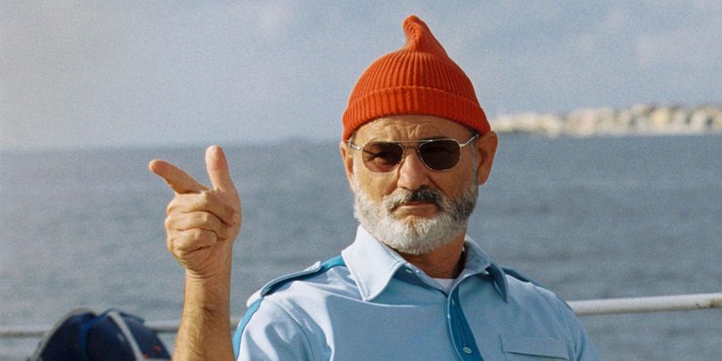
Above: Steve Zissou (Bill Murray) in his classic outfit.


Wes Anderson is well known for his strong visual style. The principles of Mise en Scene are strongly at work in every shot in The Life Aquatic with Steve Zissou.

Most notably, film’s colour scheme is crucial in creating the look and feel of each shot. Primary colours reign supreme: the red of the crew’s beanie’s the blue of their uniforms, and Anderson’s trademark yellow constantly present. By placing repeating colours throughout the frame, Anderson creates a sense of harmony within each shot’s colour scheme. Where these colours are absent, is it done to great effect, such as the all-white colour scheme of Hennessey and his crew, emphasizing the difference between the two teams.

The film’s staging recalls strongly traditional theatre and classic Hollywood films like Casablanca. Characters are arranged carefully in the shot; framed by other characters and the environment. The characters are often arranged in a stage-like formation – facing the audience. Moreover, the acting is frequently stylized and humorously dramatic, especially noted in the way the actors interact with each other. The shot of the Zissou team in special operation mode all jumping one by one over the tennis net is one that stands out. This style of acting further communicates the film’s quirky, humorous genre.

Anderson also manipulates space in framing his shots. Subjects are frequently placed centrally to the shot, framed within symmetrical set design. Similarly, characters are also placed at opposing ends of the shot to create balance within the frame.

Stage craft is further echoed in the camera movements. Anderson frequently pans horizontally across the screen. Often, the action happens on a flat plane – the camera follows the actors as they traverse horizontally along the screen with the camera. The sets are designed to allow for this, especially in the cut out set of Zissou’s boat.

Week Three Cinema Studies Blog

Experimental film is about testing the limits of film, and what questioning what film is. It challenges our notions of what film can be. It can have a range of functions, whether it be to express the experiences and viewpoints of the director, or be a form of self expression. I think experimental film can also be important in refreshing our palette, by providing a break from the mainstream norms of Hollywood cinema.

In the vein of Holy Motors from last week, this week’s films at the screening further manipulated the audience’s expectations. Ballet Mecanique is unquestioningly abstract, as demonstrated by its lack of narrative form. The film presents a form of mechanical dance, through its focus on shapes, lines, and movement. By repeating these elements, Leger sets up a pattern which the audience strives to follow, in order to find unity within an otherwise chaotic film.

My personal favourite of this week’s screening is La Jetée, which creates narrative form through still photography and sound. This technique actively engages the audience’s imagination in order to animate the images and the characters and scenes they represent. Moreover, it also highlights the aesthetic qualities of each individual photo.

The Illustrated Auschwitz explores a unique way of telling a real life story. The harrowing tale of a Holocaust survivor is created by remixing images and shots from films. The images shown correlate closely with the woman’s narration, yet they do not show actual images from the Holocaust in order to simulate the horror. Footage from the Wizard of Oz is given an entirely new meaning through this change of context.

These films demonstrate that experimental film has a broad scope, and allows directors to disrupt the illusion of space and time that conventional films create.