https://www.youtube.com/watch?v=pftto9fuWpU
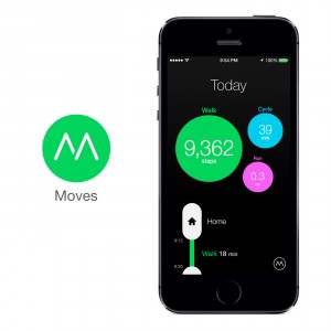
This experiment was a continuation of the ‘split screen’ look that we had used in project three. I planned out a route that I was going to follow and used Moves to track it. There were a ton of challenges I faced here with the app itself. Firstly, it’s very unreliable with it’s tracking. The plan was to head straight from home and then PT all the way to St Kilda beach. The app didn’t track my movement from home until I’d walked 5 minutes away from my house. Number 2, Moves has a problem recording your current location – you must be completely still for it to register the place you were in at all. Otherwise, it would just note you down as either walking or whatever transportation you were using.
However, I went well with the footage I shot. I think it all looks very nice, and I was following through with the ‘sampling’ idea, filming every 5 min or so depending on where I was. This also gave me a chance to plan what kind of shot I was gonna get, whether it be a close up or a wide. The breaks in between filming really gave my shooting style a meticulous edge.
When editing, I placed all my footage along with a screenshot of my Moves journey onto a 1080p timeline in Premiere Pro. To show which stage of my journey the audience was watching, I placed an arrow at the point of the ‘Movesline’ and also added a ‘ding’ sound just for a bit of extra style to the piece. For each location, I had a master wide shot which would play the entire time, and then had little small close ups that would add a bit of context to the place as well.

