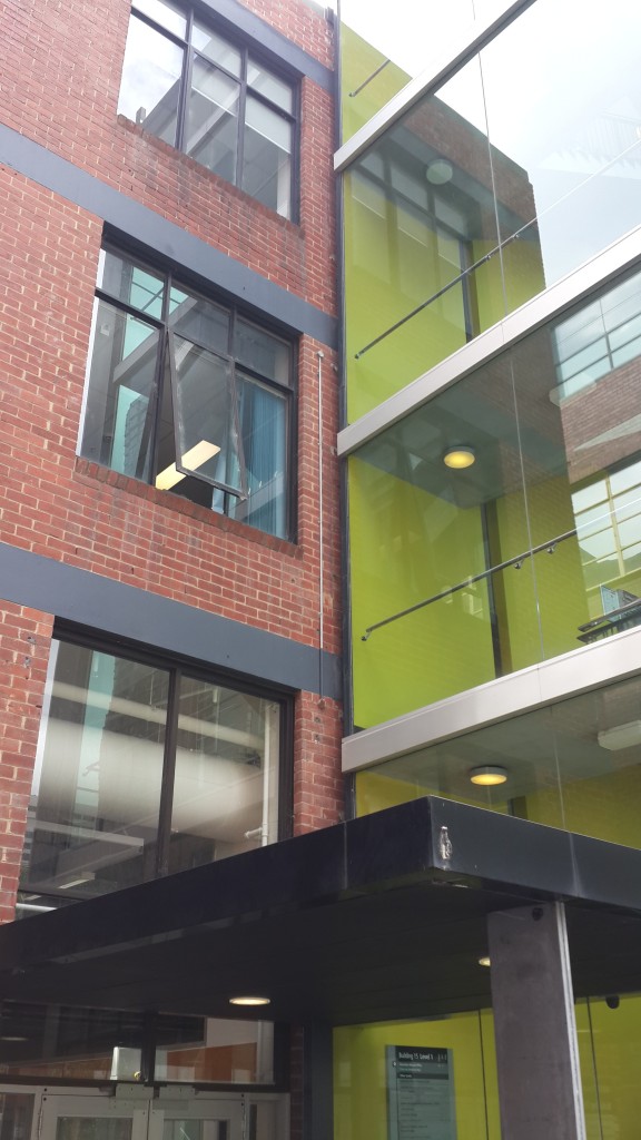
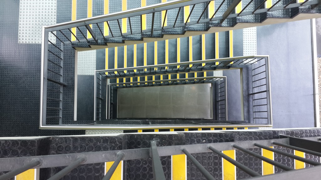
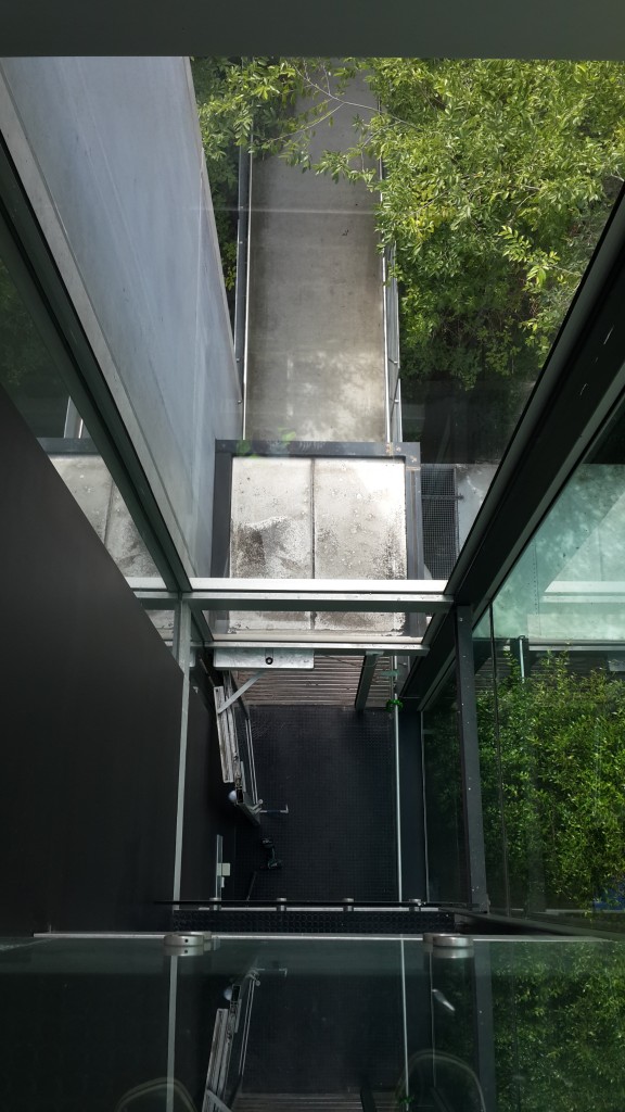
The first impression of Building 15 is the 5 storey glass facade stairwell facing the Alumni stairs that lead up to the Alumni Courtyard. It’s a very modern looking part of the building that feels very open and clean. From the outside the massive window displays one big reflection of Building 1 and part of the cityscape. The reflection of Building 1 is especially interesting, as this modern addition to the building literally reflects it’s historical roots. With all the windows it is a very clean looking part of the building, which also provides generous views outside of the building, as well as views from the top of the building to the ground, creating a sense of height as you wander up the stairs.
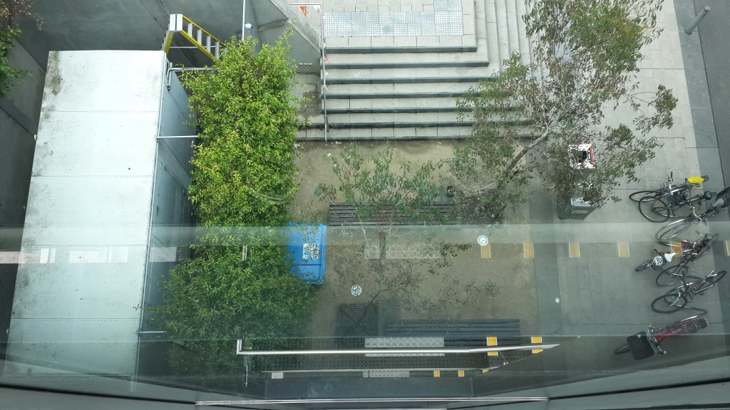
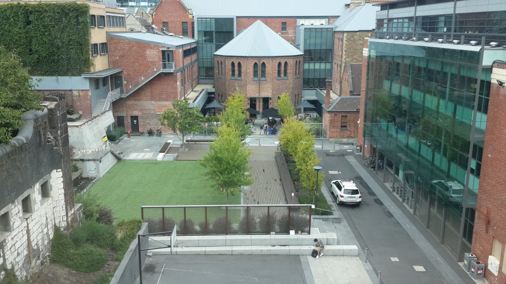
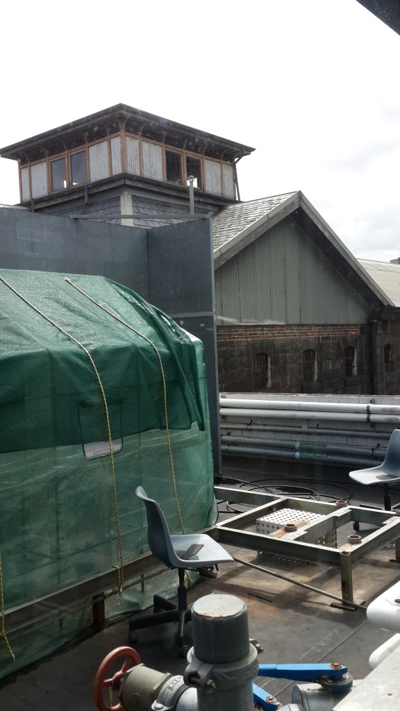
Walking into this stairwell it is quiet with many reflective surfaces, the floor and walls included. For what’s essentially a kind of antechamber, this creates a sense of spaciousness and along with the windows it feels incredibly open, almost as if it were outside. As you make you way to the top of the stairwell you can see down into the Alumni Courtyard, and onto the roof of the building and onto parts of the Gaol. However it’s not until you go into the original part of the building that you get a sense of it’s place in time.
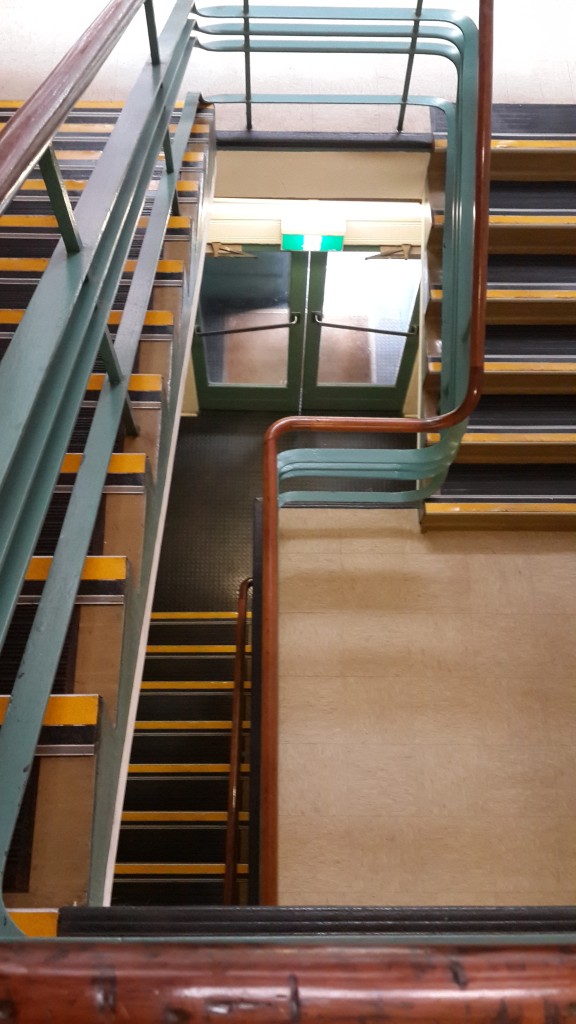
It’s interior is older, smelling musty and with noticeably more lino flooring and carpet in the offices. It feels very last century, and compared to the modern section; very dull. It feels like a place of work rather than spectacle. The stairs in this section have wooden hand rails complete with wear and scratches from years of use. The offices contrast those of the ones in the newer part of the building. Where these are designed with classic square cubicles in mind, feeling claustrophobic, the newest offices have high ceilings and wide angles cubicle spaces open to the rest of the room. It feels like the common theme between the two sections is the feeling of space. The older section is definitely more conservative and a lot simpler, where the newer section tries to encourage a feeling of wide open space.
The contrast between the very new and old parts of the building is what’s most interesting. While this is a common theme throughout Melbourne city, Building 15 shows a stark delineation of the two where glass meets brick and walking through one door takes you from clean, open design to older, closed hallway design. It’s almost a matter of form against function of a building that was originally built as an aeronautics school which focused particularly on the engineering and manufacturing aspects of the process. The original building was completed in 1945 in the latter years of World War II. While the building was used for classes it also housed a wind tunnel and dynamics laboratory for testing automotive parts.
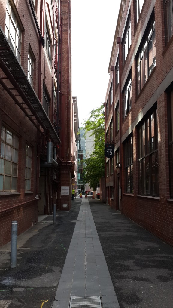
This original building is now all offices, serving a much less industrial function, but the simplicity of the building still shows it’s roots as an engineering one. Looking down the walkway the building is adjacent to, you can still see the square, squat design of the building and the original gridded windows. Overall it’s a very understated building, especially as it’s original section is hidden on all sides except for the walkway, which makes it feel more like a brick wall. In this sense it’s very much unlike some of the other, grander buildings on the campus.

Prior to Building 15’s existence, space used for Gaol, Mahlstedt’s (Vic.) Pty. Ltd, 1923, State Library Victoria
Kernot, Wilfred, ‘Engineering Education in Victoria’, One Hundred Years of EngineeringI, viewed 10th March 2015, <https://www.engineersaustralia.org.au/sites/default/files/shado/Learned%20Groups/Interest%20Groups/Engineering%20Heritage/EHA%20Victoria/Journal%20of%20IEAust%201934/IE%20Aust%201934%20-%201%20Public%20Services.pdf>
RMIT Website, ‘Building 15’, viewed 11th March 2015, <http://www.rmit.edu.au/maps/melbourne-city-campus/building-15/>

