Nam June Paik – Robot K-456 (1964)

Who is the practitioner (what is their name?) and when were they practicing?

Nam June Paik, sometimes referred to as the “father of video art”, was a Korean American artist that was active from the early 60s right up until the 1990s.

What is the title of the photo or video you have chosen to analyse (can you provide a link?) 

The piece I have chosen is Nam June Paik’s first robot, K-456. It is named after the Kochel listing catalogue number of Mozart’s concerto N. 18 in B-flat major. It can be seen here.

With the photo or video, you are examining when was it produced (date)?

It was made by Paik in 1964, this was very early in Paik’s foray into modern art, and was his first attempt at automated robot.

How was the photo or video authored?

The concept of the robot came from Paik wanting to create a robot for impromptu street performances that create a “sudden show” or “split-second surprise”. To create K-456, Paik used a selection of metals, cloth, speakers and wheels that he scavenged from various sources. This reflected what would become a staple of his artwork, repurposing cheap and disposable materials into brand new technologies. Its physical composition (body parts, human-like frame etc) also showed Paik’s desire to humanise his robotic creations.

How was the photo or video published?

The robot itself was published with the intention to be ongoing. Paik had an idealistic view of the future of modern robotics, and so wanted his robotic creations to be changing constantly. He did not view k-456 as an inert invention, but rather something that could be refashioned or constantly re-modelled if he so desired. There were elements within the robot that were published traditionally however, as the robot played audio recordings of JFK speeches through a speaker. These would have been captured with a microphone during his election campaign / presidency and Paik took them, presumably from a Creative Commons or public audio library.

How was the photo or video distributed?

The robot was originally distributed to the public via street performances, but then it was also used as part of the Robot Opera at Judson Hall in New York in 1964. It also featured in a series of performance exhibitions throughout the ’60s. It lay dormant for quite some time, but then returned to the public sphere in 1982 when Nam June Paik had their first museum exhibition at the Whitney Museum of American Art. During this exhibition, Nam June Paik took K-456 onto the street and orchestrated what he described as an “accident” where the robot was made to cross 75th street and was struck by a car.

References:

Artelectronicmedia.com. (2020). Robot K456 – Art And Electronic Media. [online] Available at: http://www.artelectronicmedia.com/artwork/robot-k456/ [Accessed 10 Feb. 2020].

cyberneticzoo.com. (2020). 1964 – Robot K-456 – Nam June Paik (Korean) & Shuya Abe (Japanese) – cyberneticzoo.com. [online] Available at: http://cyberneticzoo.com/robots-in-art/1964-robot-k-456-nam-june-paik-korean-shuya-abe-japanese/ [Accessed 10 Feb. 2020].

Gagosian Quarterly. (2020). Life and Technology: The Binary of Nam June Paik | Gagosian Quarterly. [online] Available at: https://gagosian.com/quarterly/2018/10/16/life-and-technology-binary-nam-june-paik/ [Accessed 10 Feb. 2020].

Tate. (2020). Nam June Paik – Exhibition at Tate Modern | Tate. [online] Available at: https://www.tate.org.uk/whats-on/tate-modern/exhibition/nam-june-paik [Accessed 10 Feb. 2020].

The Art Story. (2020). Nam June Paik Art, Bio, Ideas. [online] Available at: https://www.theartstory.org/artist/paik-nam-june/ [Accessed 10 Feb. 2020].

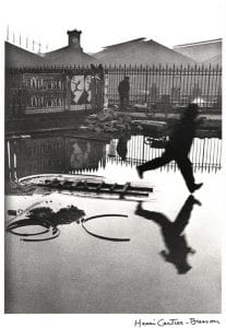
 

Henri Cartier-Bresson – Place de l’Europe Gare Saint Lazare (1932)

Who is the practitioner (what is their name?) and when were they practicing?

Henri Cartier-Bresson was an incredibly prominent French photography throughout the 20th century. Born in 1908 just outside of Paris, Cartier-Bresson studied in central Paris and began focusing on photography in the early 1930s after he discovered the works of Martin Mankacsi in Arts et Metiers Graphiques, an arts magazine active from the 1920s until 1939. Active from the early 1930s right up until the early 2000s, Henri Cartier-Bresson was perhaps most known for both his surrealist approaches to photography and also as a founding member of Magnum Photography (an international photojournalist cooperative) that Cartier-Bresson himself described as “…a community of thought, a shared human quality, a curiosity about what is going on in the world, a respect for what is going on and a desire to transcribe it visually.” (Pro.magnumphotos.com, 2020)

What is the title of the photo or video you have chosen to analyse (can you provide a link?) 

The photo I have chosen is Place de l’Europe Gare Saint Lazare. It is currently available to be seen in person in person at the Museum of Modern Art in New York, or online at this address.

With the photo or video, you are examining when was it produced (date)?

The photo was produced at some point in 1932.

How was the photo or video authored?

The photo was captured on Cartier-Bresson’s Leica camera, very soon after her purchased it in the same year. He used 35mm film to capture the image. As for mis-en-scene, he attempted to capture the moment right before the worker hit the ground, in an attempt to create a timeless sense within the photograph. This became an enormous part of Cartier-Bresson’s philosophical view on photography. He coined the term “the decisive moment” when aiming to capture these kinds of fleeting images. It is also interesting to note that this particular photos is one of the very few that Cartier-Bresson decided to crop. Usually, he would leave the entire image in its entire, but Cartier-Bresson decided to crop out a portion of fence in the foreground that slightly protruded into the bottom of the frame.

How was the photo or video published?

The photo was published in a Gelatine Silver process. Silver salt is suspended in gelatine is coated onto the desired print medium (paper, glass, plastic, film etc) and then exposed to a negative. The coating holds a latent image, which is then revealed with a developing agent.

How was the photo or video distributed?

This photo is most known from a book distributed by Simon and Schustser in 1952. It was a collage of Henri Cartier-Bresson’s work encapsulating his ideology of capturing moments in time on film. The book titled The Decisive Moment ( originally Images de la Sauvette in French) is one of the most famous in photographic history, as it assembled an enormous variety of Cartier-Bresson’s early works. This particular photo is one of the most well known from the collection and can now be seen in the Museum of Modern Art, New York.


References:

ABC News. (2020). Place de l’Europe. Gare Saint Lazare 1932. [online] Available at: https://www.abc.net.au/news/2011-08-26/france.-paris.-place-de-l27europe.-gare-saint-lazare-19322c-b/2857312 [Accessed 8 Feb. 2020].

Fondation Henri Cartier-Bresson. (2020). Biography – Henri Cartier-Bresson. [online] Available at: https://www.henricartierbresson.org/en/hcb/biography/ [Accessed 8 Feb. 2020].

Pro.magnumphotos.com. (2020). History of Magnum. [online] Available at: https://pro.magnumphotos.com/C.aspx?VP3=CMS3&VF=MAX_2&FRM=Frame:MAX_3 [Accessed 7 Feb. 2020].

Steidl Verlag. (2020). The Decisive Moment – Henri Cartier-Bresson. [online] Available at: https://steidl.de/Books/The-Decisive-Moment-0516515559.html [Accessed 10 Feb. 2020].

Wade, J. (2015). The Leica I: The Camera that Changed Photography. [online] Shutterbug. Available at: https://www.shutterbug.com/content/leica-i-camera-change-photography [Accessed 10 Feb. 2020].

The Art Story. (2020). Henri Cartier-Bresson Artworks & Famous Photography. [online] Available at: https://www.theartstory.org/artist/cartier-bresson-henri/artworks/ [Accessed 10 Feb. 2020].

The Most Influential Images of All Time. (2020). See The Story Behind the Gare Saint-Lazare. [online] Available at: http://100photos.time.com/photos/henri-cartier-bresson-behind-gare-saint-lazare [Accessed 8 Feb. 2020].


A1: Annotated Bibliography – Jack Fahey

A1: Annotated Bibliography


Assignment 1- Annotated Bibliography
Name: Jack Fahey s3382553

I declare that in submitting all work for this assessment I have read, understood and agree to the content and expectations of the assessment declaration – https://www.rmit.edu.au/students/support-and-facilities/student-support/equitable-learning-services

Blog reflections

SESSION 1
SESSION 2
SESSION 3
SESSION 4

Annotated Bibliography

Selected text 1 – The Design of Every Day things (pages 81-87) (word count 535)

Norman, D 1998, The design of everyday things, Basic Book, New York pp 81-87

Chapter 4 in Norman’s (1998) book, The Design of Everyday Things, outlines the concept he identifies as “constraints” and explains their importance to designers specifically when they are producing content/objects for consumption. The chapter postures that an objects constraints (things that limit the function of an object) can aid the user in determining the correct use and/or function of said object. Norman (1998) goes further into detail by also positing several different types of constraints that an object may have, listing four categories in total (physical, semantic, cultural and logical). The chapter also goes into detail explaining a study involving adults assembling a Lego motorcycle without instructions/guides and provides photographs detailing the task.

The article provides utility by very simplistically explaining the subject matter; the impact that constraints can impart onto objects, from a designer perspective. The results of the Lego motorcycle test is somewhat limited in application and scope (doesn’t outline method or sample, which severely limits any study’s capacity to be extrapolated), however the test isn’t intended to be used as evidence of a widespread phenomenon, but to merely simplistically illustrate to the reader the general aspects of the topic. In this sense, it is functionally useful content for the chapter to contain. The four different categories of constraints that Norman (1998) specifies (physical, semantic, cultural and logical) perfectly illustrate the different reasoning that an average adult would use in order to complete the task outlined at the beginning of the chapter. One issue with the chapter that could possibly limit the usefulness was the way Norman (1998) seems to completely ignore any potential for accidental completion of a task/use of an object. While he does go into very precise detail outlining his various hypotheses of affordances and constraints throughout his entire book, and obviously within this chapter, he will often neglect to acknowledge that perhaps the reason an object like this was built without instructions could be related to someone accidentally doing something correctly. That is to say, there is perhaps too heavy a focus on deliberate actions throughout The Design of Everyday Things, though it may be impossible to deliberately design an object to be “fortuitous” so to speak, which could be the reason that this topic is not covered. One last factor that may limit utility to readers is how much the industry of design has grown and developed since the publication of the book. Decades of shifts and changes in the marketplace may render some of the more contemporary arguments in the book either irrelevant or at the very least muted in effectiveness.

This entire book, and by extension this specific chapter, has been used all over the world by prospective designers in many different specialty disciplines and became a #1 best seller. It has, therefor, clearly proven its utility and importance to the design industry. It is perhaps even more important to the designers of today than it was in 1988 due to the fact that there is an ever expanding number of technological advancements/inventions in the software development market, and these applications are often picked up by consumers or completely forgotten based solely on their ease of use and intuitive design features.

Selected text 2 – New Media: A Critical Introduction (pages 163-169) (word count 449)

Lister, M et al 2009, New Media: A Critical Introduction. Routledge, New York. pp 163-169

Section 3 of New Media: A Critical Introduction explores both the history and the modern applications of the widespread adoption of the internet, specifically in relation to marketing strategy. It outlines both the importance and effect of the dot com crash in early 2000 and the role that the internet has played within an economic context over the following decade. The chapter suggests that modern marketing strategy isn’t only concerned with “exposure” for the brand, but also aimed at promoting “engagement”. Because strategies with high engagement can command higher fees,  Lister et al (2009) postulate that smaller audiences with high engagement can earn just as much revenue as mass audiences.

The chapter provides a good base for understanding in the introduction, before honing the argument down to a more specific and modern topic. It goes into great detail laying down its most important points and defining terms so that the reader can easily digest the information regardless of their experience or prior knowledge in this particular field. On possible drawback is that this publication is now 11 years old. Technology based strategies and information can grow at such a rapid, exponential rate that perhaps the arguments put forward in this article may have already been improved upon or rebutted in further works. Compounding this, its usefulness is somewhat limited towards any social media based marketing strategies considering the relative boom that social media has made in the time since publication. Some of the most popular social media applications of today (Instagram and Snapchat for example) weren’t even launched at the time of publication of this book. This would obviously limit its relevance and utility to anyone specifically researching that particular field of online advertising.

The chapter definitely provides a lot of utility, specifically in relation to anyone researching the early stages of the internet and the first evolution of online marketing. The chapter discusses the dot com boom and crash, the first forays into online marketing and the history of the topic at length, and this is the kind of data and analysis that ages particularly well. So, despite the fact that it was published over a decade ago, in regards to this field of research it is still very relevant. While the chapter doesn’t provide much in-depth, “fine-grain” analysis (and doesn’t aim to) it is still successful at asking questions that push the audience towards further works and it provides evidence from a variety of established, well regarded sources. So while it might not be the most useful piece of writing for experts, it does provide significant utility to people who are just beginning their research into online marketing and how it has changed since its early stages.

Selected text 3- Video: The Reflexive Medium (pages 1-6) (word count 395)

Spielmann, Y., 2007. Video: The Reflexive Medium. MIT Press, Cambridge, Massachusetts. pp. 1-6)

This chapter on the Audiovisual Medium explores how the form of video has changed the medium since its inception, and to a lesser extent provides a background of how the audiovisual medium as a whole has developed since videotaping began in the 60s. There is one main assertion made throughout the chapter; that  the central factor separating video from film reliant predecessors is that it does not produce any physical images, even though it does produce pictorial quality. Throughout the whole chapter the writer relies heavily on theoretical frameworks to support their arguments, rather than empirical evidence.

A very in depth, philosophical framework is built throughout the first chapter of this book which goes into great detail to explain the nuanced difference between digital and film based video capture and reproduction. The arguments are supported with technical and theoretical based evidence. The first major drawback to the article that may hinder utility is the incredibly specific and technical jargon used throughout the piece. There is a lot of industry and technologically specialised language that is used without defining any terms for the reader. For an audience that is well versed in the subject matter, this would not be an issue. However, anyone new to the topic or attempting to start learning more with this book may not draw an enormous amount of use out of the chapter, or the book, because of the specificity of the lexicon. Secondly, the article doesn’t attempt to back up any of its assertions or arguments with any empirical and/or statistical evidence or attempt to reference previous works in the same field. It relies solely on the theoretical arguments put forward by the author and nothing else. While this can still be a useful text, it does limit the utility that it can provide to academic works, considering the claims it makes cannot be tested and/or proven outside of being internally consistent.

Understanding the nuanced ways video has reshaped the audiovisual medium is important to people in a variety of disciplines, especially those wishing to become video content creators, film makers, producers etc. The article would be a useful text for anyone exploring the filmic qualities of technical advancements in video production as well as anyone that is seeking a further philosophical understanding of how image capture on film differs from its virtual replacement in modern video.

Total Word Count : 1470

Youtube and Social Media

An interesting point that was raised today in class was which apps we consider to be social media. Elaine asked the class which apps come to mind when we think about social media and all the normal staples of the industry were mentioned (Twitter, Instagram, Snapchat, Facebook etc). One that wasn’t mentioned by the class however was YouTube. Now YouTube is definitely a social media app by the definition, but why is there this disconnect between the others mentioned and apps like Youtube or Spotify that definitely do have social content on them?

I think, possibly, there are two reasons that YouTube wasn’t thought of in this context by anyone in the class. First, YouTube, generally, isn’t used by many people to communicate with their friends/followers. Obviously it is used in that way by the content creators on YouTube, but the vast majority of YouTube users would view themselves as consumers, not creators. When we think of a social media app, we think of snap chatting our friends, posting to an instagram story or messaging each other on facebook. I would guess that most people don’t even comment on YouTube, and so for the vast majority of people there is 0 social interaction on youtube. So, when we have that strong, direct conversational/social perception of what a social media app does, YouTube falls into a slightly different category.

Secondly, for most people on youtube, it is passively consumed content rather than active. When people are using Instagram or Snapchat etc they are often liking photos, messaging their friends, regramming or saving content they enjoy, posting their own photos etc. YouTube however, for the vast majority of users, occupies a space much more similar to traditional broadcast TV or modern streaming platforms like Netflix. People log onto YouTube, watch the content that is produced by their favourite channels and then thats where their usage on the app ends. They don’t use YouTube to message anyone, they don’t post comments, they don’t submit their own videos etc. Even when a someone wants to share a YouTube video with their friends on social media, they use a different app to do so (messenger or twitter for example).

The Long Tail

One of the extra resource readings for this class is an article published to online media outlet WIRED concerning the economic trend of “long tail media”, which basically describes the notion that the market for non-mainstream media content combined are bigger than the mainstream media that is consumed. The article goes on to argue that this line of thinking will shift the economy of media away from blockbusters/lowest common denominator content and into wider and more niche concepts. At a base level, it is true. Obviously, there is always going to be content filling niche’s that mainstream media isn’t going to bother to try and cash in on. Netflix has thousands of titles on its browser, for example, and they are deliberately picked to try and appeal to the widest audience possible. So while it is true that niche markets are big (and probably growing with the ever expanding content outlets online), the notion that the entire economic media landscape will shift towards that model doesn’t seem to line up with the current trend (especially in film and music) in content creation.


Currently, generic blockbuster movies are bigger than ever. Expanded universes, trilogies, prequels, sequels etc are dominating the box office. Cinema companies are, more and more, giving screens to the lowest common denominator films rather than taking chances on the more “niche” or (as they are sometimes viewed) “risky” options. I can honestly only see this trend continuing to a point where cinemas will only show blockbuster films and everything else will be only available online. And while, as the article points out, this online only form of niche distribution is rapidly growing in economic viability as a business model, its also getting harder and harder to find production companies that are willing to finance projects that aren’t tying in with some kind of established brand/actor/cinematic universe/source material. While it is true that the biggest market, inevitably, lies outside the top “X” percentage of songs streamed/movies played in cinema etc, that doesn’t mean thats where the most money is for the content creators. So while its true that Spotify makes a ton of money on the “small sales” (the top 10,000 songs get less plays than all the rest combined), it is increasingly becoming harder for bands to get their music onto Spotify if they aren’t an established brand. Similarly in film, while its true that a relatively sizeable portion of Netflix’s library that is streamed aren’t even released in cinemas, its getting harder to find backers with enough money to make those smaller movies with quality.

Non-Functional Affordances

Today’s lecture was centred around the design concept of affordances, which was first brought into light by Don Norman in his book The Design of Everyday Things. In a brief sentence, Affordances are an object’s properties (real or perceived) that indicate its possible functions to whoever is using it, which suggests how it can be interacted with.


Something that came into my mind during the presentation was the existence of non functional affordances. That is, what are the properties of an object that can indicate unintended uses without changing the literal function of the object at all. The immediate example that comes to mind is colour. The colour of an object can have real, tangible and deliberate effects on its uses. Traffic lights, for instance, only have intended functionality purely based on the colour of the three lights (red, amber, green). However, taking this further, can the colour of an object bring about unintended perceptions in the user. Imagine you were to enter a classroom where all the chairs were black except for one red chair. I would expect most people to avoid taking that chair, assuming it was red for a specific purpose. This might not actually be true, it could simply have been borrowed from another room where all the chairs were red, but just by virtue of it being superficially different, it would be perceived as having a separate function from an otherwise identical chair. This can be taken even further by simply focusing on spatial location too. Let’s say, now, that all the chairs are black. What if they were all stacked on one end of the room except one chair which is sitting on the other end of the room in front of the whiteboard by itself. It would have no added functions to the other chairs, it’s the same colour, weight, type, etc. From a design perspective, it is completely identical. I would guess that, once again, if a class was asked to grab their chairs when they entered the room, no one would go for that chair because, presumably, they would ascribe some sort of ulterior use / significance / importance to the positioning of the chair. 


When trying to apply this concept to an instagram related concept, in keeping with the course content, its hard to imagine how these unwanted and unintended aesthetic affordances could impact a content creator and even harder to conceptualise how a creator would be able to plan for this outcome. Perhaps one way is to try and avoid colour schemes that may be linked to other brands (avoid bright red and yellow so you aren’t unintentionally linked with macdonalds, for instance). But one could also argue that this could be used in a positive way, by syncing your apps/photos/content up with the colour schemes, layouts, visual aesthetics etc with famous brands, content creators could unintentionally lump themselves in with bigger brands/studios and gain a wider audience by doing so. Youtube creators are probably the biggest proponents of this strategy, where youtube video thumbnails are incredibly similar across different content creators in order to trick viewers into thinking they are watching someone they are familiar with.


Networked Media : Initial Thoughts

How do the affordances of INSTAGRAM affect the way that photos and videos are authored, published and distributed in the network?
I thought that a good way to kick off my summer subject blog posts would be to just go through my initial thoughts and reactions to this prompt, which is going to be the focal point of the course.


The first thing that comes to mind when reading the prompt is how the format of instagram impacts user content. It was initially built as a basic photo sharing app that is specifically tailored to and intended to be used on smartphones. On a surface level, these constraints have obviously had a massive impact on the design of the UI. The way the feed scrolls is intuitive to a touch screen, but would be difficult on an older phone, the picture size format is perfectly scaled to a phone screen but looks small / odd on a computer screen etc etc. But going beyond that, the app functionality also aims to keep users interested / endlessly scrolling on the app. The feed is basically never ending on instagram, which is a trend on most social media related apps, in an attempt to keep the user “in-house”, so to speak, for as long as possible, rather than just using instagram for a limited time and then closing the app. It also tailors its notifications to keep the user checking instagram whenever they post a photo by sending a push notification to the users screen every time their photo receives a like or comment.


However if we look deeper, the layout and functionality of instagram has also affected how content creators format their media content. For example, it was originally used purely to share photos of your friends / family but has now become an app littered with “influencers” that use instagram to share sponsored photos with their fans in order to reach massive audiences. There is also the growing trend of “buzz feed esque” videos. These small fluff pieces are all over instagram and have a very specific format to keep people interested. Instagram has a default setting which mutes audio on the app unless otherwise told to play sound, and so content creators have started to make videos that require no sound to keep watchers interested (big, constant subtitles across the video, little to no sound mixing and instead focusing on visual content etc). This is a great example, in my mind, of the functionality of an app forcing media professionals to create content in a certain way, which might grab more viewers but certainly limits creativity within the video format.

Comparing a Key Sequence


For this part of the assignment, I have chosen to compare a rough and finished version of the Billie Buttons sequence.

The reason I chose this segment of Georgie Currie, was because it features chopped up and rearranged audio. The aim of each piece is the same, to elaborate on the importance of flowers (specifically billie buttons) throughout the album artwork, and also on the thematic element of flowers through the whole EP (titled flowers for you worst days).

The original clip felt somewhat disjointed, Georgie stammered a lot throughout the explanation, and we felt this would cause the audience to lose attention somewhat. Eliminating some of those pauses and stammers cleaned up the sequence quite well, but it still wasn’t quite working for us. Taking it to Rohan, he suggested rearranging the order of what she says and moving the B-roll around a bit to cover the new audio cuts. Moving the word “Billie Buttons” and the image of the flowers in the vase to the very front of the sequence completed changed the feel. Instead of feeling a bit slow and dry, the audience immediately knew exactly what the flower was, and what it looked like at the top of this small segment.

We also moved the location of this part of the interview to right before the florist footage. I think this formed a very clear throughline from the first half of the interview into the interlude. Having Georgie talk about the flower, and why flowers were important to her lead into the visuals of her playing in a florist in front of a wall of flowers really well, and the thematic coherence added a lot to the piece.

Finally, this rearranging is somewhat reminiscent, in a more broad sense, of the entire piece. The original ordering and focus of the first cut just didn’t work. It didn’t have that sense of coherent, concise flow that is required to make a successful film. Chopping the irrelevant small details, putting the important lines/shots right at the front and giving it a proper sense of order really brought both this sequence, and the entire film together.


Reflecting on Real to Reel

What was your goal in week 1? Did you achieve it?

The goal that I outlined in week 1 of this course was; to come out the other side of the semester with a piece of media that I was happy to put in my portfolio and share with the world as a reflection of my film-making ability.
I think, insofar as achieving that, this studio has been a resounding success. I am incredibly happy with the end product of Georgie Currie. It is a piece that I am both proud to have made, and will be proud to share.

What Challenges did you face in this course?

I think the biggest challenge I face in Real to Reel was that of delving into a type of media/content creation that I wasn’t familiar with. I’d never done anything corporate or advertisement related, and I’d never produced anything that had a purpose other than itself being a work of art (in this case, showcasing the talents of Georgie and introducing her as a person to the world).
However, this course happened to coincide with a 3 month internship I acquired at a marketing firm in the film department, mainly editing commercials for the internet and television. These two experiences occurring alongside each other really helped my editing skills on this kind of media.

What did you learn along the way?

I think most importantly to my own personal future career, I learned a lot about collaborative film-making. This was the first film, short or otherwise, that I had produced/edited/filmed etc with someone else. It was a great experience in juggling my own personal vision for something that was, in some ways, my own passion project, with the ideas and creative visions of another person. I think it was beneficial not just to the work, but also to myself as a filmmaker, because it’s just not feasible to be successful in this industry, and not be a strong collaborator.

Final Appraisal of Georgie Currie

What was your intention with this work? Did you achieve it?

The original intention of this short film was to create a spotlight piece on young, Melbourne based, singer/songwriter Georgie Currie, and to promote the release of her new solo Extended Play (EP). The stakes of the piece were to outline that Georgie was going to return to university if, after a few years of full time music production, her career hadn’t picked up. Through the pre-production phase this held pretty much the same, however after the first rough cut of our footage, we felt that the stakes did the opposite of what was intended. Rather than draw the reader in, they took the audience out and made her career seem somewhat trivial. We also found that a part of the interview where she expanded on the struggles and experiences of being a young female musician, came to the forefront as something we needed to make central to the piece.

So the film kept its original intention as a spotlight on Georgie and her album for the first first half of the interview (which is all about her album and musical style), the second half of the piece focused on navigating the musical industry as a young woman. All in all, I think it achieved what we were aiming for when setting out to create this media, especially in terms of functionality for Georgie, as she used some of the footage on her social media platforms to promote her tour and her EP launch show in Melbourne.


What aspect are you proud of? What can you improve upon?

I think the centre point of the piece is what I’m most proud of. The images of Georgie with flowers in her hair, playing in front of a wall of more beautiful yet fleeting flowers inside a florist, while her interview audio over the top describes her fears that age is incredibly important for female artists, and that every year she gets older that she fears people will care less and less about what she has to say (something that is particularly true of women artists) creates a poignancy that I found really striking.

In terms of what I could improve on, audio engineering is definitely up there. I’m just not well versed in creating a sound space around the interviewer. I took some recordings of sounds to layer the piece with, but I think a much more planned and deliberate approach would have been better. A nuanced yet more diverse sound sphere around Georgie would have really elevated the piece in my opinion.