My Take on Casey Neistat

Modern media and communication technologies has given way to a whole plethora of talented people able to present themselves to a mass audience online. The majority of these talents and figures that become known worldwide are YouTube ‘vloggers,’ who blog regularly on a video based platform. And today, I want to discuss the interesting personality that is Casey Neistat.

Neistat is a filmmaker, producer, vlogger, co-founder of his own social media app (Beme), and also a very adventurous man. He has travelled so far that he has essentially gone around the globe several times, and thus has had an incredibly fulfilled life so far and he is only 34. His films, including his vlogs, are visually and technically stunning. While sometimes he prefers a point and shoot Canon Powershot to his marvellous EOS 5D Mark III DSLR, his films and videos maintain an elegantly edited and smooth finish. He is a respected media practitioner and producer, and working as a freelance commercial director has allowed his reputation to skyrocket and he has landed countless projects with companies such as Nike, Mercedes-Benz, Google and J Crew.

I just have one issue: the guy can’t keep a camera intact for more than about 30 seconds. Consistently, he has had mishaps involving dropping, breaking and damaging his cameras and having to buy new ones. If all heroes have a fatal flaw, his is that despite his incredible talent and inspiring productions, his technologies can barely withstand his active lifestyle.

The first time I became really aware of this fact, and also when I questioned my respect for him, was when I watched his 78th vlog, ‘Quitter.’ In it, he ranted for a few moments about the inadequacy of SD cards in his Canon EOS 70D DSLR, and then proceeded to gratuitously axe the camera before immediately buying a brand new 5D Mark III. It was in this moment that I, a broke university first year, saw Neistat in a much less favourable light. To myself I thought, How dare he destroy the camera I can only dream of having and then calling its superior a ‘piece of crap’?

At the same time however, I still respect Neistat. If I saw him in the street, I would lose my cool and make an enormous embarrassment of myself trying to say hi to him. The thing is, this one big part that I dislike about him does something that I don’t see alot from other YouTube personalities; it humanises him and reminds me that even though he is an extraordinary human being, he’s still just a human being. That’s what I think that I admire most in Casey Neistat, being able to get a better sense of his personality. As my own films and photography are greatly inspired by his style of visual media, it is refreshing to get an understanding of how other creative minds think, work and act.

My Take on Filming with Sound

PB3’s deadline is just around the corner, and today I have just about wrapped up shooting the original footage for the final cut.

My only problem is: I am not used to editing or producing films with dialogue or externally recorded audio. I haven’t done so much as stretched my wings beyond little experimental timelapses and music videos.

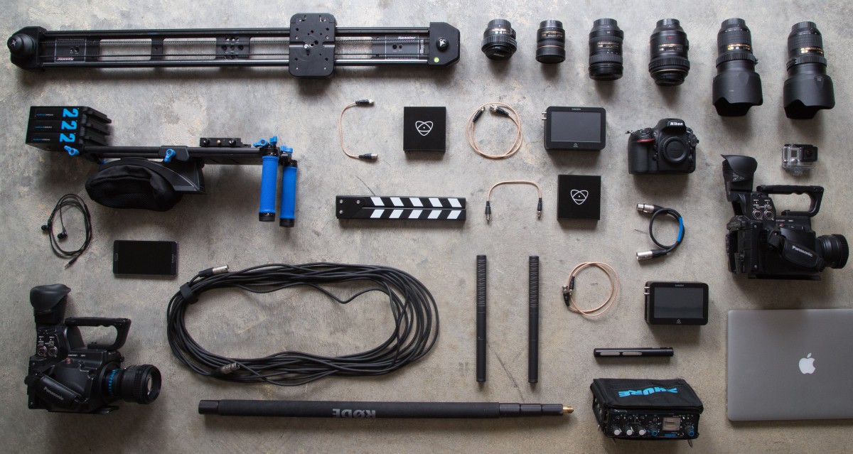
My first problem that I am encountering is recording audio. To put it bluntly, I simply don’t enjoy recording audio, whether I am using an H2N Zoom or my iPhone 6. Conceptually and technically, I struggle with understanding how to edit or improve sound that has already been recorded; alot of the time, I cringe at the quality of what I’ve recorded, particularly if it’s my own voice.

Jumping that hurdle and getting over the fact that I have an issue with understanding aural media is not something that I am keen on doing. But I’ll need to do something about it if I want to improve and appreciate the quality of my productions more.

Introduction to Interviewing

During this week’s workshop, we were sent out in groups to film an impromptu interview regarding ‘How to survive at RMIT.’ The experience was an interesting one mostly because it required us to shoot footage with people that we had not met or spoken to before, and so we had to overcome that awkward ‘just met’ boundary in order to successfully shoot the interview within an hour and a half.

Three things that were obstacles in working with unfamiliar people on an interview were:

  • Deciding where to film
  • Deciding who was going to be interviewer/interviewee
  • Deciding what questions were going to be asked

When filming with new people, creative decisions become difficult ones to make because often, people are nervous that their ideas will be judged poorly or harshly or that they may embarrass themselves in some way. In my group, we all understood quickly that we could not afford to be shy in the short space of time that we had; each of us quickly took on leadership roles in our own ways to allow us to progress in a fair and open-minded fashion.

My Take on Text Analysing in Culture

One of our more recent readings in Media 1 explored textual analysis from a media practitioner’s perspective. I have to say, it blew my mind a little bit; What made sense to me is that every cultural product made by humans is a text, and every text can be analysed.

These texts are analysed through semiotics; Semiotics and media are intertwined and depend on one another, allowing to make connotations, suggestions and representations that are communicated to audiences.

What I think caught my interest however is the notion that the language of signs differs among cultures; every ethnicity, religion, nationality and culture has their own language of signs and symbols that correlate with their social rituals and cultural beliefs. For example, in Western cultures such as Australia or the United Kingdom, the colour white is used as a symbol or connotation of purity, chastity, hope, etc. However in Eastern cultures, such as China or Japan, the colour white is a symbol of sickness and death, and is used to represent negative ideas. While an English woman may wear a white wedding dress for purity and happiness, in China white is worn to funerals.

This language-barrier, or perhaps a ‘semiotic barrier,’ is something I want to investigate and understand further in my studies. An example that I can think of surrounding how different cultures are represented by eachother comes from the 2013 fantasy-drama epic 47 Ronin, directed by Carl Rinsch. In the climactic battle scene that takes place during the wedding of Mika (Ko Shibasaki and Kira(Tadanobu Asano), the bride Mika is shown in a white wedding dress. On one level, this contradicts the source material’s Japanese heritage; a Japanese bride would wear red, as white is a colour of misfortune and illness. On another level, however, the film may have been written in this manner to connote a sense of Mika’s despair at an enforced marriage.

This is what I love about text analysis; any number of ideas and theories can be unpacked from a text, and it’s not wrong or right. It’s just another theory, which can be agreed or disagreed with, but cannot be negated outright.

UPDATE: the Peninsula

Today I went back out and retrieved my developed photos from PhotoQ, and I have to say I am super proud of how they came out. I’ve never used film photography before properly and had them developed, unless you count the little $20 disposable cameras you got for school camps.

The camera that I used was a 1980s-era Nikon FE2 35 mm camera, and the lens I used was 85mm with an aperture of f/22-f/1.8. For most of the shots I took, I had the shutter speed on automatic because, unused as I am to using a manual film camera, I wanted to do as well as I could to not waste the film. Here and there however, I interchanged between the Nikon and my 2014 Canon EOS 1200D so I could match the settings on the Nikon to the Canon.

Link to the photoshoot below

MORNINGTON_analogue_018

My Take on Burgin’s ‘Looking at Photographs’

From this week’s reading, Looking at Photographs by Victor Burgin, I got out two major ideas concerning the relationship between people and photography.

Firstly, there was a clear emphasis on the significance of subject and subjectivity. There is a lot of distinguishing between the ‘other’ and the ‘self,’ between the subjects being represented and the viewing subject. Secondly, there were many mentions in the text of how there is a ‘visual language’ in photography and imagery, a sense of there being a semiotic nature to it full of language and symbols.

My interpretation of the reading has led me to understand that these two factors are intertwined and interdependent.

The reading explored how, at a certain age, infants become self-aware; they are able to recognise themselves as a self in the mirror, and can distinguish separate beings as others. This is a trait believed to be unique to humans, and also elephants and dolphins. A product of this self-awareness is, as Burgin argues, the ability to reject reality and indulge the imagination; this becomes significant in the semiotic nature of photography.

This self-awareness gives way to encoding and decoding visual cues based on individual subjectivity. When someone observes a photograph in an album or a gallery, they view or recognise the subjects based on their own experiences and understandings that are unique to them only.

How this connects to the semiotic visual language of photography is that the human mind understands photography on a subjective level, and additionally on a unanimously cognitive level. For instance, Burgin summarised that the reason why composition is important and aesthetically pleasing is because it lets the viewer ‘prolong their imaginary command of the point of view.’

Essentially, on a cognitive level, the rules of composition in photography allow the human mind to become more invested in the subject and reject their reality for the sake of the representation. This is the same for all humans; we unanimously receive and decode representations using the same cognitive formula that is recognised in photographic and cinematic composition.

On a subjective level, our experiences, made more unique due to our self-awareness, shape how we experience the world and absorb visual language, and influence how our imagination runs and shapes our ‘frame of mind’ in which photography is remembered.

The visual language of photography is, as I understand it, a complex intertwining of the cognitive and psychological aspects of the human mind. Our ‘point of view’ or ‘frame of mind’ is a melded combination of how human reception of visual cues occurs and how our self-aware natures allow us to reject reality and substitute our own imagination, whether we are the author of a text or a receiver.

This past week, I went down to Mornington peninsula with 4 other friends on a photography expedition. Armed with a Canon EOS 1200 DSLR and a Nikon FE2 film SLR, it was a nice break from the world to go down south and indulge in the incredible natural world.

There’ll be a follow up post about the developed film, but I gotta say, it was a little daunting. I only had about 25 shots a roll, and neglected to bring more than one. Oopsie! I was also nervous because the night before, I had managed to tear apart my last film roll trying to take it out of the camera. Lesson learned: Read the manual.

The shoot itself was daunting, because the beach (whose name I forget) and rocky rock pools that we visited was the epitome of ‘treacherous nature.’ Clambering up rocks and over agonisingly lumpy stones was exhausting, but worth it entirely as we saw the ocean breathing and crashing so close to us.

Baz Lurhmann’s Use of Sound

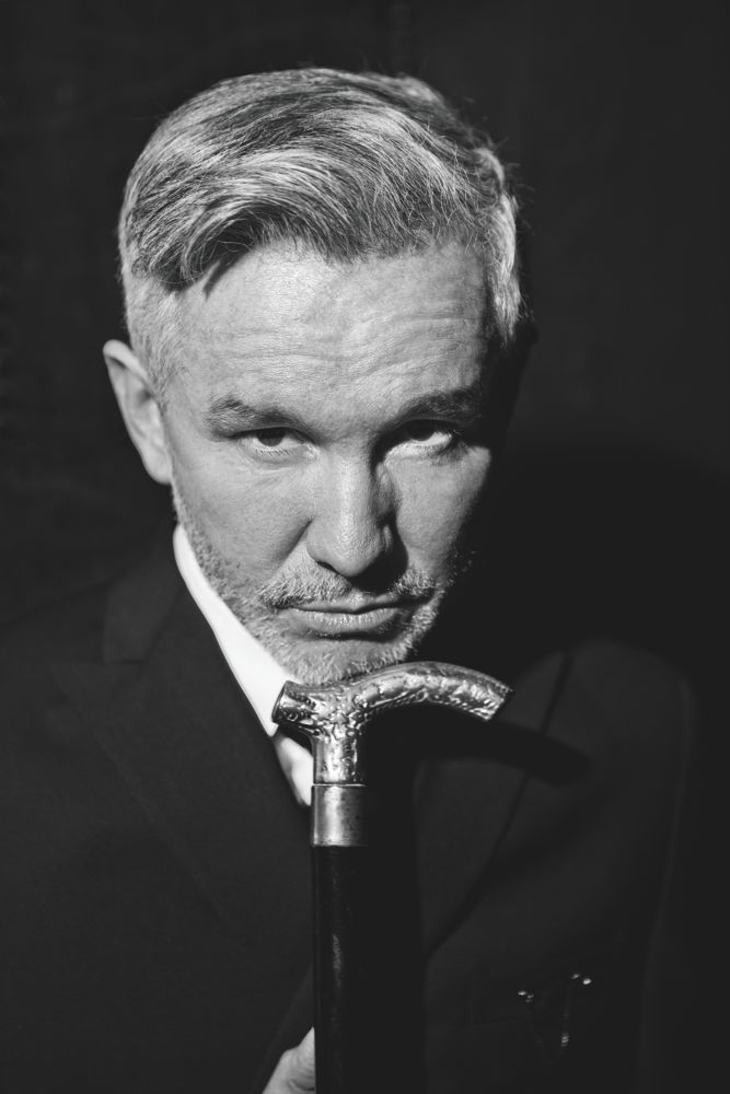
I like to think of Australian film director and former music video director Baz Lurhmann as a king of sound design. He uses diegetic sound in a way that is powerful and gripping, creating vibrant worlds that seem to assault the senses with exaggerated noises, foley and sound effects.

A scene that perfectly embodies the Lurhmann use of sound is from his 2001 film Moulin Rouge, early on in the narrative when protagonist Christian (Ewan McGregor) enters the Parisian nightclub for the first time.

Here, Lurhmann’s experience in making music videos is shown clearly; this is essentially an enormous music video. We hear several different songs, all MODERN songs, not of the year the film is set in (1899): Because We Can (Fatboy Slim) Lady Marmalade (P!nk, Lil Kim, Christina Aguilera, Mya) and Smells Like Teen Spirit (Nirvana). Lurhmann often uses contemporary, catchy and rhythmic music in his films regardless of whether or not they fit with the time period; this is seen and heard in the Great Gatsby (2013). The use of modern music, particularly music associated with dancing and partying, creates a surreal atmosphere. It feels surreal in the sense that despite being in a different era and time, we can relate across time periods to the partygoing atmosphere.

Additionally, throughout the scene, the diegetic sound is clearly pronounced; the partygoers stamp in time to the beat, their clothes rustling is exagerrated, and as the scene progresses these sounds become more exaggerated, and emphasise a sense of the wild, rambunctious and unbridled excitement of the club. Additionally, the audience feels sucked into this hypnotic psycadelic whirlwind of the Moulin Rouge, and the use of the modern upbeat soundtracks allow them to relate to the scene; a wild Friday night at a bar or club.

Baz Lurhmann’s unbridled and indulgent use of sound and music sets him apart from other mainstream filmmakers, making him a king of sound design.

Cartoons are Just for Kids

That title probably “triggered” a few people out there so let me defuse the situation first and foremost: You just got clickbaited, without the clicking and redirecting to another page, unless you actually clicked on my blog, in which case: good for you!

Now. Are cartoons JUST for kids? How about we discuss what makes up a “cartoon.” From Merriam-Webster online dictionary:
Cartoon: (noun) A film or television show made by photographing a series of drawings : an animated film or television show

What part of this definition restricts cartoons to children? From this definition, anything made up of a series of drawings could be a cartoon; it could be gory, horrifying, lewd, surreal, anything. So why do we assume that anything that is ‘cartoon’ is something appropriate for children?

Let me elaborate: one of my all time favourite films is Hayao Miyazaki’s anime classic, Princess Mononoke (1997) which I first watched when I was about 9 or 10 years old. At the time, I believed the old “cartoons are for kids” thing, and imagine my astonishment when I saw limbs being lopped off and heads being slashed off at that tender age? It wasn’t until my parents actually checked closely did they realise that this cartoon was rated M15+ – i.e. Big no-no for 10 year old me (sidenote, I knew the whole time what its official rating was. I think the opening scenes with the big wormy boar gave it away; but it was a fantastic film, so sue me right?) Anyway, they decided the damage was done and let me watch it anyway.

Basically, what I am trying to get at here is that parents need to be more aware of a) how to check for and understand media classifications and b) they need to work out what they’re okay with their kids watching and consuming. I’ll also point out that I think I’m fairly liberal with what I believe younger people should and shouldn’t be allowed to consume, within reason. It’s so simple for us to assume at a glance that a cartoon is kid friendly, but the fact is there are so many animated films and television shows out there that parents would never let within 50 feet of their children if they knew what they were getting into; and they’re a click away from us all.

Parents need to be told that classifications aren’t put on movies, cartoons or video games just for decoration; the graphic designers probably hate having to ruin their gorgeous cover art with a little 18+ sticker. I’ve heard too often of kids going into stores like JB Hifi or EB Games etc. with their parents and getting copies of stuff like Princess Mononoke, DeadpoolDead Space 3 or other media texts with ratings of R18+ simply because we are made to believe too easily that video games, superhero films and animated series are ‘just for kids.’ No, they aren’t all for kids. Check your ratings; it’s not the media company’s fault that parent’s don’t take classification ratings seriously.

A Self Portrait

Our most recent assessment for Media 1 was to craft short film self-portraits. With only a week to make them, I feel a little shy posting mine here but figured hey, why not. I’m still quite inspired by what we’ve learned from experimental filmmakers, and took a kind of associational filmmaking approach; my aim was to juxtapose people with the landscape. My favourite part is showing how we react when we realise we are being recorded.