Reflections on the final product

Before I begin reflecting I want to actually define what I believe the process of reflecting itself to be. For myself, reflecting starts at comparing the work produced with the goal you had in mind. In order to do so one must clearly establish their goals in measurable terms so that if attained, they are satisfying and if not attained one can determine what particular factors were unsatisfying.

According to this definition I will reflect upon the final product. The goal I had established for myself was to explore the long take and its effect with very little movement within the frame. To  this end I am highly satisfied. Let me explain. I did not set myself such a goal that if I were to stray from it things would be disastrous. Rather I established for myself a exploratory goal whereby I can still define the successful and unsuccessful elements.

What I love about this take is that, on its own, I feel it delivers the message I am trying to articulate. In the same way, it suggests that it is part of a larger whole. Therefore I feel it has satisfied that sense of being a unit itself. The smoothness of the pan and the track encourages a heightened awareness of the accompanying soundtrack. It is the soundtrack here that establishes a progressive narrative: First we hear the sound of a baby crying (suggesting new life being born), then a flat-line on a heart beat monitor ( alluding to the death of the mother after childbirth), children’s laughter ( the innocence of being a child), car crashing ( death of loved ones – innocence being snatched away) , and finally funeral bells. Beneath these audio tracks is an eerie soundtrack, which seeps insidiously between the separate sounds creating a chilling ambiance. The reason I added this eerie track beneath it is to foreshadow the girl’s transition from innocence to literally losing her mind.

Interestingly the chandelier was never intended to be in the shot. In fact, it proved greatly disruptive as the crane was all too close to hitting it. We then decided to work with our issues instead of dismissing their potential importance. We chose to frame the chandelier in a CU before panning down to reveal the rest of the room. This worked so greatly and I am so glad we chose to work with it because it created a greater depth of field that gave the take a much more dynamic aesthetic.

The focusing is probably something I feel we could have worked better with.  We actively chose to have the background out of focus whilst the chandelier was in focus, and then focus pulled to have the the couch be in focus – since we were panning in that direction – making the couch and the girl (myself) the foreground. We certainly had difficulty managing to adjust focus whilst the camera was panning and tracking so that is something I would like to further experiment with (Having a camera moving around with the focus changing because I feel like we only ever practice that focus pull when the camera is steadily mounted on a tripod).  The focus however worked well because the girl came into focus throughout the track and came back out of focus when she was staring at the camera. Even though that loss of focus meant that the intensity of her staring at the camera was lessened, it gave her a sense of vulnerability (figuratively alluding to the fact that she is losing herself amongst this chaos).

I would love to have had an even slower take that lasted longer but it was very difficult to keep the camera steady on the crane which was mounted on the tripod that wasn’t as heavy weight as we wanted. The solution then -for future purposes-  would be to get a heavier weight tripod that could hold the crane more stable so as to attempt a slower shot. The warp stabilizer worked well in post. I overcame the fact that you couldn’t have the warp stabilizer effect and duration effect on the same clip by simply nesting the clip.

… still in the process of reflection… will keep you updated 🙂


Shooting Day!

Film Shoot…CHECK.

Boy did it take longer than it expected. But boy did I learnt a lot.

We started at 1pm on the dot. Here is a breakdown of the day:

1.  cleared the room ( 1.00 – 1.15)

2. set up tracks (1.15 – 1.20)

3. set up Dolly (1.20 -1.25)

4. Set up tripod (1.25-1.50 – due to complications with plate)

5. Attached Crane ( 1.50 – 2.05)

6. set up lights (2.05 – 2.15)

7. discussed the breakdown of filming (2.15- 2.45)

8. shoot -> Put SD card in laptop and analyze ->shoot  (2.45-5.00)

9. Pack up put equipment in car (5.00 – 5.45 )

* Firstly I was given a lighter tripod than I had ordered. However I know that I should have checked the equipment before taking it home to ensure everything was correct. Due to the lightness of the tripod our crane was causing an imbalance which was evident when watching the shots that we had filmed. However we combated this best we can, with the knowledge that we can use a warp stabilizer in post editing.

* Setting up took much longer than we had anticipated. I need to recognize how long it takes to set up each element in the shoot. This time I had only set aside 30 minutes to set up equipment. In fact, it took us approximately 1 hr to set up the equipment. I acknowledge this and take it on for future shoot schedules.

* Lighting was probably the element we experimented most with. We tried opening the curtains behind the central character so as to deepen the field (there are trees beyond the outside window), however this was a major issue with the lights as I underexposed the interior in favor of not over exposing the exterior. I then attempted to even this out using the blonde and diffusing it so that it wasn’t too harsh on the interior in a way that grossly contrasted with the natural light outside. Every which way I attempted, I was unsatisfied. We decided it best to close the curtains so as to best manipulate the interior lights. We did however open the front door which sheds light to the left of the frame, and balanced this out with the blonde place on the right side of the camera (we diffused the harshness of the light by facing it up to the wall and letting that reflection fill the room). This worked well in terms of creating a smooth balance that looked both natural and still emphasized the warm temperature I wanted.

* The room worked perfectly for what I had envisioned. The production design itself just came together so well. The couch functioned as the central point which was encased by the curtains. The frame was balanced on each side by a tall standing lamp, which accentuated the ‘homey’ atmosphere. The colour scheme worked really well to establish that atmosphere, with the range of cream, subdued green curtains etc.

*The costume choice contrasted well with the cream couch and really established the girl both within the composition of the frame and thematically in relation to the concept. I chose this particular dress because the design itself is quite childish (therefore alluding to the childishness in her). At the same time the red colour reminds me of both blood and love and adulthood (older women wear red lipstick etc). So we have this beautiful synthesis between the  innocence of her childishness and the intensity of life experiences.

* In terms of the movement I decided it appropriate to do very little of it. I wanted the shot to speak for itself without having to intervene with my actions within the frame. I chose to simply look to the right of the frame whilst slightly tilting my head to the right. This had the effect of making me look like I were thinking about something. As the camera neared my face ( about a metre away) I slowly rotated my head and straightened up to look directly at the camera lens as it tracked closer and closer to me. This result was a most eerie effect as though the girl (myself) had been constantly aware of the camera’s presence but only chose to reveal it at the point which she turns to face the camera.

* With the knowledge that we were adding sound in editing we were able to verbally direct each other through the take. This was less important for me as it was for Daniel (who was panning the camera) and Mina (who was controlling the crane and track). Mina  had to inform Daniel exactly when he was about to bring the camera to the eye level and Daniel had to guide Mina for the speed of the tracking shot based on his constant focus adjustments.

Currently in the post-production production… working on the warp stabilizer as the movement was not of perfect smoothness due to the heaviness of the crane. Unfortunately you cannot slow down the speed and have warp stabilization so its proving to be a bit of a challenge to get the length of the take I want. Currently trying to figure it out. Will update soon….

🙂

My Prologue! … Otherwise known as week 1 in The Scene in Cinema

New Year. Here we go!

As my last year in this media degree i figured ‘Why not just go ahead and break the barrier I’ve built between myself and the camera equipment and get to know it a little better” .. oh God.

Okay..it wasn’t so bad. Phew.

Today was great because we undertook an activity whereby we formed groups and were offered unique scripts which we had to block and film. The constraints however, were that the camera perspective could not change (zoom or otherwise). We were only given the opportunity to pan or tilt. The thing I’ve come to learn about constraints is- contrary to what the word itself suggests- they actually inspire a broader terrain of creativity. See, the fact that we couldn’t physically move the camera meant we had to block the 3 actors within the scene in a way that presented some sort of dynamic. One character, Steve, was evidently the power figure so we thought it appropriate that he be seated with his back facing the camera. Synonymously, he is the closest figure to the camera which means he dominates most of the physical space (alluding to his power). The aspect that interested me most was, when we watched the original film derived from the script, many of the blocking decisions were quite similar. This universality really fascinated me because, the unity of human nature makes us understand emotions quite similarly, therefore, when it came to blocking the scene, both parties felt it appropriate to find a way to show that Steve was most dominant and stern.

It was fascinating to see what other groups came up with. See, other groups were offered the same script with different constraints. For instance, we were offered the dialogue (therefore dialogue constraints) however no blocking directions. Another group was offered all blocking directions (therefore blocking constraints) however no dialogue constraints. It was so interesting to see how differently interpreted the scene was because of alternate constraints. Many groups with dialogue constraints were more experimental with the blocking.

My Weekly Epiphany:  From this activity, I was made aware of the infinite possibilities creating by the process of designing yourself constraints such as a tight space with strict camera movement options. The thing about this epiphany is that I didn’t manage to achieve it through theoretical study and so this confirms what Robin and Paul discussed in the lecture: there are avenues and possibilities we will never understand until we physically pick up a camera and try.

I realised, specifically through this class and lecture that you design goals through the process of actually being in class and learning and then tailoring an objective from inspiration in class. This being my first week and learning what i have, i’ve decided – i know it’s ambitious – that I want to have a greater understanding of my own style as a director. I want to be able to, through research into other directors and practical application in class, figure out what style it is I prefer to work with and what constraints I like.  I feel I am way too anxious to leave the option of simply designing camera coverage spontaneously on the day of filming. Sooooo that is an avenue I’d like to explore as, in my eyes, a mixture of definitive shot planning and spontaneous moments that happen only when in the space with a camera will lead to an inventive yet clean end product.

Until next week…. 🙂

The Shivers – ESSAY

“The Shivers” – A Korsakow Film by Edward Wong, Gina Michael and Stephanie Larkin


Background:


For our K-Film, The Shivers, there was extensive brainstorming, experimenting, researching and continual redevelopment involved in achieving an outcome, which we found satisfied the essence of the medium we are using. As a group, after discussing potential ideas, we decided to narrow the broad concept down to the theme of fear; being something that we believed would be fascinating to explore, as it is something we choose not to face rather, to ignore unless faced with it. Within the following couple of weeks of discussion we managed to establish a direction for our film, as fear on its own proved an enormous concept, which we could potentially lose sight of the specificity of our piece.  Therefore, we decided to narrow down this broad topic by exploring fear on a personal level to people of varying age, but coming to this decision required both an understanding of the technical possibilities Korsakow and a thorough knowledge of creative potentials that can be explored and portrayed through this program.


If we are to acknowledge the Korsakow medium from both its technical and creative possibilities as a whole we need to think about things such as how “the juxtaposition by itself of course does not result in montage, it is up to the filmmaker to construct a logic that determines which images appear together, when they appear and what kind of relationships they enter into with one another.” (Soar, 2014). This was something integral to consider and understand when determining the direction of our own Korsakow film.  This point strongly emphasises the importance of not perceiving pieces of content on an individual basis, one which is mutually exclusive from other content, but more so to recognise the significance of how the content is collectively combined in order to form connections and effectively meaning through these relations.  With this in mind we had to ensure that we thought not so much about how an audience might relate to seeing an individual clip of something related to fear, but how we could enable them to respond to the multiple clips through the relationship they share to one another. It is through this understanding that we were able to develop the idea into something that explored the connections between fear experienced through people throughout the different stages or their life or in other words, at different ages.


Another important term to consider when producing our K-film was that of narrative, and how it can be adapted or should be thought about in order to be effective within the Korsakow structure. It is suggested by Marie-Laure Ryan (2006) that in order to allow for the constant influx of new forms of media, perhaps the definition of narrative requires expansion. Ryan also recognises, however, that there must be restriction to this expansion as it would be unrealistic to consider all texts across all mediums as narrative. From this idea of broadening though, it can be recognised that Korsakow can indeed find it’s own place in story telling. In the case of our film we are telling a story through the connections of the fears between different people of various ages. Although each segment of our film tells a story on an individual level, it is through the unique structure that Korsakow allows that the audience is able to decipher their own narrative meaning through the connections that they are able to make between each clip.

One final area that was imperative to understanding Korsakow and how it could be used in relation to the idea for our film was lists. To some extent making a K-film revolves a lot around lists of things; lists of video clips; lists of audio; lists of keywords; lists of words within each keyword etc. It is, however, through identifying the meanings surrounding each list present in a Korsakow film (things such as how they work together and how their contents is determined and arranged) that a true understanding of what your film is about and the meanings of connections you are trying to make are realised.


Furthermore, “the list as a structuring device in creative screen based documentary is a formal approach that also speaks of the infinite possibilities in combining and making connections across a networked field of elements. Components are gathered and assembled according to a logic that may be thematic, topical, place based or conceptual but the relationship between parts is kept loose” (Frankham, 2013). I feel that from this comment the list like structure and their relevance in regards to being somewhat a feature in Korsakow is explained. The abstract definition of a list given by Frankham is in some ways effectively even describing the program. Through understanding the phrase, I believe our group was fully able to recognise structure of Korsakow this, in term, allowing us to determine the structure it would take.


Deconstruction of Technical/Creative Aspects and Final Product:


We initiated with this concept of fear and wanted to explore the way fear develops over the lifespan. In order investigate and present a unique perspective on fear through the different stages of life however, we had to first consider a variety of possible ways in which we might best do this. Eventually we came to the agreement that the best way of exploring our topic would be to hear from people themselves, as this would give the film a real and engaging voice. In order to go about achieving this we set out to interview a minimum of 60 individuals across all different ages, asking them what they feared and why. It was also decided at this point that in order to be less invasive to these people we would only take voice recordings and not use any images of the person themselves. As a result of this it meant that we were required to gather both audio and video material but I feel that this, in term, worked to strengthen our film. This is as if we had simply filmed our subjects stating their fears, firstly, there is a good chance they may have been less open in their responses given intimidation that sometimes surrounds presence of a camera. More so, however, we felt the meaning of the fear itself might be lost, as attention would be drawn more to the subject and less about what they were saying.


In regards to the video content featured in our film, we decided to take quite a different approach to most other groups in our class and also in comparison to a lot of the past examples of K-films that we viewed. We used a combination of both footage taken by group members individually and also stock footage that we had all worked together to source. The nature of our film was different in that, although we had an idea of what we wanted to achieve and how we would go about doing it, we could not predict the responses we would obtain from our subjects and therefore could not strictly plan the sorts of video material that we would require. The idea behind the video that was matched with the audio was that in some circumstances it would be fairly logical and what it showed would match the fear that was being explained. On other occasions though the footage would be more abstract, this working in times where the fear wasn’t necessarily a physical thing and also in times where the person’s response triggered a specific mood. As we obtained more audio information we were able to gradually build up the video material that would accompany. In some cases this could be easily achieved through going and filming something that we felt fitted in with what was being said in an interview. However, as fear can sometimes be a fairly abstract idea, this is where stock footage became a really valuable resource. With stock footage we were able to accompany interviews with images that would not be possible for us to obtain ourselves. It ultimately gave us the power to really explore different ideas and for our audience, I feel that there will be a lot more left to the imagination and the potential for many more connections to be determined.


We played around with interface. Firstly, we designed one that kind of represented this idea of the circle of life in that the SNU’s made up a circle. However, we realised it was a bit too chaotic and would distract from the content itself. Therefore, we decided to go with a simple design for our interface. We chose to have the dominant frame in which to play the SNU’s centred on top of the three smaller SNU’s that reside below it. Similarly, we place a clown in the background image to allude to the concept that fear may remain the same through childhood, teenage years and adulthood. However, this distracted further from the videos and the wide range of colours was too intense for the abstract ideas we aimed to achieve. Ultimately, we decided to have a background image of white at the top of the image, fading down to black. The reason behind this is so that the SNU, when played appears in the white section of the image, metaphorically alluding to the idea that, when one faces their fears, they don’t appear as frightening as when we do not face them.


In order to categorise the content we chose three distinct colour filters to put over the snu thumbnails. For objects fears, the colour blue was chosen; for fearful situations the colour yellow was chosen, and for philosophical based fears we chose red. The driving force behind this decision was so as to create a proper connection between the interface, pattern and the content. Furthermore, the interface appeared more organised because of the colour coding, which in turn, further enhances the audience understanding of the colour and content patterns.


Although we generally feel that our content, interface and constructed patterns have worked together to effectively produce a presentation of fear throughout the different stages of life, there are some things that we believe we could have done to enhance our work. One of these things would have been to design some form of an introduction to our film so that the audience enters it with an idea of what they are viewing and how they might make sense of it. This could have been achieved through something as simple as a heading or perhaps even a short opening SNU video explaining what was being asked and whom we were asking. Another area where we could have improved was possibly in the overall look of you film. Although there is significant in the structure of the interface in relation to the background it does to some extent still present a little dull. I do, however, feel that this is quickly forgotten once the viewing of the presentation begins, as I believe the content is engaging and works to distract from weaker areas. Overall though, despite some areas of weakness, we have definitely achieved what we had set out to, everything works competently and our film offers an intriguing insight into fear that is unique to each viewer.


Ultimately, our film is not simply about fear but about the role it plays throughout our lives. It reminds us that there is an abundance of different prospects that frighten people and that we share fears regardless of our age. We like to believe the film has a unifying characteristic in its understanding of human fear; thus iterating the idea that we are all indeed, very similar and therefore, our fears are shared and can be combated as a group.  Our film works to connect different fears in a way in which they can be considered not only on an individual level, but also in relation to one another. It reveals that there are different ways in which fear can be looked at and reminds us that although sometimes irrational all fears are significant and trigger powerful emotions.


Integrated Media- Sketch Essay (Assignment #2)

A hyper textual framework motivates the structural format of Korsakow Film. Such Films encourage the audience to uniquely engage and extract an interpretation based upon an individualized experience with the database- like film. As Adrian Miles suggests in his ‘Korsakow as Hypertext’ blog (2011), the rules of reading k-films are “the same for hypertext”. Through the tool of the interface, the user can encounter patterns and content material in their own non-narrative based way.

As a subject for my analysis of Korsakow I explored the 2011 K-film, ‘Dreamcatcher’ (Jess Hallay, Michael Serratore, Damien Gould). The film finds its matter in the concept of dreaming. It attempts to recount the erratic nature of dreams through the collective combination of the interface, pattern and content.

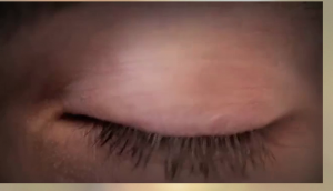
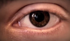
The content in a K-film is designed to stray from a ‘cause and effect chain’ but rather, organised in a list-like manner. ‘Dreamcatcher’ organises its SNU’s (Smallest Narrative Unit) into three clusters: A state of total consciousness, a hazy state between wakefulness and sleep, and a dreaming state. I found that the choice to create these three clusters functions well in continually maintaining the theme of dreaming whilst simultaneously making it more associable for the user.This assents to the creator of Korsakow, Florian Thalhofer, who commented regarding the importance of “themes” in Jeffrey Youngs ‘A champion of nonlinear narratives: An interview with documentary filmmaker Florian Thalhofer’ (2014). Each of these categories can be accessed via specific, recognizable SNU’s. That is, the ‘state of consciousness’ cluster is categorised by a close up of an open eye, the ‘hazy stage’ by an eye gradually closing, and the ‘sleep stage’ by a closed eye.

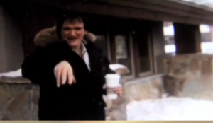
Screen shot 2014-04-02 at 12.12.01 PMScreen shot 2014-04-02 at 12.14.55 PM What I find to be effective about these three SNU’s is the pattern created through the framing and associations between them. Each of these SNU’s is a close up on either an eye or a mouth announcing the exact phase the user will enter. Although the verbalisation of the three categories aided in further clarification, I feel they were somewhat superfluous as they announced the clusters too explicitly. The basis of dreaming is in the crazy, fusion of experiences that lack too much clarity. Thus, hearing the three stages contradicts the intended chaotic nature of the piece.  Similarly, I found the choice to not use textual aid very clever, as they would provide too much clarity for a film about the confusion of dreams.  The content in itself forms patterns that enable us to distinguish between clusters. The state of total consciousness is characterised by human subjects speaking of their own dreams. For instance, a young boy speaks of his dreams regarding making movies with Quentin Tarantino. The intercutting of scenes from Tarantino movies helped in transporting me to the dream itself, thus encouraging a vicarious experience of the dreams themselves. Screen shot 2014-04-02 at 12.27.55 PM Screen shot 2014-04-02 at 12.27.49 PM The young boy returns in another SNU to speak of another dream, which I feel enables us to connect with the characters in this film. I found the human subjects gave the piece more warmth and associate. The use of a variety of stories from many different aged and gendered people appeals successfully to different audiences whilst instilling a sense of authenticity to the piece.
 

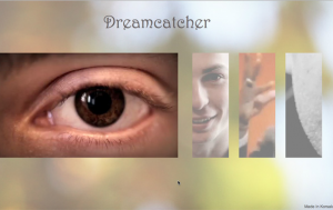
The interface functions as the point of interaction between the user and the medium. As Korsakow, by nature, lacks narrative chronology in its structure, the interface often reflects this. ‘Dream catcher’s’ interface includes that of a single dominant frame developing from the left-most side of the screen towards the middle point and three ‘sliced’ thumbnails on the right of it.

Screen shot 2014-04-02 at 11.10.57 AM

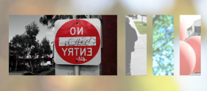
This interface can be analysed from both an aesthetic perspective and content-based perspective. Aesthetically, the combinations of colours develop a soft-tonal, spring-like ambience that works well with the out of focus background; thus drawing the user’s eyes to the central frame. Furthermore, the placement of the four thumbnails, which are unified by their exact length allows for a strong consistency and gentle, poetic flow that remains throughout the films duration. The interface plays an integral role in the manner in which the user understands the content. Due to the hyper textual basis of the K-film, the filmmaker is at liberty to construct meaning from the combination of both the content and the way in which that content is accessed. In his ‘Dense Nodes’ blog, Adrian Miles discusses the concept of a ‘small world network’, which assumes “lots of a small number of connections between individuals, but with a few individuals who have a lot of connections”. I found the ‘Dreamcatcher’ embodies the nature of a ‘small world network’ in the way the filmmakers have purely one clip with multitudinous connections to others. For instance, it is the open eye clip that leads to all the interviews clips. They form such intricate connections whilst maintaining a proper sense of rhythm through the three categories. As such, every clip is connected to another within the film, without actually having a direct link to it. This, I believe enables a clear holistic understanding as the movie as a whole with an overarching theme of dreams.  Although the interface is aesthetically pleasing, the placement of the larger frame followed by three side frames encourages myself as a user, to work through the SNU’s (Smallest Narrative Unit) in a somewhat chronological fashion (from left to right as is the form of the English language). In this sense, the content became narrative- like which distracted from the intended erratic representation of dreams. Another unpleasing element of the interface presides in the lack of looping within the SNU’s. As such, I found it quite jarring when the SNU simply played once. As a result I felt removed from this dream-like world.


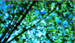
Patterns are discernible sequences that exist in all films, enabling the user to creative associative links between content. In ‘Dreamcatcher’, the different content categories are strongly realised by the patterns used within the film. Firstly, from a sound perspective, I found the filmmakers were able to reflect the chaos of dreams whilst simultaneously maintaining a recognisable pattern. Within the ‘total consciousness’ stage, the user hears diegetic sounds of the human subjects speaking within their atmospheric background. For instance, as a mother speaks of her dreams, the user can hear the somewhat disruptive yelling of her young children in the background. I found this gave an amateur feel to the film, which enhanced its authenticity. Similarly, the sleeping phase was discernable through the combination of diegetic (such as street noises and wind) and non-diegetic soundtracks (such as a soft, low tuned electric guitar that accompanies a mid –shot of a tree).  Screen shot 2014-04-02 at 12.51.09 PM

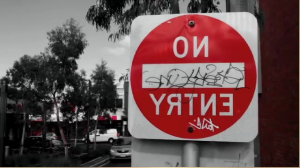
However, I found the ‘falling asleep’ phase to be too similar to that of the ‘dreaming phase’ in terms of the sound pattern, which resulted in confusion as to the shift in clusters. The choice to include both diegetic and non-diegetic sounds in the ‘dreaming’ phase was successful in mimicking the wild and unpredictable nature of dreams. Furthermore, the content was patterned by the aesthetic quality of the SNU’S. While the ‘total consciousness’ stage contained naturalistic lighting reflecting the ‘real world’ quality of the cluster, the ‘falling asleep’ and ‘asleep’ phase contained one unique saturated colour to each SNU, with all other colours drowned out in black and white. For instance, one SNU reveals a stop sign that is a strong saturated red colour with the surrounding trees, street and sky in black and white.

Screen shot 2014-04-02 at 12.59.51 PM  I found it aesthetically pleasing that these patterns are accentuated by the structural format of the interface, which, in its placement of the four SNU’s beside each other, reveals a combination of different colours that recognise the three clusters. Overall, I found ‘Dreamcatcher’ a strong thematic piece which was both pleasing in its aesthetics and content .

Screen shot 2014-04-02 at 12.59.59 PM


Ready…set… shoot!

So… Why is it we shoot to edit? Why not make everything a long take?

Well, we shoot to edit because it enables us power and control over otherwise extraneous variables if we were to shoot in Long takes.

When shooting to edit the filmmaker has control over lighting within the particular shots.  If one were to shoot a single take whilst alternating between angles, the light sources would also need to be altered; if not, the result is a discrepancy between the lighting from different angles. When shooting to edit, the filmmaker possesses the ability to move around lighting sources ancontinually alter the white balance  (that is, if changing locations within one scene – for instance taking the action from one room to another).

Another  reason we shoot to edit it so that the editor and filmmaker have more variety of takes to choose from. As a result, The actor’s best performance can be chosen. Similarly, Actors do not have to delivery lengthy paragraphs of speech but rather,split into shorter paragraphs to improve their performance and focus on their acting technique more intricately.


Furthermore, we shoot to edit so that certain props can be moved based on their requirement or lack thereof within certain frames in a scene. During a single take , it is difficult to move around props during filming due to potential interruptions. A filmmaker may want, for instance, a certain picture framed within a shot because of its symbolic significance however, from a different angle featuring the same human subject, the filmmaker may decide the picture is disruptive to the frame and thus needs to be moved.

A somewhat unconventional method of scriptwriting.

SOOO, we’ve ventured on this journey of attempting to explain the foundational basis of scriptwriting, which much to my liking, I’ve found both interesting and surprisingly doable.  Reading Kathryn Millard’s ‘ Writing for the screen: beyond the gospel of story’ I began to grasp a concept I’ve never truly understood the basis behind: that is the identifier of a ‘good’ story. Millard speaks of script guru Robert McKee, who, in his instruction manual ‘Story: Substance, Structure, Style and the Principles of Screenwriting’ (1997), defines it as one in which “structure, character,genre and idea meld seamlessly”. There are moments I experience during the viewing of a film which are jarring; it seems as though the character is somewhat removed from the fictional world which defines their reality. Mckee’s words have allowed me a somewhat more attuned perspective, not only to the salience of creating a complete character, but one who naturally corresponds within this fabricated reality. Don’t get me wrong however, I am focusing my concept around the ‘classical story design’ and not as a universal definition of the character’s role in their world as art cinema tends to focus on questioning our reality and as such, our belonging to that reality.  Millard often quotes McKee who speaks of the ‘classical story design’ , which centers around the protagonist motivated to achieve a goal despite obstacles formed by the reality in which  they exist and the antagonist. This design, as Mckee suggests, occurs in “continuous time”(pp. 45) and a “consistent reality”(pp.45)  for which an absolute ending provides closure. I found I supported Mckee’s suggestion that such a story design is both timeless and trans-cultural. Along with multiple other reasons, I believe the popularity of this design is in its satisfactory endings. It seems I can generalize on behalf of the multitudes as films such as the ‘ boy meets girl, boy falls in love, boy can’t get girl yet ultimately becomes united with her’ satisfy a personal desire for the protagonist to achieve their goals. The reason we support the protagonist is because of an association we form with them, thus vicariously living through the character and experiencing their predicaments with them.
Before committing to this reading I had naturally assumed that the script writing process existed alone within the constraints of pre-production. However my somewhat narrow minded preconceptions of scriptwriting were challenged by the scripting methods of director Wong Ka Wai who speaks of the script creation as part of the production process itself. He speaks of a script as simply foundations which are formulated into a complete script on set. Similarly, Milliard claims that one cannot write all their images on paper. I too agree with the fact that sometimes paper cannot reveal the creativity of an idea, nor can it always produce creativity in itself. Sometimes one must create the basics of the story and, once on a set, be inspired by the visual and sound possibilities that are, to me, as much a part of the film as the narrative itself. Wai plays music on his sets as opposed to delivering a script to his collaborative team. Consequently, the script is developed with inspiration manifesting from the music. I personally think this is a beautiful thing: when a scene has potential for both a rhythmic and poetic quality as a result of story inspiration from music.

humanitarian or people pleaser?

So the other day I was casually scrolling down my Facebook page when I was somewhat flabbergasted by something… Someone had donated a whopping $100 to a cancer foundation, taken a photo of their receipt and posted it. Don’t get me wrong I think doing charitable deeds is wonderful. The problem i have is with the publicising of one’s charitable deeds, which to me negates the idea of doing something charitable. Seeing someone benefit from the act of doing something kind in itself ought to satisfy an intrinsic desire to help ..… see i think this just highlights a much bigger problem, a problem that brings our humanitarianism into question…Do we commit a ‘good’ deed out of a desire to help others? Do we do it to feel good about ourselves? Do we do it in hope that others will praise us? To be honest, I don’t see an issue with answering ‘YES’ to the first two questions. Yet, I feel it somewhat – ironically- amoral for one’s intention to be deviated from a humanitarian desire. I know a lot of people would then ask, but is it not satisfactory that the deed is improving the situation of another? Well i guess i can respond with this question (bear with me, it’s a little extreme) : If you had intention of harming  someone however, that person was accidentally harmed in the process, should we take into consideration your ‘good’ intentions? Or do we simply judged based on the outcome? …. a little food for thought.