Martin Scorsese


In my exploration of camera coverage I’ve decided to base my research on one of my favourite directors: Martin Scorsese. I specifically want to analyze the opening scene of Taxi Driver (1967). As background information, the narrative centralizes around a character that seems at odd with the external world around him. I am focusing specifically on the camera coverage within the opening scene of the film. Here we have an almost continual shot-reverse- shot of Travis

(Robert De Niro) as he observes the ominous streets of New York from the inside of his cab. The extreme close up of De Niro’s eyes creates an immense sense of what director Jean Epstein calls photogenie whereby the camera brings to life inanimate objects. The lingering shots on De Niro’s eyes become a metaphor for seeing the world through a lens of fear and alienation. The switch then, to a long POV shot of the street reveals it as though a deep menacing ocean of frightening characters where even the traffic lights adopt a horrific persona. There is very little actual variations in camera set up. The focus is on the two shots themselves. What I love about this coverage is its effectiveness despite its simplicity. As an audience we really get to experience the mental subjectivity of the character.


More research coming next week… 🙂 

‘Logistics’ or Media 5 – week 2

Today in class we discussed the actual functionality of traditional camera coverage strategies. Whilst this isn’t a finite structure that one cannot stray away from it does prove logistically valid. Whilst in a classroom setting one may have extended periods where they can move the camera around in alternative positions until the scene is acquired, this is not the case in a professional film shoot. There are time and monetary constraints therefore the director must also consider the most efficient way to successfully cover a scene. For instance:

The Wide shot (Establishing/contextualising shot)  is filmed first for multiple reasons:

  1. If the film crew were to run out of time at least we would have coverage of the entire scene.
  2. We need to establish a lighting scheme through the wide shot that we can match in the more intimate shots.
  3. The wide shot is also a good point of reference for continuity so that we can match it with the more intimate shots also.


We also undertook an exercise whereby we were given a scene to film. The constraints however, included that we had to edit in camera (pressing start and stop as substitutes for cuts. We also only had a 3-5 shot constraint. The constraints were interesting because, although we wanted the scene to be aesthetically pleasing we first had to think about logistics in terms of the continuity of the shots. I learnt a lot from this exercise, specifically due to a forced heightened sense of focus on continuity.


Epiphany of the week: Oh so many! I think I will go with my recognition that logistics of camera coverage and realizing that your camera crew need to work efficiently. Alfred Hitchcock planned out every single element within camera coverage before entering the shooting space… this must mean a planning of the most efficient yet productive way to shoot. Spontaneity and creativity is great, but without logistical understanding you cannot successfully deliver that creativity.

Meeting the Family in ‘My Big Fat Greek Wedding’.

Found scene deconstruction

Upon first viewing of this scene at, the audience immediately recognizes the discrepancy between the Miller and the Portokalos family. The majority, including myself, would accredit this awkwardness to the acting of the characters. Certainly, this is a factor however, the camera coverage plays a dominant role in realizing this scene’s awkwardness.

The framing of the first two shots are quite similar in relation to the physical space around the characters. Both families are framed in a mid shot. The difference is that there are three millers and approximately fifteen Portokalos’ within the two frames. These shots are designed to emphasize the physical distinction between the two families.

The second frame – being a point of view shot from the Millers – encourages us to feel the intimidation felt by the two characters, Ian and Harriet Miller, at the point of encountering. Synonymously, the lingering of the camera on the Portokalos family invites the audience to take in the shocking density created by the mass amount of people within the frame. Centered at the bottom of the frame is a giant lamb that is roasting. The decision to linger the camera on this shot with the lamb continuously twirling on the spit adds an element of shock to the moment.


Constant cuts from the two family viewpoints create a stunning juxtaposition whereby the audience adopts both the place of the intimidated conservative Miller family, and the outgoing, ‘all-too-Greek’ Portokalos family. What Interests me is the choices made in designing the camera coverage here. The choice to frame so many people in a small space and then cut to a frame of the same length with only two people perfectly exaggerates the distinctions between two different families.


The camera adopts a slightly unsteady fashion as it lingers between the Portokalos family with a mid-close up shot as though it were one of the family members standing in the yard. This shot drew my attention because it makes me, the audience member feel somewhat entrapped within the claustrophobic space.


The last shot is a long shot that frames both families in the front yard of the Portokalos house. Previous to this shot, the Portokalos father, Gus, is introducing his endless list of family names. His list is then validated by the visual elaboration of the factual size of his family. This shot creates a great imbalance whereby the Miller family stands isolated in the background with the backdrop of the fire lit lanterns and street view whilst the Portokalos’ takes up the rest of the space.


What I love about a scene is when the camera coverage effortlessly exists. What I mean by this is that I don’t want to constantly be aware of the change in camera angles and covert editing as though I were watching a reflexive documentary (whereby the audience is actively made conscious of the construction of the film itself). Through the deconstruction of this scene I’ve begun to slowly tap into what it is I like about certain types of camera coverage, and that is, that it is subtle yet strongly delivers the intention. Looking back, we watched a scene from ‘Le Feu Follet’ (Louis Malle, 1966) whereby I was very conscious of the different camera angles for two reasons I believe: 1. There were many alternative angles 2. There were multitudinous cuts between those angles. I found myself distracted by the camera as opposed to the action in the scene. When watching a scene, I want to be immersed within the illusion of the moment, as opposed to being constantly reminded that I am watching a construction.

🙂

The HeART of Humanity

                                               The HeART of Humanity


Before attempting to write this piece I thought it wise to ascertain a basic definition of ‘art’ itself. Naturally, I cast the word into the all-knowing search god, Google, to which I was quite blatantly offered this: the expression or application of human creative skill and imagination, typically in a visual form such as painting or sculpture, producing works to be appreciated primarily for their beauty or emotional power. Two phrases stuck with me here: beauty and emotional power.

Often – and I find myself guilty of this- we disregard the depth and underlying emotional pull behind art and, to the great detriment of the artist, take it on face value. It seems we’ve built a generation of museum goers for basic art appreciation, thriller film viewers for satisfaction of basic excitement needs, and… well, you get the gist.


Just as I am about to foolishly throw in the towel, films like Frédéric Tcheng’s ‘Dior and I’ hit me in the face – rather gently might I add – with what can only be described as a beautiful infusion of two art forms that offer unparalleled understanding into the depths and emotional basis’ of the art of fashion.


‘Dior and I’ transports the audience into the commonly misconceived world of the Christian Dior fashion house during the hectic period whereby newly instated artistic director, Raf Simon’s, must present an entire haute couture collection within a brief six weeks. Before viewing this film I had already established gross misconceptions in my mind regarding its subject matter. Boy was I wrong. This film was not one intended to elucidate the designs themselves rather, the seamstresses and designers responsible for their creation. It is a film about humanity in an environment where there is so much at risk. We witness Raf amidst his somewhat prompt introduction to the house of Dior and its employees. We are gently encouraged to observe and comprehend a man highly anxious about the pressure of an upcoming line. In fact, we meet relatable characters who prove to be much more complex than the stereotyped factory workers.

What is truly endearing about this film is the way in which Tcheng utilizes monochromatic footage to juxtapose the current Dior house with the past whereby we are able to form a link between the modern designs and the designs created by Christian Dior himself.

What strikes me as most beautiful was the way in which the art of film functioned as the medium to carve the path of understanding to the art of fashion. Tcheng elegantly utilizes the camera in a non-disruptive manner whilst submerging the audience in the heat of the action. The unique touch of grace intermixed with intricacy is emphasized in the narration that functions as both Christian Dior and Raf Simons, offering an inimitable bond between the two designers, between past and present, between traditional and modern.

In the same, -excuse the pun- fashion, Wim Wenders/ Juliano ribeiro Salgado’s Oscar nominated film ‘Salt of the Earth’ combines the art forms of film and photography to offer insight into the deeply complex psyche of photographer Sebastiao Salgado. Salgado’s monochromatic photographical folio certainly speaks for itself as the images portray cultures experiencing major events, which led to states of starvation and struggle. Wenders’ gentle observatory filming methods and interviews whereby Sebestiao speaks to the camera behind a transparent photograph, offer great insight into a man whose photographic endeavors had deeply plagued his struggling psyche. In an interview with The Guardian, Wenders refers to the photographer as one who “came to the heart of darkness and may not have found the way out of it if it hadn’t been for his new encounter with nature”. This film traces a beautiful transition from Sebastian’s own tormented state to his tranquil encounter with nature.


This infusion of film and art continues in Chris Moukarbel’ ‘Banksy does New York’ which chronicles the infamous street artists month of daily art installations in New York City. This film manages to realize the essence of a man whose identity is completely unknown. He is, above all, a political activist who utilizes his artistry to realize political statements. Moukarbel designs the film in a way that mimics the randomized, chaotic appearances of Banksy’s graffiti. The audience adopts the character of the investigator as we experience those following the clues to unveil the artworks of a man who has “distinguished himself from other artists by having a bigger agenda”.


I once heard a statement that really influenced my outlook on art. I had previously labored- quite foolishly might I add – under the misconception that each art form existed in isolation from another. This was, before I truly comprehended the theory that combining art forms induces a rare, most beautiful kind of creativity.

My Prologue! … Otherwise known as week 1 in The Scene in Cinema

New Year. Here we go!

As my last year in this media degree i figured ‘Why not just go ahead and break the barrier I’ve built between myself and the camera equipment and get to know it a little better” .. oh God.

Okay..it wasn’t so bad. Phew.

Today was great because we undertook an activity whereby we formed groups and were offered unique scripts which we had to block and film. The constraints however, were that the camera perspective could not change (zoom or otherwise). We were only given the opportunity to pan or tilt. The thing I’ve come to learn about constraints is- contrary to what the word itself suggests- they actually inspire a broader terrain of creativity. See, the fact that we couldn’t physically move the camera meant we had to block the 3 actors within the scene in a way that presented some sort of dynamic. One character, Steve, was evidently the power figure so we thought it appropriate that he be seated with his back facing the camera. Synonymously, he is the closest figure to the camera which means he dominates most of the physical space (alluding to his power). The aspect that interested me most was, when we watched the original film derived from the script, many of the blocking decisions were quite similar. This universality really fascinated me because, the unity of human nature makes us understand emotions quite similarly, therefore, when it came to blocking the scene, both parties felt it appropriate to find a way to show that Steve was most dominant and stern.

It was fascinating to see what other groups came up with. See, other groups were offered the same script with different constraints. For instance, we were offered the dialogue (therefore dialogue constraints) however no blocking directions. Another group was offered all blocking directions (therefore blocking constraints) however no dialogue constraints. It was so interesting to see how differently interpreted the scene was because of alternate constraints. Many groups with dialogue constraints were more experimental with the blocking.

My Weekly Epiphany:  From this activity, I was made aware of the infinite possibilities creating by the process of designing yourself constraints such as a tight space with strict camera movement options. The thing about this epiphany is that I didn’t manage to achieve it through theoretical study and so this confirms what Robin and Paul discussed in the lecture: there are avenues and possibilities we will never understand until we physically pick up a camera and try.

I realised, specifically through this class and lecture that you design goals through the process of actually being in class and learning and then tailoring an objective from inspiration in class. This being my first week and learning what i have, i’ve decided – i know it’s ambitious – that I want to have a greater understanding of my own style as a director. I want to be able to, through research into other directors and practical application in class, figure out what style it is I prefer to work with and what constraints I like.  I feel I am way too anxious to leave the option of simply designing camera coverage spontaneously on the day of filming. Sooooo that is an avenue I’d like to explore as, in my eyes, a mixture of definitive shot planning and spontaneous moments that happen only when in the space with a camera will lead to an inventive yet clean end product.

Until next week…. 🙂

I wonder how much time i spend wondering about wondering.

Countless sleeps lost, those wide –eyed owlish nights. And over what… In school we were plagued with encouragement to contemplate the future, to assess our life goals, to plan ahead. But I want to clarify a few things. What is to truly contemplate the future? Is it to simply look ahead and wonder, wonder what our destiny holds, wonder what career we’ll undertake, who we’ll marry, where we’ll live…amidst the endless questions I came to the conclusion that the centre of all these thoughts is just it: wondering… just wide eyed nights occupied by wondering. To add another layer of complexity that muddles things up… I begin to wonder why it is that I place such an emphasis on wondering. What’s the problem with wondering? Perhaps it clouds our ability to see clearly, that which already surrounds us. When the mind overflows with wondering, there leaves no room for appreciation.  How can I appreciate what is good, whilst simultaneously wondering about a future much less immediate than the present.

It’s not a co-dependent existance…

If the concept of living is an extension of the word life itself, it seems natural then, to assume that in order to live, one is to take full advantage of the concept of life.

Here, I want to establish a specific, self-defined opinion under which I will labour for the rest of this blog. In biological terms, life is a condition that separates its possessors from inorganic matter. It is the capacity for growth, reproduction, functional activity and continual change. Comparatively, existence, in my eyes, is the lack of death. I will attempt to elaborate with an analogy of light and dark. Whilst darkness is itself the absence of light, light is independent; it does not function as a character that sources its energy from being a ‘lack of’.  Therefore, to simply not be dead is a contradiction to the activeness of living. Death is absence of life. Yet life is not the absence of death rather, requires energy to exist, just as light requires.


Colour Grading


10414489_10204922452643440_4085650268774238746_n

64240_10204922452563438_3025079553597253079_n 10711098_10204922447043300_7769401914444588050_n 10639516_10204922451963423_189612289509995822_n 10410489_10204922447563313_4763769257968819871_n934767_10204922447283306_124687284692839031_n 10556435_10204922449283356_6288524123421394532_n 1939938_10204922448403334_8409327802271004842_n

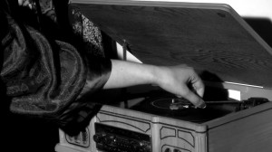
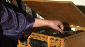
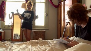
#CLIP 1 -Close up of hand on recorder: The initial clip is in colour and really accentuates the purple in contrast to the brown surrounding it. The second screenshot is that of the same shot however we colour graded it and made it monochromatic. Through this process we found we were able to add a new ‘horror’ aspect reminiscent of black and white horror films like Frankenstein.  This grading choice was the one we chose for our film as we also found it created a good juxtaposition to the saturated comedy footage.

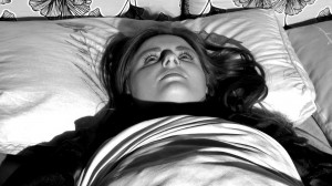
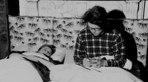
#Clip 2 – Girl in Horror Movie on Bed. This shot we emphasised the contrasts by not only making it monochromatic but by increasing the contrast so as to highlight shadows. The issue with the clip below it revealing the boy and girl in bed is that it was too over exposed so we had to colour grade that to achieve the same aesthetic as the close up of the girl. Thus we had to lower the brightness of the shot.

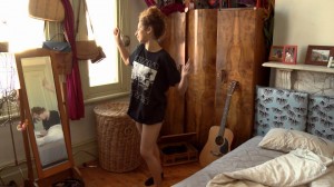
#clips 3- Girl Dancing. Here you can see a very slight difference between the two shots of the girl dancing in the film. the first image is slightly less saturated and as such it did not contrast greatly with the monochromatic nature of the horror. So we increased the saturation of the shot so as to bring out the colours of  primarily brown, blue, black and white. This subtle change in itself was successful because it helped to differentiate the ‘comedy’ film footage from the ‘planning’ stages which is much more subdued in colour.


Semester Review

I’ve honestly loved this course this semester because it was the first time I’ve been able to apply myself in every part of the production process. In the previous semester I chose to stick to my strengths and refused to expand that capacity so as to learn about production processes that were foreign to me. This is the first film which has been based on my idea and for me it’s been so rewarding seeing it come to life with a collaborative gorup that works so strongly together. I certainly got what i wanted out of this semester and that was to be more immersed in editing which i was initially afraid to try. I found great the synthesis between our independent work as a group and the class teachings which were really practical and set us up perfectly to go out on our own and film our movies. I am pleasantly surprised with how accustomed i have become with the EX3 and Z7. Most of all I’m surprised by how thoroughly we got to experience lighting and its set up and functions. I would have loved however to experience actual editing classes so as to increase my confidence however everything else has been most constructive for me, especially as a practical learner.

‘The lovely month of May’ (Jean Ravel, 1964)

When observing the film, ‘The lovely month of May.’ – (Jean Ravel, 1964) I am immediately confronted with a somewhat jarring music soundtrack. The low tuned piano and consistently fast pacing of the drums within the background function to elevate the rapidness and slightly uneasing tune. One way in which I am able to describe the music is to explain it as ‘colourful’ in a way that it balances out the monochromatic filter on the film. I appreciate the manner by which the efferverscent music soundtrack reflects a specific city period represented within the documentary.

Evidently, this is a strongly music driven film. The suddden variations within the music function as episodic dividers of the documentary narrative portrayed. Although the music functions as a directorial mechanism on it’s own, the audience’s attention is specifically focused on a thematic structure through the narration that enters the film 1 minute in. The voice describes a sense of relief, peace and distraction with specific banalities that the parisians can now be occupied with as they are near ending the Algerian War.

I appreciate the fullness of the frames in that there’s a consistency with that sense of intensity established by the rapid paced music. This is nicely juxtaposed to the serene, gentle voice of the narrrator which in my opinion, function to make the voice central and clear for the audience to focus on. The soundtrack and consequently, narrative, progressively changes as the music adopts a slower paced character involving a guitar sound that emphasises a sense of serenity matched by close ups on specific people living within the city; becoming more personalised . Once again the narrative shifts as the music returns to a fast paced, heavier and more off-tone soundtrack. This shift is again matched by a faster pace in editing between the faces within the city. The audience is taken on an interesting and eclectic journey through the different city areas. The camera seems to constantly pan so as to direct the viewer’s eye-sight to a specific element on screen whether it be the wide range of classy hats worn by the parisians (which itself has adopted a them throughout the film so as so emphasise the parisian style at such point in time). The constant close ups shown of the policemen seem to contextualise the period, which is that of the end of the Algerian war.

The camera work is interesting here in that it takes on both a ‘fly on the wall’ characterstic and an interesting omnipotent character role on it’s own. It serves as the all-knowing and all-seeing eye to the city life in Paris during the period of 1962 in which it was filmed.

The camera framing seems to conitinously vary from close ups on individuals within the city and cuts to long shots of moving objects or beings wihtin the city to emphasise the business of the period. The constant movmeemnt within the frame similarly abides by the thematic structure established through the music, narration, and editing technique.