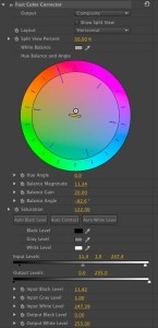
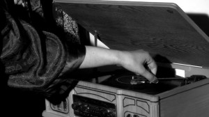
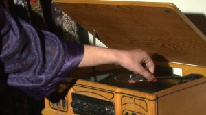
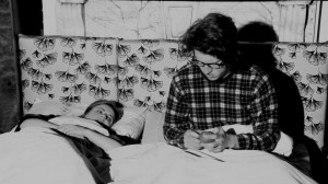
#CLIP 1 -Close up of hand on recorder: The initial clip is in colour and really accentuates the purple in contrast to the brown surrounding it. The second screenshot is that of the same shot however we colour graded it and made it monochromatic. Through this process we found we were able to add a new ‘horror’ aspect reminiscent of black and white horror films like Frankenstein. This grading choice was the one we chose for our film as we also found it created a good juxtaposition to the saturated comedy footage.
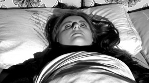
#Clip 2 – Girl in Horror Movie on Bed. This shot we emphasised the contrasts by not only making it monochromatic but by increasing the contrast so as to highlight shadows. The issue with the clip below it revealing the boy and girl in bed is that it was too over exposed so we had to colour grade that to achieve the same aesthetic as the close up of the girl. Thus we had to lower the brightness of the shot.
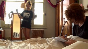
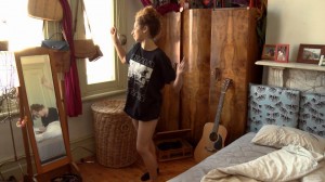
#clips 3- Girl Dancing. Here you can see a very slight difference between the two shots of the girl dancing in the film. the first image is slightly less saturated and as such it did not contrast greatly with the monochromatic nature of the horror. So we increased the saturation of the shot so as to bring out the colours of primarily brown, blue, black and white. This subtle change in itself was successful because it helped to differentiate the ‘comedy’ film footage from the ‘planning’ stages which is much more subdued in colour.
