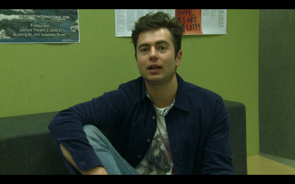
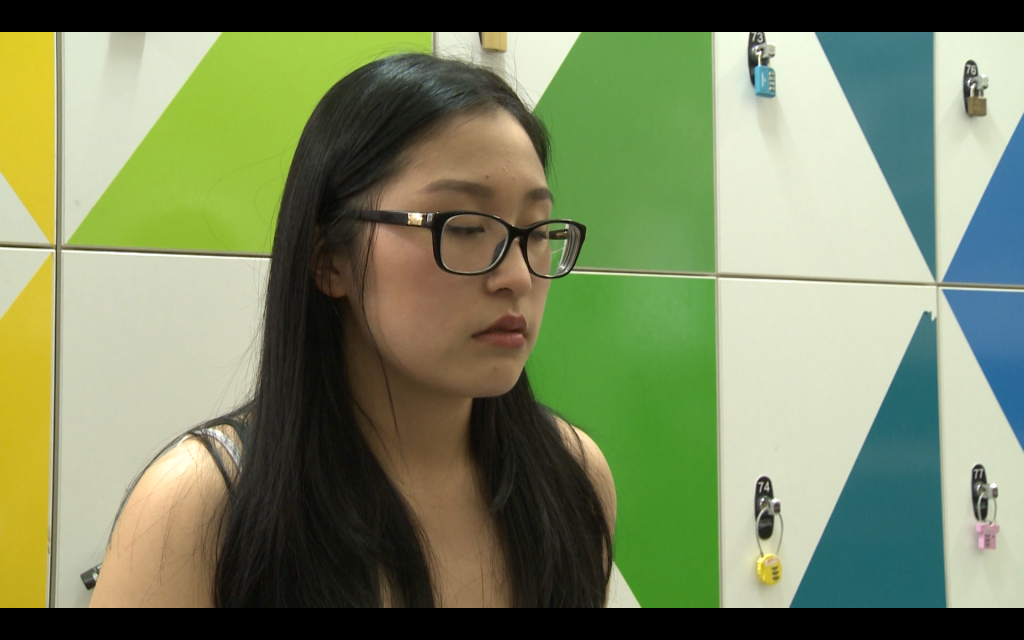
Control Image:
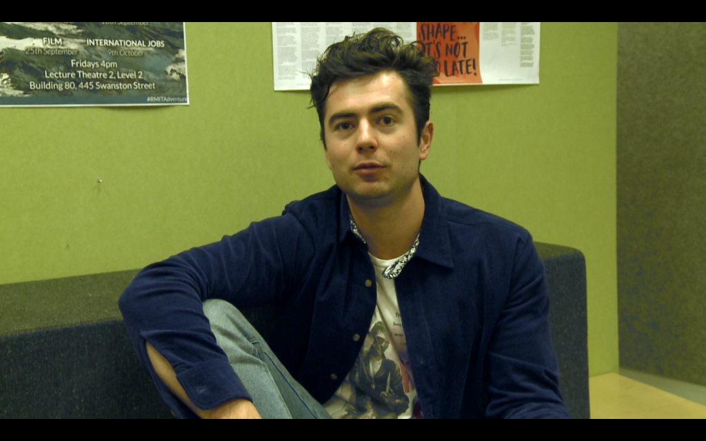
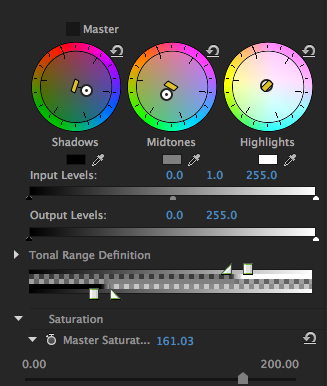
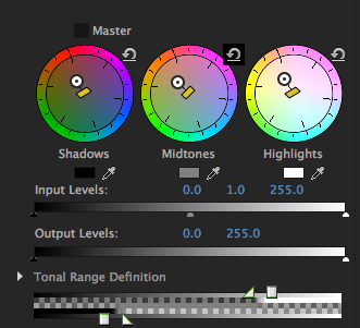
Attempt 1. For my first attempt at grading this image, I pretty much just eye-balled it. I didn’t think too much about where the indicators on the wheel were directed towards, and I focussed more on the how the image looked . I tried working out the different layers of the image, and which wheel would affect which layer so I could get a better grasp on which portion of the image I was affecting with each turn and pull of the colour correctors
Attempt 2. For my second attempt, I tried to amp up the colours and make them more vibrant. So I tried to make the green more green by pulling in that direction for the mid tones and I also adjusted the saturation a bit.

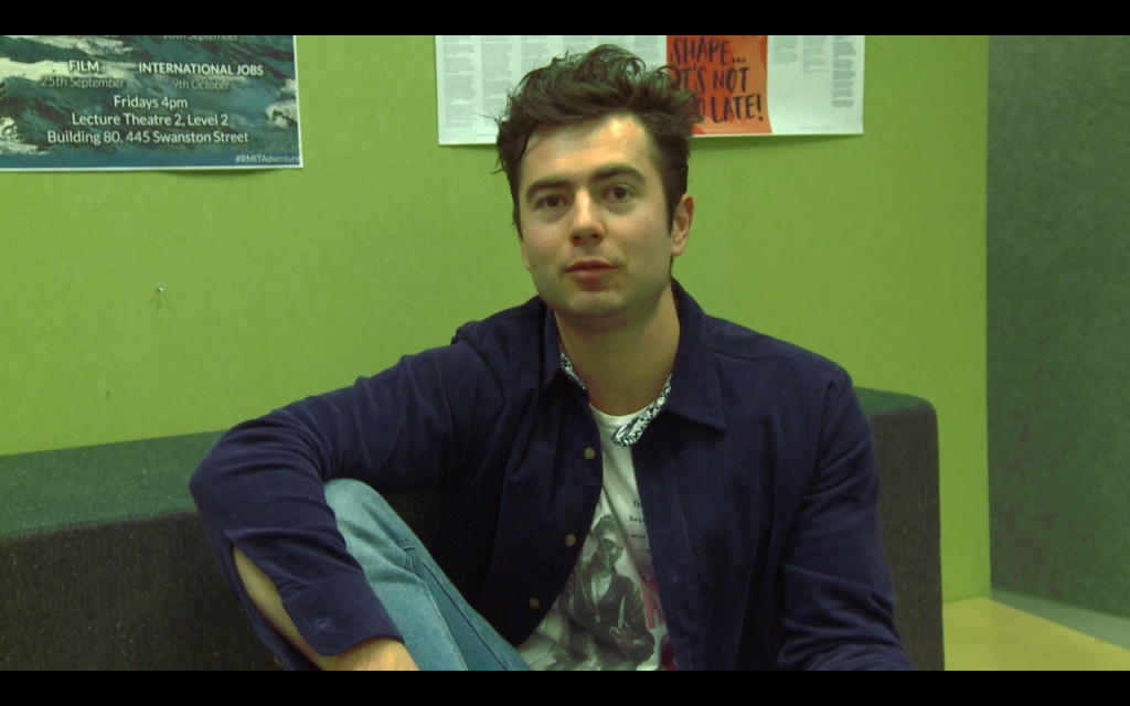
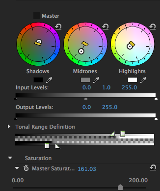
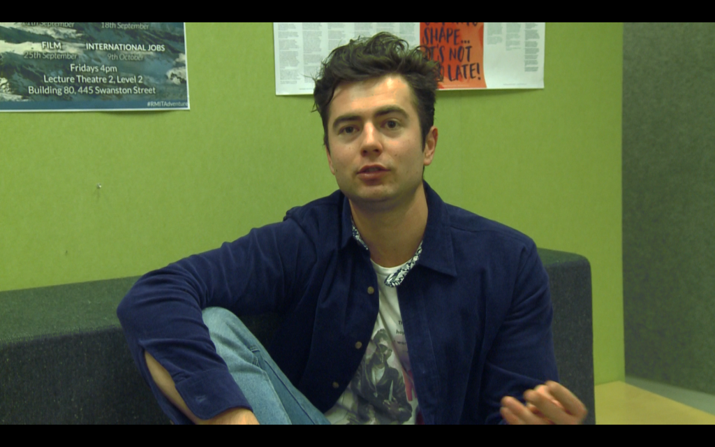
Attempt 3. Here, I wanted to make Nenad and the blue of his jacket stand out more so I pulled towards the blue. Upon reflection, I think it would be good to combine the last two attempts.
Attempts 2 and 3 combined
Image 2
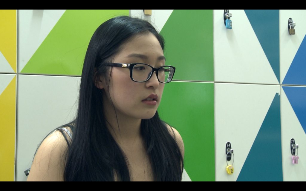
1. In contrast to my first attempts, I tried to be more systematic with these ones. To make Vivian look “cold”, I pulled all towards the blue hues. More than cold, she ended up looking rather sickly.
2. Then I wondered what would look opposite to cold, so I pulled in the opposite direction and here, she definitely looks like she has more colour. Still, something seems off in this one.
3. Finally, for my last version I decided to be a bit more dramatic since I think I was pretty sedate with the colour manipulation in the first two. I think even in the control image, the colours are already quite vivid and bright so I wanted to make it darker and a bit more dull. I pulled towards the pink because I was curious how it would look, but it actually turned out more normal than I expected. I also played with the brightness and contrast so that Vivian’s hair and glasses would be more black and I think the increased contrast makes it look more drama-esque.
Control Image

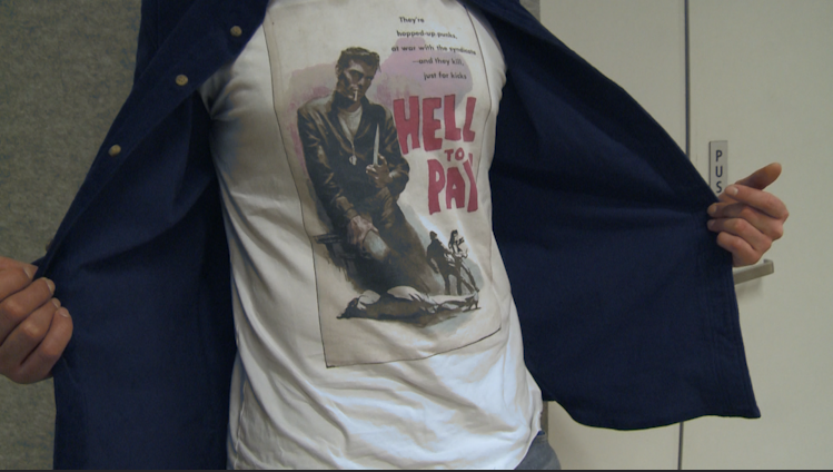
For these images, I used the same process as for the second set. One thing I realised though, is that the shadows here have also been coloured. Since I pulled all the colour wheels to blue, everything has a bluish tone even the crevices of the t-shirt.
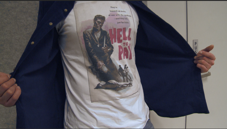 For this version, I wanted to accentuate the reddish hues on his t-shirt so I pulled the mid tones towards the red, keeping the shadows and highlights towards blue.
 For this last one, I combined what I did in the previous two but made it more subtle by dragging it out less. Somehow, it actually looks a lot more blue than in the first one where I dragged out the colour towards blue by quite a lot.
