Week 10: The City Through a Window Pane

I’m going to be reviewing the student k-film ‘The City Through a Window Pane‘ (2012) using De Bono’s hats.

RED – A very visually interesting piece. There is a lot of variety and it makes me think about all the reasons why I love Melbourne. It’s the kind of activity I do mindlessly but never acknowledge (that being looking at the city through a window pane contemplatively). The entire piece is tied together by the theme of observation.

BLACK – The background image of a street map with landmarks and cartoon images is a bit too ‘busy’ for me, and it almost looks amateurish. Some of the clips are too slow to load and I lost interest quickly. Also, some of the clips had too much to look at and I was overwhelmed. I couldn’t find a pattern between which cartoons Korsakow suggests to click through to next. Some are about food or art, whereas others are about culture, or iconic Melbourne landmarks.

YELLOW – I like that the interface has a window pane built into it, however, I’m not sure I like the design of it. I like the continutiy of the text below the fragments, always starting with “I see…”. I like the creativity behind some of the clips, such as the tram clip which shows the same view from night and daytime to illustrate convenience.

GREEN – In a similar way that it uses the start SNU as an introduction to ‘set the story’, I wonder if there was any way that they could have anchored some more ‘narrative’ sections amidst all of the footage to help the viewer learn a little more about the person who is doing all of this ‘looking’ through the window pane. This could make it more personal. The music which is created to suit each clip/mood tries to do this a little too obviously/forcefully for me to enjoy. It hits the viewer over the head instead of being suggestive, which in turn puts constraints on interpretation.

Week 09: Kitchen Stories

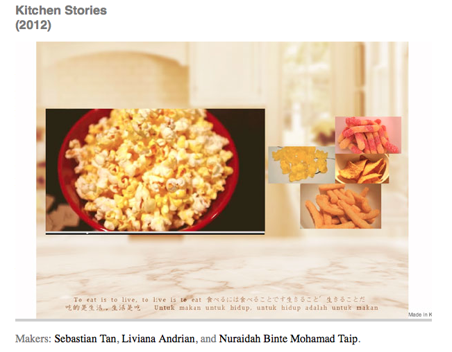
I’m going to analyse this student K-film ‘Kitchen Stories’ (2012) using De Bono’s hats.

RED  – My emotional response to the piece was that I found it hard to enjoy. It was about relations of food, using colour.

BLACK – It was very hard to get away from one specific colour, and I had to click through many many many clips to arrive at a new, fresh cluster of fragments. The constant background track was a little distracting and gave it a bit too much of a ‘linear’ feel for me. Each shot generally has different close-ups of the same food from different angles, which quickly became repetitive for me. I found the fragments to be a little too long each to keep me engaged.

YELLOW – I liked the use of multi-language. There was a sense of wholesomeness behind the idea/concept. I felt like there was a very ‘family-oriented’ vibe, with the three different cultures intersecting over their shared love of food. 

GREEN –  The background image stayed the same the entire film (with the previews on top), as does the interface. I would have liked to see what some changes and variety could have added to the film.


Week 08: Life is a Musical

A few weeks ago while researching which past student K-film I wanted to write about for my film essay, I came across Life is a Musical’  (2012).

Something pretty powerful happened inside this work for me, and that was recognising the power of the pause.

The piece is primarily about sound, and uses looped clips to create somewhat of a ‘soundtrack’ to life. However, where I really struggled was in thinking of the piece as conceptual overall (I think it makes more sense for me to say ‘continuous’ here instead) when there are breaks in the sound patterns. I found the flow constantly disjointed once I was within the rhythm that the fragments were giving me.

But then I stopped to think about what the film was actually doing, and I realised that this could be another really important way that the user can interpret meaning: through the spaces in between sounds.

An outstanding favourite lyric of mine is:

The only thing of worth you can learn from mine is that the spaces between words deserve to shine.

Junctures. Caesuras. Pauses. Rests.

They give the audience time to reflect, consolidate and appreciate. That’s powerful.

(Image via flickr)

Week 07: Ceci N’est Pas Embres

In our lab last week, we took a brief look at Matt Soar’s K-film and discussed the following:

  • The opening SNU is all about animation, roads, setting of location. It is leading us somewhere.
  • Soar has deliberately chosen to establish a scene/the arrival.
  • The work is complex in terms of the multiple fragments presented because Soar has invested a lot of post-production in each individual clip.
  • There are sequences with animation added to them, some which use a kind of stop-motion with still photographs.
  • There is a lot of diversity/idiosyncrasy.
  • The main interface is seasonal, showing time of year and location. However, the K-film uses multiple interfaces.
  • This presents an almost bricolage effect, connecting the interface and the patterns that arise in the film – using images over the top of each other, interfaces which change shape and structures, and animation over real life footage.
  • Seth told us that the work is representative  of Soar’s previous careers (working in construction, design, advertising and animation). Therefore, the piece explores this creative processes at the time, making it an incredibly interesting self-reflexive piece.

You can find Soar’s film here.

Adrian also pointed us in the direction of this interview with Matt Soar. I really like reading about his response to issues such as “the edge spaces between, and around, established media” which he is currently interesting in. I also liked hearing him talk about his creative process (and how this intercepts with the commercialised world).

He also raised a really interesting point about how you display interactive works to large audiences (such as at a film festival where both himself and Florian Thalhofer have displayed their K-films), when they are traditionally created for audiences of one.

Week 07: Reflections

We got to talking about lists again this week. It was said that lists achieve much more when we think of them as something that aren’t ‘literary’ in a sense. Lists aren’t narratives. Think of micro-blogging, or sites like Twitter and Flickr as being list-building devices.

Bogost mentions the phrase ‘the tyranny of representation’ in last week’s readings. Adrian discussed why representation can be tyrannical by saying the act of narrating is actually an act of arrogance on our half.  You can only ever say a little bit about what you’re trying to represent. Narrating, by nature, includes and excludes (in a similar fashion to my discussion about the politics of definitions), however lists are vastly different because they don’t reduce things into meaning. They just simply are.

We talked quickly about why a company such as google hasn’t bought Korsakow (in conjunction with YouTube/online developments in video). Adrian pretty quickly dismissed this question, but touched briefly upon the fact that Korsakow is very different as software to something like YouTube – nothing in YouTube is about rethinking what video is/does, and in this sense it is ‘old media’ because they focus more on audiences and advertising. As an avid YouTube watcher myself, I reckon this is not necessarily true because there are communities of content creators who have incredibly creative takes on what they can achieve through their video medium. For example, one of my favourite YouTubers KickThePJ who studied digital film at university in England and is doing some really fascinating things regarding video content.

Another point which really struck home with me is how multi-linear our day to day activities actually are. When you think of the way we navigate the internet, we often have many tabs open, steam music, check the news, and reply to emails all at the same time. However, there’s no real mainstream idea who what multilinear means. We’re on the cusp of an enormous media change; the media landscape is so different to anything that’s ever been. But we’re still in the middle of the change, we don’t yet know what direction or form those changes are going to take. Twitter, Instagram and Vine are helping to popularise fragmented modes of media. The way we seem to be heading, as our media use becomes more and more niche, is towards creating building systems which do interesting things with these fragments we produce day in and day out.

(Image via flickr)

Film Essay: ‘Eulogy to Suburbia’

Eulogy to Suburbia2012.

CONTENT

Eulogy to Suburbia is an observational K-film which explores the minutiae of domestic life in the suburbs. The film is composed of many fragments displaying residential homes, streets, roads, parks and skies. All of the clips are thematically similar, with no sharp contrasts, yet each clip invites us to look upon a scene with fresh eyes.

Most clips are shot as brief single takes, from the same angle (with the exception of a handful). There is not a lot of movement in the frame of each of these fragments. Where movement is focused upon, it is usually through the action of cars, or wind through tree-lined streets. The fragments present as visually congruent, with the film-makers clearly making an authorial decision to build coherence throughout the K-film.

What I found interesting, in concurrence with Aston & Gaudenzi’s interest in the fundamental human need to try to make sense of the world, was that due to a complete lack of humans in all of the clips, the K-film seems to invite personification of the houses and cars themselves, essentially becoming ‘characters’ within the K-film’s diegesis (2012, p.129; see also Bordwell & Thompson, 2013, p.76). However, I continually had to remind myself that this work is a non-narrative, multilinear artefact which has no cause and effect, nor any sense of temporality.

The overall feel of the K-film breeds a sense of ‘familiar anonymity’ that is encapsulated by suburbia. The content comes across as intimate, but also holds a certain sense of unease which I believe is caused by the mildly voyeuristic nature of the content.

PATTERN

On first viewing, the initial fragments seem to suggest a pattern between light. Many individual clips focus on the expanse of sky above residential spaces, and the previews often group together clips with an aesthetically similar skyscape. This use of natural light could be to imply the warmth of communities which are often embedded in suburbia.

Eulogy to Suburbia - Light


 Colour similarity becomes more and more apparent as you begin to negotiate your way through the relations of the film. The fragments are matched according to the predominate colour which appears in the clip.

Sound is a less obvious pattern within this K-film. The majority of the clips contain incidental background noise of engines, car horns, birds, and even the wind. I believe an important comment can be found here between the bleed of industrial life into natural spaces. We are presented with a ‘rhythm’ of suburban life, where urban noises harmonise with Mother Nature’s own soundtrack.


INTERFACE
Eulogy to Suburbia - Start SNU

The interface is built of one viewing window, and five connected preview windows positioned below. This interface is consistent throughout the whole K-film, creating visual solidarity.

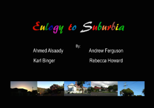
The K-film begins with a start SNU introducing the four film-makers accompanied by the sound of birds in the background. The viewer is then offered a beginning point, however these five previews are not set, and change with each viewing.

I found that the deeper you get into the K-film, the five available previews start to have less commonality. However, some seem to appear more often, indicating a higher SNU rating. Some fragments have multiple lives and will continue reappearing as your delve further into the K-film. None of the clips are set on a loop, so a still screen appears at the end of each clip with the previews still positioned underneath.

CONNECTIONS

On the website of their K-film, the authors concede “our project attempts to represent suburbia, not in a negative or positive light, but the way we see it, just the way it is”. I believe that Eulogy to Suburbia is an experimental film in that it is a “poetic reveri[e] which [tells] no story” (Bordwell & Thompson, 2013, p.355). It simply invites observation and new ways of looking at things, without authorial judgement or criticism. This is similar to Serra’s invitation in his film Railroad Turnbridge which asks us to “notice and enjoy the slowly changing pictorial qualities of line, shape, tonalities, and movement” instead of finding ‘meaning’ or looking for deeper qualities (Bordwell & Thompson, 2013, p.356). However, if this is to be taken as true it is interesting to note that the K-film has been titled ‘Eulogy‘ to Suburbia, suggesting that suburbia has in fact died.

The film is neither abstract nor associational, as there is a clear thematic linkage and the audience expects the fragments to be placed in succession with each other. Rather, it aligns more closely with Sobchack’s (1999) conception of a “memory box”, which collects and preserves selected memories. However, she also claims that “human memory and it’s re-collections don’t compute so neatly,” which could be considered a downfall of this particular K-film. The K-film works well as an artefact which can be grazed at, as the viewer may learn to appreciate the scenes more closely with each return viewing.

I think that the K-film’s strongest element is the consistency of its interface. This choice perfectly complements the patterns and relationships that are created within the content of the film: that of the ‘everyday’ repetition of suburbia, which stays steadfast and unchanging. However, as Ryan (2006) reminds us, “we can never be sure that sender and receiver have the same story in mind.”

REFERENCES 

Aston, J. and Gaudenzi, S. (2012) ‘Interactive documentary: setting the field’, Studies in Documentary Film, 6: 2, pp. 125–139.
Bordwell, D. and Thompson, K. (2013) Film Art: An Introduction. New York: McGraw-Hill.
Ryan, M. (2006) Avatars of Story. Minneapolis: University of Minnesota Press.
Sobchack, V. (1999) “Nostalgia for a Digital Object: Regrets on the Quickening of QuickTime.” Mille 34. Fall.


Week 05: Type:Rider

Type:Rider is a really intriguing artefact, and I was hesitant to write about it for IM1 seeing as it’s not necessarily an interactive documentary or anything of the sort – it’s a video game. However, the reason why I think it’s significant to our learnings is that it uses the interactive form to give documentary-style information about the history of typography. I’ve been looking at a few K-films, but haven’t quite got the knack of writing about them yet (which I will need to do for the film essay). I decided to write about Type:Rider in order to get a bit more understanding of the umbrella form of i-docs before moving on to focus more specifically on K-films for the remainder of the course.

My first impression of Type:Rider is that you can tell a lot of attention has been paid to the interface – it is very ‘designed’ and aesthetically beautiful. The game requires you to use the keyboard arrows to navigate your character (a colon, of the punctuation kind…) through an obstacle course of letters and glyphs in order to unlock the page of information about a typeface before levelling up to the next typeface. The goal is to collect an entire alphabet of floating letters, whilst avoiding pitfalls and barriers.

Screen Shot 2014-05-22 at 5.40.12 pm

I loved that I was actually using my whole hand to utilise more of the keyboard space instead of just clicking a mouse (which you do in Korsakow). It didn’t quite feel like I was learning because I was gaming at the same time, which I think is a very effective (and sneaky) psychology behind interactive education.

The music is very ‘designed’ as well, developing with the gameplay. Each time you progress to the next level/typeface, the music adds a layer to itself, mirroring the ‘progress’ which the content is showing.

At first I thought there was a good amount of text to keep the audience interested, but it quickly became boring to scroll through (I couldn’t figure out if this was because I wasn’t engaged with the content, or because the scroll function was very slow and I couldn’t read at the pace I wanted to).

There was a great element of adventure and excitedness in Type:Rider, which really drove the content. I really liked that I found myself paying so much more attention to the actual letter forms that I would normally, due to the fact that the lines and circles of each letter were actually becoming the things you needed to utilise and/or avoid in order to progress to the next level.

It is very clever how they designers have incorporated things into the interface of the game – for example, in the level when you are learning about moveable type and the letter press system, a big printing-press machine appears and tries to crush you, which you quickly need to avoid.

The difficulty with a medium such as this is that games cause frustration. A format like this can mean that viewers might not necessarily stay as long as you want them to if they get stuck on a particular part of the game (which is exactly what happened to me!). I’m going to need to keep this in mind when creating the final Korsakow project, and be mindful of our audience with every authorial decision we make.