Project brief no. 2

project brief no. 2 from Ellie Jamonts on Vimeo.


Overall, I found this second project brief to be equally satisfying and frustrating.


I’ve had very limited experience with editing and seeing my project come together was very rewarding. I didn’t go in with a particular aim – I knew I wanted to talk about my ridiculous attention span and I knew I wanted to take videos in the city at night, but wasn’t sure how those would work with the project brief. I’m happy with the result, though I can see acres for improvement, and believe I’ve met the criteria.


My main concern, which is a strange thing to admit on a self-portrait, is that this is too much about me. I chose to record myself speaking because I didn’t want to be too abstract – particularly since the video largely is – but I worry the sections I chose present me in the wrong light. It wasn’t my intention to come across with a sort of ‘special snowflake’ complex. My aim was to describe the world I’ve constructed for myself – I believe everyone has their own interpretation, shaped by their beliefs, temperament and memories. It might just be me trying to please everyone but it does concern me that my project might be interpreted as overly narcissistic.


The decision to leave the section with the tram journey without a voice-over is one I’m glad I made. There was so much I wanted to say (much more than I could in a minute) but I think forcing myself to leave this space empty, in a sense, gives my piece breathing room. Leaving in my original audio choice would have given a more cluttered effect overall and, even if it had remained, wouldn’t have said everything I wanted to anyway.


I felt that my inexperience with my editing program (iMovie) and editing in general led to most of my frustration. There are moments in my piece that can only be described as ‘clunky’ and I didn’t have the skills to smooth them out. I think this can only be solved through practice and familiarisation.
Thoughts on the power of editing, the questionable nature of post-its

I’m wary of post-it notes. There, I said it. I think they’re unreliable and never the right size for what you want to write on them. They’re also too expensive for paper with glue on, which makes me suspicious. My personal opinion on post-its isn’t massively relevant to the rest of this post but since I’m probably never going to be able to express my opinion in conversation I thought I’d grab the opportunity. Post-it notes: what have they got to hide?


I have to grudgingly concede that they were practical for the editing exercise in this week’s lecture. Editing is something that I don’t have much experience with, as I mentioned in my editing trial post. I’ve always admired the patience editors must have and the massive undertaking of skilfully editing a film but, aside from shuddering over such detail-orientated work, I’ve never thought too much about it.


I think it was also helpful in understanding the construction of a storyline. An actor’s performance might mean less that I assumed it did – not to discredit the importance of talented acting. What I mean is that I didn’t realise our understanding of what good acting is is so dependant on editing. A well-acted, shocked reaction can be completely spoilt by a poor choice of which shot is placed before or after it. Likewise, weak acting can be worked around and seemingly improved by a talented editor.


I remember my childhood drama teacher pontificating on the importance of reading your before and afters before filming a scene; she gave the example of an actor who’d been happy and relaxed in a breakfast scene only to discover, to his horror, that the scene chronologically before that had been him breaking up with a long-term boyfriend.


In terms of what I’ve learnt about editing, though, it could have made the storyline even more interesting. Why was this character so happy after he’d just had his heart broken? Which was fake: the tears or the smile? Or neither? What did he have to hide? What if the phone scene had appeared afterwards, as a flashback, instead of in chronological order? (For the record, in this case they just gave the actor a slap on the wrist and reshot the breakfast scene.)

Project brief no. 1: reflection

After watching my presentation, my table made a really good point, a sort of ‘it’s obvious once you see it’ point: ‘How is this about you?’


As I mentioned in my process post, I wanted to detail the world I live in and use that in an abstract way to fill in the blanks of what I actually am. It’s something I’d like to expand on in the future but for now it does beg the question: is inverting a self-portrait to make it a portrait of everything but you being too abstract and sneaky? And does it even fulfill the brief?


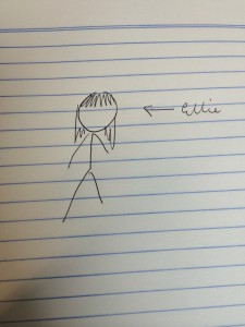
I think some of my more abstract moments just came off as generic, particularly the audio. Yes, public transport is central to my life… just like most every university student and a great deal of the rest of the population. While it might mean x, y & z to me, when you listen to it without my personal preconceptions all you get is a girl that catches the train. It’s the audio equivalent of drawing a stick figure for a self-portrait.


photo

I mean, yeah, technically 


That said, I’m very happy with how the video and images came out. While I won’t be going further with the concept, I think my photoset demonstrated exactly what I wanted it to and held a sense of continuity without being too similar. I’ll be adapting the video for project brief no. 2 but I think it was a good representation of how I choose to see the world rather than how it is presented to me.


It’s given me a great deal to think about for my second project brief, which I know is going to be a lot more personal. Next time, I’m going to talk about the world I’ve created for myself rather than the world I happen to exist in.

Project brief no. 1: process

I admit it started out as a pretty bleak project. I’d had a long day and my weak ankle had given up, along with my contact lenses, and I was tired and hungry and dehydrated. I decided I’d focus on all my flaws. I could record myself apologising or saying please and thank you ad nauseam, or I could get mum to say that I’m a lousy admin assistant (which is true, unfortunately). My images, which have remained mostly the same, would revolve around the way I see the world, which isn’t too clearly. As I said, it wasn’t a happy start.


Flaws evolved into quirks, thank god, as my mood and blood sugar improved. I realised quirks make up a large portion of my day. The way I see the world is defined by my strange little habits and my bad eyesight along with all my other so-called flaws. This was the second stage of my project, which morphed into my eventual focus on my perception of the world.


Ultimately, only the pictures summarising my eyesight and one video of looking up at city buildings lasted out. I eventually came to a theme of existing in the world; a self-portrait with the scenery vividly displayed and the subject left blank.


Audio: I catch the train every day and wanted to parallel going out and coming home (which ties into my day-in-the-life text component). I don’t drive so public transport is a huge part of my daily experience and has certainly shaped me into a person who can easily adapt to getting around an unfamiliar city. It’s also a lot of down-time to stare out the window and think about just about everything.

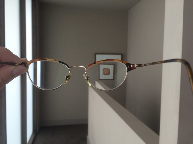
Images: My poor eyesight and low depth perception are huge in shaping the way I exist in the world. I’m grateful that most of my problems can be (mostly) rectified by a visit to the optometrist Without a visual aid I’d be (literally) lost. Even with them, having terrible depth perception means I’m constantly bumping into things and tripping over. This constant stream of little embarrassments is incredibly annoying but it’s given me a higher tolerance for humiliation, which is great for karaoke nights.

Video: There’s nothing better than getting your script updated and being able to appreciate every leaf on every tree as something sharp and distinct and beautiful. Not always being able to see the world has given me a deep appreciation of how beautiful it is. I think Melbourne is one of the most beautiful cities in the world and I’m always reminding myself to look up and look out.

Text: There’s a very small part of me that wouldn’t mind staying in bed all day. Getting up and out and really existing in the world is often a challenge — I’m shy, I’m introverted, I’m lazy, whatever label you like. But I’m always glad when I do get out. I wanted to parallel that daily challenge of forcing myself to have a full life, to demonstrate that there’s always a little voice in my head saying, “Nah Ellie, let’s go home and take a nap”. Sometimes I get all the way down the list, some days I get part-way and some days I don’t even start it.

Editing trial

editing prac from Ellie Jamonts on Vimeo.

Le temps de l’amour performed by Françoise Hardy
Lucien Morisse/André Salvet/Jacques Dutronc
©1962 Vogue

Editing isn’t easy. This is my first real go at it (which I think is fairly obvious) and while I did find it satisfying to tie all those little segments together, even this took its time. I can only imagine how painstaking it would be to edit film by hand. It’s based around the theme of COLOUR so I went for a pretty standard approach: the gulf between the conservative elements of the 1950s and liberation of the 60s.


As I was going along, I realised how valuable paying attention to cues in the music can be. Watching my first cut something felt a little off and I realised that by swapping two clips there was a much better sense of flow. Transitions made a difference, too, and made it clearer that this vision of the 60s was literally a vision being had by the man driving the car. I did feel limited by the title — I think it looks kind of 2007 Windows Movie Maker — but it got the point across.


If I did this again there are a few changes I’d want to make. I’d prefer the colour clips to be more along the lines of the lady in red and perhaps change the song to something a little, well, less polite. I also would have liked to include a reaction shot of the black and white man before the car crashes to make it more explicit that he was reacting to the premonition of the 60s.


In doing this I learnt a valuable bonus lesson about saving my drafts, since I hit refresh and lost everything the first time I wrote this post.

Trash

The deliberate noticing exercise prompted me to think about a form of media that’s very nearly always within urban eyeshot: packaging. From where I’m sitting in the City Library I can see the label on my iced tea and on the packet of chips I’m eating, an apple sticker someone’s put on the desk, a Mt Franklin bottle and a packet of gum. Beyond food there’s stationary, computers (does the outside of a laptop count as packaging?), a bag from Zara… In fact, the only non-branded packaging I can see is a banana skin.

“I don’t actually drink full fat coke… here I am advertising coke for free just cos of a pink can.” (image by Hayley Hughes)


Packaging is powerful, as illustrated above by blogger Fashion Hayley, who only bought the can to match her outfit during a shoot. I’ve been known to save a good-looking, sturdy shopping bag and carry things around in it, partly because it’s practical and partly (mostly, let’s face it) for the aesthetic.


So if packaging means so much, what happens when it morphs into litter?


I gave friends and family, very informally, a hypothetical situation. Take two near-indentical products —  Fanta and Sunkist, for example — how would they feel if they always saw Fanta cans crumpled on the ground? Would it make a difference to what they bought? Honestly, my most common response was “I don’t really  think about it”, followed by something along the lines of “if it was common knowledge that everyone littered it, maybe not” and “I wouldn’t want to be associated with it”.


People reacted more strongly if they’d seen someone actually do the throwing away: “He threw a whole thing of chicken nuggets out of the car window. They went everywhere, all over the nature strip.” Had they bought nuggets since? “No.” It was an ugly memory, forever associated with McDonalds. My friend didn’t want to associate herself with the kind of people who throw rubbish out of a moving car.

A Torontonian anti-litter campaign: “Littering Says a Lot About You” (image via Feel Destain)


My investigation failed to reveal much, unsurprisingly. My tiny sample pool seemed to be more concerned with who was littering instead of what. That said, if they associated a product with a specific act of littering they did think negatively of it. That’s one of the downsides to distinctive packaging; you can recognise it, even when it’s tossed from a fast-moving car. The brighter and more attractive it is, the more it stands out for better or worse.

Media in the Wild

At the State Library…


Up High

  • Will Smith’s giant head (film advertising)
  • Children’s Book Festival flag
  • V&A Inspiration by Design advert on scaffolding
  • Statues (is that media?)

On the Ground

  • my backpack (Fjallraven Kanken)
  • 50 Shades of Grey being read
  • Biscuit packaging

Kanken cult all over town

Mid-Ground

  • Two people sharing a phone to watch something
  • Free Tibet rally — flags, posters
  • Tram advertising
  • Man studying with laptop and notebooks
  • Carrefour bag

Back-Ground

  • Tibetan chanting, national anthem
  • Construction site (noises, signs)
  • Omnipresent Melburnian coffee cups
  • Shop signs, promotions e.g. travel adverts at Student Flights

Foreground

  • Group writing on worksheets
  • Clothing brands e.g. Cheap Monday, Acne

In Your Hand

  • The worksheet
  • Notebook
  • Text from friend: “A bird just flew into my f***ing eye”
  • Mum called, had a conversation about this great butcher outside of Daylesford

On the process of noticing…

Deliberate noticing is something I enjoy – I love people-watching, noticing patterns (like the popularity of Kanken backpacks, which I admit I’ve fallen victim to), looking at the way they interact with their surroundings. That said, sitting down in the middle of the grass with a notebook and jotting down what I see felt forced. It was interesting and a little unnerving to see how saturated the world is with media, especially advertising, and I get the feeling that even though I saw a lot there’s even more that I missed. All I can say is that there’s a lot going on at one given time.

Copyrighted silence

It’s difficult to write about something that didn’t happen. Since today’s workshop was silent I thought I’d write about (arguably) the most famous silence of them all: experimental composer John Cage’s 4’33”. The composition is three movements of an orchestra shuffling uncomfortably in their seats and not doing much else.


4’33” is the most elegant blend of idiotic, pointless artistic snobbery and deeply personal, genuinely moving work. On the surface, Cage’s ego in attempting to harness and eventually copyright silence is almost intolerable. It’s like that joke about an artist deciding a blank A4 sheet is art and going on to sell it for millions, simply because the artistic world was too afraid to be seen to not ‘get’ it.


On the other hand, 4’33” is incredible. Peter Gutmann, freelance music columnist and broadcast regulation and transaction specialist at Womble Carlyle Sandridge & Rice, PLLC, says: “This is a deeply personal music which each witness creates to his/her own reactions to life. Concerts and records standardize our responses, but no two people will ever hear 4’33” the same way.” And Peter has a point. Silence is a deeply personal experience that we bring our individual thoughts, fears, hunger and discomfort to. 4’33” might be uncomfortable shoes to one person, mild tinnitus to another. If art is about interpretation then this might be one of its purest expressions.


None of this excuses the lengthy legal battle between Cage’s estate and Mike Batt, lead of a band named the Planets and composer for the Wombles (no relation to Gutmann’s firm). It’s an ugly story that detracts from the piece itself. Put in a vacuum — away from a musical community desperate not to miss out, away from later re-writes (I’m not kidding; silence was rewritten by Cage multiple times) — 4’33” is beautiful. But it doesn’t exist in a vacuum; nothing does. I know now that whenever I listen to 4’33” all I’m going to hear is The Wombling Song. 

Shallow focus

I’ve noticed the way I learn has changed over the last few years. I’ve always had a relatively weak attention span; there was this tree outside my Year 8 science lab that I knew better than anything I ever learnt in there. My focus has deteriorated now to the point where I can’t watch TV without being on my phone. It’s sort of pathetic. So it was interesting to read about it in academic terms, to give it its proper names: deep and hyper attention. It’s ironic that even as we were discussing our thoughts on the essay we couldn’t keep on track. I don’t know if I have particularly hyper-attentive tendencies; it’s more that I tend to get distracted. I can do a very specific nothing with great focus for hours on end. Still, I think it all relates.


It’s a valuable thing to learn about your own learning. I have a system to get through bulky readings; a little star in highlighter, evenly spaced throughout, to give me a little feeling of fabricated accomplishment. I never noticed the parallel between levels in video games. If I can understand my own brain, the ways its benefitting me and letting me down, and I can use that knowledge, I think uni (and life) could be a lot more productive. The difficult thing is knowing what to do with what we know.