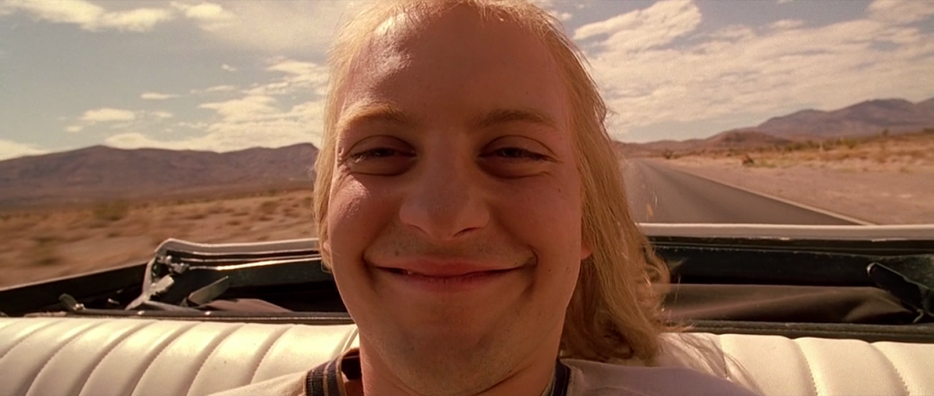
The promo video and has finally come out! Just gonna take a moment to commend and thank Michael for sifting through all of the footage… Top effort.
The crazy, colourful lighting looks fantastic, especially because of the way that Michael graded it. But the out of focus moments in the hallway shots (my doing) really annoy me. Also, the camera movement is not smooth or fluid enough for my liking. There are parts where it’s nice and smooth, and other parts where it’s sort of stiff/rough/slow. I cringe at it / am hyper-sensitive to it because I’m the one that shot it.
I like the handheld shot of Gabby sliding against the wall though. I like the framing and the timing of her head turn with the camera movement (how the framing adjusts to follow her movement and gaze direction). The wide angle lens really makes this shot.
The noise that felt like such an issue on the shoot day isn’t too noticeable – Michael did a good job minimising that. Also the visual effects that Michael added – speeding up and warping of shots etc. – work nicely.
The music works really well for the trippy style / Fear and Loathing in Las Vegas theme. As for the voice over, I think a couple of things could have been tweaked. If just a couple of words were altered, I think the sentences would have flowed better and had more power. Also, I think the text at the end should have been the same font as the rest of the on-screen text (except for the stylised ‘Fear and Loathing in Documentary’ title – it’s great that we matched that to the poster font).
I’d originally thought that the final video would have documentary-esque shots of the bustling CBD in combination with the trippy hallway shots, as was Carl’s vision, but I suppose that Michael and Carl decided it wouldn’t work. Carl ended up buying stock footage to go in the trailer. It looks good (although I’m not sure about the goldfish addition), but it would have been even better if there was some documentary-esque footage. I don’t think that we quite sold the ‘documentary’ appeal of the seminar in the promo video. In fact, the final promo video still doesn’t seem like it has a clear concept, but on the other hand its abstractness is justifiable, working with the theme that we have.
There’s one main thing that I reckon should have been changed prior to the promo video’s release, and that’s the length of the video. It’s about one minute long, which is 30 seconds longer than what it really should have been. Also, much of the promo is just repeating itself over and over – repetition is fine to some extent, especially under our theme, but it’s obvious when the repetition becomes unnecessary filler. Promos for social media exhibition should generally be as short as possible, because they’re working within a medium that champions shorter-form content and doesn’t support longer content. Audiences on social media don’t have the patience for minute-long promo videos. People are so used to Vines and 7-second clips on these platforms that their way of engaging with video content – or any content – has changed completely. This transformation in audience mentality/behaviour is a product of shrinking screens as well – smaller and more mobile screens promote shorter video content (because the content is being brought into the viewer’s personal and changing environment rather than the viewer entering a space dedicated to the video content, like a cinema). Instant gratification is another factor for why even slightly longer content is failing online – audiences have been conditioned by digital networked technology to crave this immediate and short-lived sense of satisfaction and reward when they interact with something. It’s all just a general outcome of the digital and mobile and networked shift, increased user autonomy, and the proliferation of content that occurred as a result of the Internet. Because we’re saturated with content, what is scarce is attention. So we have to really tailor our video work to this new audience demeanour. It’s become such a thing that people are incapable of watching full movies without pausing them part way through and coming back to them on another day. Or not at all. I know that it’s not exactly the same with a one minute trailer, but we’ve got to be so calculated about our marketing, because there’s just so much noise cancelling itself out already. We can’t assume that whatever we put online will be consumed without issue and with impact.
Nice job, Michael! What a trooper to sift through the many, many shots from that shoot day. And great work to Carl too for putting so much thought and effort into the video. And of course to Gabz who’s the best @ errything. Good hustle yo.
We’ve got a promo video, so I’m happy!
