30/3 WEEK 5 || REFLECTING ON PROJECT BRIEF #2

Project Brief #2 was not a walk in the park. And although we had some practice during our lo-fi self-portrait, this was a hard task to complete and I am not as happy with my final piece as I could have been had I prepared properly. Yet again I was confronted with the task of creating my own original video footage and audio bites that could encompass me, digitally. As a person whose kept diaries over videos and listened to music as opposed to making it, or even attempting, I was floored. And unlike Project Brief #1, of which we could just give our raw footage, photos and sounds to you and that be that, Project Brief #2 brought with it a whole ‘nother world of problems/adventures. I guess what I’m trying to say is that I need practice. And lots of it.

It was fun to play around with some of the editing tricks, without getting ahead of myself, I learnt how to play a clip in reverse and also a bit about editing or trimming clips. Something that didn’t work out well for me was the written element within the video. I used the images of my writing over a picture of food in an attempt to try something new and to avoid typing over a transition screen in iMovie, but wasn’t sure if that would be enough to be counted as ‘written text’ so in the end I used a screen of typed words, to tie in with the idea of food and hunger I’d used in those first images. I would be paying more attention to getting a more succinct idea across using different mediums other than words typed on a screen if I had my time again.

Overall I wanted, again, to highlight the movement in my life. An inability to stay in one place for too long remains constant. I wanted to show this through the footage I used for the video elements, the bike riding, the tram catching and the walking. In using those two trimmed clips of my own voice at the end of the video I was really just trying to push myself out of my comfort zone. I think that that element of spoken word works really well with the end of my clip and also in highlighting my frustrations at my ability to portray feelings and emotions over this medium.

25/3 WEEK 4 CONNECTION || HITCHCOCK, BIKINI’S AND IMPLIED EVENTS

After this weeks reading ~Scott McCloud’s Blood In The Gutter, our look at the Kuleshov effect and our work on PB2 I’ve been thinking a lot about the things that aren’t there. Being alerted to the Kuleshov effect has made me realise, it’s not actually often we are explicitly shown certain important details or events in movies or television. It’s simply a mastery of editing, knowing which absolutely important elements of the events need to be kept in, and then placing them within a sequence in such a way that the audience ~ with their surely basic knowledge of human emotions, reactions or cause-and-effect ~ can fill in the gaps.

This is exactly what McClouds reading was about, written/drawn in a truly engaging and interesting way McCloud emphasises that often meaning or events are inferred but never actually shown. When looking into various editing techniques and well-known examples of the Kuleshov effect, the recurring example that I just couldn’t escape is that of Alfred Hitchcock’s 1960 film Psycho, most importantly that shower scene.

We all know it, we’ve all seen it, and it probably features on every single list of important movie scenes EVER. The thing about this scene is that Hitchcock is relying completely on the Kuleshov effect to let the audience know what’s going on. And it works. Interestingly we’re never shown explicitly that anything has happened, but from the mastery of editing the ~over~ 80 fragmentary shots we know, or feel we know, that a naked woman has been stabbed to death while taking a shower. Here’s Hitchcock now, talking about his use of editing and his very own example of the Kuleshov effect.

24/3 WEEK 4 LECTORIAL || THE WORLD EQUALS ONLY WHAT I CAN SAY ABOUT IT

More speakers today in the lectorial, first up Dr Adrian Miles who spoke to us about the integration of theory and practice and how that is what makes up MEDIA.

“I think, therefore I am”

Miles spoke to us about how ‘thinking’ can only become tangible through the act of ‘making’ and that what we are at university to learn is how to create from the things we see, things we think and things we feel, and create something larger than that. We were divided into small groups and given cue cards on which we had to write elements of a story or narrative that could be completely re-arranged or changed ~~ without disrupting the flow of the story. I found this activity really hard to master! I found that our short narratives were too reliant on certain elements or plot lines and without them the stories faltered.

Next Liam Ward talked to us about editing. He started his talk by showing us the opening clip from 2001: A Space Odyssey (something I still haven’t seen!) Most importantly the jump in footage from the bone being thrown into the air and the spacecraft. Two completely separate (well, relatively separate) pieces of imagery positioned next to each other in a way that the audience draws conclusions. This clip and explanation tied in really well with the editing activity we had done in the workshop.

Ward’s talk was really engaging, as he explained that editing wasn’t FIXING but more a case of pulling everything apart and creating an environment where the audience wants to and can fill in the gaps itself.

“The bits we choose, the order we put them in and the gaps used is where the magic happens.”

23/3 WEEK 4 WORKSHOP || SAD ABOUT SOUP? ME TOO

The Kuleshov Effect

This weeks workshop was focused on editing and editing techniques. We were shown this short film by Lev Kuleshov(above) in which a short sequence of unrelated photos are placed together, the audiences reaction to this is referred to as the ‘Kuleshov effect’. The ‘effect’ refers to the mental phenomena of people associating emotions or feeling with images that don’t neccessarily carry these; resulting from the images placement against and with other images. In Kuleshov’s case, an image of a mans face portraying no emotion is placed next to, first, a child in a coffin, the same image of the man is shown again, next to an image of a bowl of soup and last, the man is shown immediately before the image of a woman laying on a bed. This experiment in editing is used to exemplify how the precise placing of images in a sequence can truly affect the way the audience receives each image.

We were then shown sites such as archive.org, a place we can access lots of stock footage to use in future assignments, this footage has passed its copyright dates and is now considered within the public domain – which is great! We were each given a different subject or idea such as shape, time, movement and then left to source stock footage and have a play around editing techniques on whichever program we had. It was hard to pull myself away from some of the seriously weird and entertaining old footage found within the site! I’m looking forward to practicing my editing skills more over the next few weeks during work on my project briefs, and in class.

18/3 WEEK 3 CONNECTION || IDEA$

After presenting my first Project Brief to the class earlier this week, I’ve started thinking about what elements I’d like to recycle into my PB2 and what approach I’m going to take in making a 1 minute edited video that ~represents~ me. I had a quick look for some inspiration on Vimeo ~probably aiming a little high there but nonetheless~ I definitely want to incorporate the footage I made of myself riding my bike and I found this little ‘Silent Self Portrait’ which is essentially the dream of the quality of work I’d like to create one day + Cinelli handlebars ***drools***

(https://vimeo.com/107976854)

17/3 WEEK 3 LECTORIAL || COPYRIGHT OR WRONG?

To be honest, writers block has had a firm, unforgiving grip on me over these past few weeks and I have been finding it very hard to get my motivation revved right up to where it needs to be to move past that first-draft phase.

BUT HERE GOES

This weeks Lectorial was broken into 3 parts: Copyright, exploring the unknown and pre-production.

The copyright element was stock standard but still very handy, especially as we all wade out in the creation of our next Project Briefs, especially the PB3 coming up in week 7 in which we can use stock material AKA stuff we don’t create ourselves. I heard other classmates talking about contacting local and unsigned artists for the use of their music when creating things – I thought that this was a great idea and something to definitely keep in mind over the years of this degree.

Next up Kyla Brettle spoke to us about immersing yourself in the field. She was a really interesting speaker and talked to us about some of the experiences she’s had over the years being a documentary filmmaker. She used sound bites from the field which really contextualised what she was saying about putting yourself out there – especially in situations where you find yourself in unfamiliar territory to get a story. She was truly a captivating speaker, and gave us all a real life example of the skills we learn throughout the course being translated into the real world!

We then had Paul Ritchard talk to us about pre-production and collaboration. It’s really great to hear from a variety of voices and people during our lectorials, especially in regards to forging our careers in the media ~ whatever that may involve

16/3 WEEK 3 WORKSHOP || LO FI PRESENTATION

Today we presented our Lo Fi Media self portrait to each other. This assessment was a really good introduction to the work we’ll probably be doing for the rest of the semester, especially considering the media we produced for this assignment can be reproduced and refined in our Project Brief 2. It was pretty nerve-racking as this was the first time we’ve all had to show any ‘work’ to the class and the assignment required us to produce images, sound bites and footage that represented ‘us’. There were some really good elements produced in other peoples PB1. A recurring theme seemed to be that of public transport and media artefacts that represented ‘home’. I know that they’re two things I definitely tried to portray through my work.

We were introduced to the requirements for our PB2, in which we would have to create a 1 minute video of edited original footage ~ which would in turn represent us. I’m looking forward to having a go at editing together some footage, but I’m a bit wary of the problems I could face when involving my audio elements because I’ve never really worked with pure audio before!

16/3 LO FI MEDIA SELF PORTRAIT

IMG_1685

IMG_1506

IMG_1673

 “But I’m homeward bound; grab a quick look at those around me

Same faces, different day in this ghost town

Kings and pawns, side by side

Modern day slave ship for the nine to five nation

Daily grind ritual

Each rides with their own private soundtrack to the same visual”


BACKYARD

10/3 WEEK 2 || SHUT OFF AND SOCIALISE

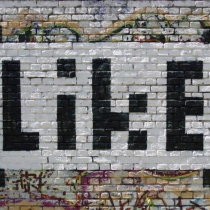
like-by-peter-drew

It’s funny, after yesterdays noticing activity in the Lectorial I’ve been really aware of how much(or how little) of the media messages projected almost everywhere in the city, in our lives, I actually absorb. We live in an over saturated world, over saturated with opinions, advertisements, ideas, sales, information, consumerism and art; plastered, projected and programmed all around us. I’m surprised we’re not all exhausted from taking it in or blocking it all out ~ both huge tasks. I’ve found, by actively noticing my reactions to the media I see on a day to day basis that often I’m more likely to notice and react to ads or ideas that I don’t agree with, as opposed to ones that compliment my ideals and beliefs. Things such as ads promoting a “healthy lifestyle” by eating Subway or McDonalds, and especially promotions by large supermarket chains such as Coles or Woolworths really get a reaction from me! It’s in these situations too, that advertising really does rear the uglier side of itself and perhaps thats why they rile me so much.

On a more positive note, the activity reminded me of street-art projects by an Adelaide artist a few years ago, Peter Drew, who is now putting those great “Real Australians Say Welcome” posters all over the place (GREAT STUFF). His earlier projects were called ‘like’ and ‘pixel face’ and they were and still are a common sight within the street art landscape of Adelaide. Those paste-up pieces always resonated with me – as a kid who loves the use of technology and why people use it –  and I became a follower of Drew’s work. The pixelated faces which were pasted above buildings, shopfronts, on signs and even in various galleries over time, were used to “convey the flatness and banality of human emotions as they pass through technology”(Peter Drew). The use of imagery usually associated with technology, the pixels, and the word ‘like’, given meaning and weighting as numerical through social media sites such as Facebook or Instagram really make you question your involvement with technology and how or whether it implicates your ability to really ‘like’ or notice things IRL