Apr
2019
Assignment 2: Week 5
As I have just proposed my advertising campaign last week, the timing was nothing but perfect for week 5 reading “How to Successfully Promote Your Festival”. As you probably guessed, this is exactly what I’ll be rumbling about in this blog post. Let’s go.
I have mentioned maybe a hundred times that I am very fond of marketing, advertising, branding and everything that has to do with sales and communications. I was very excited to have an opportunity to manage the advertising for MIYFF, and even more excited to receive such positive feedback from the team. I figured that it’s very important to keep every ad consistent and working towards the same goal, communicating the same values and the same idea. We want the audience to have a clear understanding of what MIYFF is about and what’s the image around it. As Rambousková says in her article:
Your festival needs a clear visual identity that the potential audience will easily comprehend and that will distinguish the festival from other events.
I’ve also looked at some of the other film festival’s aesthetics and noticed that they all are very similar and maintain a consistent appearance and ‘mood’. The short promo for KVIFF that we discussed in class, for example.
Another example is the design of MIFF ads, which are always colourful, bright and somewhat goofy.


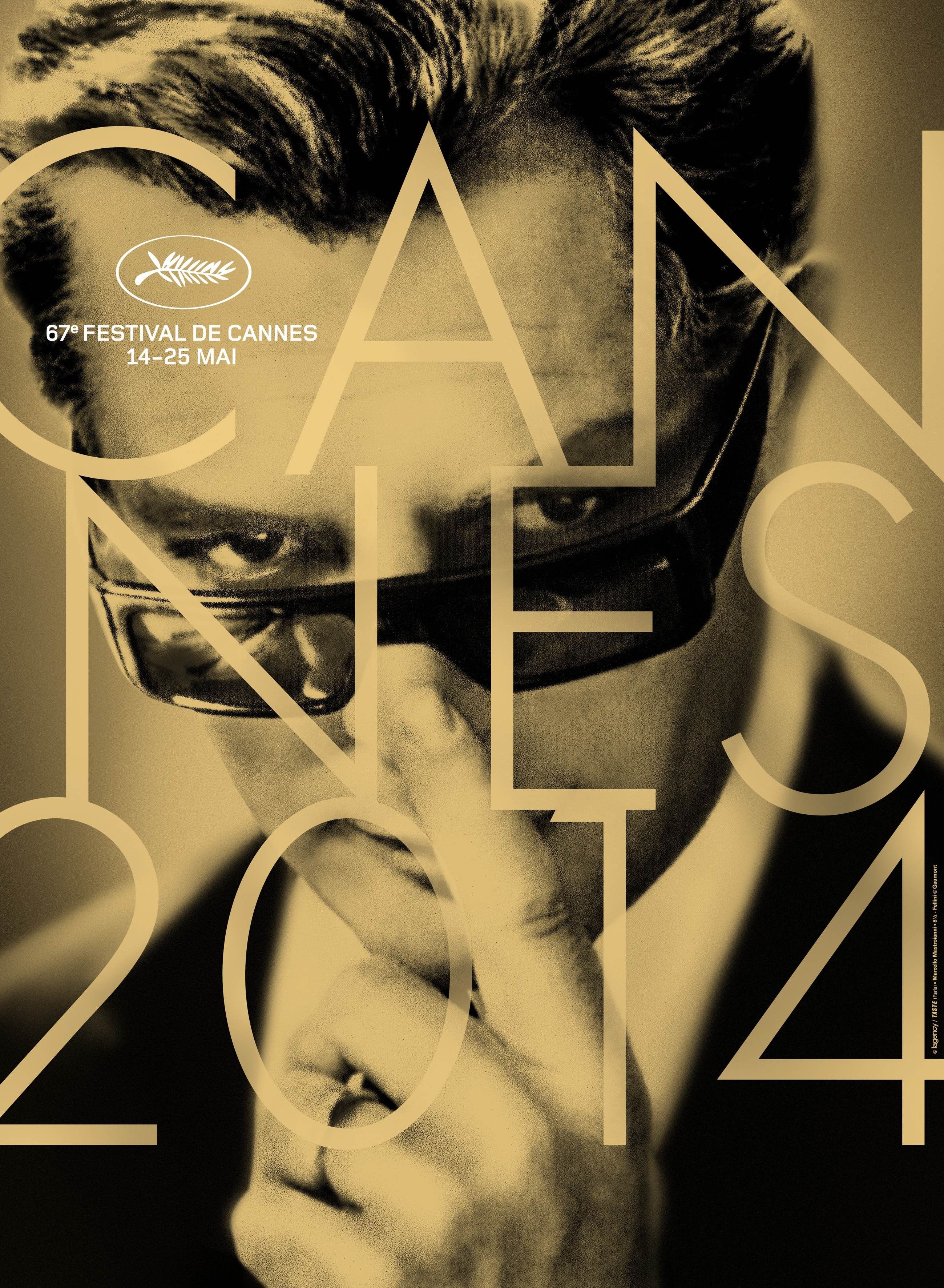
And even the iconic Cannes film festival keeps their posters consistent: modern, sophisticated and glamorous, which is exactly in line with the festival aesthetics and positioning!


It was an interesting observation to find out that all the high league film festivals are consistent with their communication strategies, so I figured that we should follow. Below are the images I found so far:
All of these are consistent in two senses:
- They are all very similar visually: black and white, old photos showing famous filmmaker at a young age.
- They communicate the same idea of possibilities and ambitions, the value of realising your full potential through a starting point, the idea of “just the beginning”.
Another interesting insight from the reading that intrigues me was the term “key visual”. It’s more than a logo, but also more precise than just the ‘mood’ of the festival. Rambousková described it as:
Your festival needs a clear visual identity that the potential audience will easily comprehend and that will distinguish the festival from other events.
In regards to our key visual, I guess it’s first if all the logo, and, secondly, the aesthetic of the advertising campaign. I propose to use red and white shrift on the pictures, which is within the same colour palette as the logo and will, therefore, enhance the brand image.
It’s been an incredibly productive week and I am very excited about progressing further with the festival.
Word count: 416
Cited:
Bohdana Rambousková, “How to Successfully Promote Your Festival (Links to an external site.)” in Setting Up a Human Rights Film Festival, vol. 2, Human Rights Film Network, Prague, 2015, pp. 97-114.


