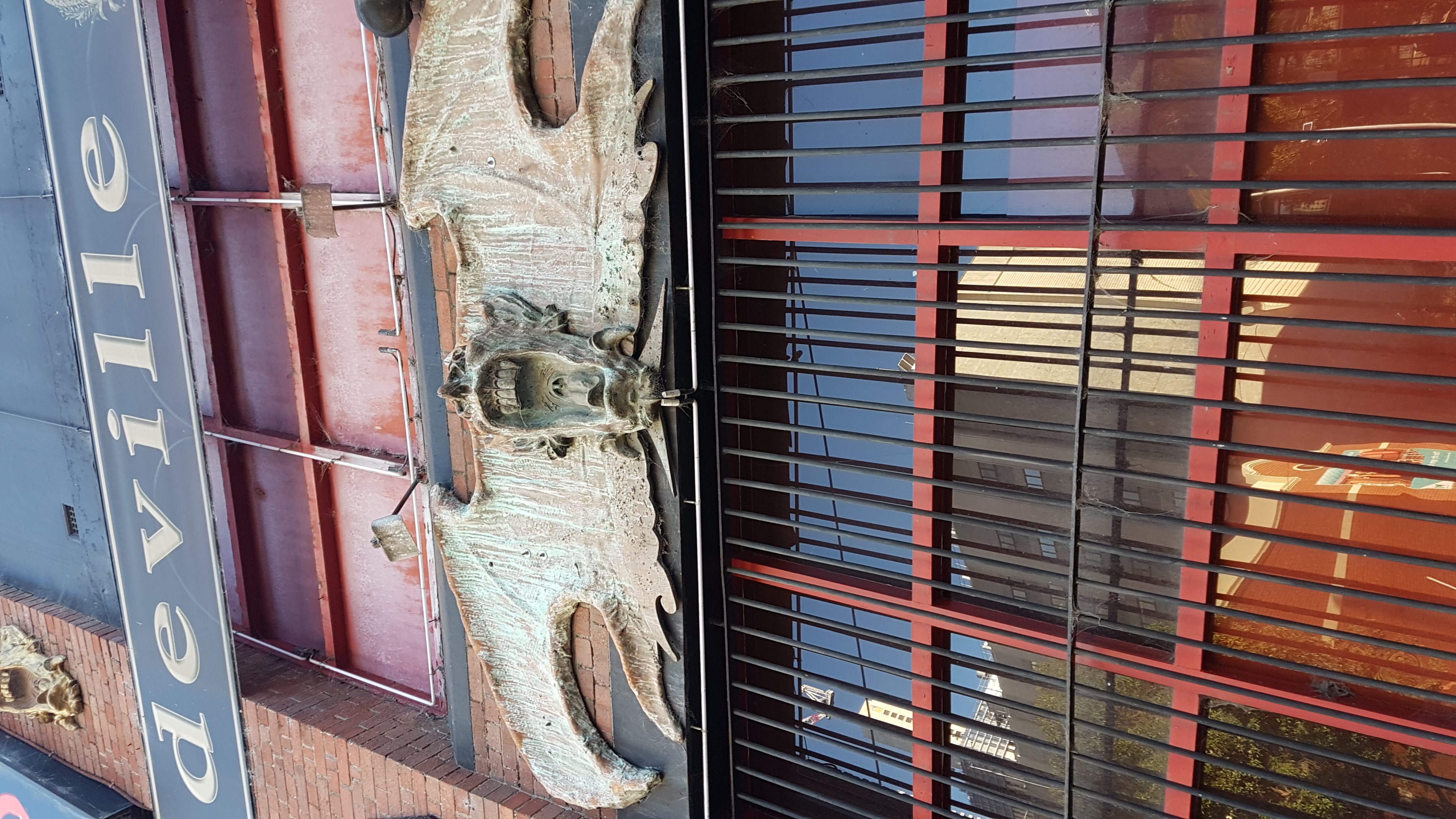
Oh boy, this is belated! But here we go anyway!
Look at this here! This poorly photographed sculpture that isn’t a gargoyle got me thinking about gargoyles. like “I think that ones’ name is Phil”, or “gargoyle. that’s a funny name”, but most importantly it got me thinking about the history behind them. well, that and because it was our task. let’s do some learnin’!
Coming from the French word for throat ‘gargouille’, gargoyles are stone structures that are thought to have originated in 630AD Rouen, France, as a symbol to ward off evil and guard waterways.
Although originally depicting the severed head of a dragon, as gargoyles spread over nations – from England to Egypt – they adopted several forms; changing animalistic features, adding wings and horns, changing heads, until they eventually came to be their own unique, demonic design that we recognise today. (thanks Ghostbusters)
Whilst occasionally being steel reinforced and made from separate pieces of terracotta, gargoyles are predominantly hand crafted from single blocks of stone, and have been both revered and challenging tasks for masons and stone-cutters.
Now, on the other end of the spectrum, what do you think of when you hear the word ‘craft’? If you’re a smartass and sometimes think you’re funny like me and you guessed ‘macaroni’, then you’re absolutely correct!
During the Great Depression and World War 2, the effort and resources put into package design was seen as a strain and waste of time and supplies, thus it was cut almost entirely – with only luxury items being made with unique design packaging. Thus, following the end of the war, with glass bottles, tin cans, paint, carboard and other resources coming back into the market, advertising saw a massive boost, with manufacturers wanting a unique design for their product.
In 2010 Kraft announced a change of design for all of their signature macaroni boxes, changing (well, adding) the face of the company with the inclusion of the ‘macaroni smile’, which can now be seen on all products in the line.
Kraft macaroni and cheese products have an iconic design and can be recognised easily by most people in Western culture, particularly North America and Australia. However, England has a completely different design for the product. Rejecting the macaroni smile, Englands designers opted for a more simple advertisement, opting to move far away from their counterparts cool blue look, and rather plan red packaging.
https://en.wikipedia.org/wiki/Gargoyle
http://www.stonecarver.com/gargoyles/index.html
https://medium.com/digital-packaging-experiences/the-evolution-of-packaging-57259054792d#.ubromphmd
http://www.thedieline.com/blog/2011/2/10/before-after-kraft-macaroni-cheese.html


