Exercises on Capture and Edit: Three-shot

I enjoyed this particular exercise for the reason that though it was rough, the team was able to pull together, find a location, and think up a sequence of shots on our feet, film it and rock and roll through the editing process.

Title: Blissception
Scenario: Bliss ties her shoelaces, gets up, walks towards the elevator, enters then exits out on a different level.
Goofs: *spoiler alert* Continuity goof because which floor did we start in again?

Types of shots:

  • CLOSE UP – tying of shoelace
  • WIDE SHOT + PAN – Bliss gets up and walks towards the elevator doors
  • LONG SHOT – Bliss presses the elevator button and enters
  • MID SHOT – Bliss enters the elevator, turns around to press the button and the elevator door closes
  • MID TO CLOSE-UP SHOT – Elevator doors open and Bliss walks out straight towards the camera before FADE

Simple, quick and easy. The main character is motivated and goes through each shot with ease. Shooting the scenes in sequence allowed us more time to shoot other shots (i.e. establishing shot of the elevator numbers going up/down) that then in turn, helps in the editing process.

I know that on a professional film set, it is rare to shoot films in sequence (Paradise Road team, I salute you) but that is exactly why it is important to have a SHOT LIST that dictates what will be shot on certain days and the kind of shots these will be too. These are important for the editors, especially, to make their work a lot easier also.

Learning learning.

Choosing your shots wisely gives the final product colour and texture. Unlike in the first exercises we did in class where most were simply mid-shots and wide/long-shots of this or that that was, for no better word, boring, it is useful to think up of a scenario and picture it not as you would see it with your naked eye but see it as one would see it on screen or whilst you’re reading a book or even dreaming. An example of such experimentation (because we know what the outcome will look like) below:

Inspiration: actions and locations that inspire the creative machinations

Roman Polanski said,

“…we had no design or definite idea what we would be writing about.  It wasn’t, “Hey, I have an idea so let’s write a screenplay.”  It was, “Let’s write what we’d like to see on the screen – the kind of emotions, the kind of feelings, the kind of characters, atmosphere we’d like to see in a film.””

After much discussion with my yoghurt-eating self and eventually having the courage to also share my ideas to my tutor last week, I have finally come to the conclusion that “courage is not the absence of fear, but the judgment that something else is greater than fear” and in my instance, this “something” is my love for this certain set of books that has me in blissful creative raptures.

Before I go on a bit of a spiel on the huge adaptation talk (a nasty kind of conference meeting, really) I will instead be informing you all of the certain set of actions, locations and nasty real-life people who have inspired my creative machinations.

Actions

  • A man resting his forearms  on his knees, head bent between them – the raw, masculine image of it
  • The ethereal movement of a young woman
  • How some people carry themselves in an almost otherwordly dignified and graceful manner
  • Someone leaning on a balustrade overlooking a crowd of people and they uncannily spot a person they know amidst the throng and pandemonium
  • The way a person would clasp their hands anxiously whilst sitting down
  • The uncanny way a person notices another without directly looking at them

Location

  • A big lake outlined by old houses
  • Grand houses – villas
  • Old Elizabethan-type roads – unpaved Cobblestone houses, buildings, roads
  • An antique bookshop
  • Old bookstores, libraries
  • A house in Manly – a red entrance door beside two grey buildings, musky scented carpet nailed on the stairs, muffling the sounds of your footsteps.

List of actions (as vague as one can be)

  • A young woman- gracefulness, dignified manner of walk
  • Man – built, posture
  • Man- the way he slicks his hair back all the time and the way the clothes he wears simply sits on him and he carries the grace of an actor with a mission
  • A young woman – ethereal presence, almost aloof but very wise

If I were to be frank, most of the actions listed above are motivated by my need to see them in real life. They are drawn from said favourite set of books, but these subtle movements are what makes the books stand out for me, propelling me to find conclusive evidence through the myriad variations of the human actions of everyday.

This list isn’t exhaustive but these certain actions have in much influence in the final project that I have in mind. I want to explore emotions, characters, sentiments, the human condition portrayed and valued in its vulnerability. Some questions that pop in my head in regards to turning these into a project are:

  • How am I to capture this? What’s the best way to do so?
    • I could write a short 3-page script inspired by said characters. Or I could also just focus on one character and two max. three locations.
  • What kind of shots would best portray a character’s emotion?
    • Research on dramatic movies would help in highlighting which shots can be used.

Reflections – class exercises and motivated shots

I reflect on one class exercise we did titled the abstract image.

  1. The Abstract Image
    Aim: to investigate a place

This exercise involved us directors to choose a certain framing in a specific location we choose to capture. We considered the following:

  • Different planes (of focus)
  • Texture
  • Movement
  • Expressive potential of image size, focal length, focus, depth of field, exposure, colour
  • Implications of framing – what is in and out of frame

What I learned from this exercise is that I am highly in favour of intimate shots whose subject is usually something around us that is often overlooked. I don’t have the videos we have captured but these photographs could give one the sense of what I mean:

Screen Shot 2016-03-11 at 11.20.19 PM

Screen Shot 2016-03-11 at 11.19.53 PMObserving the two images that I took above (not from class exercise), you can see that in the frame are two subjects: the tree and the lamp post. These two images, though taken months apart, convey my decision to frame my shots on a particular object that is not my subject. Of course, I deliberately chose to place these objects in my frame, sort of like I was the set decorator and the Director of Photography at the same time. In the exercises, my cohorts and I did the exact same. The shots are motivated by a certain object in the frame that is not necessarily the subject of the photograph/video.

Why do I do this, you may ask? I think for me, this certain framing implies a sort of closeness to the scene; an artefact that you can almost grasp or hold on to, something to fall back on and easily remember when you are trying to recall this scene. For example, with the photograph on the above, taken in Massachusetts last August, I was struck by this lamppost that punctuated the first time I have been in an American neighbourhood. It was the image, the artefact, the object that struck me upon my arrival and my soaking in of the scene. However, I can’t say the same for the photograph below it. I could have simply taken a photo of the lake of shining waters and left the palm tree out of the frame but then it just wouldn’t be the same. For me, especially, that image wouldn’t be special, would not have captured the essence of that lake and its simplistic grandeur if I had not included the palm tree (no matter how many times I have seen one in my life).

In video, I work the same way. I could roll and allow things to happen, but I can encourage something to happen also. I think reflecting back on this work and after I edit the videos we have captured, I would be able to eventually define my reasons for these shots and how I can utilise them in my creative practice and vision.

Initiative: the practice of simplicity and the essence of the human condition in film

Tribute to Hayao Miyazaki by dono 2015

When I came across my first Hayao Miyazaki film (Spirited Away) three, four years ago, I finally opened the magical door to a world of film in its most simplistic and also in its most grandeur…simultaneously. The stories are etched in a man who, like everyone else, had been a child once, and has discovered the mystical pulling powers of one’s imagination at play. I loved his films for their presence. There is a realism there that is deeper than showing someone suffering from a sort of emotional turmoil or play. His films are like watching a piece of art come alive.

Ways of Making aims to help us budding filmmakers find a way to actually make a film that is a combination of our “creative vision” and our “respect for the subject matter as an active agent shaping the final form” and I am enthused by the idea that I can make a Miyazaki film, or at least, draw from the essence of his films into my own creative works and directorial vision…something I want to accomplish as a director, writer and producer.

In this particular post, I would like to highlight my inspiration of capturing in my future films what is known as the essence of humanity: that even through a non-animated film, one can create a fictional world that could also “soothe the spirit of those who are disheartened and exhausted from dealing with the sharp edges of reality”. I know it sounds a little contradictory when you think about it but I think the truth very much lies in what story you are telling and how you are telling it.

I allude to my previous post in regards to my admired directors. I mentioned Peter Jackson for his foray into the genre of fantasy and action and adaptation and creating The Lord of the Rings which is now at the heart of every movie-goer and those swimming in pop culture waters. Though Jackson created a world that Tolkien had already envisioned and blue-printed, Jackson (and his team, of course) chose the characters, inhabited the settings, rode the horses, and sharpened the long swords.

Miyazaki drew his inspirations from his childhood imaginations, and also some books, or graffiti maybe, or a stall at a busy night market and like clay, formed them in an image of his creative vision.

This is the kind of storytelling I want to produce, an exploration of the human condition through humans themselves, perhaps, and a conglomeration of both animation and realism.

A lot to think about but I so very much ready to make this happen.

Ways of Making – a media 6 studio

Ways of Making – an alternative approach to the production of film

Okay but listen….

“A film project invariably requires a commitment to a particular from and its methods of production.

But does this limit the film’s expressive potential?”

This speaks volumes to me. As someone who is inspired by a conglomeration of filmic productions morphed into my own signature, to be able to do a studio where I am able to explore and experiment and therefore create films that is no confined by the traditional methods of production (it’s a concern and I am grateful for inspirationally-iconoclast directors out there), it really makes one want to break through the status quo in a Mad Max Fury road.


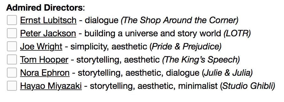
Imagine I was naming some directors I admire from the top of my head.

Screen Shot 2016-03-11 at 6.17.05 PM

And I would also like to add Alejandro González Iñárritu in there somewhere for complete and total destruction of the word ridiculous, and this list is continuously growing, of course. There are just so many. But I love the above.

Do you think I can do a combination of all of them and call it my own?

In this class, I believe I surely can.

Let’s go, team!


I declare that in submitting all work for this assessment I have read, understood and agree to the content and expectations of the assessment declaration.

Re-establishment v.2016

I am running on a 6-month-away-from-home jetlag but I think I’m doing quite fine…slightly. I wrote about 33 resolutions this year and half of them are pretty much goals but they are kind of bracketed under the same umbrella of motivation and keeping it real so let me just add some more to push myself harder than an ob/gyn would a labouring mama sita.

  1. Paper Quirks refurbishment – fresh-faced, graduating year aesthetic whatever that may be. It’ll probably involve corns or something yellow.
  2. Blog.489382309 – a final project for myself. I’ve got some filmic studying to do so I am willing to bore you all, ghosties, with my learning progress there. You may catch some creations or two so don’t hold thy breath.

It’s clearly only two more additions to the 33 so it isn’t too bad. My creative portfolio is running on a bit of a low since I am either dissatisfied by the ones I’ve already made or I’m just too shy to behold them to others. I’m pulling an American here by calling myself a senior and ain’t nobody got time fo’ that. It’s hustling time and I am ready to exert the effort needed to one day work under Kathleen Kennedy because Star Wars is where it is millenium falcon at.

Catch me in a few,
C.


300?

The filmmakers used bluescreen 90% of the time, and greenscreen for 10%. They chose blue because it better matched the lighting paradigm (green would have been too bright) and because red garments (a la spartan capes) look better when shot over blue.

Above is a trivia from Zack Snyder’s comic epic 300, a movie about King Leonidas of Sparta taking on the the Persians at Thermopylae in 480 B.C. alongside 300 of his best men. Now, I’m a HUGE history buff. I go nuts for it. And as a film stude, it is one of my great dreams slash ambitions to helm in a historical blockbuster epic; and my sights are set on Ancient Rome 70 A.D.

But I’m getting a little side-tracked here…

Something you just can’t dodge from watching Snyder’s epic is the use of the aforementioned ‘bluescreen’ and ‘greenscreen.’ I have yet to encounter these formidable screens (the post production team oh so love these things) but that little trivia gave me a nice insight as to how it works. Looking at 300, we see that the overarching tonal colour is almost white-washed; comic-strip variations of the dark shades. The battles were almost always consumed by a sudden shift to sepia and faded blacks and whites and I believe that Snyder et. al. did this on purpose to reinforce the tenor of the graphic novel.

I say, spot on. The red (or is it blood orange?) Spartan capes outshone the Persian blacks, maintaining the focus on the big and buffed-up superheroes of the 117-minute film. Even the blood-splatters weren’t given the spotlight as one would expect from a violent-looking film. I admire this type of editing and such use. I haven’t seen a movie these days that has done the same thing, specifically with the Marvel and DC superhero tsunami we’ve been having lately. I am both excited to explore this genre of film and immerse myself in its technicalities.

But not that I’m getting ahead of myself since I will be studying Advanced Production: Directing in the coming months for my overseas studies so we shall see how the colours will help me somehow, well, see.  

Ghosts of RMIT – a reflection on spaces and places

I came into this class with an open mind. I was ready to tackle the subject of place; the interpretations, the notions, the expositions, and I was ready to welcome the destruction of previous biases and a transformation of the mind. Let me break it down in a manner that hopefully does not give you a headache.

See this photograph here? I have a printed copy of this photograph adorning my wardrobe door alongside magazine covers, paint palettes, 1920’s posters and model mood boards. Without going political and messy, this class has taught me to think about this photograph in more ways than the usual machinations.

Tim Cresswell (bless him) is the forerunner for opening my mind. With his guidance, I thought about the geographical place this rally was set. Wherever it may be, perhaps in front of a square similar to Federation Square in Melbourne or in the City Square in Collins Street, where I had been trapped amidst the mass of bodies vying for Aboriginal rights. But wherever this rally was held, its geographical space became a new place that is born out of a contested process of interpretation. The rally-goers, the protestors all gave meaning to the space where they stood vehemently shouting their cries for freedom, thus, giving that certain space, meaning and so, it becomes a place. I’ve never looked at similar photographs the same way again.

The course challenged me to intentionally notice my surroundings. To stop and think about why certain memorials were placed in specific spots, why a simple bench as you walk through your campus is laid out there, and it’s been deliberately put there, mind you, for architectural purposes that yes, I have never even bothered to think about before.

And my opinions towards architecture seemingly only about buildings seen as “discrete, disconnected entities” were dismantled. And I welcomed it. Cresswell’s fifth chapter, Working on Place – Creating Places, defines the term genus loci, a Roman belief wherein “places had a particular spirit that watched over them,” a guardian angel of sorts. And with a specific study on RMIT’s Building 20, the Old Magistrates’ Court, justifies this concept to me in all its physicality.

With the projects assigned to us throughout the semester, my biggest challenge, at first, were to intentionally notice these “spirits” around me. But I realised, upon entering the threshold of the great bastion of law, that vestiges remained, sleeping spirits that simply needed to be awakened by my imagination, my creativity on a high. I learned to take an interest on cracks and niches (even more than before), to make use of the resources around me including the State Library archives and the hidden repository of the Public Records Office. Online databases including Trove, a rich source for invisible information.

Architecture used to take a rigid stance in my interpretation, but now I realised that the architects behind each building, each monument, bears the flag of genus loci, the need to appropriate this spirit in each of their work, not just the physical values of a place but also the “symbolic values in the environment;” the harmonising of the two.

Throughout the semester, I learned to take my historical appreciation to an even deeper level. I ended up using the research-skills I’ve learned to greater use, researching the time away on specific places I’ve encountered before in my own personal journey. This included the researching of monuments I’ve encountered during my childhood, the emergence of tombstones and the celebration of the dead, and my fernweh, being homesick for a place I’ve never been. This one speaks to me the most and this course has really opened my mind to the idea that I’m homesick for New York City because photographers deliberately chose to take a photograph of that particular person in his tweed suit, in the rain, running after a “cab.” Or I’m homesick for Ancient Rome thanks to the picture painted by Francine Rivers in my favourite novel, A Voice in the Wind.

Would I have gained much appreciation to places if not for what I have learned in this course? Would I be so challenged as I am now to continually take a small notebook with me and jot down important physical details as well as my own creative impressions of things and places around me?

And then Cresswell goes on to talking about home, a seeming “elementary” ideal for most of us, lying “right at the heart of human geography.” I never thought that I would look at my final project, The Caretaker, in this certain way either. It challenged me to think about the human tendency to make certain places “feel like home.” The caretaker in my short feels the exact opposite. His is lonesome for he is surrounded by mere vestiges. Sure, the spirit of the place is true and revealing, but it is not something he hopes for, something he wants. And I found this challenging to interpret in my production process, but I enjoyed in the learning process because it made me dig deep. What is the root cause of his loneliness? Could he not have given his own meaning to the place around him? Made it his own?

In my creative practice, these sort of questions are now my constant companions. I want to explore places not just for the meanings I give to them, but what exactly evokes that meaning to me? Is it the history of the architects? Is it deliberately done, or placed in this certain way for me to think of it as such?

Ghosts and Spaces has been a journey of self-reflection and jump across the creative boundaries. It has been enjoyable to complete and has challenged my sense of place and practice and I’m even more pumped to tell stories of places in ways I’ve never told before.

Tim Cresswell defines Place

Notes on Place:

  • Geography = about place and places. But place is not the property of geography
  • a concept that travels between disciplines and must be studied using an interdisciplinary approach
  • not a specialised piece of academic terminology; can be used in various different ways, almost daily, especially in the English-speaking world
    • place as in particular location or building
    • position in a social hierarchy (i.e. “she put me in my place”)
    • particular order of things that have a socio-geographical basis (i.e. “a place for everything and everything in its place”
  • defined as all spaces which people have made meaningful, spaces people are attached to in one way or another; a meaningful location
  • Three aspects of place by John Agnew:
    • 1. Location – fixed objective coordinates on the earth’s surface
    • 2. Locale – actual shape of place which people conduct their lives (i.e. New York as a vast collection of roads and streets and buildings)
    • 3. Sense of place – relationship to humans (i.e. novels and films evoking a sense of place, the feeling of what’s it like to “be there”)
  • Naming – one of the ways space can be given meaning and become place

J.E. Malpas and the influence of place

Malpas fluently articulated of land around us as a “reflection” of not just our practical and technological capacities, but also of our very own human needs, dreams, preoccupations, aspirations and hopes. He talked about how humans relate to land in the economic and suitability sense, (e.g. building a bridge over a river or planting apples rather than mangoes because of a colder climate) but also the more pervasive: “our relation to landscape and environment is indeed one of our own affectivity as much as of our ability to effect.

He talks about the the ties between human identity and location as something not limited to romantic nature poetry, but as an idea that has an ancestral history. I recently found out that Aboriginal people, after marking a land as their own, would never leave the place as they have claimed it as their own. In Wordsworth’s words, the land becomes their “living Being, even more Than [their] own Blood.” And I find that extremely fascinating as an immigrant of this great country.

I wasn’t born in Australia and for almost half my life, I had lived in a place that I had called home. And though it seems like a very long time from now, a part of me still lives in that place. My place of birth. And it is called “place of birth” simply because that certain space was given meaning by our welcoming into the world. Malpas credits Gaston Bachelard, writer of The Poetics of Space wherein he claims that the “life of the mind is given form in the places and spaces in which human beings dwell” and that in those spaces themselves, our human memories, feelings and thoughts are shaped.

This topophiliac claim validates the notion of “cultural differences.” I was inherently shaped and moulded by the place of which I was born into, the social, economic, cultural way of thinking and acting. The stuff of our “inner” lives is thus found in the “exterior spaces or places in which we dwell.” And I find that fascinating as now, having lived in two countries for ten years each, I have a part of me in each country that shapes the way I think and behave in terms of places and dwellings.

Definitely something to further explore and ponder.