Der Schmerz
This project is an amalgamation of introductory static movement and short film direction. Formatted like an old silent film, this short film investigates the direction of movement, characters as occupants of space, and the camera’s intimate approach to an abstract narrative.
Der Schmerz (meaning Grief), is a short film submission for my final project for my studio course, Ways of Making. My intention for this short is to explore the notion of static movement (i.e. cinemagraphs) and how its principles could be used to alter the outcome of a film shot in live-action. Beginning this project, my intention for this collaboration can be seen in this Alexandre Desplat-motivated 30 second sample I made here:
During the “initiative” stages of the studio, Paul invited us to investigate various approaches to filming scenes so we may have a first-hand feel of what grips us in a creative choke we do not want to be let go of.
Morbid.
Nevertheless, the direction of movement is choreographed by the director in regards to the mise-en-scène.
Direction of movement and characters as occupants of space.
There are minimal movements throughout the film as I was more interested in how the actors would occupy the space around them as opposed to what they occupy. My DOP must have harboured such ill-feelings for me because I was incredibly picky when it came to production day. I constantly moved the camera and thus, him, to perfectly capture that shot.


I was interested in “tight” mid to close-up shots with as minimal use of negative space as possible. Negative space is as unnatural-looking as it is clunky and uncool. Ultimately, it looks quite the unprofessional.
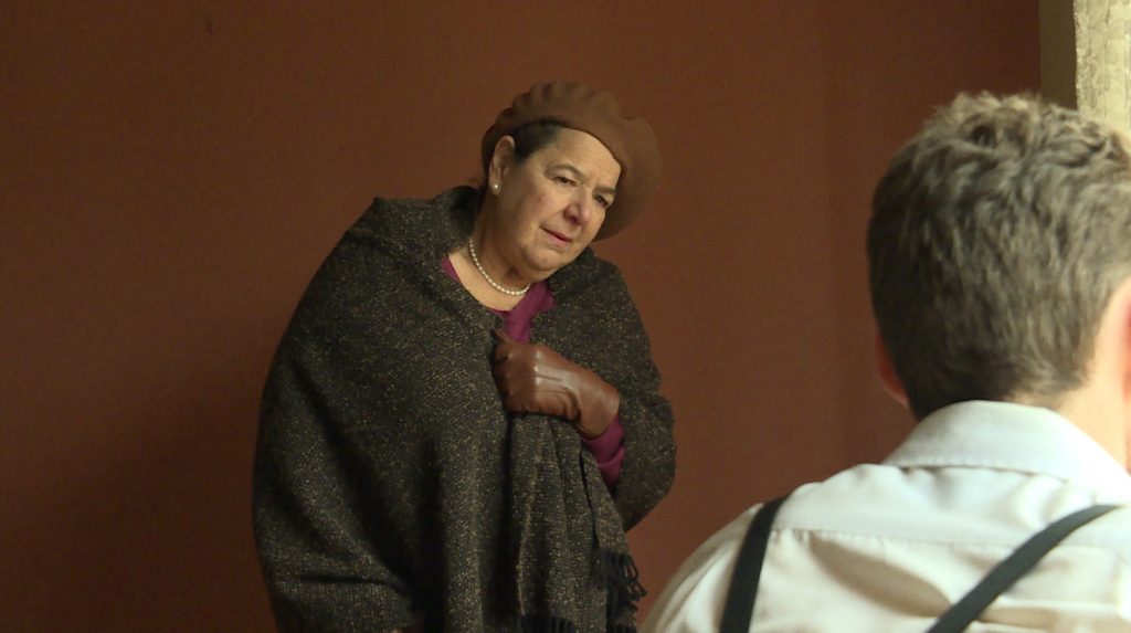
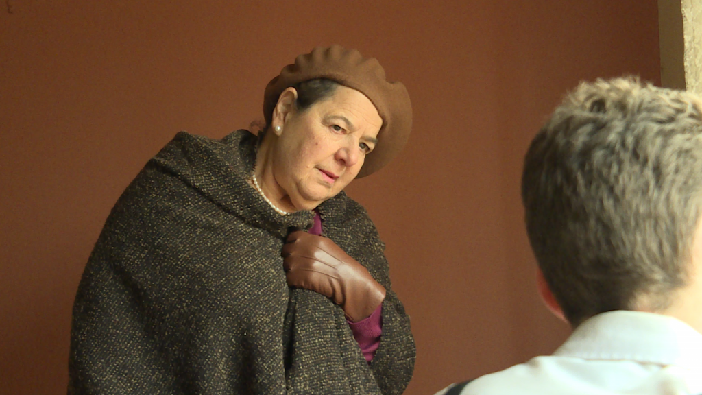
Take a look at the difference between the first take and the last take of this scene:
First take, the character of the wise old lady looks adrift from the frame as if she was superimposed over the shot of the character of the young man. Reflecting back on our class exercises, I find this to be my arch-nemesis. I always seem to find an excuse to capture “as much” as I can in a frame and in doing so, the supposed focus on a particular element on screen (i.e. a character) is lost. Of course, the use of a wide-shot is very commonly used in films, but their purpose is to establish and to convey a broader sense of space and place.
Intimate approach to abstract narrative.
I purposely made the narrative of this short abstract as to not take away from the visuals. In the beginning, I thought that this ambitious thinking would yield outstanding visual results. To my dismay, I had not thought it through enough. I quote myself,
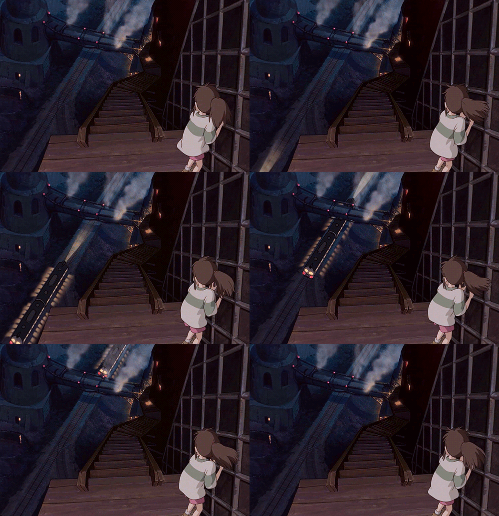
Miyazaki builds upon the innate ability of humans to sense movement and draws his viewers through this and the explicitness of it, thus making for a profound play on the senses.
Ultimately, I did not weigh in the repetitive value of a cinemagraph as opposed to the one-directional movement of a live action shot. Cinemagraphs are essentially, living images. It gives the viewers the illusion of watching a video (or a photograph) when in fact, they are watching a combination of both.
You see, cinemagraphs cannot be transitional unless I slow their speed/duration down to match the rest of the sequence’s pace. In doing so, however, would mean a distortion of the cinemagraph’s purpose of movement and will take away from its lifelike quality. A conundrum? A conundrum. This is why the only cinemagraph you see in the first cut of this film is at the very beginning. It established the reason as to why the young man was crying and grieving and established the backstory of his conversation with the old woman towards the end of the film. And unfortunately, that’s its one and only use.
At the editing suite.
I found myself dozing at half past twelve with bowls of honey oatmeal lying around my table and a dream sequence of my ambulating to receive my Academy Award.
Three words: Tu.to.rials. They are your best mates, never take them for granted.
I originally didn’t plan the film to be formatted like an old silent film but after finding an old found-footage documentary on Poland and analysing the bottled-up tears for my bleak attempt at colour grading that yielded zilch, I yelled eureka! I mean, why not format it into a silent film after all? It’s dusty, it’s grainy, it’s noisy and pitched at the highest quality of low. What better way to set a film in WWII by being attractively 1930’s? Below:
Final Outcome.
What will the outcome be? Will the transition be too jarring? Or will it punctuate the emotional resonance I am trying to achieve in this scene? And if it turns out incongruous and incompatible, could the application of 2D animated static-movement techniques (i.e. Studio Ghibli films) help even this out?
Above is the question I posed in regards to the the transitional use of static movement. In the film, I used the cross-dissolve effect for the “transition to be too jarring” problem. Did the cinemagraph punctuate the emotional resonance I was trying to achieve in the scene? I believe it did, and I deliberately made the length of the cinemagraph scene longer because of such.
I want to focus now on the “application of 2D animated static-movement techniques (i.e. Studio Ghibli films)” to help to even out the incompatibility of cinemagraphs and live-action. Because I want to continue the project further down the track, my next investigation is the use of lighting/colour and continuity.
- Lighting/colour

For my next attempt, I will “mute out” the “still” parts of the video and add more vibrancy to the moving elements of the image like above.
- Continuity: Cinemagraph (repeating) CUT TO live-action shot of the footage before it was turned into a cinemagraph.
This particular edit, I think, would work well in regards to transition.
Final thoughts.
Ways of Making met my expectations and more. What I enjoyed and appreciated the most was the creative freedom we had to investigate and eventually make a film/sequence/media that we were most interested in. The practical exercises helped in my understanding of the use of cameras and capitalising their attributes and functions to best suit our needs and at the same time, leaving enough room for exploration and investigation.
I enjoyed working with a talented bunch of kiddos who I know will do so well in their own careers as media-makers and I am now even more equipped to use this visual medium to write, produce and direct as much as I possibly can.


