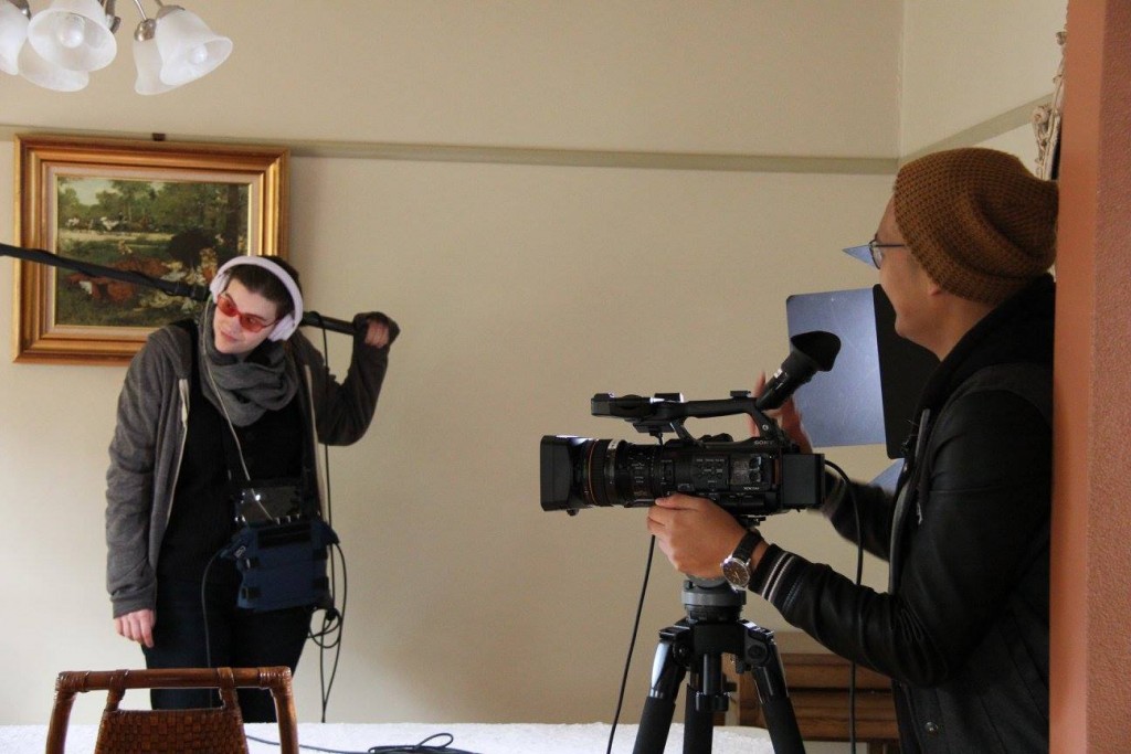
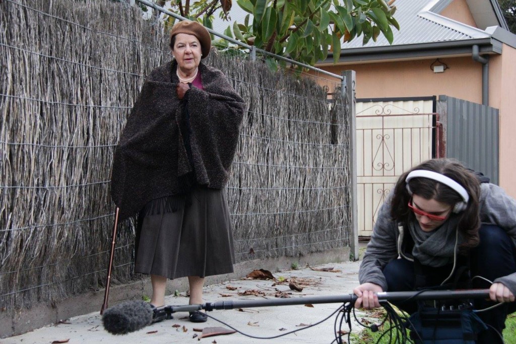
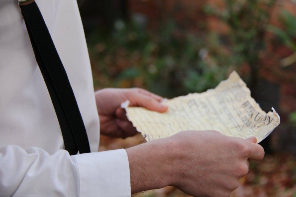
2016 Screen Futures Summit & Youth Media Festival – Internship Intro

As promised, I return with a tag – #ScreenFutureShip – (I can be clever) to document, chronicle and digitally immortalise my internship adventures here.

Screen Shot 2016-06-22 at 8.38.46 PM

Screen Futures is an international conference and forum for industry professionals, educators and academics interested in the future of the screen in 2016.

It will be a dynamic three days packed with insightful and provocative discussion around:

  • screen education,
  • screen innovation, and
  • the screen industry.

Screen Shot 2016-06-22 at 8.38.56 PM

The Youth Media Festival will run concurrently with the summit throughout Saturday 2 July.

It will be programmed by and for young content makers and students working in film, television, radio, games and online spheres. It aims to provide participants a forum to share ideas and network, as well as gain new skills and knowledge in screen media. The festival will create an opportunity to crew on a live media event and the Media Careers Expo will open up pathways and career possibilities in a range of media professions.

The Internship runs from 22 June to roughly 4th of July (Happy Freedom, ‘merica!). Today’s shenanigans involved meeting the team and the faces behind the ghostly e-mails of hello’s and back and forth relaying of info. Verdict: very welcoming, very charming. The Screen Futures team are bursting with a mapped-out, very informed, blueprint of what they want and expect from us, passion and excitement for the summit and festival themselves, and an encouraging attitude to help us grow and learn as much as possible whilst on the job.

My desire for this internship is not only to work with like-minded fellow interns and a power-house team to capture the summit’s festivities, but to also exercise flexibility, state and strength of mind, initiative, and power-forward, driven thinking to maximise my own creativity and organisation across this particular area of event-based media production.

I’ve articulated a number of times of my deep desire to focus on writingdirecting, and producing in the area of Film and Television more so than anything else. Though I am also a Social Media junkie and loves the blast of pop-culture on one’s Melbourne-wintered face, event-based production has not crossed my mind as an immediate prospect of interest. This is the beauty of my “vague”, more general Media and Communications degree: opportunities to reconnoitre the ever-expanding mediascape.

In this particular internship, I can very well ascribe some of my experiences in producing for shows and film with skills such as: tabulation and cataloguing of information, team-reliant communication, filming, editing and photography, and a tonne more, I’m sure. What I gain back is the chance to work in an environment independent from but also juxtaposed, in its filming methods.

I believe that the challenge lies in the direct filming of each Keynote event and Breakout sessions throughout the Summit and Festival. Why? Because you don’t have a script to go off to. You don’t have a 1st AD yelling numbers and frames and lenses at your poor unfortunate ear. As a director and editor, you find that these constraints (or lack thereof, depending on how you look at it) stretches not only your artistry, but also your technical prowess. How do you handle the challenge of, liberally-speaking, the almost abstract concept of capture and edit on the go?

Find out on the next episode of Naruto Shippuden!
– jokes.

Find out the answers with me next time!


X-Men: Apocalypse – Sansa, lemons, four horsemen and who is Jubilee

I didn’t even inhale popcorn while watching this movie, guys. There must be something seriously done wrong or something seriously done right.

(there are no in-betweens….maybe)


  1. Sansa/Sophie/Jean was like looking at a full-bloomed lemon tree knowing that any time now, life’s just about to give you some lemons.
  2. Isaac’s Apocalypse wasn’t as intimidating as I thought he would be but he’s blue and that makes up for it.
  3. The Four Horsemen of Weakness or was it just me?
  4. I never thought Scott to be that cocky for a boy who kept “blinking” at someone else’s girlfriend. The head nod to the joyride made up for it, though. Gotta love my X-Men Evolution.
  5. Who is Jubilee?
  6. What is her significance to the story?
  7. Quiksilver has just replaced vanilla cupcake as my favourite nail colour.
  8. I do feel really bad for Magneto. When will he ever get a break, you know?
  9. Wolverine!……again.

I think this series packed a punch in the introductory sense but it begs the question of are we restarting the X-Men franchise again with this cool new kiddos ‘cause I’m pretty sure I’m all for it? Was Quicksilver killed in The Avengers so that his story is explored more here in the X-Men franchise because I think that’s smart? 

There are many ways to enjoy the “end” of this franchise and that is by believing that it, in fact, will not. With X-Men: Days of Future Past (2014)’s timeline-altering consequences, there is an expectation of character-driven storylines that can involve a hypersexualised Wolverine to a teenaged Jean Grey and a more soulful Scott Summers; Rogue, where’s Rogue? and Nightcrawler in his corduroys cheating on a game of catch me if you can.

I’m a little bit all over the place but I enjoyed it more than my niece and nephew did. Apparently they slept the entire time. Amateurs.

xoxx out of xoxo

feature image c/o

Final Project: “Der Schmerz”

Der Schmerz

This project is an amalgamation of introductory static movement and short film direction. Formatted like an old silent film, this short film investigates the direction of movement, characters as occupants of space, and the camera’s intimate approach to an abstract narrative.

Der Schmerz (meaning Grief), is a short film submission for my final project for my studio course, Ways of Making. My intention for this short is to explore the notion of static movement (i.e. cinemagraphs) and how its principles could be used to alter the outcome of a film shot in live-action. Beginning this project, my intention for this collaboration can be seen in this Alexandre Desplat-motivated 30 second sample I made here:

During the “initiative” stages of the studio, Paul invited us to investigate various approaches to filming scenes so we may have a first-hand feel of what grips us in a creative choke we do not want to be let go of.

Morbid.

Nevertheless, the direction of movement is choreographed by the director in regards to the mise-en-scène. 

Direction of movement and characters as occupants of space.
There are minimal movements throughout the film as I was more interested in how the actors would occupy the space around them as opposed to what they occupy. My DOP must have harboured such ill-feelings for me because I was incredibly picky when it came to production day. I constantly moved the camera and thus, him, to perfectly capture that shot.Screen Shot 2016-06-09 at 9.31.13 PMScreen Shot 2016-06-09 at 9.21.04 PM Screen Shot 2016-06-09 at 9.21.40 PM Screen Shot 2016-06-09 at 9.23.01 PM

I was interested in “tight” mid to close-up shots with as minimal use of negative space as possible. Negative space is as unnatural-looking as it is clunky and uncool. Ultimately, it looks quite the unprofessional.

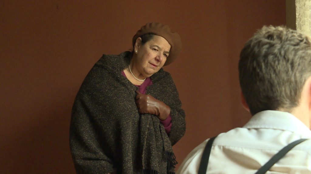
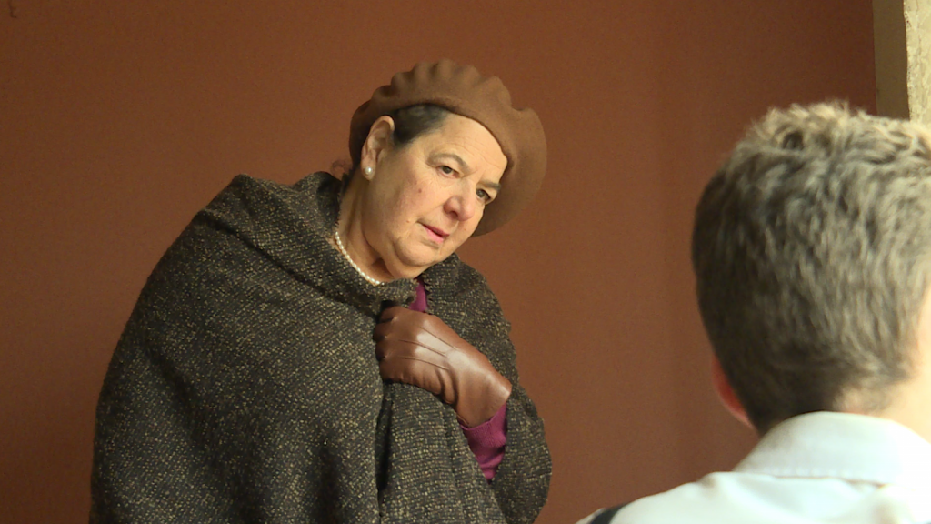
Take a look at the difference between the first take and the last take of this scene:

Screen Shot 2016-06-09 at 9.34.34 PM Screen Shot 2016-06-09 at 9.22.25 PM

First take, the character of the wise old lady looks adrift from the frame as if she was superimposed over the shot of the character of the young man. Reflecting back on our class exercises, I find this to be my arch-nemesis. I always seem to find an excuse to capture “as much” as I can in a frame and in doing so, the supposed focus on a particular element on screen (i.e. a character) is lost. Of course, the use of a wide-shot is very commonly used in films, but their purpose is to establish and to convey a broader sense of space and place.

Por ejemplo:Screen Shot 2016-06-09 at 9.26.17 PM

Intimate approach to abstract narrative.
I purposely made the narrative of this short abstract as to not take away from the visuals. In the beginning, I thought that this ambitious thinking would yield outstanding visual results. To my dismay, I had not thought it through enough. I quote myself,

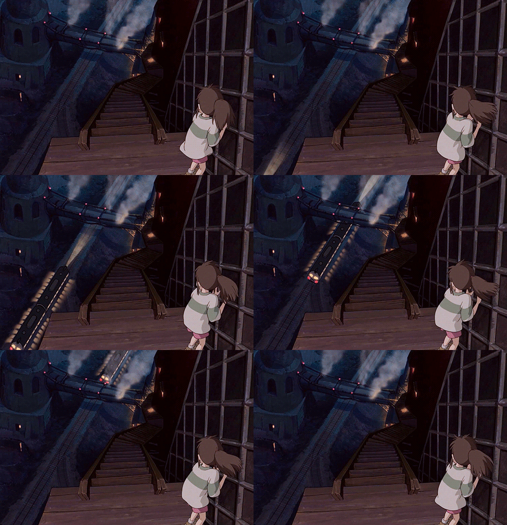
Miyazaki builds upon the innate ability of humans to sense movement and draws his viewers through this and the explicitness of it, thus making for a profound play on the senses.

Ultimately, I did not weigh in the repetitive value of a cinemagraph as opposed to the one-directional movement of a live action shot. Cinemagraphs are essentially, living images. It gives the viewers the illusion of watching a video (or a photograph) when in fact, they are watching a combination of both.

You see, cinemagraphs cannot be transitional unless I slow their speed/duration down to match the rest of the sequence’s pace. In doing so, however, would mean a distortion of the cinemagraph’s purpose of movement and will take away from its lifelike quality. A conundrum? A conundrum. This is why the only cinemagraph you see in the first cut of this film is at the very beginning. It established the reason as to why the young man was crying and grieving and established the backstory of his conversation with the old woman towards the end of the film. And unfortunately, that’s its one and only use.

At the editing suite.
I found myself dozing at half past twelve with bowls of honey oatmeal lying around my table and a dream sequence of my ambulating to receive my Academy Award. 

Three words: Tu.to.rials. They are your best mates, never take them for granted.

I originally didn’t plan the film to be formatted like an old silent film but after finding an old found-footage documentary on Poland and analysing the bottled-up tears for my bleak attempt at colour grading that yielded zilch, I yelled eureka! I mean, why not format it into a silent film after all? It’s dusty, it’s grainy, it’s noisy and pitched at the highest quality of low. What better way to set a film in WWII by being attractively 1930’s? Below:

Screen Shot 2016-06-09 at 10.33.37 PM

Final Outcome.

What will the outcome be? Will the transition be too jarring? Or will it punctuate the emotional resonance I am trying to achieve in this scene? And if it turns out incongruous and incompatible, could the application of 2D animated static-movement techniques (i.e. Studio Ghibli films) help even this out?

Above is the question I posed in regards to the the transitional use of static movement. In the film, I used the cross-dissolve effect for the “transition to be too jarring” problem. Did the cinemagraph punctuate the emotional resonance I was trying to achieve in the scene? I believe it did, and I deliberately made the length of the cinemagraph scene longer because of such.

I want to focus now on the “application of 2D animated static-movement techniques (i.e. Studio Ghibli films)” to help to even out the incompatibility of cinemagraphs and live-action. Because I want to continue the project further down the track, my next investigation is the use of lighting/colour and continuity.

  • Lighting/colour

For my next attempt, I will “mute out” the “still” parts of the video and add more vibrancy to the moving elements of the image like above.

  • Continuity:  Cinemagraph (repeating) CUT TO live-action shot of the footage before it was turned into a cinemagraph.
    This particular edit, I think, would work well in regards to transition.

Final thoughts.
Ways of Making met my expectations and more. What I enjoyed and appreciated the most was the creative freedom we had to investigate and eventually make a film/sequence/media that we were most interested in. The practical exercises helped in my understanding of the use of cameras and capitalising their attributes and functions to best suit our needs and at the same time, leaving enough room for exploration and investigation.

I enjoyed working with a talented bunch of kiddos who I know will do so well in their own careers as media-makers and I am now even more equipped to use this visual medium to write, produce and direct as much as I possibly can.

short film production day + pics!

It’s been pre-production madness for Grief (working title) the past couple of weeks when 1. you’re a broke university student who cannot afford to hire the perfect location of your dreams and 2. I’m getting ahead of myself because 3. when you’ve got a superstar of a production manager who can find the perfect location in a span of a couple of hours, you know everything will be A-OK *thumbs up emoji*

Yesterday’s production schedule went super smoothly with the fun of a thousand elephants at a watering hole that I even found myself tampering with the footage as soon as I got home and friends, that’s saying a lot for someone like me who prefers to nap out than sort out.

Here’s a couple of cool BTS stills/picz!

13323595_1213041702039477_5318423249632773124_o 13320515_1213044188705895_6798377257607507872_o 13316989_1213042085372772_1917555108271588799_o 13268263_1213043575372623_1030144938314853068_o13316969_1213045658705748_6337407097687839558_o

Shoutout to LaMarcus Aldridge, Stephanie and Alaine for being the troop de troupe crew of endless patience and resilience for my innate ability to be like Amy Santiago from Brooklyn Nine Nine (everyone go watch it).


To-do list:

Monday = cinemagraphs
Tuesday – Thursday = putting everything together.

Pray for a friend. It’s going to be a long one. #TeamNoSleep


a woman’s éclat, writing scenario

Written at a time I was at a Myer store figuring out whether Lady Gaga’s black liquid Fame was poison. I’ve always wanted to be Mithridates.


Scene: Black tie, event of the century, electric


1st P.O.V (fem)

I wanted to vomit it out. All of it. That suffering swallow of black mollusk tartare, sweetened and honeyed, a spoon of toxic substance. But everyone was looking at me with their epicurean eyes, so, I swallowed. Enough to make me angry at myself, and enough to fill my glass with wine so red, so enticing, it’s blood on my lips. And I saw his smug look, not too far away, and I straightened. Perhaps I could gouge his eyes out instead. 

3rd P.O.V.
It was as black as the polish on her feet. She had left them all black while her fingernails wore a French. Was that vile cuisine French? Please no, she beseeched whomever could hear the dying grumble of her insides. Looking around her, feeling the criticism through their sequinned dresses and black formals, she straightened up. She made sure to do it in an effortless flourish, like calligraphy on parchment. But those eyes. The French one, this one she was sure of. So smug, so conceited, so attractive that it was, in all accounts, heinous. She left a smudge of lipstick on the rim of her glass. Her liquid saviour. She’s going to have to poison him with it.

3rd P.O.V. (male)
It’s her pride, he concluded finally, noticing the discreet glares of those who milled in close proximity of her dying insides. She reigned it in quite effortlessly, really, and he was half impressed. Well, more than really, if he was being generous. He thought perhaps she would run from the establishment in a flurry of red silk hugging every delectable curve… she had done that once. She didn’t though, he guessed that too. Even better, she’s walking towards him and so he set his glass down. Finally, we begin.

feature image c/o

Reflection on visual aesthetic: the Pride & Prejudice

There are certain films that beguiles, encapsulates, wraps you up in tenderhearted sentimentalities as you go flying up, up, up in a cloudless sky where dreams are made of, grasped, and you can ride beyond fields of imagination made real.

And as a young girl of twelve then, I found this in Joe Wright’s Pride and Prejudice.

~ Yarra Valley Shoot ~ 

Pride and Prejudice.mp4

I was heavily inspired by Kevin Macleod’s “Calmant” as I put this little piece together. Again, as noticed the exposure is not to my liking as DSLR’s are still not my forte. I’m going for this kind of look:

I have read that for his film Atonement, also a gorgeous and visually similar film to P&P, Joe Wright stretched Christian Dior stockings over the camera lens to achieve soft focus, and that, my friends, is the kind of aesthetic I am here to emulate and be inspired by.

In this particular piece that I’ve put together, however, my focus was on the music and soundscape. I have an inherent adoration for nature and filming on-location, capturing the magical beauty of the natural world as they are and so I augmented this theme/sentiment by adding a soft, nature soundscape (Koyoora autumun afternoon).

Without the use of tripod, it does look quite clunky at best but reflecting back on it (edit: watching the clip many times over), I realised that with the combined music and soundscape, it almost makes the film feel surreal, as if you’re floating, almost, particularly towards the end.

I plan to explore this aspect of filming with next time using a tripod, similar music and soundscape, and different exposure as well.

Reflection on visual aesthetic: exposure in fantasy

~ Yarra Valley Shoot ~

Enchanted path.mp4

Crossroads: thick, dark, wooded forestry to your left, bright, illuminated, enchanting path to your right.

Dilemma: where do you go? Which path should you take? I, the filmmaker chooses “por que no los dos!” (I knew my Spanish would come in handy at some point).

(00:00:01-00:00:11) I chose to play around with exposure in this particular exercise. If you notice, hard light illuminates the enchanted path on the right, thus bathing the wooded forestry in contrasting darkness to the left. I like this particular scene because it gives off an abstract meaning of finality on one side, and an unknown adventure on the other. Choose wisely, says a Morgan Freeman voice over.

The implications of this chosen exposure is highlighted even more on (00:00:12-endin the sample.

With an addition of J.J. Abrams’ style lens flare, I make my way towards the crossroads. When I focused on the left forest side, light filters in and reveals that the forest is not as scary as it actually looks when given a bit of light. Of course, the crunching sound of feet could very well say otherwise, but visually, the audience can feel somewhat relieved.

As I pan to focus on the enchanted path on the right, however, the forest is again bathed in darkness but the path is dazzlingly radiated. As I reflect upon this particular exercise, I come to several conclusions in using movement and exposure.

Firstly, if I had been following a subject from behind, exposure plays an important part in the outcome of choice. Would the subject follow a path of darkness or would the subject follow a path of light?

Screen Shot 2016-05-12 at 5.05.55 PM

We filmed using natural light on quite a sunny day. If I balanced the wide-shot by lighting the forest side, the shot would be interpreted completely differently.

Reflecting on my visual aesthetics on film: farm buggy shot

I’ve had a tumultuous past couple of weeks ranging from some sort of creative menagerie in addition to some nasty “Winter is Coming!”-type of cold or whatever, but alas, it always surprises me how easily I can open up Premier Pro and string some pieces together and assess my visual aesthetics.

Of course, this is a very important aspect for a director. Very important. Filmmakers, though we’ve seen plenty productions that look and feel and seem very much alike, this often always is not the case. Shall we study my Spanish-er, my directorial language then?

(excuse the quality of the videos. DSLR is not my forte.)


~ Yarra Valley Shoot ~

Farm Buggy.mp4

This was a coincidence shot. I was roaming around with the camera, mostly focusing on the surroundings when the buggy violates my peripheral vision. It was going faster than you can say pull focus, so I zoomed, framed and as best I can, follow (pan) the buggy as it works it way on the path.

Notice my frame. Again, I reiterate the composition. The trees “blocking” the buggy from view made me think of a hide-and-seek vista. The camera doesn’t do the work for you, instead, the audience’s eyes have to do the work themselves. I tried and evidently failed towards the end to allow the buggy to leave the frame as I focus on my framed end shot, but you can somehow tell (I hope).

This particular exercise taught me two things: i. the power of colour (refer to The Girl In Red scene in Schindler’s List (1993), and ii. my preference of intimate, tight framing.

In post, I tried to up the contrast from softer hues to a higher degree of polarity to highlight the colour of not just the trees, but also the red-orange colour of the buggy. This helps the audience in the “seeking” side of the H-and-S capture. And for tighter framing at a distance, what kinds of lens is best to use? 50mm so both foreground and background remain in focus? (I was on 35mm)

If this shot was part of a narrative, the focus is on the buggy, seen from a character’s point of view. It could also be a motivated shot to show the audience that there is more to the buggy than what a wide-angle shot could portray:

Wide angle – establishing shot, shows the general “setting” of the scene where a buggy so happens to pass by.

Tight frame shot – like above, there is an intent, a reason that as to why the buggy’s view is blocked and why it follows it specifically. It’s preparing the audience for the scene to come and/or making sure the audience keeps this buggy at the back of their minds to be later address in the film/narrative.

a variety of exciting projects and what I garnered from them

During today’s presentation of ideas, I thoroughly enjoyed the eclectic mix of project proposals each person had in mind to create and produce by the end of the semester. From an exploration of lighting and mise-en-scene, to the philosophical, the long-take and what makes editing good or bad, the thought process and the means to do so are both encouraging as their fellow media-maker and also a stimulant to one’s creative plotting and/or scheming.

What I garnered from the proposals that could perhaps lend itself to my own project is directed more towards those who were interested in mise-en-scene, framing and composition, lighting (I am horrible also and I aim to befriend thy project-owner so you can teach me your skills), and editing, particularly the action-editing sequence.

Action-editing: this particular component (editing in general, really) is crucial to the way I will be structuring my short film. Would a variety of cuts ranging from close-ups, medium-shots, etc. would allow for more freedom in using cinemagraphs in a variety of ways and thus, convey the narrative aspect of the short film more fluidly?

Screen Shot 2016-04-21 at 11.37.34 PM

Framing and composition: I am aiming for a more intimate feel as an aesthetic and also as to ease the burden of ambitiousness. But stay tuned for this because after writing a script or shot list, it may just change. Besides, one must think about feasibility always.


First things first: SCHEDULING. Will return with a more updated schedule for short film production!