Film Link: http://www.themediastudents.net/im1/projects/where_we_come_from/
ESSAY
Carl Gibson s3324901
Troy Torcasi s3381625
Zoe Winther s3329929
Our prompt for the Korsakow film is as follows: an exploration of our hometown describing the nuances and aspects of our lives in a picture wall interface. Within our film we wanted to provide a look into our hometowns, and show what is interesting to us based on anecdotal, autobiographical video shorts. We have three distinctly different hometowns, two outer suburbs of Melbourne and a rural Victorian town, and to emphasise this, our clips are shot with three different styles. Our hometowns are places that are familiar to us. Naturally we had many stories and places we were passionate about. Basing our project on where we come from is broad enough to enable creativity and individual ideas whilst still maintaining a constant theme. We’ve also taken advantage on each group member’s skills with this design decision: Carl for instance takes on a conventional documentary style with plenty of editing, smooth pans and still images. Troy’s videos on the other hand took on a much more informal style with mostly one shot clips with a number of experimental camera angles and movements. Zoey’s style was somewhere in between. In our work, we wanted to focus on listing little pieces of the places we come from in a personal, self-reflective way, and in the process give the viewer a strong sense of place and what that place means to us.
Interface
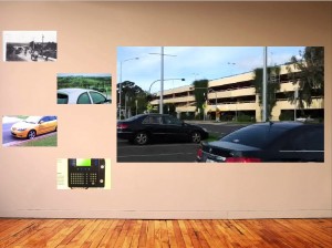
The focus of our interface has always been to evoke the feeling that you are looking at a collection of photos on the wall and reminiscing. Each preview would be like a picture frame which you can go into and see that memory. We wanted to create, as if you are asking someone about what was in the picture and finding out about a new facet of them through an anecdote. The wall look is essential to our theme. We ultimately decided on a more streamline and simple interface design that maintains the collage appearance we wanted whilst still being neat and user friendly
One of our goals was to create a Korsakow film that stood out. Vouching for an image as the background instead of the traditional black generates more intrigue for the audience to want to learn more. While the default black interface tends to look more professional, a high resolution image achieved a similar result. We used an image is of a simple white wall, with floor boards taking up the bottom 5th of the image. The image was altered in Photoshop. This involved editing out a power point present in the bottom right corner of the wall and a number of colour adjustments so that the image had more warm tones rather than the cool pink present in the original. The preview tiles are slightly off center to create the illusion that they are frames casually placed up on a wall. JPEGS were used for the previews instead of auto playing videos so that the audience is focused on the clip being played for the entirety of its duration. The preview tiles are small in scale so that the viewing window can be as large as possible. This will ensure that the user can see any fine nuances/ detail in the videos that we have created. Our Korsakow interface is able to adopt our own personal style whist still working like a traditional Korsakow film.
The interface only has one particular look throughout the film. We did not want a complicated interface that takes away from the topic. In other Korsakow films it was evident that the use of multiple different interfaces confused us and we kept thinking where we are meant to go from here. Having one will designed interface means that a user unfamiliar with Korsakow will be able to understand how it works in the smallest amount.

Pattern
The motif of narration will be the key element connecting our films. We felt that the idea of letting someone tell you a story from their hometown and/or childhood is very personal, and one way to do this was through the narration. We tried to do this narration in a personal way, keeping our tone reminiscent of a conversation whilst still sounding fluid. This is evident by our consistent use of pauses. We aimed to have our film work cohesively as whole, talking about our different hometowns, but not making it as though they are three separate works stuck together. Many of our clips are structured in a similar way. Beginning with an introductory sentence e.g. “The worst memory I have”, “One of the things I like about my home town”. This helps to tie the work together in their overall content design. Another tactic we used when creating the content of our film was by filming on quality cameras in 16:9 aspect ratio. Some videos were shot with mobile phones, however still maintaining a 1080p high resolution. Some impressive shots were filmed and the occasional shakiness ended up adding to the Vlog style the majority of our group members were going for. Characteristics indicative of being “phone-like” such as shakiness comes through every so often, purposely reminding the viewer the clips have been filmed on a phone. Sorenssen mentions in his article the importance of the personal computer and how this change the way we view content; similarly the mobile phone. What does this mean for content creators and how is it different to imagining creating for a big cinema screen (Sorenssen p. 49 2008)? We wanted to channel this idea in our work: phones are so personal and using them is such an intimate experience, so we wanted this idea to shine through in using our phones to film many of the clips in our Korsakow film.
We found that patterns emerged as we built our film. This is something our lecturer Dr. Adrian Miles frequently spoke about in the lectures. We gave ourselves the freedom to film pretty much whatever we found most interesting about our hometown, dividing the clips into 20 each. We did discuss the value of constraints and considered looking for a specific elements while filming, or filming at a certain time of day. However because our hometowns only resembled each other in certain areas, we gave fellow group members the ability to branch out into topics which were unfamiliar.
The principle constraint was having to go to our hometowns and film exclusively there as “Where we come from” is the main theme. The majority of our videos fell into five district categories. Memories, places, people, home, and nature. These categories became the SNU’s when building our project and ultimately formed the groups the videos paired into, when one views our film.
We also had the technically specific constraints, such as each clip being around a half a minute in length. Similarly, many of our video topics revolved around the same subjects such as family pets, schools we attended and locations we were fond of. Showing the audience akin videos creates pattern but shows the topic from a totally different perspective. This will ensure that our film will not be repetitive for the viewer. As in Frankham’s article Complexity, Flux and Webs of Connection we wanted to harbor a “poetic approach to documentary characterized by an openness of form that facilitates moments of pause and contemplation”, (Frankham 2013) and we hope that when the viewer listens to our anecdotes about bushfires and floods, pets and baking and will have time to pause and consider their own hometowns and childhoods, and in this way we can “enlist the audience as co-creators of meaning”. In the same way Sobchack’s Nostalgia for a digital object, Sobchack expresses that QuickTime movies “draw [the viewer] down and into their own discrete, enclosed and nested poetic worlds: worlds re-collected and re-membered; worlds miniature, intensive, layered and vertically deep“, (Sobchack 1999) and we want our work to encourage this self-reflectivity on our viewers.
Content
The amount of post-production varied from group member to group member. Carl’s video clips involved a large amount of editing. Effects such as image stabilization made many clips far easy to watch as the camera was able to smoothly pan. Many of Carl’s videos also used colour correction to enhance the look of the cinematography to create more eye catching images to encourage the audience to continue their viewing of the film. Colour correction is “also about bringing human perception into your picture” making the images look like you are there (Kenlon 2014). Transitions such as fades to black and overlapping images made each video feel evenly paced and ascetically poetic.

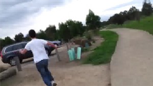
Troy’s videos contained little to no post production. The aim of his body of work was to emulate that of a quickly produced vlog. All narration was done in real time as the camera was recording and did not try to combat shaky cinematography. Noise disturbances including wind and camera rustling were left intact. This style of film aims to make the audience feel that they are with Troy, participating in activities e.g. running down a hill, swinging on a swing, and going for walks down to the shops.

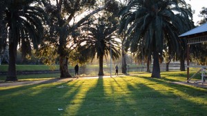
Zoey’s body of work used an even mix of informal and formal elements. The videos were shot without the aid of a tripod. Movements were natural and focusing was done in the midst of shots. However narration was added later in post-production using a quality microphone without noise disturbance. They often revolve around nature, being primarily shot outdoors. The videos are shot on a bright sunny day which separates them from the other group member’s videos that were shot primarily at sunset or on over cast days.

The varying techniques each group member used reflect aspects of the creator’s personality. This blend means that when the audience begins to grow tired of one group member’s style they soon will be shown another group members, thanks to the randomization of our interface. We hope that the content we have created will encourage multiple viewings of our film.
When a viewer finishes watching our Korsakow film it will be as if they have gone on a tour with us, around where we come from. They will walk away with some curious facts about a handful of places, some interesting stories and maybe even a little bit of history or geography. As we made this film we began to appreciate our hometowns more. Korsakow films generally are not meant to tell narratives, they are designed to give a viewer small pieces of information every time they view it. We believe out Korsakow film achieves this. The three varying styles make for thought-provoking juxtapositions. The informal relaxed delivery of the audio encourages fast multiple viewings and the relatable subject matter might even make the audience think about where they come from.
Bibliography
Frankham, Bettina Louise. “Complexity, Flux and Webs of Connection.” A Poetic Approach to Documentary : Discomfort of Form, Rhetorical Strategies and Aesthetic Experience. (2013): PhD Dissertation, University of Technology Sydney.
Sobchack, Vivian. “Nostalgia for a Digital Object: Regrets on the Quickening of QuickTime.” Mille 34.Fall (1999)
Sørenssen, Bjørn. “Digital Video and Alexandre Astruc’s Caméra-Stylo: The New Avant-Garde in Documentary Realized?” Studies in Documentary Film 2.1 (2008): 47–59. EBSCOhost. Web. 19 Sept. 2013.
Kenlon Seth 2014,“Colour Correction in Lightworks”, Lightworking: Tutorials & Training, <http://lightworking.net/colour/>
