After a tutorial with Paul- who gave us some editing hints some of which were in regards to colour grading, I went back to my project and tried to enhance my footage a little bit. Because I shot in a very green, natural area I thought I would be doing my image justice by dragging the toggle on the three way colour corrector, towards the green-emphasising the predominant colour on my image. This gave me a very melancholic, mellow look, the brightness of the image was de-emphasised and overall the picture, though still quite visible became darker-it had a very twilight/dusk feel (though it was shot slightly before dusk). When speaking to Robin about my colour grading I showed an image in which my two actors were present and on the shadow-on the sides of their faces there was a slight greeny/mouldy grey tinge, which I initially didn’t pick up on, however Robin noticed and as soon as he pointed it out I couldn’t un-see it. Robin then suggested that I give it a more orange tinge, because it gives the image a similar melancholic effect without creating any nasty colours on the actors faces. This tone I really liked-it gave the picture a classic Australian Cinema feel which did justice to the environment that’s captured in the film. The Orange also ‘heated up’ the image a little bit and made it look a little bit more stylised and unnatural, which stylistically complemented my film (for example my use of obtrusive blue plates, random axes, purple shirts) amidst a traditional bush setting. The Orange in the image also made the setting look physically warmer, more uncomfortable-which can help to explain as to why the characters look and appear in so much discomfort.
Notes From Pauls Presentation
– Its important to set up your own filing system, make sure you create bins and folders for each days shoot. (This is something I need to do next semester-and I’m not just saying that! My filing system was a mess and it caused issues when trying to figure where my most recent edit was (I kept saving ambiguously named copies after each editing session), so next time I am going to save myself time and be organised.
– When I edit I should make particular sequences and label each one. It is also important to go through and watch each shot and label it.
– Order of editing. Assemble=shots into a sequence, you start cutting. Rough Cut=Order/When too cut and final cut=minor adjustments, colour grading and audio.
-By expanding each track you gain access to the rise and fade lines. P for Pen and V (arrow) to put in a key frame and lower it between the two key frames. What happens between the two points is what you hear, fade out by dragging down and increase by dragging up.
– Dialogue should peak at -6db.
-You can raise the level of every clip by adjusting the master audio track.
– If you fix an annoying hiss on one clip, paste the audio attribute over all the others.
– With the Luma Corrector you can effect the brightness.
– With contrast you are are effecting white levels.
– Work with brightness levels first, then contrast, then the 3 way colour corrector.
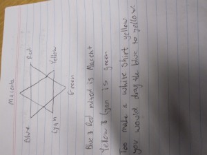
This image here is of the colour wheel that Paul spoke about, the question he posed was How too make a white shirt yellow? The answer was that you would drag the blues to the yellow section. This demonstrated that when you mix certain colours, you get the ‘middle’, the ‘in-between’ colour (for example when you mix blue and green, you end up with Cyan, because it is in-between the two on the colour wheel)
