Reflection

This semester has been very hard, it is of course my last semester so I have made sure I ended my degree on a high and put a lot of effort and work in which I hope is seen in my work.

This semester I chose to do an essay/blog investigation instead of creating a film or shot scene. I did this because I wanted to challenge myself in a theoretical and analytical way. I have read countless essays and readings on lighting, blog posts from others, reflections, examples of lighting and I have watched many of the same scenes several times to understand why lighting was used within the shot and what it created in doing so.

I do not regret my decision to do this because I felt I learnt a lot more about lighting then I ever thought I would if I were to go out and shoot and I hope to take this learning into any future work I have lined up.

I chose to explore lighting and investigate it through films because I feel its a film technique that doesn’t get as much recognition as the other elements. I consider it a form of art and stylistic art expression. I look to lighting to seek emotion and overall a sense of feelings when positioned in front of me and or the viewer (audience).

What I learnt 

  • I learnt that lighting can create a lot more than emotion, it can express characteristics of an individual as well as the whole film itself.
  • I learnt that lighting itself can be created in many ways from artificial lights to form this representation or even the natural lighting from the sun or moon.
  • I learnt that it can create a dramatic point of view or even express happiness.
  • I learnt that even colour lighting can be great in constructing a scene.
  • I learnt that lighting can depict a certain time from historical or cultural point of view.
  • I learnt it can create a mood
  • It can highlight to enhance a person
  • I learnt it cane a useful tool in all film techniques
  • I also learnt that its absolutely awesome and I hope to create a film one day that highlights the use of light.

Overall this class has been quite challenging as I put a lot of work and effort into the investigations and films I chose to explore. It was very difficult to grasp what I was actually doing but I am glad to finally understand what I was needed to do and how I am able to learn from it all.

I loved the classes where we went out and shot with my classmates, it was great to see how others felt about films, acting and direction and put your own input in and hear feedback. At first I regretted choosing this class but I feel it has defiantly made me a more skilful person in understanding and researching topics which I have defiantly applied in my other learning.

Investigations: Montage

Montage is a technique in film editing that express a series of short shots that are edited into a sequence to condense space, time and information. Its a form of creative editing which usually suggest a passage of time and create a symbolic meaning.

A very notable and well known example of a montage is the training montage from the film “Rocky”.

Investigations: Mise en Scene

What is Mise en Scene?
This is the most recognizable attributes of a film. From setting to actors to costumes and makeup, to props and all the other natural and artificial details that characterise the spaces in film, we are presented with mise en scene.

“Mise-en-scéne” french for “placing on stage” is a term used to describe the design aspects of theatre or film production. It is here we can see visually see a story developing through cinematography, stage design and storyboarding.

When applying this to cinema it is often referred to everything that appears before the camera. Composition, sets, props, actors, costumes and of course lighting. We look at mise en scene as a visual representation of film in the eyes of its viewers. It’s seen as a way to express various film elements mostly in time and space as all as it sets and overall mood. Everything that is in shot through mise en scene is there for a reason. It is there to tell a story and enhance the overall vision of the whole film.

The key aspects it represents is 

  • Set design – the entire setting of the scene, establishing a place
  • Lighting – can influence the audiences understanding of characters and moods through texture, shape, mood, time of day or night season and glamour
  • Space – the depth, proximity, size and proportions of places and objects through the camera.
  • Composition – the placement of objects and a balance of symmetry
  • Costume – what the characters wear, distinguishing the narrative and make clear distinctions between characters.
  • Makeup and hair – to establish time period and reveal character traits
  • Acting – historical and cultural representations
  • Film Stock – black and white, colour
  • Aspect Ratio – size of the films image

Spotlight on Films that use Lighting

Blade Runner

bladerunnerroybatty br_bradbury_ext

The use of colour lighting in this at the time ‘futuristic’ film is amazing. It expressed no only the future but a very dark representation of the future. Bright neon style artificial lights surround the concrete city and gives are very extensive glow.

The Dark Knight

6a00d8341c2df453ef010536e894ea970b 500x700px-LL-dad46078_image

Easily one of my favourite modern day film’s that use natural lighting and extreme shadows to express emotions within a scene. Mostly shot in the night the lights are used to create shadow but when the shots are in the day we are positioned to see bright evenly lit pictures which I feel Nolan uses as a non threatening image compared to the darkness when it is often seen as scary and unexpected.

There Will Be Blood

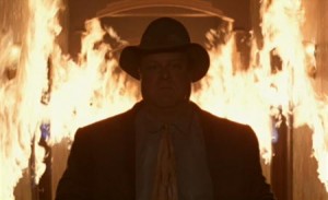
900x5000px-LL-161731b4_image

This film uses a range of lighting techniques which I hope to explore in its own blog post. From single light sources in a room which create shadow to the natural outdoor shots in the day to the extreme light depicted from the huge fire that occurred on sight.

Back To The Future

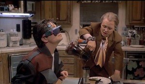
6 - Back To The Future 500x1000px-LL-f262070d_19 Back-to-the-Future--006

This film was obviously depicted in the future. As I watched the film I noticed nearly all the shots within the film are so evenly lit. They use a fill light the entire time when representing a shot inside. This fill light technique allows for no shadows at all which allows the audience to see it as a “futuristic” representation or a positive view.

Gladiator

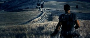
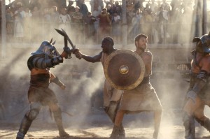
 Gladiator gladiator50034-gladiator-theredlist

This is a great film to explore in terms of natural lighting. The natural lights shown when he (Russell Crowe) is in battle highlights strength and emotion. The light from the sun shines down on him and almost creates a sense of power and a “god” like representation of his character. Whats great in this film is when he is in a dream the lighting in the shot is very dark and diffused. This particular technique was used for the audience to identify the difference between a dream and the real.

The Godfather trilogy

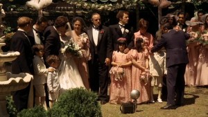
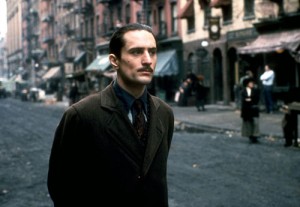
 godfatherWedding the-godfathergodfatherII-vito

The Godfather trilogy expresses a large use of lighting as it shows past and present through the films. When depicting family gatherings or happy moments the lighting expressed within the shot is very well light and expresses a happy light representation. When expressing danger or a dramatic scene often the use of shadow appears and is usually lit by one or two lights to create the dramatic effect. When they are expressing the past, the light of the shot seems very “old school” or diffused as if it has a fade on it.  This particular light is often natural outdoor lights and uses a lot of mellow tones such as greys and blacks and whites.

Taste of Cinema: Most Exquisitely Lit Films of All Time

Throughout my research I came across a large variety of websites which show lighting in film and give a very detailed example of how it is used within the shot to give emotion and stylistic representations within the shot. I found one that I truly liked and decided to share on my blog to enhance my work on lighting through the eyes of a person in the field.

Below are “The 10 Most Exquisitely Lit Films of All Time” according to (tasteofcinema.com)

10. Barton Fink    

barton_fink Dark, ominous, and depressing.

A renowned New York playwright is enticed to California to write for the movies and discovers the hellish truth of Hollywood.

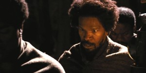
9. Django Unchained

Django-UnchainedOverhead light sources, and strange lights found in the middle of no where. Should seem weird but obviously Tarantino expresses it as a very bright moon, but no one seems to notice.

8. Schindler’s List

Schindlers-ListA black and white film which show lighting as art and creates mood through despair, hope, anger and triumph.
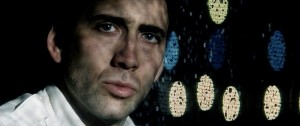
7. Bringing Out The Dead

bringing-out-the-deadLighting highlights misery and brings out the theoretical spotlight on Nicholas Cage’s character.

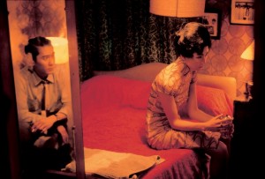
                                                     6. In the Mood For Love                                              

In-The-Mood-For-LoveShadowy illuminations, and manages to create it own separate narrative through the use of lighting.

5. Shadow Of A Doubt

shadow_of_a_doubtHitchock was the master of suspense as well as the master of light and shade. This film used lighting as a way to express mystery but also expressed light in a positive way when showing family as it represented safety.

4. A Bittersweet Life

A_Bittersweet_LifeA south Korean film that uses lighting as graceful.

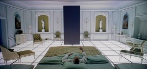
3. 2001: A Space Odyssey

2001-A-Space-Odysseylighting in this film is seen as absolutely amazing throughout the mind boggling film. Through reflective lights and lights expressed from the moon Kubrick has to explore fiction vs reality.

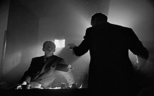
2. Citizen Kane

Citizen-KaneMoody and deliberate. Shadows shadows and more and more shadows. Lighting can humanise a lot and show emotions far greater than imagined.
1. Angel Heart

extrait_angel-heartThis film relies heavily on the mood created by the light.

The relationship between Shot Construction & Lighting

When coming across this topic of discussion I am faced with a large variety of questions to explore.

  • How is lighting used in coverage?
  • How does lighting effect shot construction?
  • How is the shot filmed around lighting?
  • Is lighting important to a shot construction and or coverage.

Each of these questions I have in some way answered throughout my blog posts this semester.

I feel as though lighting is quite possibly the most important source for film and shot construction. Usually overlooked, the lighting of a film set is often seen as an unappreciated art form. “The tireless work of a skilled lighting technician typically goes unnoticed by the movie going masses and, when done properly, that’s the way it should be. Natural yet synthetic, subtle yet bold, the final product should effectively be a paradox: an unseen vision.” (Bookman, 2014)

It allows the audience to understand the difference between happy and sad, dramatic and warm, and light and dark. Without lighting how is the audience able to express and feel the emotions the actors are creating within the storyline? How can the audience connect with these actors?
Cecil B DeMille once said “lighting is to film what music is to opera”.

The relationship lighting has with shot construction is simple, it lights the way for the audience to see emotion and visual representation of a scene. They work well together as it shows us dramatic, crime, comedic, sci-fi, family, mysterious, loveable or musical representation and helps us connect with the certain genre the director is wanting us to feel. Without lighting it is hard to seek emotion.

Spotlight on Quentin Tarantino

Quentin Tarantio, aged 52 from Knoxville, Tennessee, USA is an American film director, screenwriter, cinematographer, producer and actor. His work has been noted for many years in the non linear violence and action styled films. He was often criticzed for his use of gore and blood as it was sometimes seen as repulsive to watch. Other than that he is also a cinema genius when it comes to the image and setting of his films and are most considered cult classics.

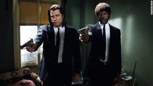
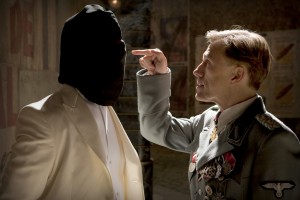
Tarantino expresses a large variety of bright overhead light sources thought his film, most of his films have spotlights or key lights positioned on the main characters to express dominance.

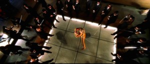
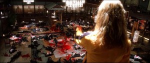
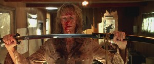
Kill Bill Vol. 1. (2004)

kill-bill-bride-vs-crazy88 kill-bill-vol-21 Random-Captions-Vol-1-kill-bill-30553765-1600-900

Django Unchained. (2012)

 Django-Unchained django-unchained-pow

Pulp Fiction. (1994)

140922202605-08-pulp-fiction-story-topPulp-fiction-t-shirts

Inglourious Basterds. (2009)

Film Title: Inglourious Basterds inglourious-basterds-may13photo-03

Each of the shots I have shown above in my “Spotlight on Quentin Tarantio” express a well known technique used by Tarantio, which is the key light or hard light source from above. This technique is used in a particular way to highlight the certain character he is wanting to show. Most of these hard light sources are from artificial light in the room but he does express some from natural lighting which creates a strong use of shadow. In his indoor shots he uses a fill light to create an even spread, unless he is creating tension or a dramatic effect like many other directors the strong use of shadow usually come into play along with the dark representation.

“A Beautiful Mind”

In respect, of the recent death of American Mathematician and Nobel Prize winner John Nash, I chose the film “A Beautiful Mind” directed by Ron Howard (2001).

The film was set in the late 1940, depicting the life story of John Nash and the struggles he went through. The film starts off with him as a young student, and ends with him as an old man.

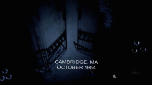
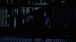
The found scene I chose to explore is the car chase seen which involves John Nash, William Parcher and the ‘Soviet agents’. The scene is already shown in the dark, very low lit mostly by street lights which are noticed as they reflect off Nash’s face as he leaves the mail box.


What I love about this particular scene is the artificial lights and how its added to the scene to construct a very dramatic representation of panic, thrill and paranoia. The emotions the audience gathers from this setting in the scene is dark and scary. Nash walks up to a large creepy house with a large creaky fence and just a single lamp post to light up the area Nash is walking in.

Screen Shot 2015-06-02 at 1.19.24 pm 1Opening shot of he scene.
Big black fence opening to an unknown house where John Nash enters to deliver his work. The shot is very very dark and lit by only the one artificial street light from above. This creates a sense of mystery and tension.

Screen Shot 2015-06-02 at 1.19.35 pmThis shot is of Nash leaving the unknown mystery house in a hurry to not be seen. That one artificial light has created an extreme amount of shadows on the house behind Nash as he leaves as well as a hard light source on the right side of frame highlighting his left side of his body.
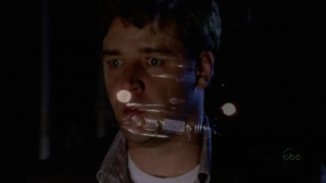
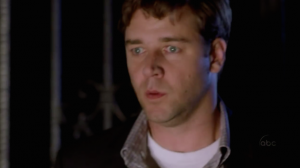
Screen Shot 2015-06-02 at 1.07.36 pm Screen Shot 2015-06-02 at 1.07.37 pm
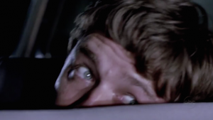
The two shots above is of Parcher, rolling the car up to get Nash, as people are following them. What I love most about this show is it has a transition where you can see the car rolling up and its two lights and then ends on the hard light shown on Nash’s face from the car. It created this almost deer caught in headlight effect, which the audience can sense from his face as the car stops just in front.

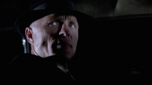
Screen Shot 2015-06-02 at 1.07.53 pmAs Nash enters the car Parcher frantically talks to Nash, alarming him of a chase. The light of the car behind him creates a very hard backlight which creates a very dramatic representation on his character, which works well in the shot as it is a thrill type scene.

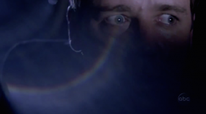
Screen Shot 2015-06-02 at 1.07.50 pmThis shot is beyond fantastic. The glare on the screen highlights the artificial light source depicted. What you can see is a hard backlight behind him from a street light creating that white outline around his character. It also has a hard key light positioned in front of him depicting the car following, which you can clearly see as his eyes light up showing his emotion of stress and panic.

Screen Shot 2015-06-02 at 1.08.07 pmThis shot follows on from the one above, but the light source from the car behind them is much more intense and highlights John Nash in distress. It shows as if the car behind them is very very close. The backlight from behind is in a way washed out.

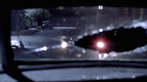
Screen Shot 2015-06-02 at 2.03.02 pmThis shot justifies the light source from behind. From this particular angle we can see light sources from the street lights as well as the car behind chasing. The bullet hole/break in the window has a hard light edge which I think creates a more intense representation as they are in full frame.

Lighting Ratios

As I was searching lighting, I came across lighting ratios. This never seemed to have occurred to me but was something I found interesting and was something I could investigate. I found this table that was able to help me understand a bit more on how it all worked etc.

1:1 – No difference (flat lighting)

1-1ratio-darlenehildebrandt

2:1 – One f-stop (for general colour photography, videography)

1-2ratio-darlenehildebrandt

4:1 – Two f-stops (for low-key dramatic effect)

4-1ratio-darlenehildebrandt

8:1 – Three f-stop (film noir)

8-1ratio-darlenehildebrandt

Reflectors, Diffusers and Flags

Lighting can create a range of different effects, which I have explored throughout my investigation. But there are several ways to improve these lights, whether its natural or artificial. In this post I hope to explore the use of reflectors, diffusers and flags in film and how they are presented on screen.

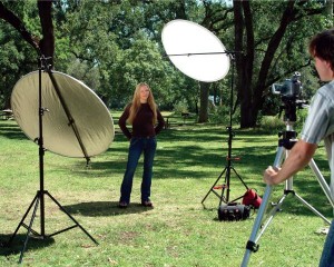
Reflectors are great if you’re wanting to fill in the shadows and/or highlight the “natural” light or artificial light source on the character you’re aiming at.

reflector

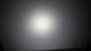
A diffuser is used to soften and smooth the image on the screen. It is used with the light source on the object and/or individual is too hard.

deffusior

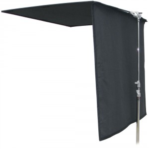
A flag (which in my research finally realised what this was called) is used to block the light and deepen the shadows using a black card or ‘flags’. This particular object is used primarily for blocking the sun or natural light coming from inside the window or outside use. This would only be used inside if you were wanting to use artificial lighting to create an even balance.

Matthews_169028T_48x48_Floppy_Cutter_184869

Skip to toolbar