Month: March 2016
?
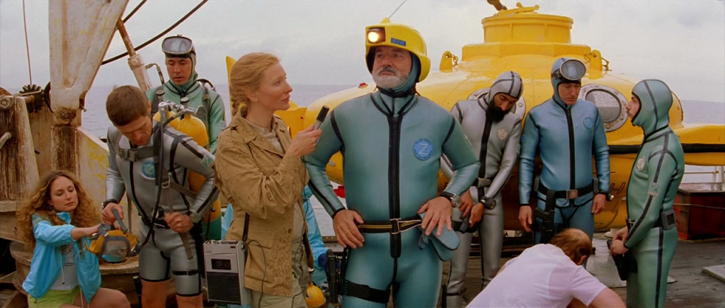
Wes Anderson’s The Life Aquatic with Steve Zissou is heavily centred upon mise en scene, employing it to not only carry narrative action and the development of characters and motifs, but also, importantly, to create a particular aesthetic used to reflect and enhance these aspects and create specific emotive climates within the film.
The film has a very specific colour palette, composed largely of blues, reds and yellows. Throughout the film the colour between scenes, and even between shots, switches from being predominantly yellow to blue, depending on the tone of the film. For example, whilst Zissou’s crew is under pirate attack, the film has an overall blue grade, with cool lighting and set dressing; however, this switches to yellow the moment Zissou decides to take back command of his ship, with the light shifting from a blue overcast to yellow sunlight in an instant to reflect Zissou’s newfound agency. Such colour shifts can be seen throughout the film, as yellow sets, grading and props are used to represent optimism, resolve, and joy, as seen in the motifs of the safe, submarine, and jaguar shark, whilst the blue often represents the opposite: infirmity, lack of agency, and dejection, exemplified by the team’s old uniform and ship which serve to reflect the public’s views, as the crew are no longer seen as authentic, talented filmmakers.
The mise en scene of the film’s final scene (particularly focusing on the second shot) is very telling in terms of where its narrative leads. Here, Zissou is staged with his back to the camera as it pans across him, settling on the young boy that exits through a set of blue doors. This signifies a shift in focus, as Zissou is no longer his own priority; his young fans have regained precedence. This is reinforced as Zissou also has his back turned to the paparazzi and crowd; he no longer panders to them as he was originally criticised for doing. To reinforce this, the crowd is dressed in dull clothing with muted colours; communicating that they are no longer Zissou’s prime concern.
The only sources of blue in this scene are the large doors through which the boy exits, the security that stand guard, and the bright flashes from the paparazzi’s cameras. These glimpses of blue reference not only the sea and the place they have come from, but further, the colour’s notable absence is symbolic of the emotional shift that has occurred in Zissou by the end of the film; he has newfound priorities and has regained confidence in himself, as signified by the large amounts of red and yellow which coat the set. The final scene shows a decided shift in the use of colour. It contrasts with much of the rest of the film, employing sombre lighting and tones, which work with Anderson’s heavy use of black to bring finality to the film; their time at sea has passed, and much of the emotional conflict presented has been resolved.
♗
As an aspiring documentary filmmaker, many of my opinions and beliefs, and therefore much of my personhood, is constructed through learning about the experiences of others. Consequently, I decided that a documentary-style film would be a fitting, if somewhat abstract, way to create a self portrait. The questions that I asked my subjects all related to their experiences in moving to Melbourne’s city, as I have also done. Interestingly, despite coming from vastly different backgrounds, many of their answers reflected my own encounters, as well as each other’s.
As perhaps the film’s most prominent feature, the choice of sound was deliberate. Without utilizing generic traffic recordings, the audio in the film intends to mimic the pace of the city soundscape. This allowed the focus to be kept on the people, as visual reinforcements of the city were rendered unnecessary.
Due to the intensity of the audio, it was important to keep the film’s visuals minimalistic; to balance out the sound. In addition to this, I graded the film with a soft, light colour, to both reflect and reinforce its relatively intimate nature. The film’s shots have been taken quite close to the subjects to further reflect this.
The abstracted framing, used to show only small aspects of the subjects’ features, was used in order to allow their experiences to be related to universal experiences, instead of being tied to one identified person. Their names were withheld until the film’s end for this reason also.
As someone who has had virtually no experience in sound design, I am pleased with the way in which the audio works to achieve its intended purpose, and furthermore, how the film’s different layers come together to tell a complete story between people (even if it takes multiple listens to fully comprehend). Although I made minor tweaks to the audio levels in order to better harmonise the separate tracks and create smoother transitions, I would like to experiment further with audio editing in future to create something with a more cohesive, professional treatment. It may also be wise to look into finding more creative ways of using text within film. Further, I could perhaps have included footage of my environment in the assignment, as I believe this is instrumental in constructing identity (as spoken about here).
♩
A post on noticing sound.
Today’s lecture was mainly about sound; different ways of listening to sound, different types of sound (speech, music, sounds and noise) the distinction between listening and hearing, aural semiotics, sound perspectives (figure, ground and field), and the affordance of sound as a medium.
The idea that stood out for me, was that created by the example of John Cage’s infamous piece, 4′ 33″ (1952). This performance lends itself to the notion of listening to sound, as opposed to simply hearing it; being utterly aware of the aural environment. It reminded me of a more physical practice from iconic performance artist, Marina Abramovic, as shown below. Both Cage and Abramovic’s work forces attention, ensuring that minuscule, routinely ignored sounds and actions are brought to the fore.
This relates to sound design in film, as some of the most masterfully designed soundscapes go unnoticed, as the audio is felt, rather than heard or listening to. The aim of sound in film is not to stand as work in and of itself, but to perform cohesively within the film to mould the audience’s emotional discourse and create an underlying dialogue which informs and gives depth to the film’s predominant messages.
ϟ
A Reflection on Pop Culture – The Place of Punk
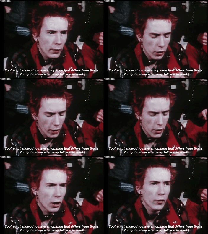
Originating in the late 1960s, punk was a subculture defined by its counter-cultural dissidence, political outspokenness and anti-materialism. The movement rejected many of the decade’s dominant ideologies, and actively sought to defy the mainstream popular culture of the time, which it regarded as ‘a crisis of meanings caused by the commodification of everyday life’ (Moore 2004, p.311). Despite this, seventies punk iconography has retrospectively become a prominent part of the decade’s popular culture, as the movement’s valuable societal influence has been recognised, along with its commercial viability within the current capitalist landscape. Punk imagery has been ‘co-opted over the years into wider consumerist frameworks’ (Sabin 1999, p.225), distilled into an aesthetic version fit for widespread public consumption. Ironically, punk iconography has been popularised within a modern context through the very means which disassociated it from the dominant culture of its time.
The changing place of punk within popular culture exemplifies the notion that popular culture artefacts and practices are variable, not historically fixed (Storey 2008, p.15); yet, while individual artefacts and practices may change status as popular culture, a general framework is in place to identify this cultural subset. Within a popular culture context, ‘culture’ is broadly defined as a group’s particular way of life, and as practices and texts created as sites wherein meaning can be derived (Williams 1988, p.90). The word ‘popular’ holds four distinct definitions: something that is widely favoured, work created to win favour (a decidedly commercial definition), culture made by the people for themselves, and inferior types of work (Williams 1988, p.237). Popular culture itself exists as the complex interplay of these individual definitions (Williams 1988, p.237).
This conception of popular culture carries with it particular implications surrounding its function as a social, political and economic force. Many popular culture scholars posit that ‘culture is collective by definition,’ therefore, culture has a social purpose to identify one as a member of a group (Takacs, 2015, p.3). An extension of this asserts that the ‘people’ inferred by the term popular culture include many diverse social groups, united through their distinction from the economic, political and cultural elite (Storey 2008, p.12). Popular culture consequently becomes a definitively political terrain, whilst furthermore demanding accessibility for the masses. Interactions between cultural texts and ‘the people’ thereby embody present social climates (Takacs 2015, p.9).
Popular culture emerged following industrialisation and urbanisation, thus, a further aspect of the concept that must be addressed is its commercial qualities (Storey 2008, p.13). As ‘people do not spontaneously produce culture from raw materials of their own making… what is certain is that its raw materials are those which are commercially provided’ (Storey 2008, p.10). Contingent upon a commercialist, capitalist society, this definition inherently links popular culture to marketability, and commerce.
Punk conforms to the popular culture guidelines of political motivation and social collaboration, with a set of determining artefacts; however, lacks commerciality and popularity. As a relatively localised movement, punk was not a part of dominant culture. In recent years however, punk iconography has been repositioned and adopted into mainstream popular culture; popularised through its visuals as opposed to motivations, making superficial aspects of punk accessible to and popular within the modern mainstream, thereby creating a commercially viable product and allowing it to be reframed historically as a prominent part of 1970s popular culture.
 Reference List
Moore, R 2004, Postmodernism and Punk Subculture: Cultures of Authenticity and Deconstruction, Taylor & Francis Inc., New York, USA.
Rhodes, Carl & Westwood, Robert 2008, Critical Representations of Work and Organisation in Popular Culture, Routledge, New York, USA.
Sabin, Roger 1999, Punk Rock: So What? The Cultural Legacy of Punk, Routledge, London, UK.
Segal, Emma 2012, Punk Britannia, Not Just a Label, viewed 19 March 2016,
<https://www.notjustalabel.com/editorial/punk-britannia>
Storey, J 2008, Cultural Theory and Popular Culture: An Introduction, Pearson/Prentice Hall, London, UK.
Takacs, Stacy 2015, Interrogating Popular Culture: Key Questions, Routledge, New York, USA.
Williams, Raymond 1988, Keywords: A Vocabulary of Culture and Society, Fontana Press, London, UK.
?
Editing & Experimental Film Form
Chris Marker’s La Jetee is a prime illustration of the existence of experimental film as a spectrum. Unlike the clearly abstract form of Stan Brakhage’s Dante Quartet, or associational form of the 1920s classic, Ballet Mecanique, La Jetee is presented through a narrative form in the traditional sense. Despite this, the film draws largely from avant-garde cinema, and maintains the ultimate goal of experimental film throughout as it challenges the viewer to see and experience film in a new way.
Presented almost entirely through still photographs, La Jetee explores the concept of motion and temporality through unconventional means. The careful composition of each individual photograph captures a moment in time, with the transitions between each shot producing the illusion of movement, as the viewer instinctively creates closure between moments, mentally constructing one continuous, unified reality. Many of the fade transitions in the film are instrumental in constructing this reality, as they visually blend these moments together. La Jetee’s non-diegetic music is utilised to similar effect, creating audible continuity between photographs, and additionally reflecting and shaping the emotion presented within them, thereby audibly animating the image. In direct contrast with this, the film’s use of black and white colour grading in combination with its still photography creates a sense of stillness, as many of the characters are frozen in time, only existing within particular moments, which the main character traverses between. This juxtaposition of meaning reinforces the film’s exploration of the confusing nature of temporality.
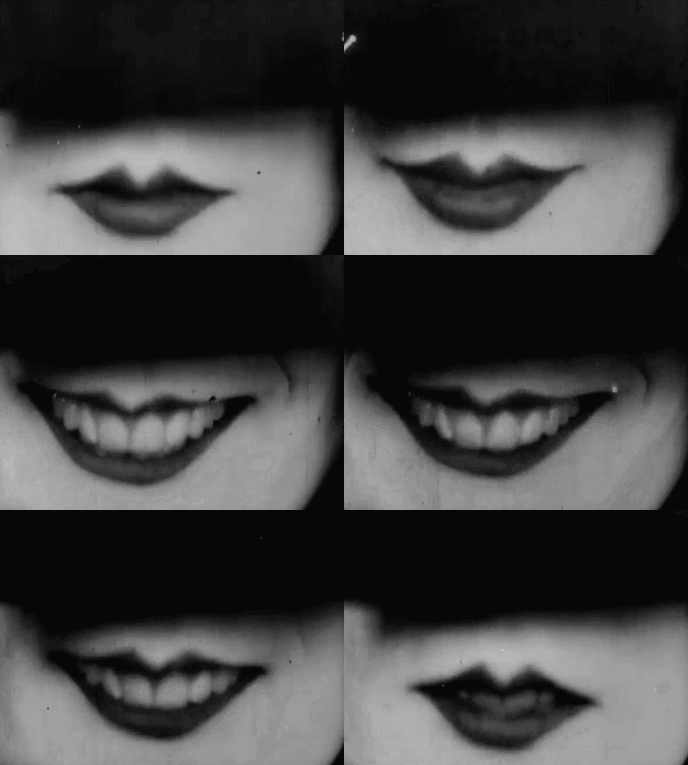
In contrast with La Jetee, which tells its main narrative through a spoken voice over, reinforced by a variety of deliberate decisions in regards to film form which enhance and add depth to the film’s prevailing themes, the meaning of Leger and Murphy’s Ballet Mecanique, is derived through exploration of the film’s sequencing. An associational film, Ballet Mecanique, employs patterning to conjure ideas and evoke emotion in the audience, as viewers naturally search the film for meaningful connections. An example of this may be seen in the film’s repetition of a woman smiling, as through this repetition the action is made mechanical, thereby illustrating and reinforcing Ballet Mecanique’s prevailing theme of comparing man and machine.
♦
To practice editing in Premiere Pro, we created one minute films composed of a combination of your own and other students’ footage, a haiku, and a music track.
Films could not include shots focussing on individual people, and had to use static frames.
I chose a haiku by Hashin:
No sky
no earth – but still
snowflakes fall
The shots that I chose, and the way they’ve been layered and sequenced was deliberate; to create contrasts between the natural/moving and the urban/structural to reflect the poem’s dystopian nature.
?
This week’s workshop was spent looking at different ways of critical thinking and evaluation. Specifically, the system of de Bono’s Hats; a tool designed to aid in the thorough discussion and evaluation of different works. It does this through a set of six coloured ‘hats,’ metaphorically representing the different categories of evaluative thinking. This is an incredibly successful model, as the separation of these hats promotes parallel thinking; a constructive alternative to adversarial thinking, or debate, as it directs attention to one specific aspect of evaluation at a time, allowing for productive feedback to be generated and specific elements of a work to be focussed upon.
To demonstrate the way in which these hats work, I have chosen to evaluate my preliminary self portrait: project brief 1, using this system.
Yellow ?: benefits
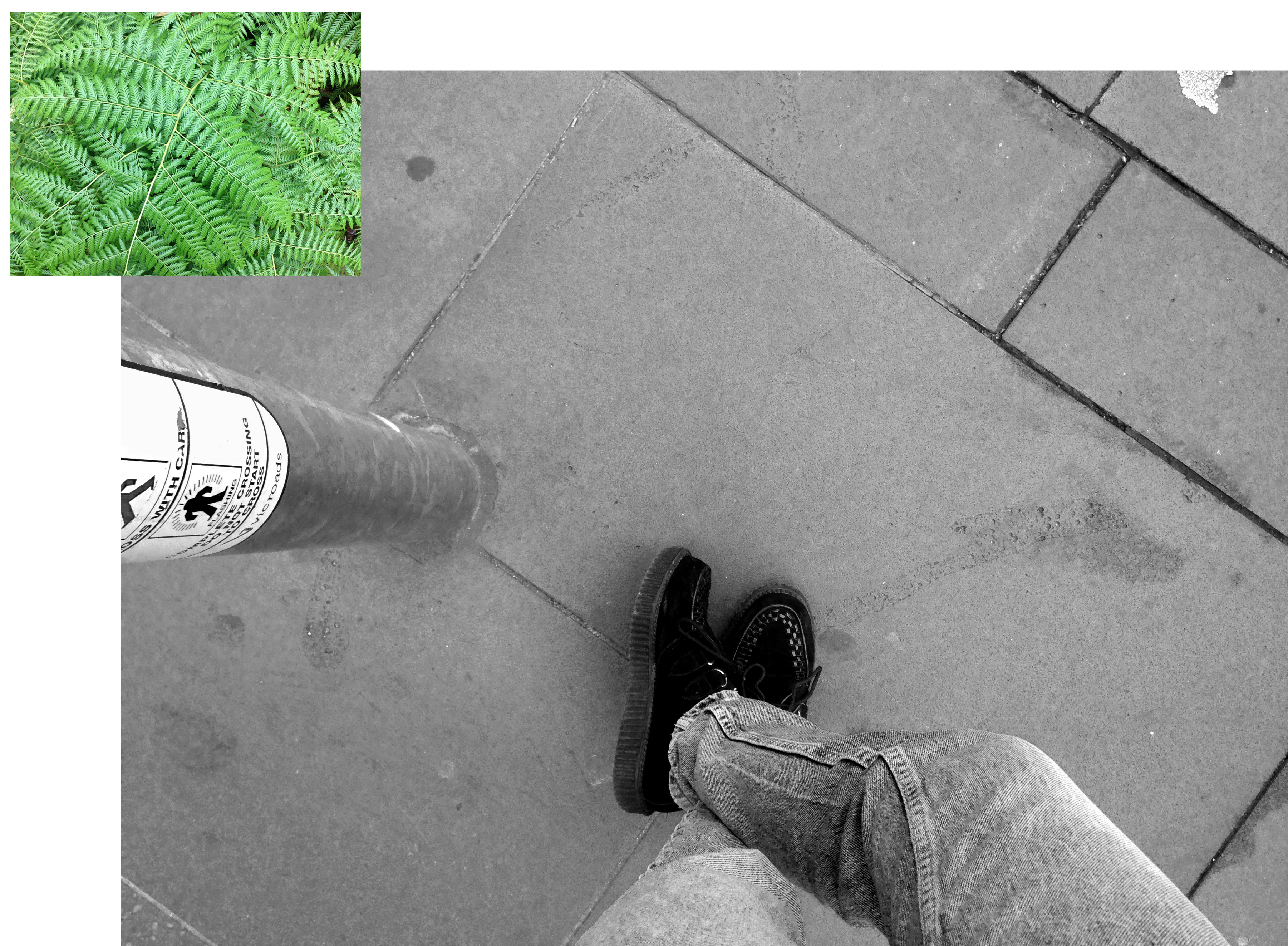
The individual aspects of personhood informing each piece of the assignment were well deliberated, and show a range of ways of illustrating personality through literal, metaphorical and referential means. Each shot has also clearly been thoughtfully composed in order to confer meaning.
White ?: facts
The selection of photographs, video and audio provide unique insight into the subject’s life, characterising their personality, however they do not provide a broad image of the subject as a person, instead only providing relatively small insights into their life.
Black ?: cautions
The layout of the assessment is lacking. Without post processing, or the ability to move and layer the different media close together, the layout is rather bland.
Green ?: creativity
To solve the issue of layout, a colour scheme or specific subject matter could be identified to create a more coherent piece. Also, the juxtapositions present within the written explanation of the piece, between the city and the natural world, could be explored visually, contrasting the brutalism present in city buildings against the organic forms found in nature.
Red ?: feelings
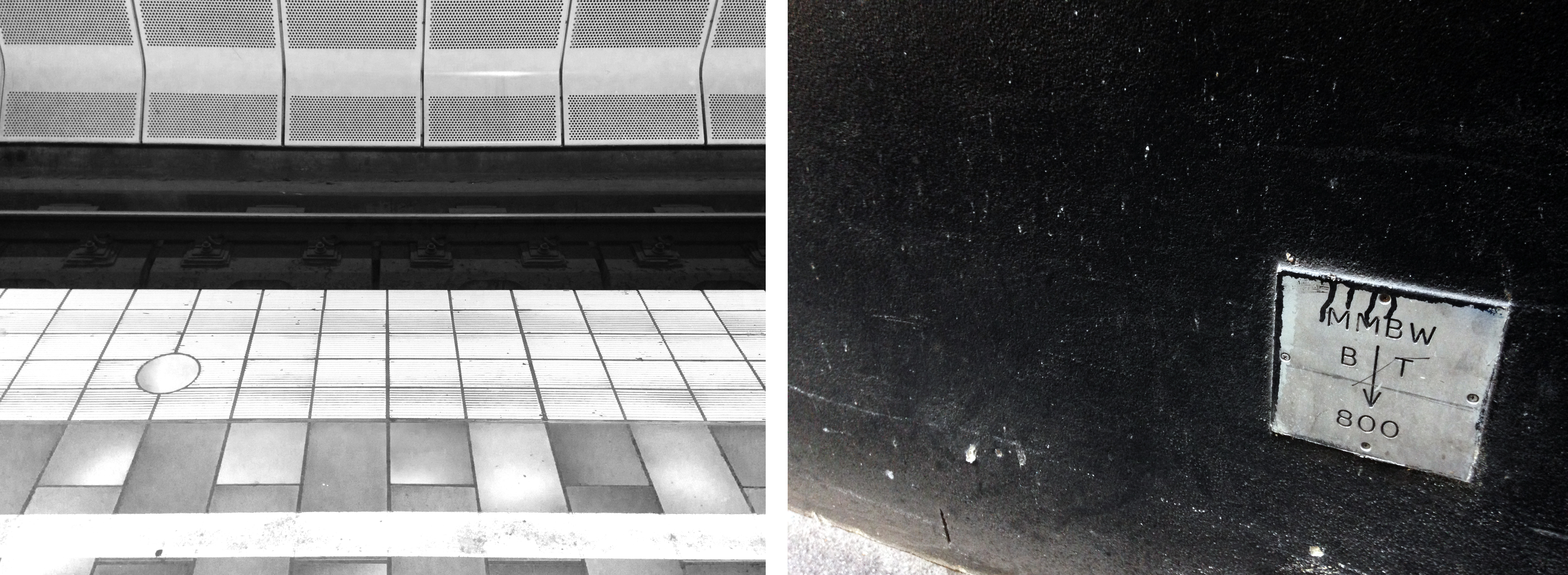
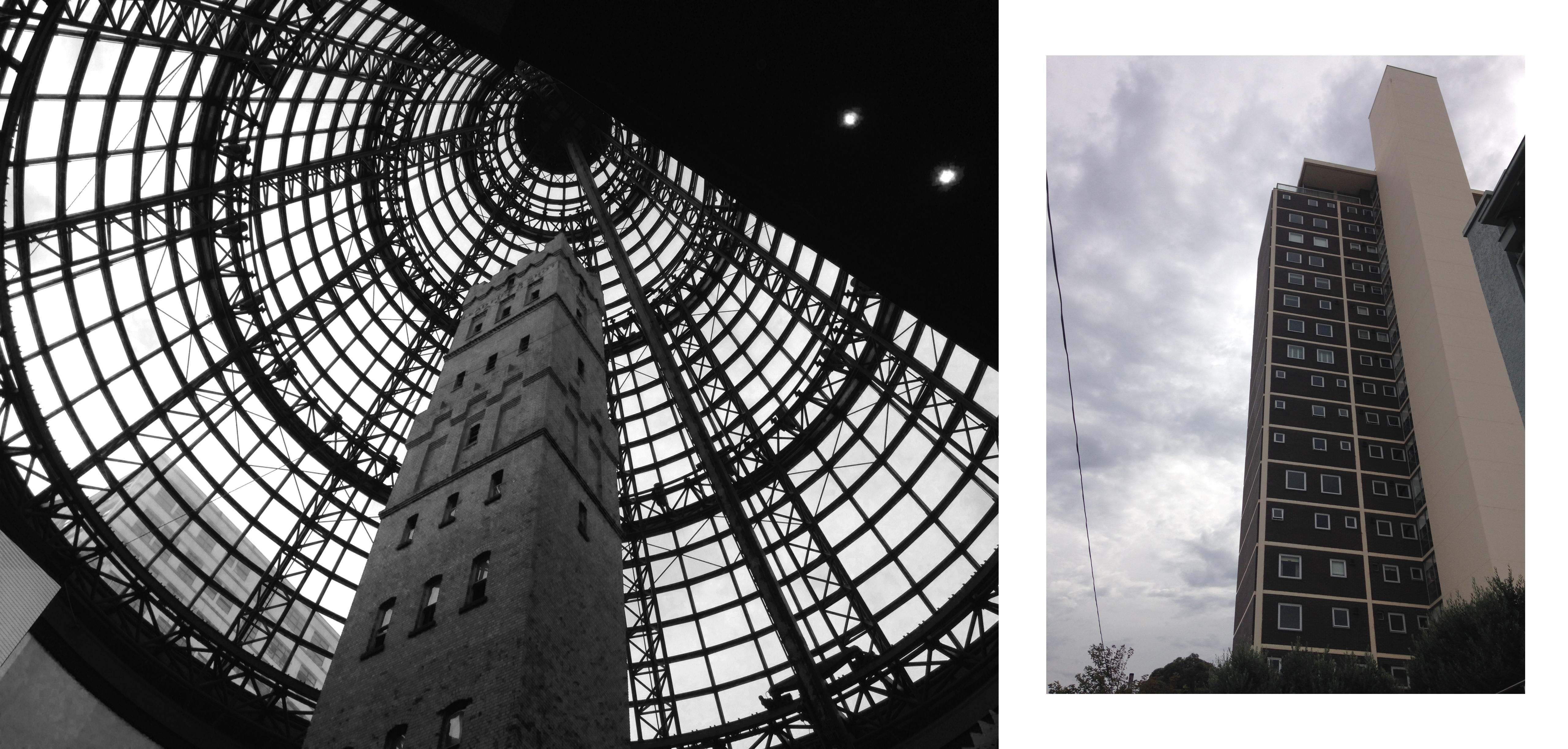
While reactions vary between each element of the piece, those featuring nature are instinctively calmer than those of the cityscape, which evoke a sense of being overwhelmed, almost claustrophobic, as many of the pieces featuring the city are shot on an upwards tilt, creating a a sense of looming, or are utterly filled with noise and movement.
Blue ?: process
From this assignment the main elements of my personhood have been identified, and thus may be explored further in the second project brief, expanded upon, or focussed on.
?
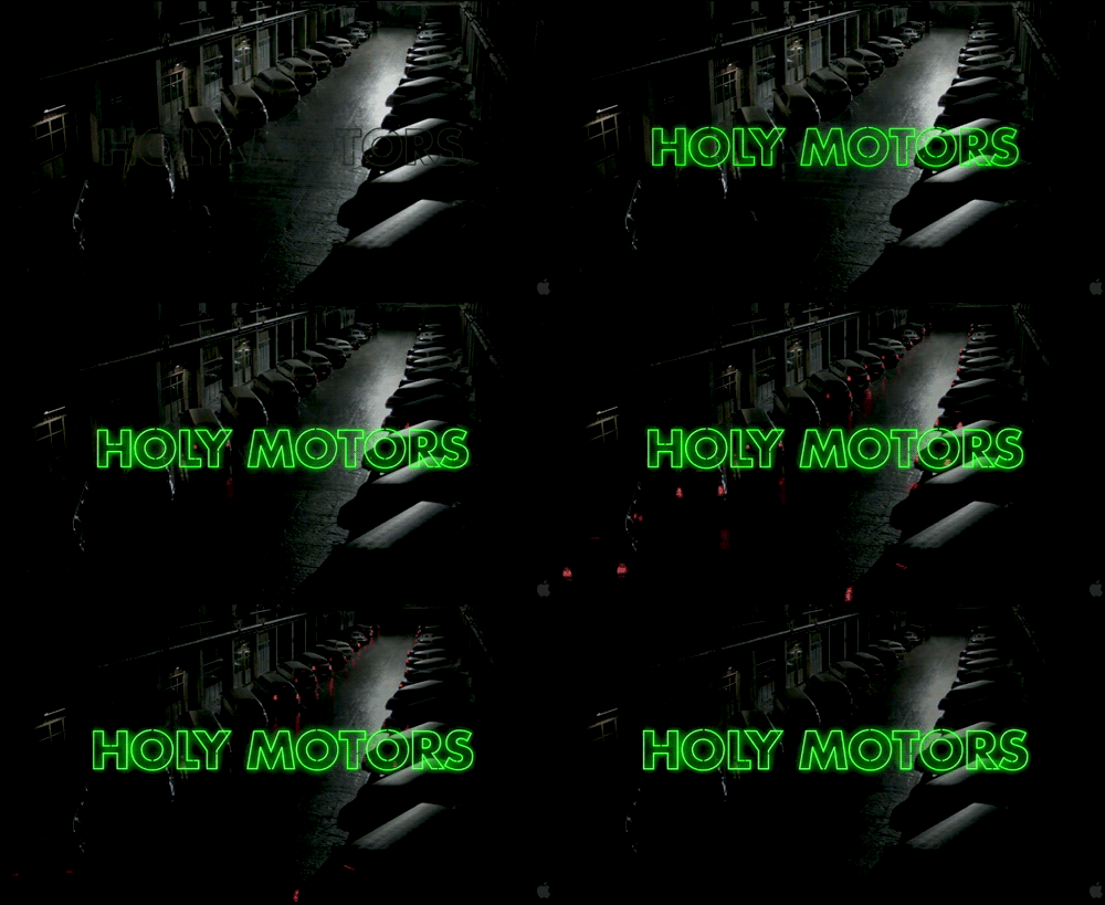
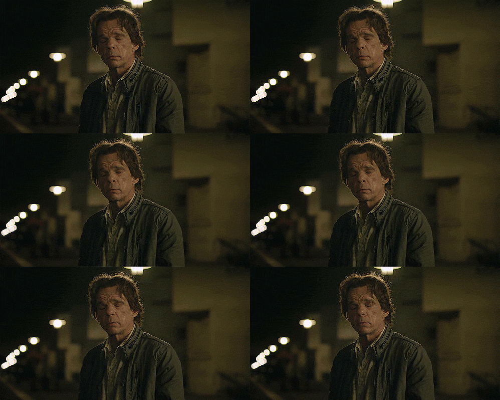
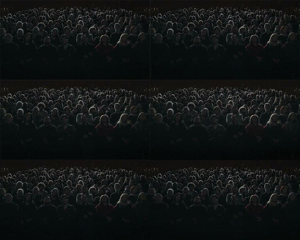
Leos Carax’s 2012 film Holy Motors, is a rare film, as it leaves the audience with more questions that it resolves. Why does Eva die? Why are there web addresses on the tombstones? Is the protagonist really her father? The unresolved nature of the film is due, at least in part, to the unorthodox storytelling path it takes; following no conventional narrative structure, not a traditional story arc, three act structure or hero’s journey. The film may be best described as taking the form of a montage; a set of seemingly unrelated characters and scenes through which the audience derives its own meaning, as it subconsciously creates connections throughout. Indeed, the film’s only constants are the relative length of each scene, Celine the driver, the varying characters as portrayed by actress Denis Lavant, and importantly, the limousine, which serves as the vehicle through which we move within the film. As the film’s auteur, Leos Carax has stated that the film ‘is a way of telling the experience of life without using a classical narrative.’ Hence, through the various characters portrayed throughout the film, Carax attempts to show the immense range of human experience, as Lavant’s character moves between lives via a white limousine. The film’s establishing image sets this up to be the case, as Holy Motors opens on a shot of a crowd in the cinema, facing the camera as they would be the screen. This hints at the way in which the film is a reflection of life, as we, the audience, are positioned as the feature from the film’s inception; the audience is both the film’s hidden viewership, as well as it’s subject.
