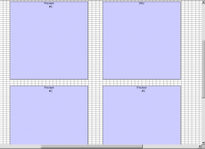
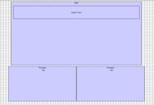
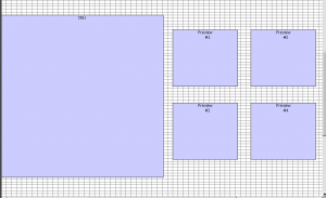
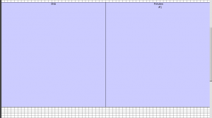
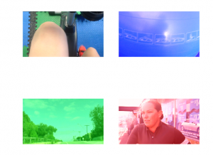
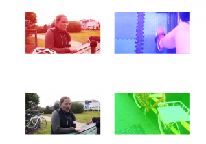
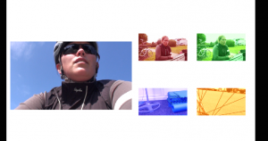
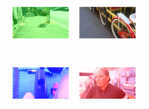
The finalising of Project Brief 4 consisted of changing the interface designs (not dramatically, just in regards to the feedback we received), adding a title to the interface, and changing the look of the previews (such as changing their colour). All of this is in regards to the feedback that we received from the week 12 presentation, and I have worked hard to try and bring this project all together considering everyone’s comments, so produce a k-film to a higher standard.
On the main screen the previews have been changed to black and white to allow the yellow to stand out within the title. This is the beginning of how colour influences our work, and the structure of it. Colour is a key component that stands out within the k-film, which is intentional for design and user face practices.
The boxes in the interface design were made larger, so that there isn’t as much negative space on the screen – this way they are easier to watch and engage with.
The colours vary depending on the cluster they are in. Each cluster is assigned a different cluster those being: Community – green, Cycling – yellow, Training – blue, and Purpose – red. This will be a reoccurring pattern throughout the k-film that the user will be able to pick up on. Not only will each cluster play in the same position within the interface, their previews will all be the same colour. This works instead of text, as text could guide the viewers attention and influence where they click; while colours only create groups/clusters that make each theme stand out.
All together, this k-film represents where we have come from, and the research that we have done; along with the feedback we have taken on board to achieve a multi-linear non-narrative through a polyvocal software. This enables us to work with no structure and to interpret the work how we wish, or how the content naturally structures itself. It represents the idea of keywording and clusters through a more poetic approach that offers the viewer a journey that they might not expect. This is the beauty of working with Korsakow, as the creative possibilities are endless.
This is still a work-in-progress prototype, that demonstrates what we have learnt and achieved throughout this studio this semester. We have gone through massive up hauls to get we we are now, however it has been a huge learning journey that will forever impact on our new media practices and the way we work in future projects.


