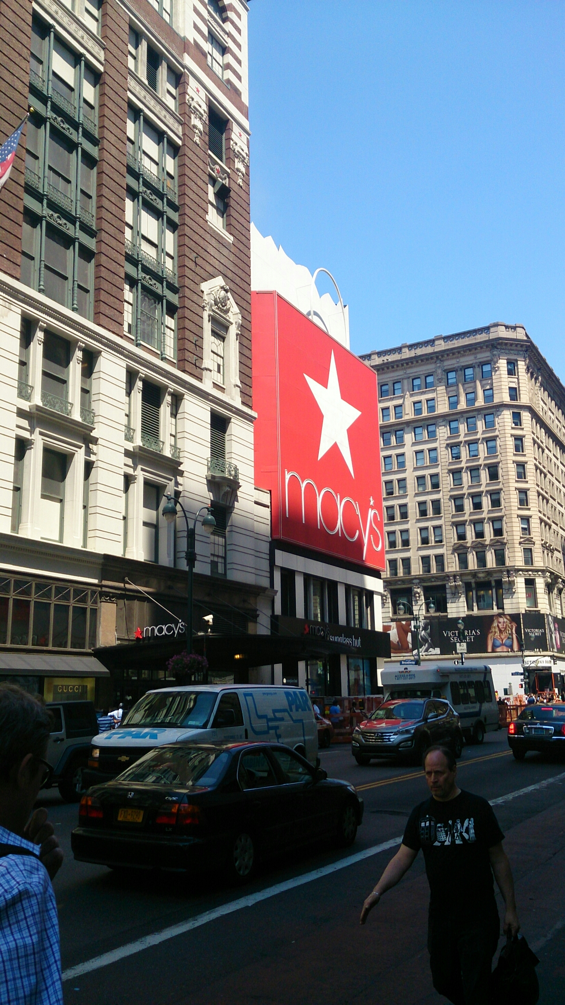
Day 5

Battery Park, the gateway to the Statue of Liberty.

image

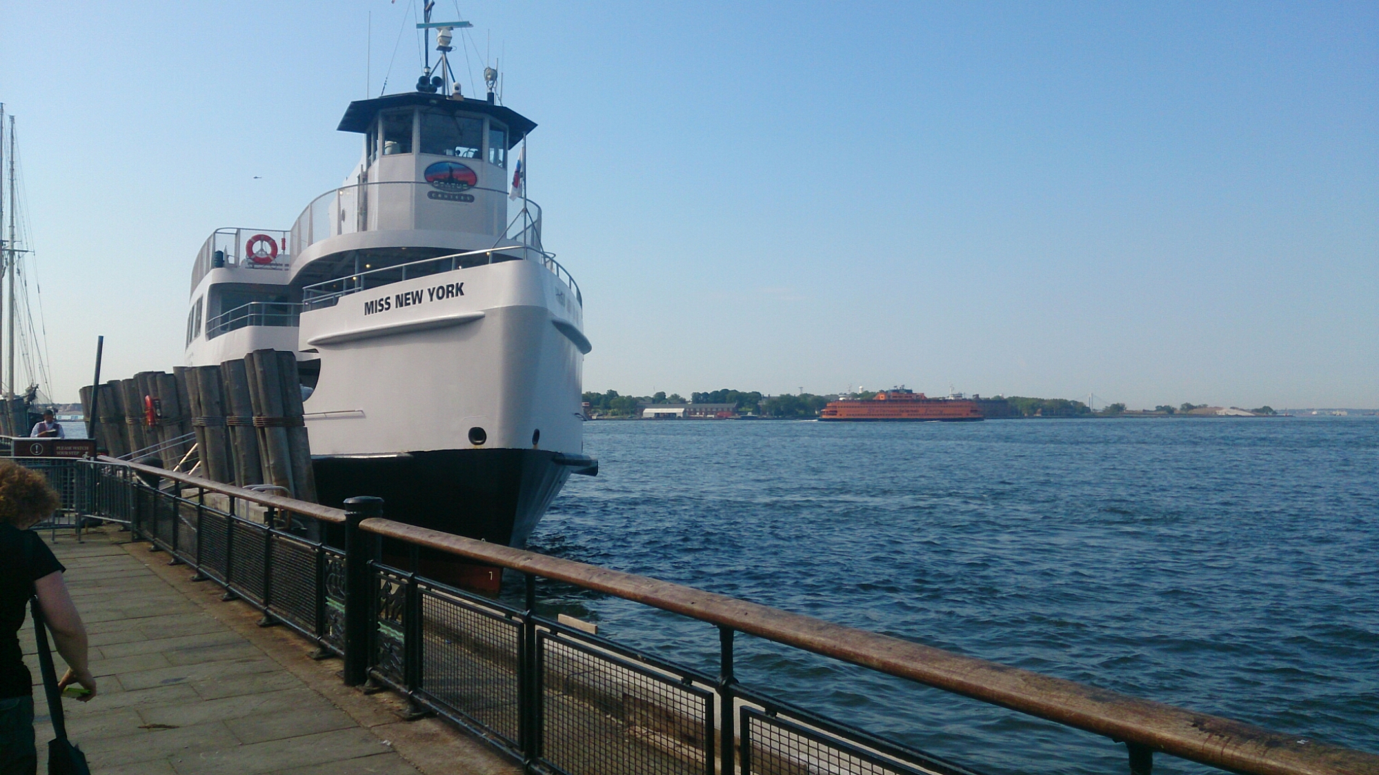
Miss New York, the vessel.

image

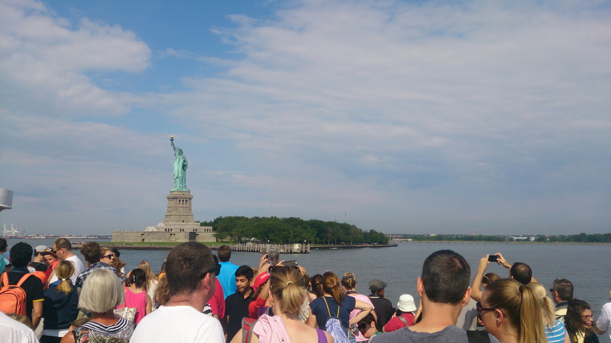
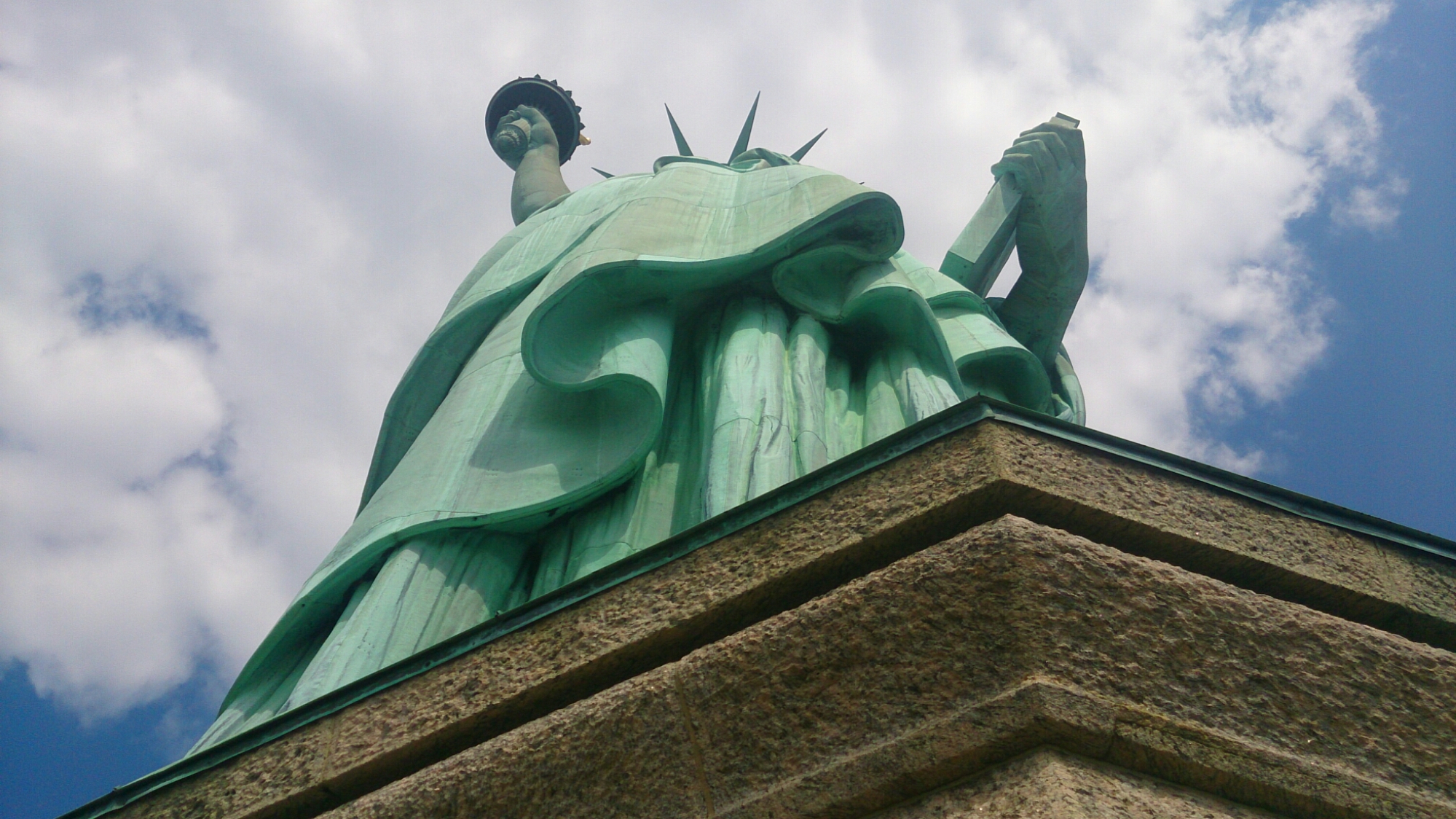
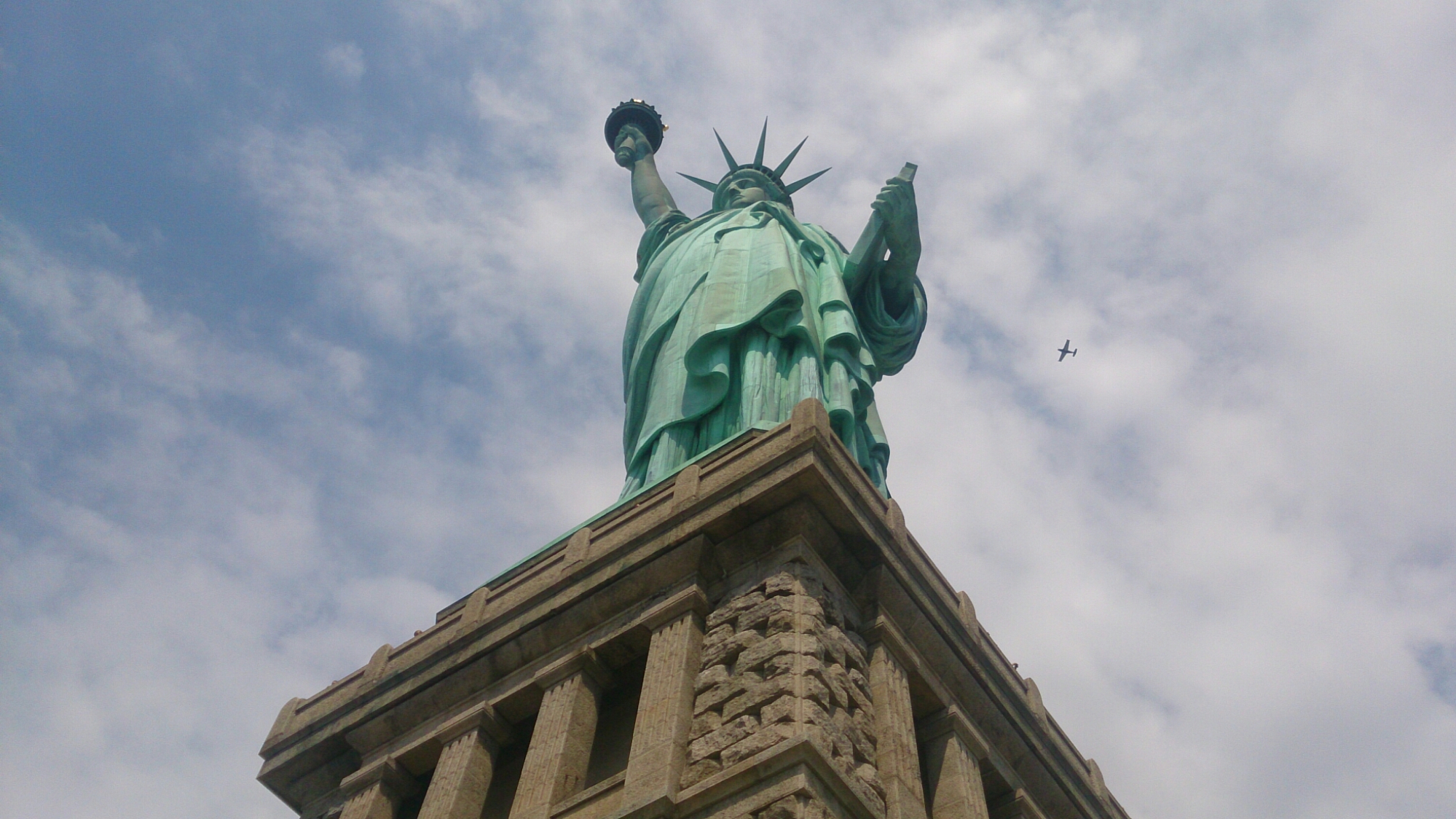
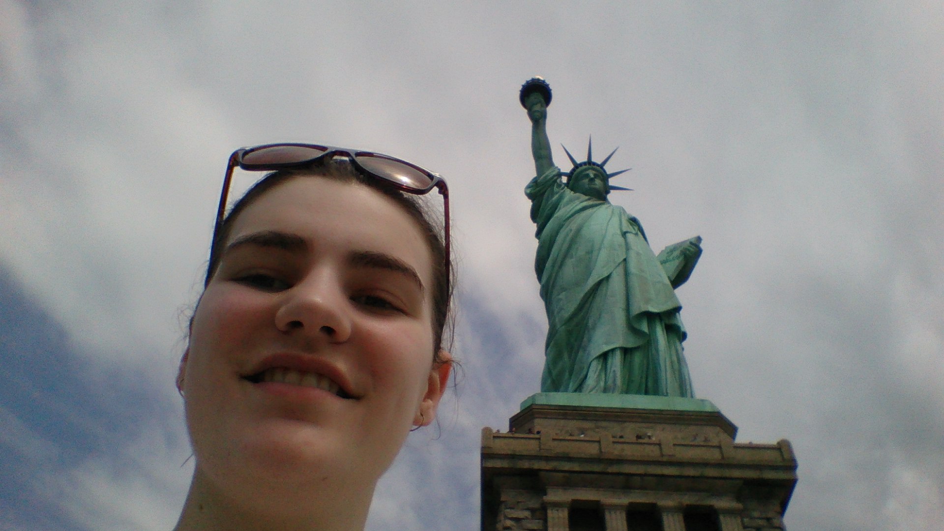
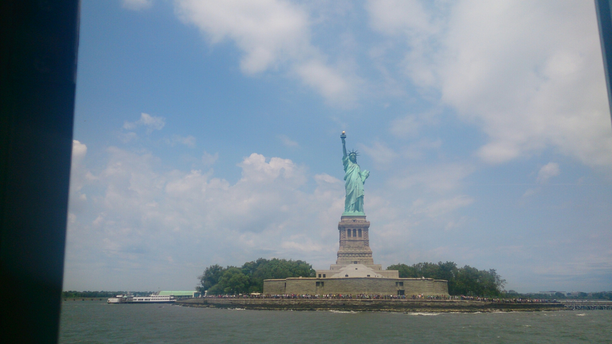
And, Lady Liberty herself. Today is probably the most tourist-ey day we’ve had this whole trip.

image

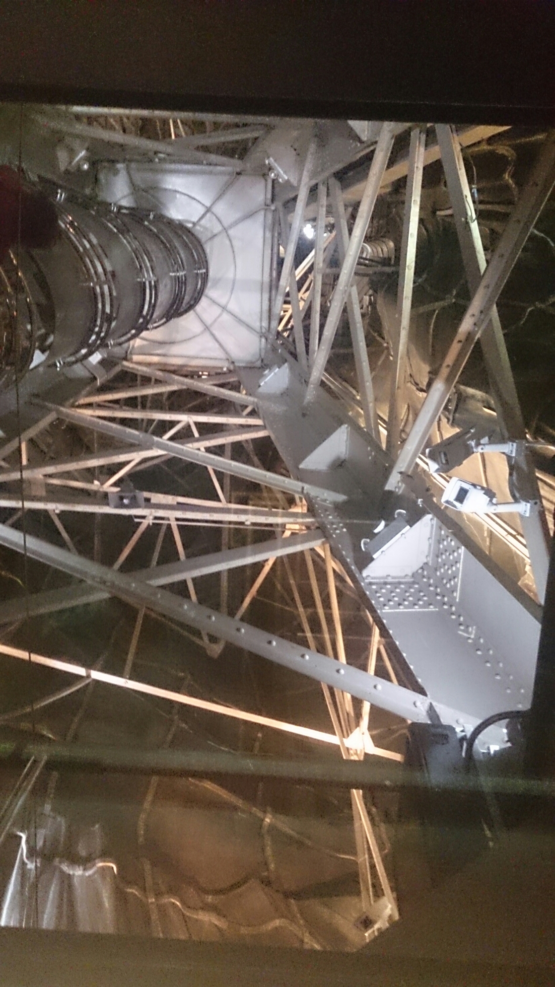
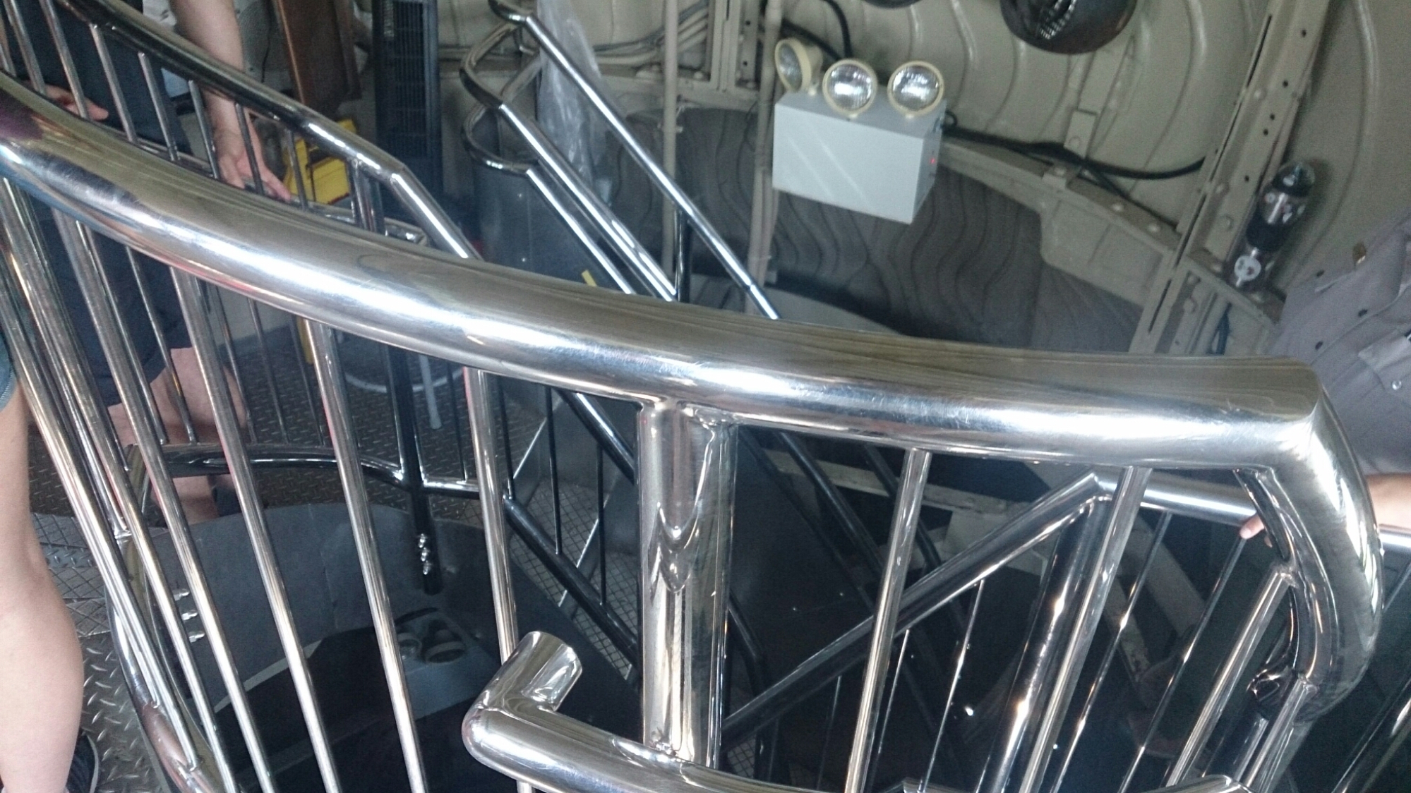
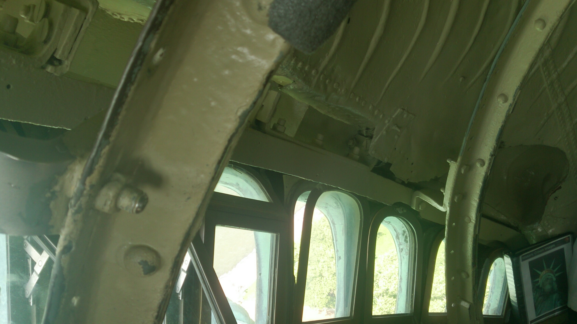
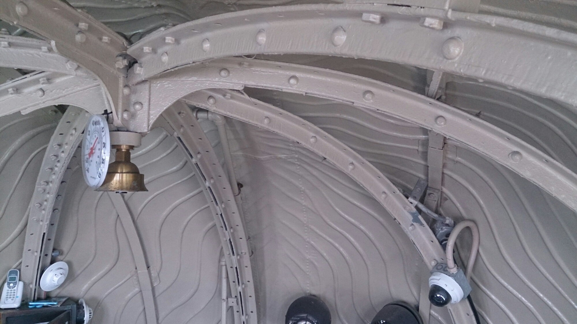
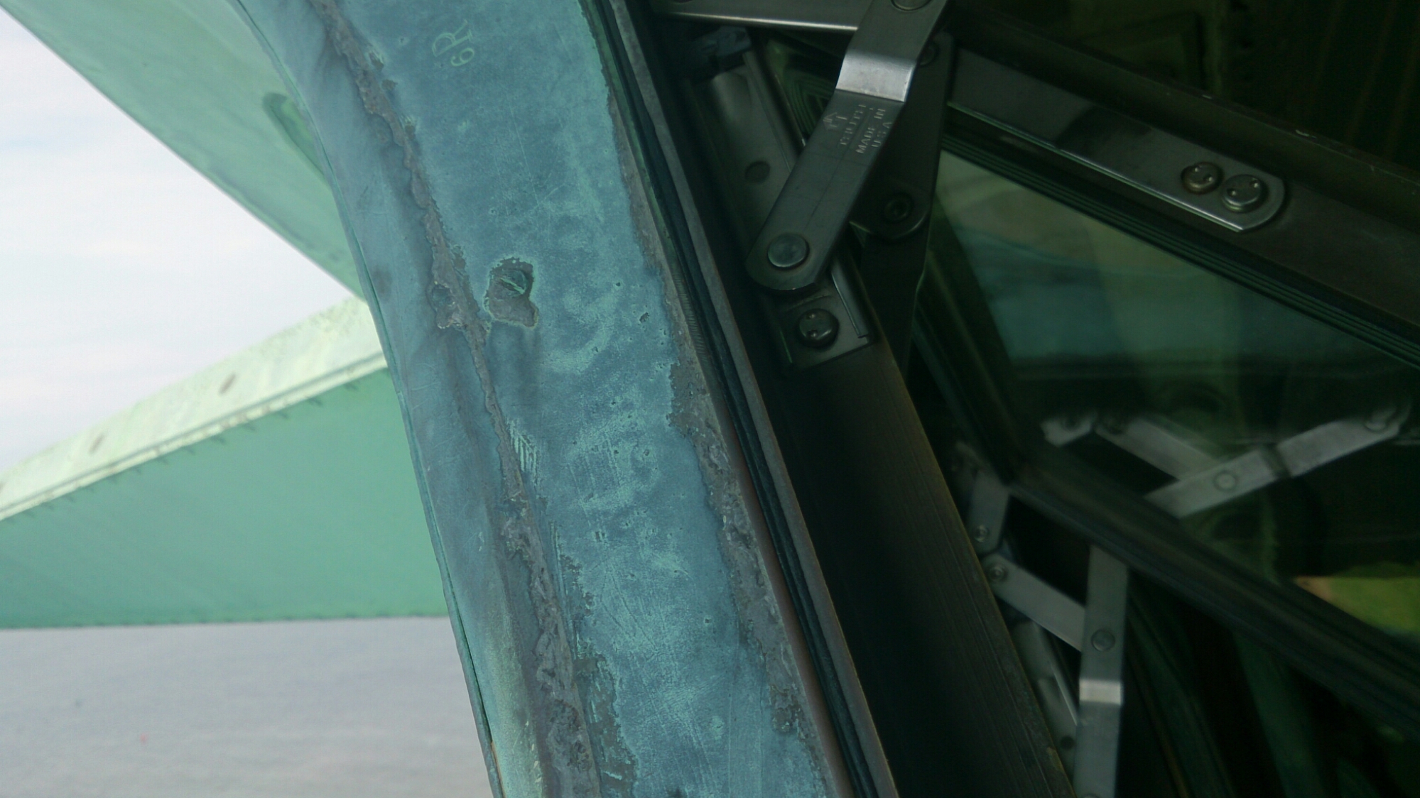
The internal structure of the statue, made by monsieur Eiffel.

image

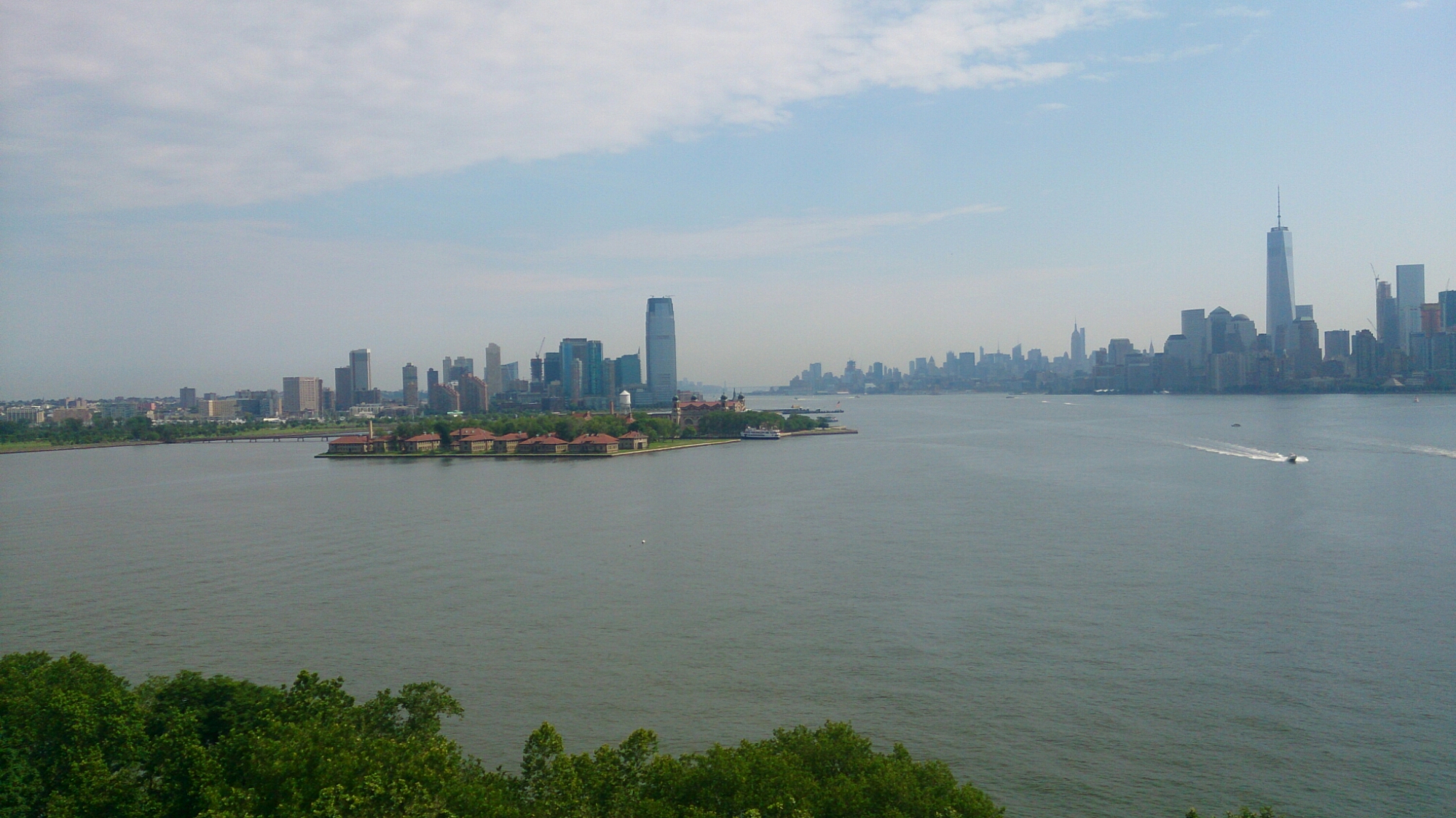
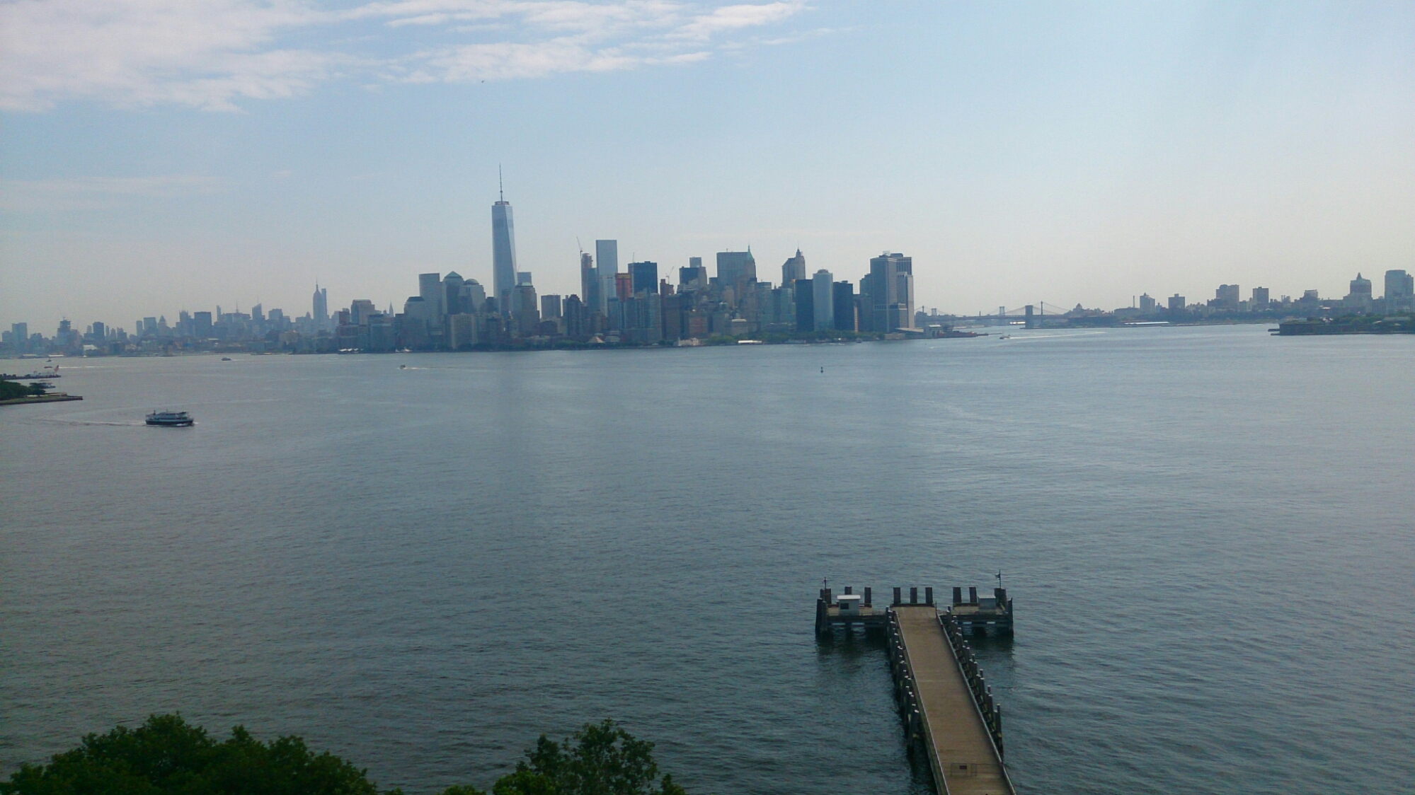
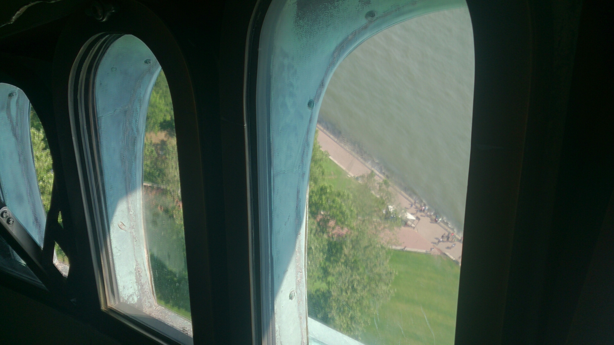
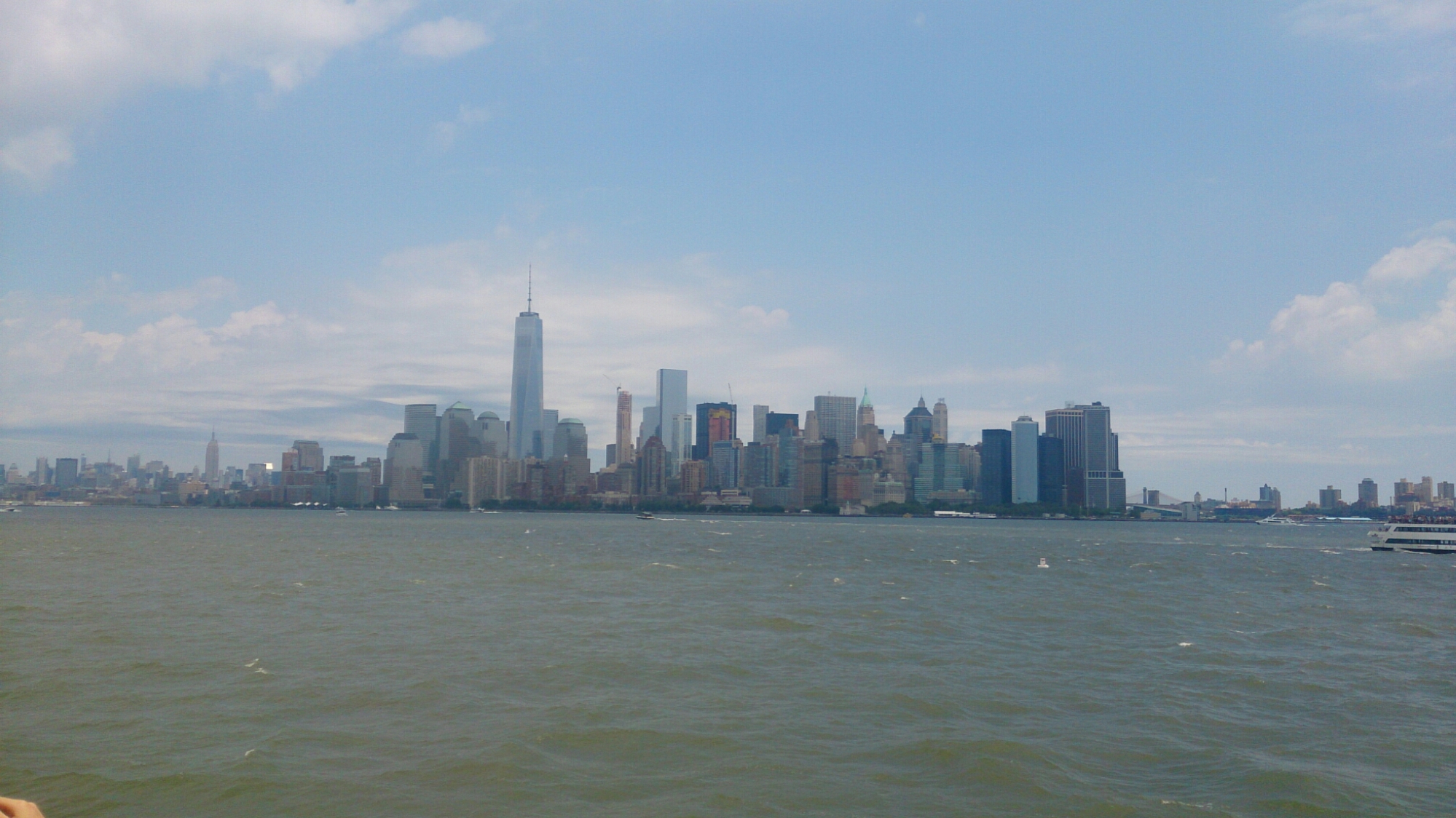
The view.

image

image

image

image

image

The way up to the crown. Only 50 allowed up a day.

image

image

image

image

image

image

image

image

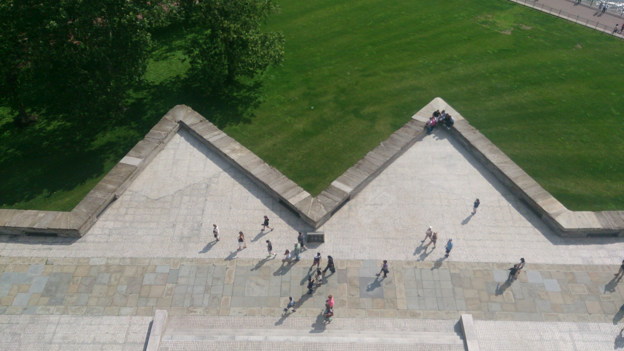
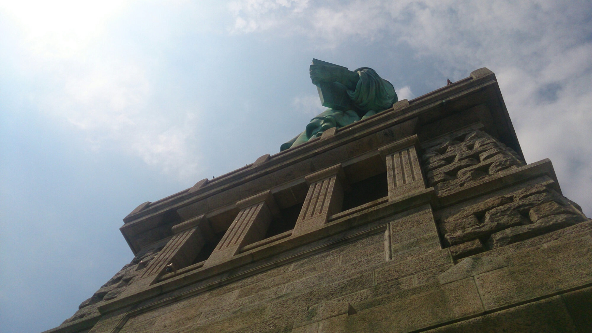
The lowest level of the pedestal, great views of the lady in copper.

image

image

image

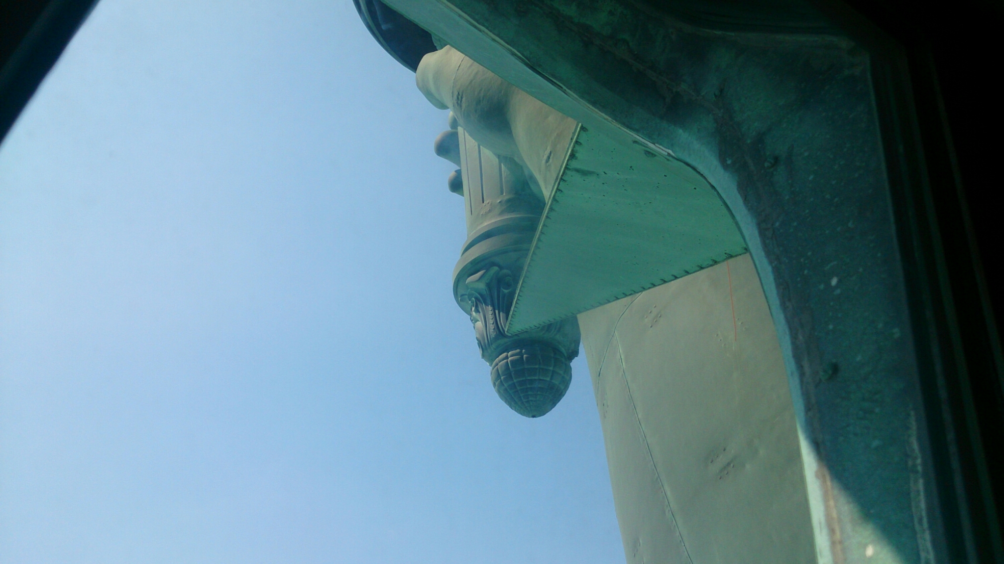
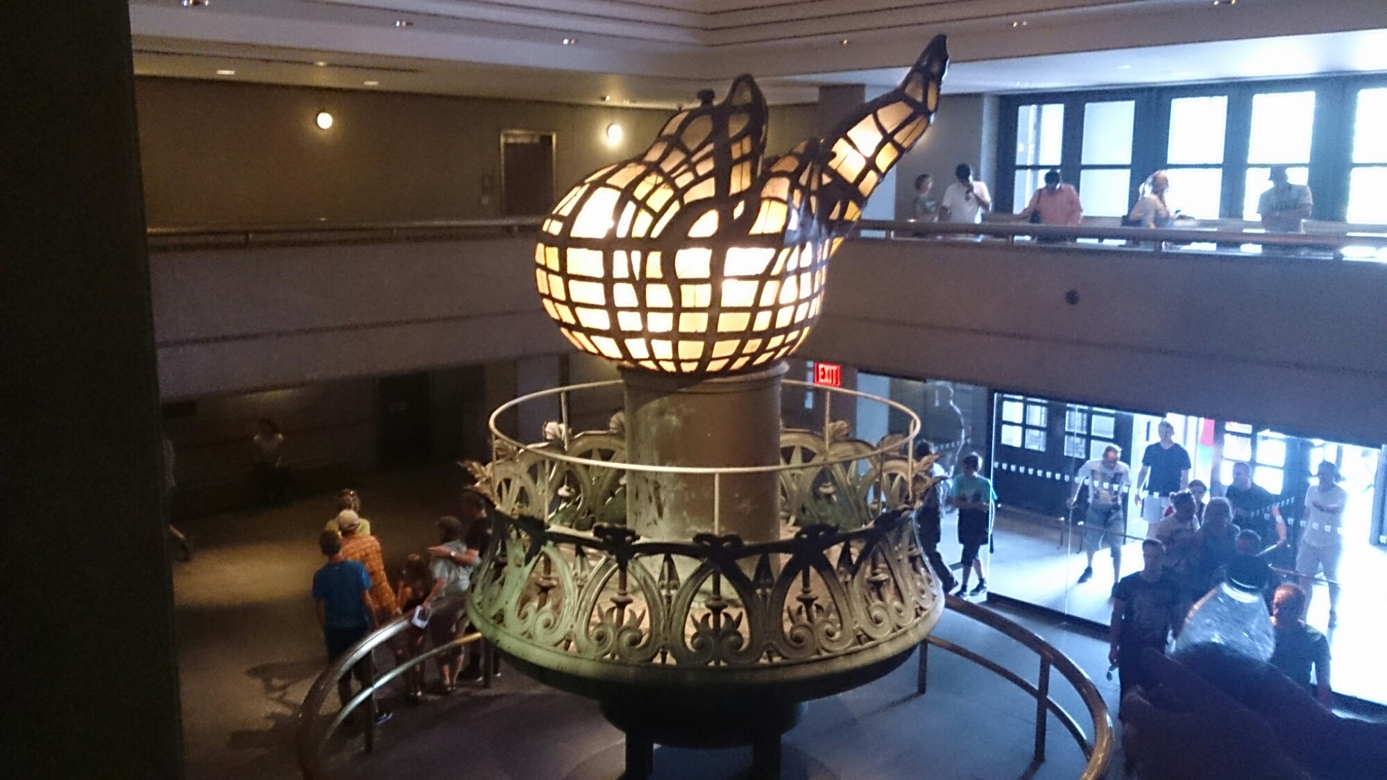
The original torch that was replaced due to leaks casuing deterioration to the copper.

image

The trip back on the Miss New Jersey.

image

image

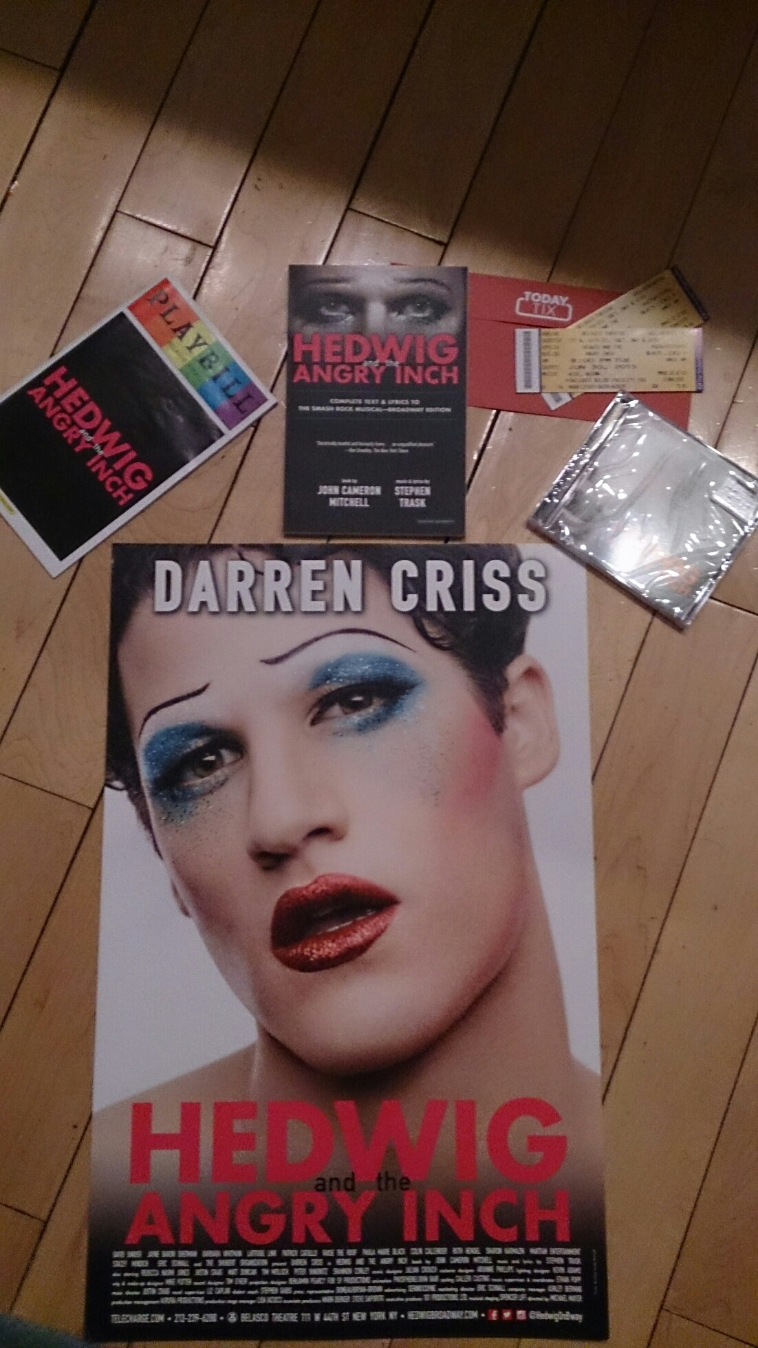
After returning after about 2 hours (and WAY too many steps), we decided to split up and go shopping, mum and I going to Barnes and Noble, Forever 21 and a vegan bakery. We binged on cakes before having a rushed dinner and heading off on the subway to our discount broadway show – Hedwig and the Angry Inch, starring Darren Criss.

It was an amazing show. The songs were incredible (so much so we bought the soundtrack), the characterisation was amazing, it was all through the 4th wall, which was a nice change of pace and really allowed for the reality of the story to kick in. The lighting and set design is also used  masterfully. I don’t think I stopped smiling the entire show. There were also some very interesting ‘punk’ and ‘rock’ gestures at and towards the audience, such as spitting, jirating and licking, which was fantastic and made me grateful that I wasn’t in the orchestra area. A brilliantly written and characterised show. Darren Criss was amazing, and the adlibbing was awesome. I actually bought the script and a poster as well, which was pretty cool to see from a show, selling the script that is. Another thing that’s great about Broadway – the playbills are free.

image

Today was probably the day that I felt most at home and like a New Yorker, like I’d been absorbed into the city somehow. The longer I’m here the better and more excited I feel. It’s surprisingly exhilirating and scary at the same time.

Day 4


Today was a lazy day. We spent the morning doing nothing until we finally decided to stop being lazy and tired and do something worthwhile and interesting.

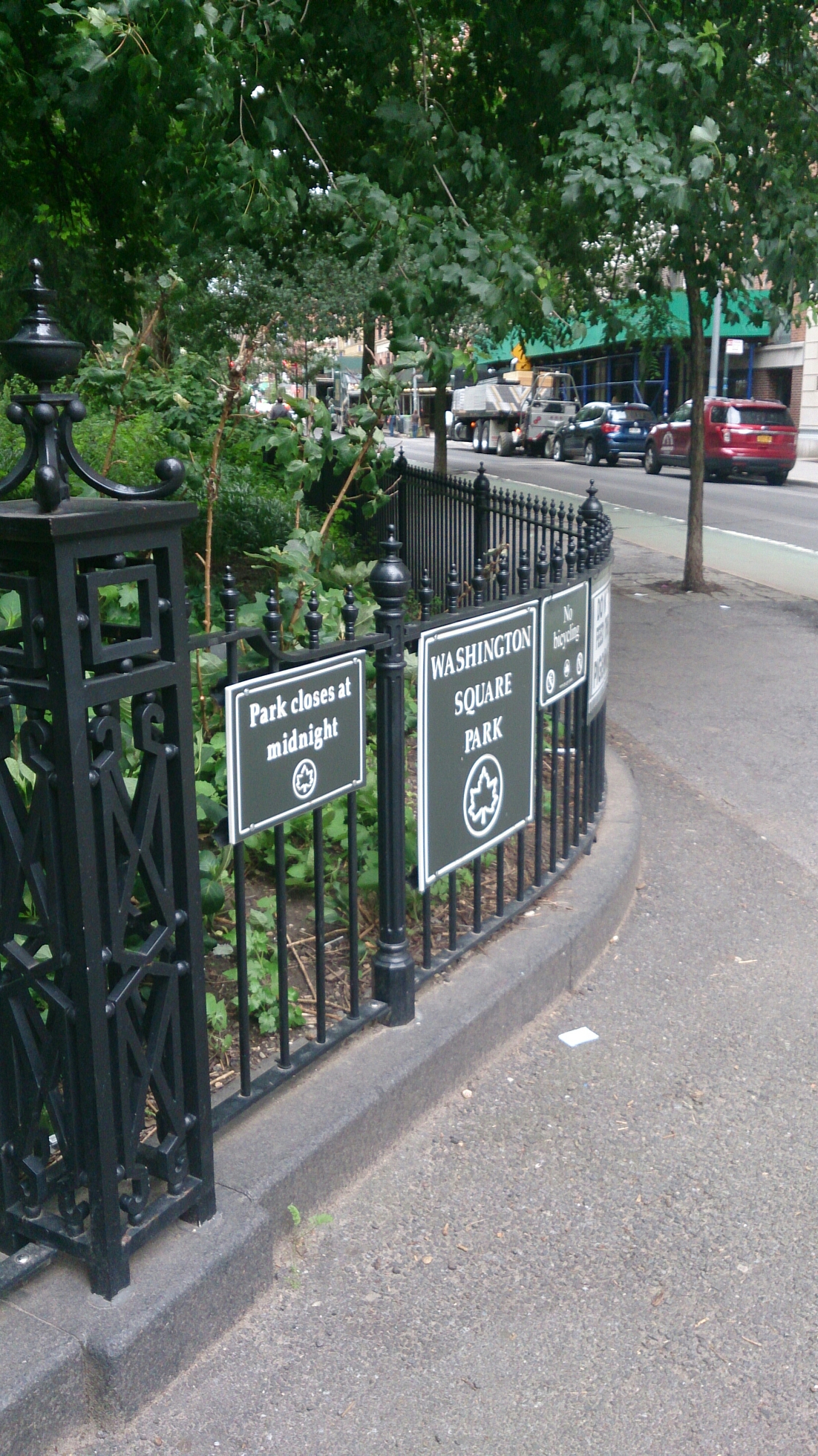
Washington Square Park, another stop along the ‘mum-fuelled tour of famous places in films’. There was actually a small film shoot happening right next to the arch. Seriously, just walking through Chelsea on our first day, there was at least 3 photo and film shoots going on in the streets.

image

image


NYU is right next to Washington Square Park, in particular TISCH School of the Arts and the Kanbar Institute of Film and Television. We tried to visit, but security is so tight here.

image


After that, we visited Grenich Village. The streets are small, lovely and green. Almost suburbia but more boutique-esque.

The building below is the narrowest building in New York. Apparently the guy who owned the building next door was sick of people using the lane way next to him for ‘inappropriate activities’ so he bought the laneway and built on it.

image

image

Originally a worker’s courtyard, designed to be adjacent from the main street, it is now one of the most expensive places to live in Grenich.

image

After the Village we went to TJ Max for some cheap, good quality shopping, and it just happened to be right next to the New York stock exchange – the home of the evil capitalism monster. Just kidding…

image

For dinner we went down to Chelsea Piers, which is some of the best use of space I’ve seen. It uses multiple piers to both host boats and create various sporting grounds for golf (there is seriously a huge driving range), basketball courts and a gymnastics area as well as food.

image

image

image

We wound up going out for Italian though and I had a giant calzone (and I mean giant).

wpid-dsc_0868.jpg


After dinner we walked along the Highline, a park made from an old railway line, with the amazing views still intact.

image

They even had some unique artworks commissioned for the umique view of the park.

image

image


And, the Empire State looked gorgeous as usual at night.

image


The views and parks in New York are incredible, surprising for such a big city.

Day 3

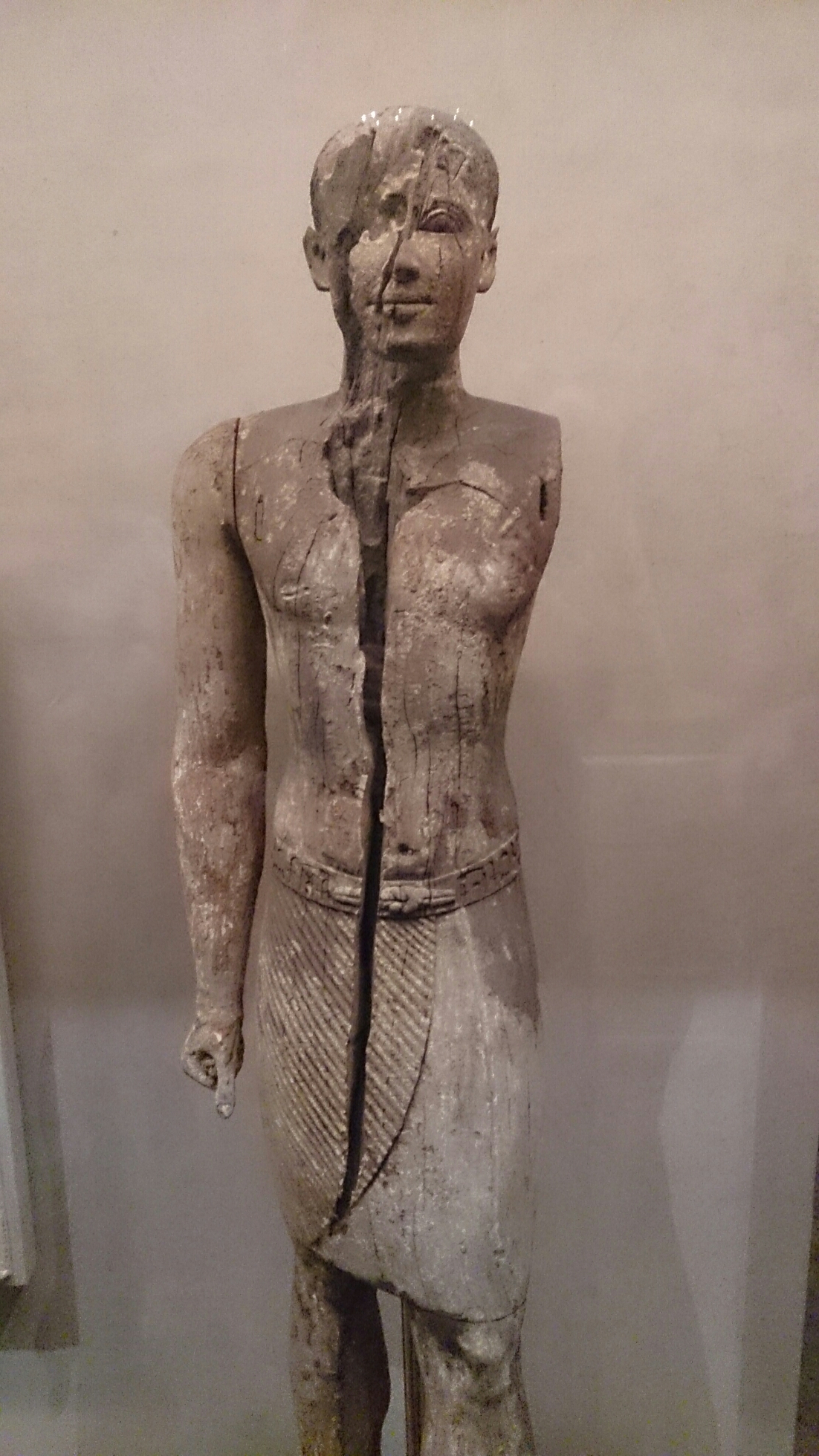
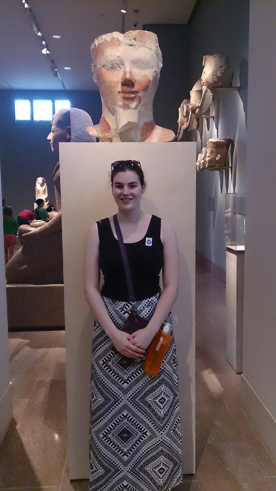
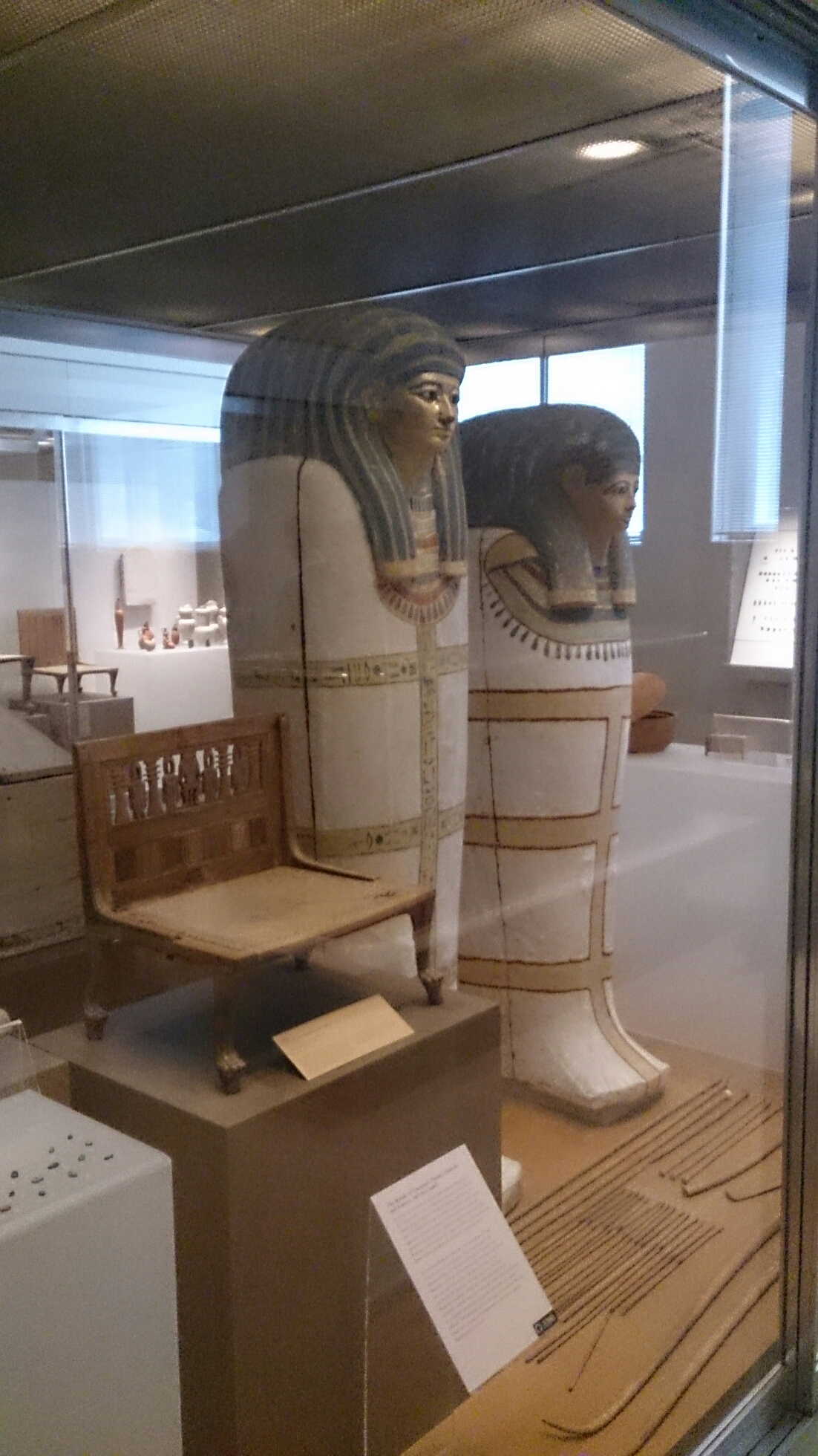
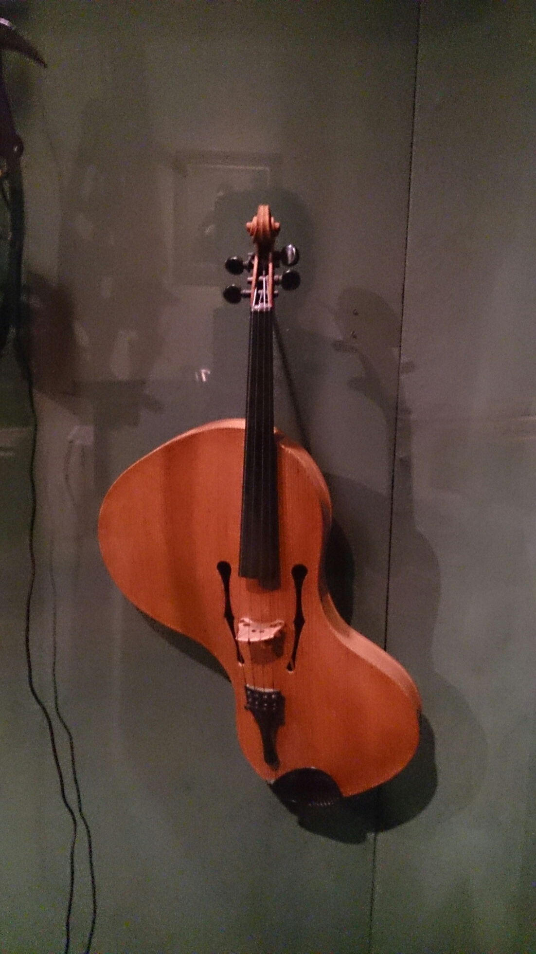
The Met. AKA the Metropolitan Museum of Art. We arrived at the beginning of the day and there were still a lot of people there. The museum is huge, so we only had a small amount of time to go to a few exhibits, which were absolutely incredible.

We started off in ancient Egypt.

image

image


image

image

image

image

image

image

image

image

image

image

image (A model of a grainery found in a tomb).

image

image

image (Hair decorations reconstructed in a wig).

image

image

image

image

image

image


image

image

image

image

image

image (Children’s toys with moving parts. The dog had a moving tail and mouth with a tongue and teeth).

image

image (Sakhmet).

image (A crocodile).

image

image

image

image

image

image (A double harp).

image

image

image

image

image (The armour room).

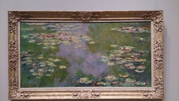
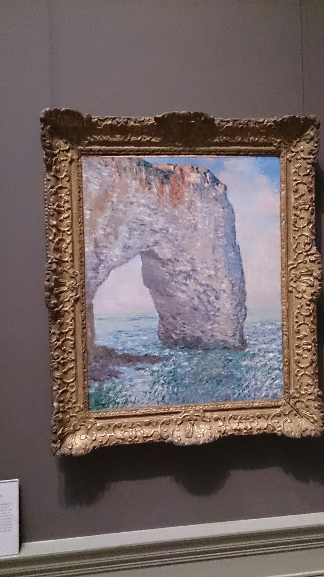
And then we went to the European art area, the area containing the art of the late 1800’s, including Monet, Degas and Manet.

image

image

image

image

image

image

image

image

image

image

image

image (All of the above: Monet).

image

image

image

image

image

image

image

image

image


image

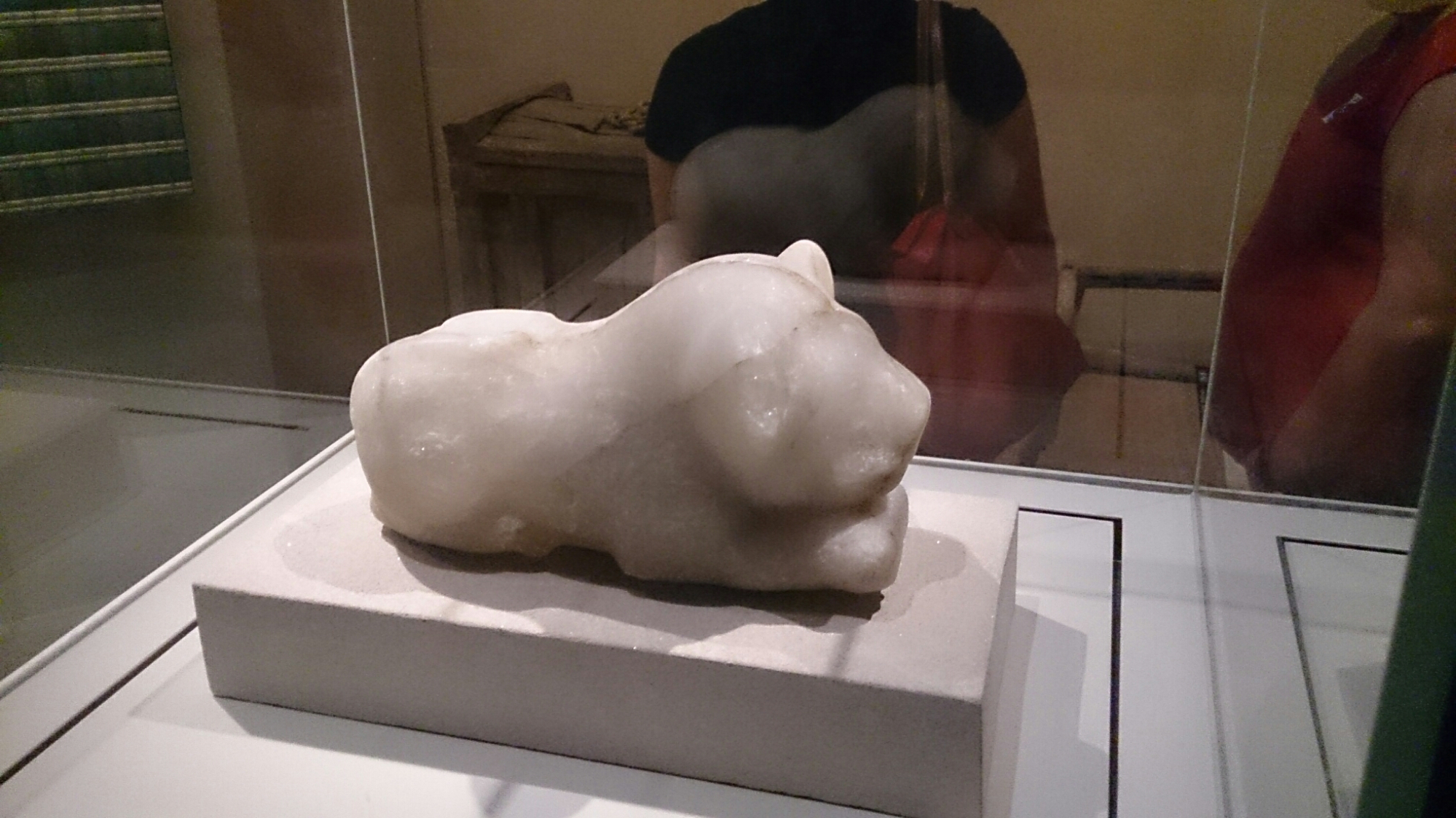
On our way out we also encountered a very familiar yet very different civilisation – Ancient Cyria.

DSC_0770


DSC_0774

They even worshiped similar animals to the Egyptians, the creature above looking just like the sun god Ra. The ancient Cyrian empire was actually more advanced than Egypt, but due to its poor resources and location in comparison to Egypt, it’s kind of become Egypt’s uncool cousin.

We then went and had some great Colombian food, saw the Gougenheim.

DSC_0788

Went to B&H and bought this flashy new laptop which I am now writing this blog post on.

DSC_0810

And then we went to the Eugene O’Neill theatre on Broadway to see The Book of Mormon, which was fan-fricking-tastic!

DSC_0807

Seriously, it was hilariously crude and rude and made me long for South Park. The writing was great and beautifully satirical in both the book and the music and lyrics, as is to be expected from Trey Parker and Matt Stone. The set design and characterizations were also oddly exaggerated and cartoonistic, which was also very fitting for the hilarious, naive style of the musical. It was great, especially for my dad and brother who hate that kind of stuff.

DSC_0808

Broadway is so different to Melbourne. In comparison the Melbourne arts culture is underground. On broadway, crowds come from everywhere just to see the shows andevery show almost always get a standing ovation, whereas in Melbourne the crowds seem to be constantly duller. Its interesting seeing how different the culture is over here, everyone is so serious and polite, whereas in Australia we are so layed back. Also noticing the similarities between cities, people are people afterall.

Day 2

An early start…

image

And we’re off to the Freedom Tower! Seriously, this place really is like a Disneyland Ride. There is so much VJing going on, so many useless interviews with construction crew, and an overload of emotionally overpowering music, in true American fashion they’ve managed to create a place that is incredibly entertaining, loud and an overload to the senses before you even get to the observation area.

image (but hey, the inner building design is pretty futuristically cool).

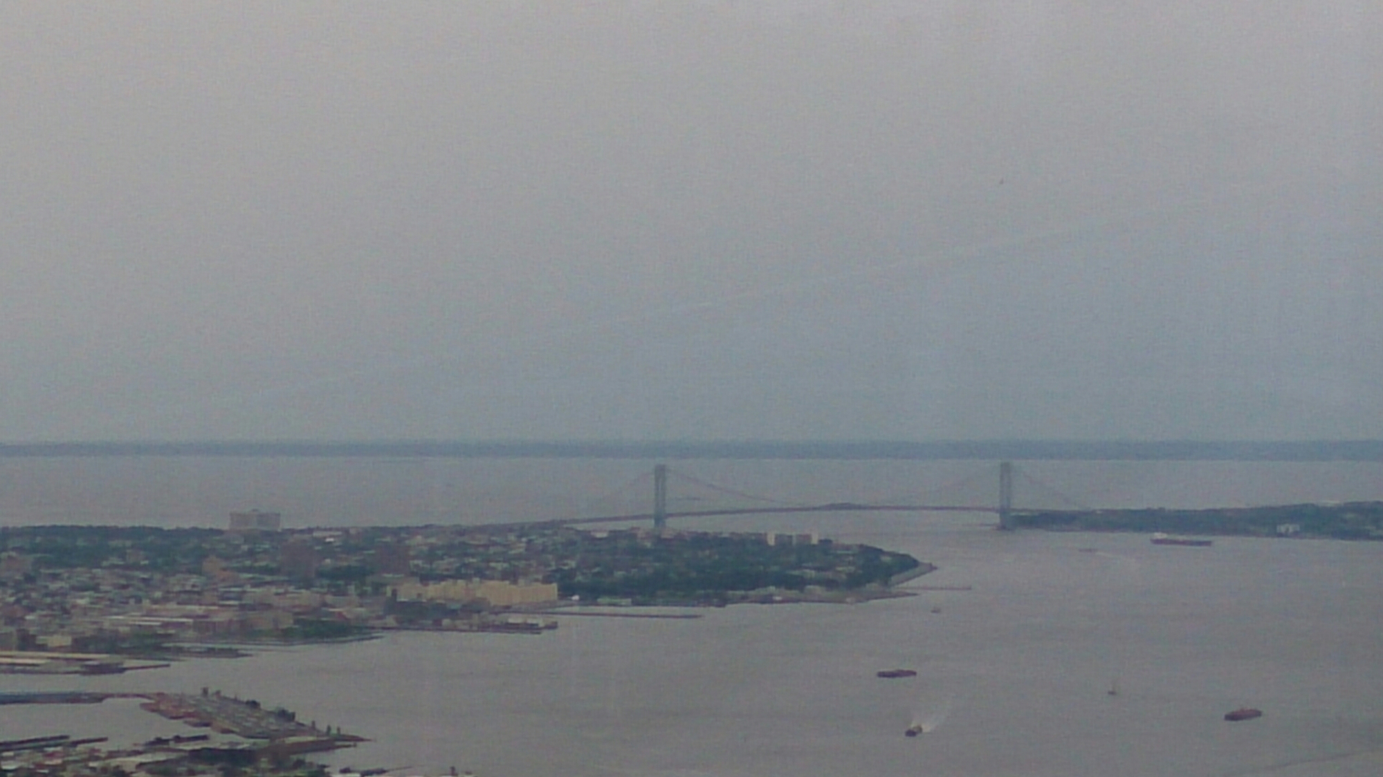
Up on the observation deck (once we’d cleared all the inspirational and emotional music. Seriously, there was a lot of it.) The view was absolutely incredible. To the point where I took so many photos it took me a long time to sift through and find the best 11 photos.

image

image

image

image

image

image

image

image

image


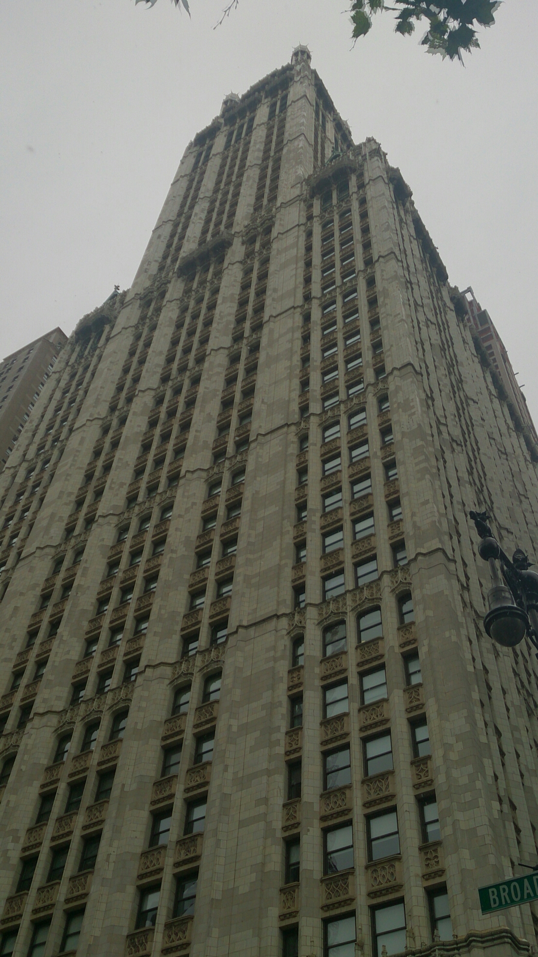
(The one with the copper spire is the incredible Woolworth building. It is beautifully old and majestic).

image

image


The Twin Towers memorial. This is probably the most fitting and emotionally compelling memorial I have seen (other than the WW2 memorials in Berlin), as the memorial is actually two pools made from the exact base of the towers’ foundations. Being in the presence of such a massive cascade of water on the black tiles of the foundations really made you feel the impact that 9/11 really had.

image


This building was also in the area, and I don’t know what it was for, just that it looked awesome.

image


Freedom Tower from below. It really is a monolith.

image


After going up to the top of Freedom One, we went to the Century 21 department store which was pretty crazy because it’s basically Macy’s (as in designer clothes) but discount everything. Our feet then incredibly sore, we stop for sushi, which of course New York knows how to do incredibly well, and then we took the train to Brooklyn to walk across the Brooklyn bridge. Brooklyn (or what little I saw of it) was a pretty cool and nice area, so I can quite easily see why all the trendy people live there.

image


The views were absolutely incredible, and if any of you are going to walk the Brooklyn bridge take the subway to Brooklyn then walk back, as you get all the incredible views of the Manhattan bridge and the beautiful New York cityscape.

image


The Brooklyn bridge itself is amazing, as the wires and archways create some amazing shots and views on their own.

image

image

image


This building is actually one of the municpal buildings and is absolutely beautiful and huge!

It also has an amazing internal structure.


image

image


In true tourist fashion, I took a photo of a squirrel while my family had an in depth converstaion about how they are so cute and why American’s dislike them so much (they’re basically like our possoms, although America also has possoms…).

image


Another pretty building

image


The incredible Woolworth building from street level. It is seriously an incredibly beautiful and old building.


image


We did so much walking and wandering today that my feet are killing me, but I really don’t care. I feel like the more I walk the more I understand New York and its inhabitants, both of which are incredibly normal and diverse at the same time, which I guess is just another way of saying they’re both very human.

Day 1

After a very long and stressful time flying that just happened to begin at the exact morning at which Tullamarine customs decided to go on strike, we finally arrived in the beautiful and constantly shape-shifting New York. Every corner has something new in building design, sprawl and character.

image (FYI this is a photo of L.A as we had to stop over at LAX before running to catch our flight to New York as well).

image

One of the most common things in New York are fire escapes, and to be honest having fire escapes on the side of buildings creates some of the most beautiful architecture and unique patterns.

image

Everywhere, throughout every street, there are beautiful buildings with incredible facades just jutting out of the not so unique street line up.

image

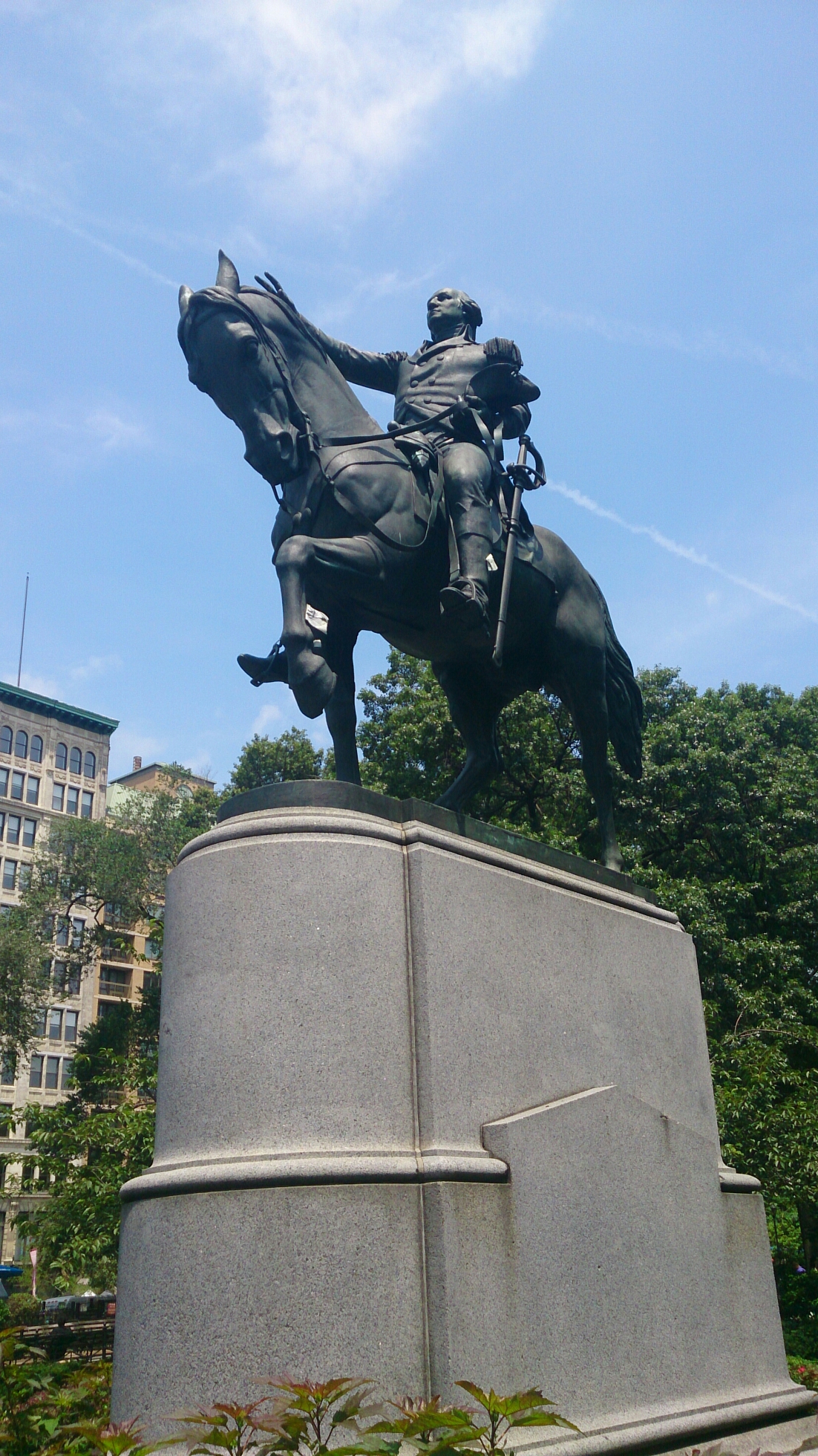
We made our way to Union Square. There was an amazing farmer’s market with some buskers playing jazz. We saw the George Washington statue and walked around Union Square which was beautiful in the sunlight.

image

image

image

The Flat Iron building. Quite frankly the most amazing example of a very interesting type of building unique to New York city: the corner building.

image

Madison Square park. Beautiful art covering most of the walkways right next to the flat iron building and Eataly (a great gelati shop), and even had a really cute little dog park section (which really made me miss my dogs…)

image

Empire State.

image

We went to Macy’s, which is basically a better and slightly cheaper version of Myer. Inside, they still had the old escalators made from wood. That’s right wooden railings, and one even had wooden steps.

image

Another interesting thing about Macy’s, and somethig that I think should definitely translate to our stores, is the fact that each brand of makeup on the ground floor (at least on the day we were there) had their own DJ.

image

It really lifted the mood, although it was interesting because each area was a different competeing sound.

We then went on a ‘mum-fuelled tour of famous buildings that had been prominently featured in films’, starting with the New York public library, in such films as The Day After Tomorrow.

image

It is a truly magnificent building with a lot of interesting free events in and around the building.

image

Next up on the tour, Grand Central Station. Featured in pretty much every Hitchcock film ever (or at least North by Northwest and Strangers on a Train, so the two train themed ones).

image

image

The old building is so huge and beautiful, and to be honest being in the middle of this old beauty it finally hit me where I was. The grand majesty of this place is just so old and grand, and yet so present, like the whole of New York pretty much. It breaths life through its age and history as the old becomes adapted into the new.

image

The roof has beautiful designs of star signs, which are actually upside down.

image

We went to Times Square after walking around all day and went and sat on the stairs in the center (yes, the same ones in The Amazing Spiderman 2). It was incredibly calming and interesting just watching people go by and being above and detached from the huge crowds of Times Square. We actually wound up spending just over 30 minutes sitting down and people watching, while we rested our feet.

image

Darrel Lea is here too, which was surprising…

image

There’s no mistaking it’s Australian-ness.

image

In true American fashion, we went to a convenience store and bought bucket loads of junk food. And of course we laid it out on the counter ritualistically for the slaughter.

And for all the Mad Men fans among you…

image

THEY STILL EXIST! And with pretty much original packaging too.

image

PUPPIES!!!

image

Burger… Vegan NYC style.

And Finally…

image

… Ice Cream….

image

… Sandwiches…

image

And a vegan carrot cake for dessert. Its like christmas, but with food. Wait, what am I saying. That is christmas!

Day one is over and I’ve already learnt so much from this city. I can feel its diversity and confidence leaching into my bones. Let’s just hope it’s a permanent thing.

“The Big Sleep” (Hawks, 1946): A Critique

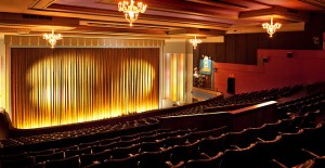
On Sunday I went to see “The Big Sleep” (Hawks, 1946) at the Astor theatre in St Kilda. This was a first for me in two regards, my first time seeing The Big Sleep and my first time seeing a film at the Astor theatre. For all the film aficionados in Melbourne, I know, I don’t know why it took me so long to go and see a film at this incredibly beautiful, restored, with all the old furnishings and old timey style intact, 1930’s, single-screen cinema.

astor theatre foyer astor theatre top section astor theatre interior astor theatre

Even the ticket stub looks authentic.
DSC_0024

Ish.

Waiting inside for my friend to show up on the trademark bouncy couches of the era was like stepping into the 30’s in surprising comfort.

Now to the film.

The Big Sleep is a film adapted from the 1939 novel of the same name written by none other than Raymond Chandler. That’s right kids, the man who practically fathered the genre (or at least the classic, convention-filled, hard-boiled detective and femme fatale centric story line film noir that we’ve all come to know and love). The Big Sleep itself features such classic conventions as the hard-boiled detective, namely the original archetype found in Phillip Marlowe, the femme fatale or in this case Vivian Rutledge, an almost literary dialogue, expressionistic lighting and weather and the girls falling for Marlowe as far as they can possibly throw themselves.

While this film does contain many of the qualities that make it an almost nostalgic film noir, as it ticks all the ‘conventional’ boxes, it is however formulaic and fits the category of being a film that seems to simply want to get in on the movement sweeping the era, rather than create something unique and interesting within the genre, such as “Double Indemnity” (1944, Wilder), a film written by Raymond Chandler, which came out two years prior. The editing and staging, and therefore direction is also poor in some areas. I personally don’t know if this is exemplary of the era and the level of the equipment being used, but I feel like other film noirs did these things better, as there was no visible lag and displacement between some of the cuts, which in The Big Sleep actually creates a sort of ‘forceful ejection’ of the audience as they are forced out of the world in which they were previously consumed.

Also, the plot is at times difficult to follow. It honestly just jumps around too much between different people of interest. At one point when there is a big reveal, the sound level suddenly drops for no apparent reason other than possibly the technology at the time (which is just really bad luck) and I actually didn’t know what the big shocking reveal was at first. I can’t help but wonder if it was because I was viewing it in a cinema on old celluloid film, or whether it was actually the production and processes used during the production itself.

Enough of the black hat, let’s move on to the good, juicy stuff.

One thing I’ve always loved about film noirs, and which was very evident throughout The Big Sleep, is the use of stark chiaroscuro lighting in an expressionistic way, that is to say lighting in a film noir is never usually realistic but almost always amplifies what is occurring in the film, both in terms of action and emotion. In The Big Sleep though this was taken to another level, as not only the lighting was stark and expressionistic, but so too was the weather. As the mood became gloomier and gloomier, the weather began to mimic it as it suddenly went from sunny in one outdoor scene to raining in another. The best uses of this technique were during a sudden plot development, lighting strikes and bars are created through the Venetian blinds (personally my favourite lighting trick in film noir is the use of shadows, particularly when Venetian blinds are involved).

The whole last section of the film takes place in fog which creates the most suitable metaphorical weather conditions while also creating some of the best lighting effects I’ve seen in a film noir, or any film for that matter. Much of the lighting in film noirs is used to emphasise a characters development, and in this case emphasises Marlowe’s internal struggle with the case, and shows his development morally as a character, the fog in particular giving the idea of confusion and setting up the atmosphere for the upcoming hectic scenes.

Another thing I really love about the film noir genre, especially films adapted from/written by Raymond Chandler, is that the script, mainly the dialogue has a very literary feel to it. It’s a constant eb and flow, a dance between the characters in such a poetic way. Ask yourself, ‘would I ever say this in reality?’. With pretty much all film noirs that have this literary feel, the answer is clearly no, as they feel more like your listening to the sweet words of two poets battling than two characters on screen. Chandler tends to have this flowing effect with his writing and this was clearly transferred to the adaptation.

The dialogue is also, when viewed today, very forward and sexist and like a game of cat and mouse, Marlowe being the cat and Vivian being the mouse. In the context of the times such a male fantasy, being surrounded by beautiful women throwing themselves at you only to find a woman more beautiful and seemingly impossible to attract (the femme fatale) is very common of this era and explains the heavy use of filming techniques that linger on the female form and create a ‘male gaze’.

While such male-centric techniques were common during the 40’s, 50’s and 60’s it’s unfortunate to see that such techniques are still heavily used today in film, despite the fact that they often do not contribute to the overall film in anything but style and alienate around half the audience, as nowadays women are just as likely to enjoy action films and other such male-centric genres as men.

The Big Sleep is a classic, classic film noir, following all of the conventions we’ve come to both love and hate of the genre to the point where this could even be called a mainstream film by the standards of the era. Like many blockbusters that are distributed around the world today, this film may have been more concerned with mooching money off of the film noir movement than creating a traceable and understandable plot. That being said, this film does create some worthwhile scenes using expressionistic lighting and circumstance emphasising the best parts of the genre. I guess we’ve just got to take the bad with the good.

Watching this film at an old theatre like the Astor and seeing the final shot wrap up with the red curtain being drawn over the top of it to reveal the ending title card somehow seemed more fulfilling than simply watching this film, or any other film like it, at home. A beautiful, old theatre like the Astor, that somehow seems to have some renewed vigor imbued within it, is definitely the way to watch any classic film.

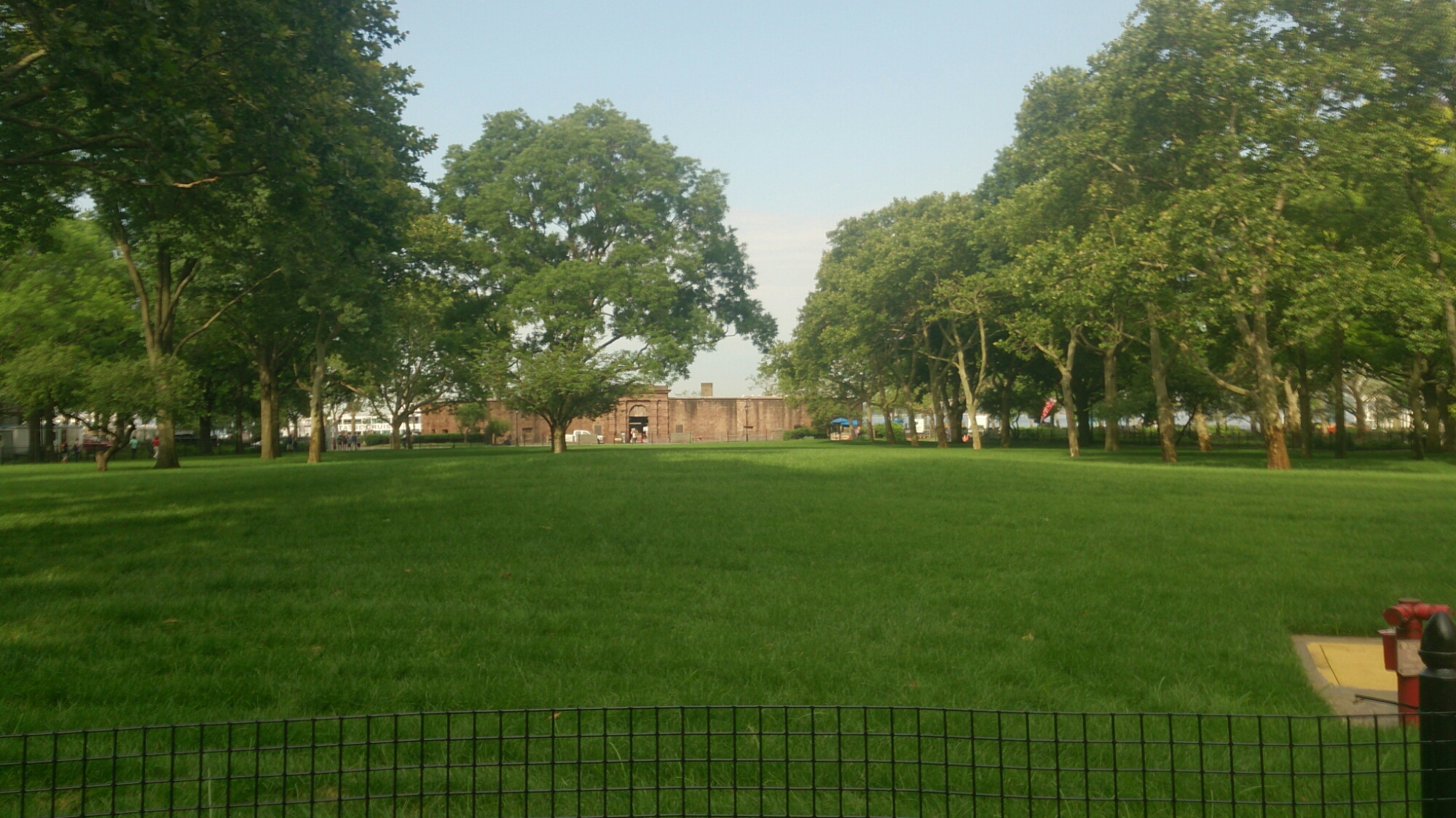
Train Dance

I consume the space around me as I sit and watch the two train cars flawlessly dance back and forth, intertwining with one another, perfectly in sync for one encapsulating moment, only to be thrown back out of sync.

They are however not out of sync, but rather catching up with one another, like a constant, lagging, domino effect, sending reverberations from train car to train car, creating an odd dance between the two. A dance which can only create a moment of stillness and beauty, the synchronising of the present and the past, for that is the dance of life, is it not?

Daily Creativity Challenge

Recently I’ve realised that I need to start doing something creative everyday, just a little bit at a time, so I can get through all the crazy creative ideas I have in my head and actually start creating and learning to create things that I’m proud of. I know that my degree is definitely helping, but I need to do some by myself. So I guess this project is a step towards something great.

A little creativity everyday keeps the day dreams, and philosophical ideas, at bay.

Semester 1: A Curation of

This semester has been an amazing experience. So here are the light-bulb moments:

1. My first project: “Self Portrait: Naive and I know it.”  For me, each piece of this assignment was a piece of myself that had just been building up, waiting to burst forth onto some kind of medium, and I finally had that opportunity, so I wasn’t going to waste it by doing something that wasn’t worthwhile or meaningful to myself.

2. “John Cage: The Art of Noticing.” Looking at John Cage’s work in class and then later at home, I felt inspired to try and experiment not just with content but the way in which I present my content, that is the very essence of the medium itself, as each story has and needs a different aura and therefore aesthetic feel to it, and therefore should be presented in a different way (kind of like a Wes Anderson movie).

3. “Integrating Theory and Practice: Editing.” I’ve always been incredibly intrigued by the practice of editing and yet at the same time stifled by the theory and ideas behind it as well. For me, listening to Liam Ward’s guest lecture and then going and exploring the idea’s of editing really helped, and inspired me with tying the concepts and practical nature of editing together.

4. “Zoom H2N Sound Recorder Practice.” This semester (especially the first and second projects) have for some reason fostered a fascination within me surrounding sound and the creation of deep and complex, layered soundscapes. This workshop activity really showed me the versatility of sound recording and the use of sound as a creative outlet.

5. “The Remix and the Glitch: Breaking Things Since 1930(ish).” This lectorial was especially intriguing for me. I found the readings incredibly provocative and interesting to read, and I wrote a lot about it in my blog post for the week. It was very interesting hearing about the new wave of art coming from computers and the internet, and it inspired me.

Semester 1 Reflection: Time Just Flies By

This semester has been an experience of constant growth, as with each class, reading and task I feel as though not just my skills are evolving, but my way of thinking about and approaching certain issues, as well as my knowledge base, have all developed. I feel that I’ve learned a lot more about media in a very broad sense, through many practitioners and an exploration of the self to allow me to explore and develop my own understanding of what creativity and film-making is, especially in terms of my own creative process. I have learnt a great deal about the basics of high quality video production and sound production, as well as the importance of sound and editing to create meaning. I have also learnt a great deal about editing video and audio both literally and laterally, as editing is vital in the creation of meaning.

Throughout this semester and the many various tasks, readings and lectures we’ve had I’ve found that the best way I learn is through just simply doing, that is participating, doing things I normally wouldn’t and noticing things around me that pertain to my practice/interests as a media practitioner. I also find that I learn well from looking at other people’s work and analysing what makes it click, and what makes it fit into that certain category/genre, so I can set myself a sort of list of conventions to possibly include in my work.

Even though I knew my way around an editing program pretty well from year 12, I still found that I couldn’t quite create the meaning I wanted through editing. I found it difficult to create these mental links in my storytelling, even if I was only creating an experimental piece expressing an emotion. I feel as though through each of the works I have created this semester I have grown better at this though, and with the help of Robbie and my fellow workshop members, I was able to straighten out my thoughts and create some great pieces that I am proud of. I also feel like one of the most challenging parts of this course for me has been keeping up to date with the readings and the blog posts throughout the semester due to my medical condition, but I found that towards the end of the semester I was able to keep up with the workload and take more on as I began to adapt to university life and leave the old habits and ways of thinking from high school behind me.

Through the production of many different kinds of products in many different kinds of forms; progressing from the self portrait with separate mediums, to the self portrait with combined mediums (as a video), to the portrait of another person with found footage, to a multimedia website utilising as many forms as possible to explore and convey one single idea; through this logical progression throughout the semester I feel I have been able to develop and explore my own creative process, learning about my own creative style as well as learning about how best to express and create through a visual medium, as well as many other kinds of mediums, as I have mainly written previously.

Here is a learning graph I made to represent how much I feel I’ve learnt, not just from the course itself, but from the findings ideas within the course have led me to, as well as the philosophical ponderings upon such ideas:

Learning Graph (1)