KAZUO MIYAGAWA

Yojimbo

Going into this study, I chose to reflect on a cinematographer’s body of work I’ve not yet appreciated and am thankful for this approach, as it lead me to a master of cinematography – Kazuo Miyagawa (b. 1908 d. 1999).

Miyagawa was considered the most influential cinematographer of post-war Japanese cinema. He shot over 130 films in his career and worked closely with Akira Kurosawa, Kenji Mizoguchi, Yasujirô Ozu and Kon Ichikawa. However, it was Miyagawa’s versatility that became his greatest strength and most notable definition in style and aesthetic.

Influences

Miyagawa drew inspiration for his lighting from a number of sources. He particularly admired the ‘gloomy contrast’ between light and shadow achieved by German expressionist filmmakers and admitted this influenced the contrasty style of light in his jidaigeki films.

In addition, he drew upon his childhood memories of the aesthetic of spaces and landscapes in Kyoto, which he felt ‘trained’ his eye to ‘see’ shadows and light. This contributed to his low-key aesthetic and asymmetrically balanced compositions. Watanabe Yutaka, a Japanese cinematographer and critic, agreed this influence was identifiable in Miyagawa’s style and described a typical home in Kyoto as ‘The ​house ​is ​a ​little ​dark ​inside, ​only ​with​ a ​few​ lights ​from​ somewhere. ​The ​backyard ​and ​the ​fish​bowl​ on ​the ​terrace​ are​ the​ only ​bright ​spots ​in ​the ​space’ (Miyao, 2014).

Another key influence was Miyagawa’s studies in sumi-e (traditional Japanese paintings in monochrome ink) that provided great insight into the infinite tonalities of grey. This skill provided a unique vantage for him working with B&W film and as a result, contributed to his distinguishable ability to create a sense of ‘colour’. Sumi-e also influenced Miyagawa’s composition – a style that was rarely symmetrical yet perfectly balanced. As Dusing (1981) describes, ‘the sumi-e painter does not fill the entire surface of the paper, nor does he arrange his composition symmetrically. Instead, he uses the borders of his surface to create separate planes within the space.’

Versatile Style

Miyagawa’s versatility is most evident in the comparison of his work in films from Kurosawa, Mizoguchi and Ozu. In Ukikusa or Floating Weeds (1959, Ozu), Miyagawa helped to define Ozu’s ‘tatami-level’ low angles and distinguishable deep focus. These qualities see the cinematography as unobtrusive and ensures the natural narrative and setting are emphasised.

Floating Weeds

In Ugetsu Monogatari (1953, Mizoguchi), his style is linked to the tonal greys between the monochrome and also his long, choreographed takes. In order to satisfy Mizoguchi’s directorial desire to suspend tense moments, Miyagawa exercised long, drawn out takes that allowed Mizoguchi to achieve dramatic performances without interruption.

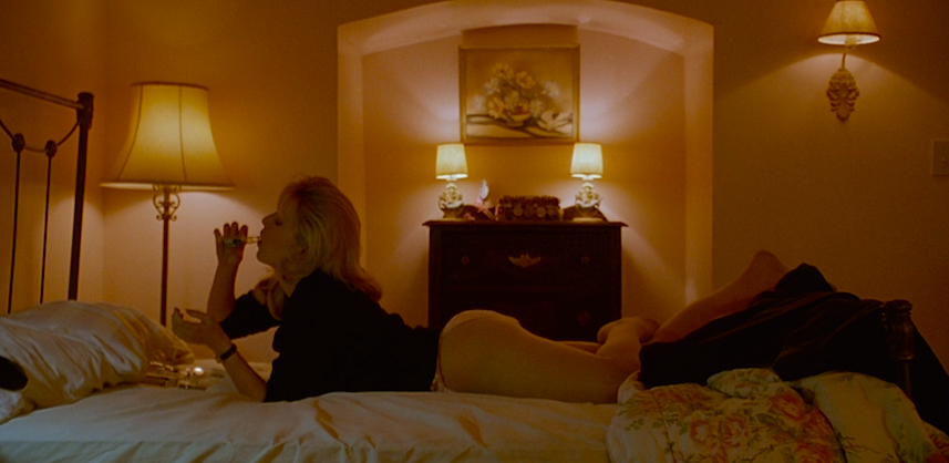
While in Kurosawa’s Yojimbo (1961) and Rashomon (1950), complex camera mobility and high contrast became Miyagawa’s notable technique. In his emphasis on contrast and clarity, Miyagawa stated that his was for the purpose of capturing the ‘seriousness’ of the story and that it would ‘express the true nature of human beings’.

It is clear Miyagawa constantly reworked his own techniques in order to best articulate the director’s intentions and developed significant diversity. He also continued to explore new technologies such as anamorphic formats (e.g. CinemaScope), color film stocks and development processes.

Camera Coverage

Miyagawa’s approach to camera coverage is particularly fascinating as he allows the action/movement in the scene (i.e. a samurai unsheathing his sword or river brushes swaying in the wind) to determine his camera placement. For example, the scene below from Ugestu Monogatari highlights an atypical camera position that is driven by the action. Miyagawa effectively creates a cinematic tension through his low, static, distant placement of the camera that restricts our view and forces us to patiently wait for the boat to emerge and travel to the front of the frame. This approach is observable in all his work and often is used to gradually reveal information to the viewer.

Interestingly, Miyagawa felt the camera should be thought of as part of our body, that the cameraman should become one with the camera and ‘dance with it to capture the subject’. He referred to the camera as a tool to ‘paint on film’ and mobility should be motivated by our own physical sense – I feel this explanation helps to best explain the motivation in his camera placement.

Innovations

Throughout Miyagawa’s career he experimented with cinematographic practices that lead to innovations still employed today. One of his notable innovations was the employment of mirrors on the filming of Rashomon. In a scene shot on location in a forest, Miyagawa utilised mirrors to redirect sunlight onto subjects otherwise hidden in shadow. This conserved on the costs and practicality of electric lights and allowed him to maximise on the location. His idea to use mirrors was further developed when he ‘cut’ the hard sunlight with branches and leaves to design a dappled light.


Rashomon

The second and most notable innovation of Miyagawa, was his invention of the Gin-nokoshi or ‘silver tone / bleach bypass’, a technique used in the development process. This innovation was a chemical process that created a greenish-gray tone and more importantly, provided greater control over colour saturation and tonality. The Gin-nokoshi technique has become a regular development tool for the practitioners of today, including Janusz Kamiński, Vittorio Storaro, Darius Khondji and Roger Deakins.

Miyagawa is a master not only because of his complex tracking shots, dynamic range, asymmetrical composition or deep focus, but due to his capacity to mold and adapt his own style to best suit the various collaborations across his career. To conclude in Miyagaway’s own words:

“Forget the expensive equipment. Only a beautiful person can take beautiful pictures”.


References

Allen, T 1981, ‘Journals: Tom Allen from New York’, Film Comment, July/August, <https://www.filmcomment.com/article/journals-tom-allen-from-new-york/>

Dusing, L 1981, ‘Kazuo Miyagawa honored by A.S.C.’, American Cinematographer, #5

Miyagawa, K 1985, “Paint” on Film, “Poetry” through Tone, “Rhythm (Music)”, Camerawork <https://www.filmcomment.com/blog/art-craft-cinematographer-kazuo-miyagawa/>

Miyao, D 2014, The Aesthetics of Shadow : Lighting and Japanese Cinema, Duke University Press, Durham

Tessier, M 1979, ‘Japanese Cameraman: Kazuo Miyagawa’, Monthly Film Bulletin, 48, 3, Arts Premium Collection pg. 188

BEDROOM LIGHT

The following is a brief outline of our group’s concept and how my idea aligns with our overall intention. After much consideration we came to the conclusion that each of us would be responsible for a project/shot (in total 4), but our idea must meet two common measures:

  1. We will all shoot at the same location, thus maintaining the same conditions including opportunities/limitations with light.
  2. We will all include a window in our compositions, to provide an iterative motif that is highly motivated by light.

The ideas circulating in our group include the exploration of deep focus, natural light and light that can elicit a mood. My plan is to shoot a bedroom that illustrates time passing, which will be achieved through temperature and quality changes in light. The type of light I hope to design includes:

  • Morning sunlight – hard, high contrast
  • Winter’s day – soft, overcast, cool
  • Bedside lamp at night – muddy, extra warm
  • Afternoon sun – direct, warm
  • Moonlit night – cool, soft, dim

In addition, I plan to shoot a subject within the scene to further suggest time passing through their actions i.e. reading a book, sleeping, drinking a cup of tea. My camera coverage will be driven by a loose narrative and operate hand-held. Note, it will not be a static time lapse style shoot. The below outlines key equipment requirements (at this stage). However I can refine this list if need be.

  • Canon 5D M3
  • 50mm
  • Fluid head tripod
  • 2x 1000k Fresnel w/ stands
  • 1x Dedo kit
  • 1x Kenoflow w/ stand
  • 1x C-stand
  • 1x Black core board, 1x White core board
  • 6x shot bags
  • Diffusion, CTO and CTB
  • Lee gel kit
  • Audio kit

So far we plan to shoot in Weeks 10 & 11, therefore allowing time for post production in Week 12 (and or contingency plan if need be). Next week we plan to recce the location and confirm a schedule. I will also develop a shot list and shooting schedule since my idea involves multiple lighting set-ups. In the meantime, I have sourced a few references to further demonstrate my idea.


Image sources include Lost in Translation, Lost Highway, God Save the Girl, Never Be Like You (Music Video), Atlanta, Fire Walk With Me, Real Destination

EXPECTATIONS

In Nicholas Roeg’s memoir The World Is Ever Changing, he observes the effects of our acceptance of an on-screen ‘reality’ whilst the film industry transitioned from B&W to colour film. Most importantly, Roeg highlights that our colour perception of the world establishes an expectation of how the on screen world should look. I would also surmise in contemporary audiences these imposed parameters are influenced by the context of the film, e.g. the sci-fi genre.

Interestingly, our perception and cultural acceptance of what is ‘natural’ on film continues to change and can influence performance, lighting, dialogue and special effects. Consider the groundbreaking CGI employed in the blockbuster Jurassic Park (1993, Steven Spielberg). At the time it was unbelievably ‘real’ but today would be considered artificial due to technology advancements and what we accept as natural.

Roeg observes that since our perception of reality is not in B&W, we accept its artificiality. As a result, we are less critical of B&W’s representation of the world on screen and he claims this enables it to be ‘more ‘artistic’ instead of ‘artificial’’. In fact, this (at the time) permitted filmmakers to do ‘extraordinary things’ such as stylistic or dramatic lighting that would otherwise not be possible in colour.

Furthermore, these artistic possibilities are somewhat limited to B&W as when executed in colour, render as artificial (due to our supposed expectations). But Roeg was excited by the opportunities colour welcomed and ponders, ‘How can we make colour more dramatic, what shall we do?’. This excitement is effectively illustrated in his film Don’t Look Now (1973), where primary colours are consistently contrast in the mise-en-scene to establish theme.

However, Roeg does acknowledge the unique challenges that come with colour or B&W:

Colour has its own balance, but to bring beauty to it or drama or threat is more difficult, in many ways, than with black and white; on the other hand, is more difficult to approach in terms of the actual photography than colour.

Overall, Roeg observes that our interpretation of B&W on screen is ultimately uninhibited as we do not perceive the world in monochrome. While the representation of reality on screen in colour is influenced by our expectations of how reality actually appears. So is it these expectations that attribute to the industry’s current lighting standards/style?

My understanding of the relationship between light and B&W/colour continues to develop and leads me to again consider the question proposed earlier in the semester – Why do some of the shots ‘work’ in B&W but lose a/some quality when in colour? After studying secondary sources on the internet I find this question to be a can of worms, one that opens many doors. Despite this, I was able to gain further insight from an article by Rick Hubert (Luminosity-Landscape, 2017) that discusses his take on the differences between B&W and colour photography:

Black and White conveys Depth through luminance. Luminance is extremely important to how we see and perceive photography. Luminance is a subjective measure and is determined by how bright the average person judges a light to be. Black and White or Tonal Values are essentially pure luminance. The reason luminance is so important to photographers is that our perception of depth and sense of volumetric space is affected by luminance alone and is insensitive to color. While color alone can be quite compelling, color alone does not convey a sense of depth. As such, Black and White images become a powerful tool in portraying 3-Dimensional Volumetric Space on a 2-Dimensional Canvas or Screen.

To conclude, our interpretation of B&W and colour undoubtedly differs and importantly influences our reading of luminosity. Because of this, filmmakers have unique opportunities to exploit that can ultimately influence our understanding of a scene. For now, this reflection helps to answer some of my questions but not surprisingly raises new ones… I would love to do an exercise that specifically explores the relationship between light in B&W/colour!

References
Hubert, R (2017), ‘Black and White vs. Color’, Luminous Landscape, blog post, 17 July 2017, accessed 3 April 2018 <https://luminous-landscape.com/black-white-vs-color/>

Roeg, N. (2013), The World Is Ever Changing, London: Faber and Faber

‘THE MISUNDERSTANDING’ SHOOT

Photo by Max Simonson

Our group was incredibly supportive and everyone was very active in helping achieve the scene. Above all, we were professional and time conscious and our efforts at managing the public especially reflected this.

The ‘pre-production’ helped to establish how the scene would be staged in order to block reflective surfaces and on the day this really helped save time! Also we appointed Michael to direct the talent, which ultimately allowed me to remain focused on the light/camera. Since my plan was to shoot hand-held I chose to improvise with a ‘mock’ monopod and operate the camera locked to a closed tripod. This helped with steadier OTS shots (and OTS walking shot), particularly as both talent were taller than me. Although the mock monopod provided these benefits it came at a real cost – it was not sustainable or ergonomic. In fact, I could not even press record by myself, which resulted in unnecessary head and tail footage on each take. By the last shot, outside, I could no longer manage the weight without affecting composition (think skewed horizons) so thankfully Michael saved the day with his initiative and in one take got it!

Another important reflection was the changes to my proposed storyboard, which intended for the camera to operate within the opposite side of the ‘line of action’. But on the day of filming this flipped, mostly due to how the light modelled the boys’ faces… and this was by no means, a scientific practise, simply decisions based on what ‘felt’ right. Initially the shadows cast from the down-lights seemed overbearing (especially both of their offside eyes), however I chose to accept it and hoped it would further illustrate the scene’s ambiguity.

My greatest underestimation of the location was the public’s use of the space. At least 50% of our time was spent waiting for the elevator actually being used. For similar reasons I also had to sacrifice bounce boards as there was no way it was safe or practical. These factors required us to think on our feet but due to our recce visit we were able to make informed, artistic choices.

On a quick note, the addition of ‘extras’ in the scene (for everyone’s exercise) really added to the cinematic quality of our work and I feel enables the project to be considered more than just an exercise.

No doubt our planning and investigation of each location prior to filming, helped to establish a vision and on the day form smarter lighting decisions. But for me, the support and focus of our crew/cast attributed to our success – it truly was a team effort! Our efficiency and collaboration made for both a professional and fun experience.